Thursday, July 27, 2017

A New Card and a Little Update

Hello everyone! This is my second blog post for today so if you are looking for The Challenge #93, keep scrolling down. This card is for this week's Color Throwdown Challenge #453.

I had so much fun playing with Pattern Play Hexagons from Altenew yesterday.  I have several other projects in progress that will be coming in the next week or so, but there is just one for today.  I love the colors in the inspiration image so I really wanted to play along on this challenge.  There is bright Pink, Yellow and Green and as always any neutrals we like. In my case, the neutral is White as it often is.

The Pattern Play Hexagons Stamp Set is from Altenew's latest release and I had to have it.  I also want Pattern Play Diamonds.  Both sets are 6 x 8 stamp sets. Nicole Picadura designed these stamps and they are awesome.  The clear background stamp is large enough to cover an A2 card base going either direction. There are 6 other stamps that let you fill in whatever parts of the pattern you want and includes two sentiments as well.  I knew I'd want to heat emboss the background in Antique Gold so that is what I did yesterday morning.

You can see here the various parts that are included with the stamp set.  There's the hexagon, the diamond, the diamond row and the zig-zag row.  I have a MISTI Tool but I just did my stamping yesterday by hand with an acrylic block.  If I would have used either of the rows, I would have used the MISTI Tool. Since I was selectively stamping in only some random diamonds and hexagons it wasn't necessary to be so precise. There is no rhyme or reason to my stamping so don't look for a pattern as there isn't one there.  I used Altenew's Crisp Inks in Pink Diamond, Frayed Leaf and Lemon Tart from Papertrey Ink for my yellow.

I wish I would have thought to take a picture of just the background panel before I assembled the card, but I didn't. Next time I work with this set I will try to remember to do that for you.

Once I had my background stamped how I wanted it, I die cut it with the WPLUS9 Gift Card Layers Die.  I like that it is a full A2 Card front size as I love this pattern and didn't want to cut any of it off.  Next I heat embossed two of the flowers and two of the leaves from the Beautiful Day Stamp Set which continues to be a favorite.  Heck, all floral stamps are my favorites, but Beautiful Day has seen more use than any other set in my collection. I used the 2nd and 3rd detail layers in Pink Diamond and Pinkalicious from the Altenew Cherry Blossom Collection for the blooms with Frayed Leaf and Forest Glades for the leaves from the Green Fields Collection.  By misting each layer right after it was stamped, it helps to soften the color and let the two mix and mingle.  The Cherry Blossom Collection is one of the 3 new ink collections from Altenew's most recent release. I only have room to store one more collection so I have to be very choosy for which collections I want. I'll have to move one collection to a different storage area as soon as I add one more which I would say is highly likely at some point in the not too distant future.  I'm still wanting to add Tropical Forest Collection and Pocketful of Sunshine Collection to my ink color choices.


I had one tiny little spot where the embossing was a little messy but I just put that corner where I was planning to put the blooms to cover it up.  So this is how the card sits as of this posting. I like how it looks now but I'm thinking of adding some Crystals or sequins to the card.

I've gotten a few e-mails from folks commenting that I'm not blogging as much right now.  I'm not planning to slow down, but right now I'm taking a class and there is a lot of homework for it.  So I'm making just as many cards, but doing fewer blog posts.  The blog posts take a considerable amount of time. The class runs through the 2nd week in September, so it's only temporary.  I share nearly everything on Instagram so you can look for me there. There's a link just under my blogger profile. I will still be doing my Design Team posts for The Challenge each week and The Card Concept will be starting back just as my class is finishing up.

I'm also going to link this card up over at the Simon Says Stamp Wednesday Challenge this week with their theme of "Anything Goes".

The Challenge #93

Hello and Happy Thursday!  It's time for a new challenge at The Challenge over on the Always Playing With Paper Blog! This week is Challenge #93 and it is a Keyword Challenge which means you can use one or more of the words from the graphic to incorporate into your card.

For my card this week I kept things simple for the most part.  I started by stamping the Simon Says Stamp Rebecca Lace Background Stamp onto Watercolor Cardstock in Versamark and heat embossing it in Simon Says Stamp Antique Gold Embossing Powder.  I prepped my surface beforehand very well by brushing baby powder all over the card front.  Because this stamp is very intricate, this step is more important than usual.  In fact, I even messed mine up a little bit but it's probably not noticeable to the average person.  I use a Wagner Heat Tool. I previously used a heat tool from Darice but the Wagner Heat Tool gets much hotter, much faster and that means less warping of my paper if I'm not having to hold it on my paper as long.  It took me a bit of time to get used to it and not scorch my paper if that tells you how hot it gets. *Ü* The Wagner Heat Tool does not have the protective cap on it so be careful if you get one.

The newest release of Distress Oxide Inks came yesterday and I had spent some time yesterday morning after the dentist and before my hair appointment doing several of these heat embossed backgrounds so that I would hopefully have time to play with the new inks. I only had time to play with this one color so far as my last few weeks have been very busy.  Knowing that Seedless Preserves is my favorite color in Distress Inks, you know I had to try out the Seedless Preserves in Distress Oxide first!  The Distress Oxide Ink Pads are available in individual pads or your can buy the bundle. You can lighten or intensify the ink color by how much or how little ink and then again by how much or little water you add into the mix.  For this card, I barely added any water because I wanted to retain the true purple color.  If I wanted to have a chalk or suede look, I would have used more water. The water causes the oxidation in this ink formulation. I'm not into the random drops, splatters or mists of water to "Bleach" out or distress the color so I did not do that.  I like it once in a while but not all the time. It's got to be right for the project.  I did use a touch of Tsukineko Sheer Sparkle Shimmer Mist after the ink was dry which is a water based product.  But I kept the mist high above so it would not leave drops.

Next I used the WPLUS9 Gift Card Layers Die to cut the background panel and the Concord & 9th Floral & Flutter Dies to cut a single butterfly for gold floiled cardstock.  I heat embossed the "Happy Birthday" sentiment from the Papertrey Botanical Blocks Stamp Set onto a banner cut from Papertrey Ink Tag Sale: Quilted dies.  I try to make sure I always have banners cut in white, black and watercolor cardstock so I don't have to stop in the middle of a project to cut one out. It's easier to cut several at a time than to have to dig it out each time I want to use it.  I assembled everything to a top folding white card base made from Papertrey Ink's Stamper's Select White Cardstock.  All of Papertrey's Card Stock is 110 lb and super smooth.  It's my favorite.


You probably didn't notice it at first but the background design is done in a circle incorporating a 3rd keyword into my card.  I love using background stamps to make my card front any color I want.  I'm going to be testing this particular one out again soon for a niece's wedding coming next month.  Be sure to stop over and see all of the Design Team's Inspiration for you at the blog.

Lesley Croghan (Challenge Creator)

Don't forget to check back each week on Thursday to see a new challenge posted. We hope you'll find time to play along.  

Tuesday, July 25, 2017

Papertrey Ink July 2017 Blog Hop

Hello everyone! Today is the day for the monthly Papertrey Ink Blog Hop and our inspiration photo is on the left. Since I was a little girl, I have loved stationary; note cards are particular favorites.  You can write a note to let someone know you're thinking of them or thanking them for a gift or just letting them know that they've been on your mind. I always loved having coordinating products like matching envelopes, envelope seals and what not.  That's what came into my mind when I saw this image.  The stationary of my youth was a usually a soft shade of pink or lilac and I used it to send letters to all my grandparents and great grandmother who all lived in other states for most of my growing up years. I love this soft shade of kind of blue-ish grey.  In fact, that is a favorite neutral for me although I haven't had any in a number of years.  It makes me want to go out and hunt for it.

For today's project, I used Spring Rain Cardstock and Ink from Papertrey Ink as my primary color choice. To begin my project, I stamped a background panel on Papertrey Ink Rustic White Cardstock using the Papertrey Ink Grand Finale 2017 Anniversary Stamp Set. There are coordinating dies but I did not use them for this card.  I tried several colors and combinations of ink including Soft Stone and Blueberry Sky, but in the end I felt Spring Rain was the best choice for the look I wanted. Using the Grand Finale leafy flourish, I inked it up in Spring Rain and then gently tapped around all the edges with Aqua Mist then stamped down. This gave the images the soft blue with a touch of aqua on the tips.  I stamped twice to give the flourish an "S" shape on my background panel.  I cut a few leaves in two sizes and a few of the small blooms from more of the Rustic White Card Stock using Garden Party Stamps and Garden Party Dies (designed by Dawn McVey) and then stamped them in the same two-toned style using the negative as a place holder with my MISTI. Next I cut a card base from Spring Rain Cardstock and also a stitched oval for my greeting. I stamped the greeting using one of the quotes from A Cheerful Heart, another set designed by Dawn McVey.

That card is going to be sent to someone who is dealing with a difficult health situation but always has a positive attitude and a heart full of gratitude.  I personally know how difficult that can be in the face of so much illness.


I stamped the chosen greeting in Versamark and heat embossed it using Sapphire Pearl Lustre Embossing Powder from Stampendous.  I have had it for a long time now.  I don't use it very often, but when I need it, I like having it.  I wanted my embossing to stay in the shades of blue and this was perfect.  Once I had that stamped and heat embossed, I die cut an oval from Fun Foam to put behind the cardstock oval which will help it travel through the United States Postal Service a little better.  Then I arranged the flowers and leaves around the left side of the saying.  I finished off the flowers by adding little gems to the centers rather than their stamp layer and giving a nice shimmer mist all over for a bit more fun and sparkle.


To finish off this card, I also stamped one of the flourishes in the same manner on a coordinating envelope leaving room for an address and return address.  The envelopes that were included with the Modern and Marbled Kit are a great match for the Rustic White Cardstock. Seriously, there could be 100 people using the same stamp sets and each of us would use it in a different way.  That is part of the magic of stamping for me and for most people I know who are card makers. I also love that I can personalize each card with colors and/or styles.

Be sure to go over to Nichole Heady's Blog, Capture the Moment, to see all of the cards or projects from everyone who is playing along with the challenge today.  Most of them will be cards but we also get the occasional other project such as treat boxes, or even planner items. Be sure to link up your own project before the deadline!  The supplies I've used are linked up throughout my post. Thank you so much for stopping by today.

Thursday, July 20, 2017

The Challenge #92

It's time for a new challenge at Always Playing With Paper's The Challenge! For my card, I chose Black and White with Pink which is a favorite color combination.  The delicate rose pinks with the bold graphics of the black and white background is a bit unexpected.

I have a tendency to pull stamps and dies out for any ideas I have for upcoming projects and challenges. They might be stamps that are new or just some that haven't been used for a while. it seems like I always have several on my desk. I've used black and white quite a bit in the last few weeks so I will post some of the other projects I've created at the bottom of this post so that you can get ideas for any projects you might want to do. I know that for me, I get inspired each time I see how someone else used a particular set. For this card, I used the Simon Says Stamp Bouquet of Thanks Bundle from the One of a Kind Release.


I made a top folding card base made from Stamper's Select White  Next, I cut the My Favorite Things Diagonal Stripe Cover Up Die. I cut one from True Black and one from Stamper's Select White.  I put each of the cover ups face down on my work surface and lay the opposite color stripes into place and tape it with a bit of micro-pore tape on the back side so that when I flip it over for my card, it all stays in place. When you finish both of the ones you've cut, you have 2 front panels ready to go. I used all Papertrey Ink Cardstock with the exception of Audrey Blue which came from Simon Says Stamp. The colored card stocks I used are linked and listed below.

All of the colored images were done with Copic Markers except the heart was just cut from Black, White and Autumn Rose Cardstock.  Today's card used three shades of "pink" in the RV Color Family, RV63, RV52 and RV000.  I stamped with Simon Says Stamp Intense Black Ink on X-press It Copic Blending Card which I love. I'm finding it to be much less work to get a blend when I use this specialty paper to do my coloring on.  It is the silkiest paper I have ever used by a lot and takes much less effort than my #110 lb cardstock. I was a bit worried about how it would stand up to die cutting, but it has not been an issue at all.  I cut each sheet of 8.5 x 11 inch paper into 4 pieces and then stamp as needed. I used the companion die for the Bouquet of Thanks to die cut it. To finish off my card today, I used Nuvo Crystal Drops in Ebony Black Gloss and Glossy Accents over the die cut word.  For some of the other cards below, I used Liquid Pearls, Nuvo Crystal Drops or some even sequins. I have some black iridescent sequins that are a favorite. I'm not sure where I got them as I have had them for a long time. It's always nice to have a few choices. *Ü*


Card 1: Stamper's Select WhiteTrue Black and Lavender Moon with the Avery Elle Floral Bouquet Stamps and Dies.
Card 2: Dark Indigo and Stamper's Select White with the Avery Elle Floral Bouquet Stamps and Dies.
Card 3: True Black and Stamper's Select White with the Avery Elle Floral Bouquet Stamps and Dies.

Card 6: True Black, Stamper's Select White and Autumn Rose with the Caprice Heart.

The die cut greetings are from several sources; Hero Arts for the first Hello, Simon Says Stamp for the Painted Hello and Miss You, Little Yellow Bicycle for the Smile, Friend from Mama Elephant, and Thanks from Simon Says Stamp.

I hope these cards will give you lots of ideas for how you can incorporate another color into your black and white palette. Create a new project and link up over at The Challenge to show us your card.  You can also check out the other design team members here:


Have a great rest of the week and I hope you'll come back soon.  This is always a popular theme so there will be lots of inspiration to see in the next week!

Monday, July 17, 2017

The Color Throwdown & Fusion Challenge

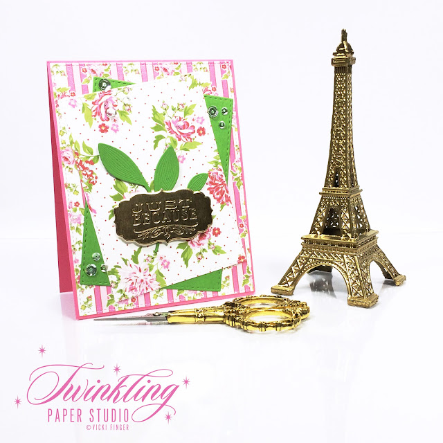
I am popping in with a quick card this morning. I made this card yesterday but I didn't photograph it until this morning. The Color Throwdown #451 has these pretty colors of dark pink, light pink, green and white.  The Fusion Challenge has a great sketch this week and I wanted to try mixing a couple different patterned papers which I am not that great at doing.  I wanted to give it a shot so I selected two coordinating patterned papers and decided to incorporate the two challenges into one card by combining the key elements of color and sketch.
I started with a top folding card base made from Hibiscus Burst Card Stock. I die cut the My Favorite Things Stitched Rectangle from Blueprints #15 from the pink and rose striped paper for my background layer.  Next I cut two smaller Stitched Rectangles using the second largest of the Simon Says Stamp Stitched Rectangle Dies; one from a different patterned paper and one from New Leaf Cardstock.  I adhered everything using the sketch as my layout design.  I wanted something simple to bring that pop of green onto the foreground so I die cut one of the Spellbinders Romantic Leaves and then popped the sentiment on top of that.


I finished off the card with a few sparkling clear sequins from Simon Says Stamp.  The ones I have are an assortment of sizes in one package which works best for how I use them.

This is it for now.  I have a few other projects on my desk this morning to finish but I am getting dental work done this afternoon so I don't know if I'll be back today or not.  I might come back and work until the anesthesia wears off.  LOL! Have a great day everyone!  I hope you'll come back soon.

Thursday, July 13, 2017

The Challenge #91

This week at The Challenge we have a sketch up for you! I have only recently been doing Sketch Challenges but I am enjoying using them as my starting place for my cards.  I hope I never get stuck in a rut but sketches are a great way to be inspired by a fresh approach to card making.  The Challenge on the Always Playing With Paper Blog has a sketch challenge about once a month.  This allows me to use the same products in a different way than I might have previously. Let's face it, stamps and dies are a significant investment of both time and money, so I want to stretch mine as far as I can.  
I wanted to use a combination of Green and Navy for my card so I started by water coloring the panel using Lucky Clover Distress Ink. Using a No. 8 Round Silver Black Velvet Brush, I wet the panel in a circular pattern and then added a heavy concentration of color and let it move with the water.  I put a few drops of reinker on an acrylic block to get this heavy concentration.  I left it alone (as much as is humanly possible for me) so I could get those hard, fringed edges. Once the watercolor was dry I hit it with some Tattered Angels Iridescent Gold Shimmer Mist and let it dry completely before die cutting the panel with the Gift Card Layers Die from WPLUS9.  The largest die in this set cuts a full A2 sized stitched rectangle panel.  


I cut the widest and 2nd widest strips from the My Favorite Things Horizontal Stitched Strips Die out of Dark Indigo and Gold as well as the "Celebrate" die from Gold Foiled Cardstock. Next I stamped the "You Did It" phrase from the Birthday Cheer Stamp Set onto the Dark Indigo strip using Versamark and heat set it with Antique Gold Embossing Powder.  I adhered the Dark Indigo layer to the gold layer using tape runner and the word die using Ranger Multi Medium Matte. A strip of fun foam was placed beneath the horizontal strip to attach it to the card. Using the banner from the Tag Sale: Quilted Die, I folded it so that two ends would show underneath the horizontal strips as in the sketch. I assembled it all to an A2 Top Folding Card Base made from Stamper's Select White Cardstock.  I added a few Pretty Pink Posh Metallic Gold 6mm Sequins to add the finishing touch.

Be sure to stop over at the Always Playing With Paper Blog and see all of the projects from the design team.  As always, there is some fantastic inspiration among my teammates.  We hope you'll be able to join is this week!

Wednesday, July 12, 2017

Papertrey Ink July 2017 Create Along With Us

It's release time at Papertrey Ink and that means we have another "Create Along With Us Challenge".  Sometimes I like to see all of the projects before I decide what I'm going to do for the challenge, but this month Michelle Leone's card caught my attention right away so I decided to go for something along these lines.  I love the soft shades she used with the super fun florals, leaves and sprigs. Those are from a new set releasing this month designed by Nichole Heady. I chose to use brighter colors for my card but I hope I achieved some of the same feeling that Michelle's card conveys.
Michelle Leone's Card

Of course, this month's release is in the pre-release stage as of this post and hasn't yet been available for purchase; that happens on the 15th of every month at 10:00 p.m. Eastern Time. So, I grabbed a set from last month that I've been meaning to sit down and create with called Garden Party designed by Dawn McVey.

I started by cutting several of each shape from the Garden Party Coordinating Dies from Stamper's Select White Cardstock. It always takes me a bit of practice to see how things line up since the images are not perfectly symmetrical.

This particular stamp set has a few choices in how you stamp it from full solid color image on the bottom to one that stamps with white space left for the 2nd and 3rd layers. The leaves are all just a single layer and I originally stamped them in New Leaf Ink.  That didn't give me quite the look I was going for so I stamped some more using Smokey Shadow Ink.  The neutral color gave a lot of balance for the monochromatic look and the backgrounds I had chosen.

For the front panel, I used a die cut panel of Lavender Moon Stripe that had been cut first from the largest Simon Says Stamp Stitched Rectangle Die and then with the Concord & 9th Select-A-Size Edge Dies.  The background panel of Smokey Shadow Cardstock was cut with a slightly larger Stitched Rectangle Die from the My Favorite Things Blueprints 15 Die Set. I adhered both of the background layers to a top folding card base made from Stamper's Select White Cardstock.


The banner is the Papertrey Ink Number The Stars Banner Die but I use it often with the sentiment from Altenew's Beautiful Day set because it's a perfect fit. I stamped it in Versamark and heat embossed it with Ranger Liquid Platinum Embossing Powder.

I arranged my flowers and leaves and then used the "Press-N-Seal" method to lift the entire arrangement and put glue on the back side then laid the arrangement back down and pressed again.  This held everything in place while the glue had time to set and I could peel the Press-N-Seal away.  You can use a little piece of the Press-N-Seal for many times until it completely loses its tackiness.  It always gives me a little smile when I remember that Simon Says Stamp carries this item!

The challenge for this week over at The Paper Players is a monochromatic color scheme in these lovely shades of Pink and Rose so I used the Rose Petals Collection of inks from Altenew to stamp my blooms.

Thanks so much for stopping by today.  I hope you enjoy my card.  Be sure to head over to Nichole Heady's Blog to see all of the submissions for the Create Along With Us Challenge this month.

Saturday, July 8, 2017

Double D & CAS(e) This Sketch

I have a fast and easy card that is also clean and simple for the Pastel Party Challenge over at Double D Challenges this time around.  I don't often use pastels in my work but this was so simple and I love the result.  I'm also going to be linking this up to the Challenge over at CAS(e) This Sketch.


I have a nice selection of Brilliance Pearlescent Pigment Inks.  Most of them are in the little Dew Drops Style but I have a few in the larger pad size and that is what I used today.  I pulled Ink Pads in Pearlescent Coral, Pearlescent Purple and Pearlescent Jade. On a 4.25 x 5.5 panel of White Cardstock and using the SU! Work of Art Stamp Set, I stamped the "swash" 3 times, once in each color.  These inks are a fast drying pigment ink but I didn't want to take any chances that it might be wet, so I hit each of them with my heat tool for a few seconds.

After using some powder tool (my version is baby powder and a fluffy brush which feels and smells good), I stamped the saying in Versamark ink and heat embossed it using Simon Says Stamp Antique Gold Embossing Powder.  I hit it with some Sheer Sparkle Shimmer Mist and let it dry.  The stamp is one I bought recently at Hobby Lobby during a half off sale for around $5.00.  I really like this for sending encouragement cards.


Next I die cut the panel with the MFT Blueprints 15 Stitched Rectangle Die and adhered it to a top folding landscape card base made from Stamper's Select White Cardstock and finished it off with some Nuvo Glitter Drops in "Sherbert Shimmer". Yes, I do know that the correct word is Sherbet, but the label says Sherbert. I always really like how nice these pigment inks look on white cardstock.  Dye inks can tend to look a bit muddy or grey until they dry but that isn't the case with pigment inks.

Thank you so much for stopping by today.  I hope you'll come back soon and that you'll take some time to scroll through my blog and see my other projects.  I blog several times each week so there is often something new to see or read about.

Friday, July 7, 2017

Heat Embossing for The Flower Challenge

Today I have a card for The Flower Challenge. This is a monthly challenge where we get a new theme around the first of each month. This month's theme is Heat and/or Dry Embossing. This card surprised me a little bit because I thought I would never use this cardstock color called Melon Berry from Papertrey Ink. When I was pulling this card together for the challenge, I wanted to use Kraft Cardstock and Berry Sorbet was just too bright! This color, Melon Berry, is a bit "dusty" to me but on a whim, I decided to see how it looked and I really loved it.  These images were stamped in Berry Sorbet, Melon Berry and the leaves were double stamped in Soft Stone.

I had stamped some of these bouquets a few weeks ago when I was creating for the Monthly Blog Hop at Papertrey Ink.  The outlines are all heat embossed in Simon Says Stamp Antique Gold Embossing Powder on the floral sprays, so when you are creating one, you might as well do a few while you have everything out and ready to go and all lined up in your Misti Tool.  That way if I want or need to pull a card together quickly, I have them ready to go.  If you've been to my blog before, you know that I often have Parts & Pieces of things that are extras. With this particular floral spray, I often put them in the stamp pocket with the stamp set so I will remember to use them.

I love the look of Heat Embossing and it always lends an elegant touch to my projects so I had to learn pretty early on in my card making to get clean embossing.  I have tried the EK Success Powder Tool and an Embossing Buddy but I didn't have much success with either.  The brush on the EK Success Tool isn't great when it's new, but the bristles break easily so pretty soon I didn't have much of a brush on my tip.  The Embossing Buddy is filled with a very chalk like substance and I hate the feel of it.  On a whim, I tried using Baby Powder with a fluffy paint brush and I've been using it ever since.  I keep a bit of the powder in an empty embossing powder container and just put a bit from the larger container in once in a while. It also smells nice so that is another plus. I do A LOT of heat embossing and using a powder tool of some kind is my most recommended tool for this technique.


I'm fortunate that I have a desk and a large table in my studio so I'm not having to get my heat embossing stuff in and out.  It's always out at my table and I have my heat tool sitting on a stool next to that area. I have a Ken Oliver Craft Mat underneath it just for the extra protection. I previously used a Darice Heat Tool but I invested in Wagner 650° Heat Tool after talking to my friend, Yana, when we were both at CHA earlier this year.  I wanted to make sure it was worth the extra money, and having used both she said it was.  I had been watching it for a while on Amazon and when it went to $28 and change, I grabbed one. I have been very happy with the performance, especially since I do so much heat embossing. As my husband would say, "You need the proper tool to do the job". It's kind of the same thing with bone folders.  Once you have the Teflon Bone Folder, you would never use an old style unless your Teflon one was missing but I had to think long and hard about spending the money for it.

I have some larger containers for my 7 most used Embossing Powders which include Simon Says Stamp Antique Gold (my favorite), Ranger Gold Tinsel, WOW! Metallic Platinum Sparkle, Hero Arts White, Hero Arts Satin Pearl, Simon Says Stamp Clear, and Judikins Iridescent Sparkle. For the Antique Gold, I buy a couple of containers every time Simon has it on sale because I use so much of it.

If you've stuck with me this long, Thanks!  I used two of the floral sprays for this card and finished it off with some Nuvo Glitter Drops in Golden Sunset.  I've only used this color one other time but they were the perfect finishing touch.  The nice thing is that it would be nearly impossible to create drops of all the same size but it was easy to vary the size of each drop on the card front.

Thank you so much for stopping by today for this very word-y post!  You can connect with me by following my blog, and there are links to Facebook and Instagram in the right hand side bar.  I do my best to provide you with great information and I hope you'll come back soon.

Thursday, July 6, 2017

Make It Monday #290

This is my second post for today so be sure to keep scrolling down to see the other one.  This week's Make It Monday #290 combines Stenciling with Masking to achieve a very unique look. Betsy's gorgeous card was easily achieved by using masks over the portions of her card front where she was planning to stamp as well as a stencil with a Mini Ink Blending Tool.  For my card, I chose to use the Wisteria from the Garden Gate Kit along with the sign from the kit so I cut masks for each of those things and then applied Aqua Mist Ink to my background. I would love to have the Brushstroke Stencil but it's a part of a kit that I don't have and its not available separately.  For my card, I made my own stencil from card stock and a rectangle die.

At first I had masked off the area for the sign but I didn't care for it in White, so I ended up covering it up at the end.  I cut a sign from Royal Velvet Cardstock and stamped with Versamark then heat set with Antique Gold Embossing Powder.

Once I had my ink blending done, I stamped the leaves from the Wisteria Stamps in New Leaf, the blooms in Amethyst Allure and finally the vine in Cocoa Bean. I love these Wisteria so much and had already stamped several of them previously so I popped a second layer up on foam tape and also the sign.  I really needed to add something to the left side for balance and to create that visual triangle so I also stamped one of the Hollyhock images using Amethyst Allure, Plum Pudding, and Bright Buttercup for the flower and New Leaf for the leaves. 


I cut my card front with a Stitched Rectangle Die in addition to a Winter Wisteria Cardstock Panel with a slightly larger die.  Then I attached them to a Top folding card base made from Royal Velvet Cardstock.  

This was a fun and easy technique but if I did it again, I'd definitely get out my MISTI because it took five tries to get the sign stamped correctly!  I hope you have a wonderful day.  Thank you so much for stopping by today.  

The Challenge #90

Hello Everyone!  It's time for a new challenge at The Challenge on the Always Playing With Paper Blog. Lesley always finds the most gorgeous photos for our inspiration and this time is no different.  There are some absolutely gorgeous cards from the Design Team to see as well.

I had so many ideas for this week's challenge but I ended up using the colors as my starting point.  There's some Hot Pink, Black and Orange as the major colors in this image. Using Distress Reinkers in Abandoned Coral and Picked Raspberry, I watercolored a background panel onto Canson XL Watercolor Paper.  I chose this particular paper so that when I hit it with some glimmer mist after the watercolor was dry, the mist would catch or kind of pool in the texture and give it a little bit of a pattern. This effect is probably not visible in the photos but you can definitely see it in real life.  The Glimmer Mist that I use is Tattered Angels Iridescent Gold and I have been buying it directly from Canvas Corp because none of my usual retailers is carrying it even though I've asked.  I was pretty happy to see this booth at CHA and they told me I could order it from their website.  I usually order 4-5 bottles at a time and they ship to me for free. They have many many colors, but I love the Iridescent Gold.

Once everything was dry, I stamped the sentiment using the Papertrey Ink Quoted: True Friends Stamp Set in Versamark and Heat Embossed it with Simon Says Stamp Antique Gold Embossing Powder.  This stamp set is broken into 7 parts so you can have it read how you want or you can stamp each part in a different color of ink. I like that it is so easily customized.

As the person who moved away from my closest friends 4 times in the last 33 years, I love sending them cards to show they've not been forgotten. I left my best friend behind 7 years ago when my husband's job brought us to Oklahoma. That was the hardest move yet as I also left behind my daughter and 3 grandkids. Thank goodness for Facebook, Facetime and Cell Phones.  It's been a lot easier to stay in touch this time.


Once I had the heat embossing finished, I die cut the watercolor panel with the 2nd largest Simon Says Stamp Stitched Rectangle Dies, and cut a background panel using the largest Stitched Rectangle Die from Gold Foiled Cardstock. Then I mounted everything to a top folding card base made from True Black Cardstock. Additionally, I die cut another panel from white cardstock for the inside of the card.

That's it for today's card.  Be sure to stop over at The Challenge to check out all of the Design Team's projects.  Thanks so much for stopping by!