Wednesday, September 30, 2015

It's All About the Ombre

I worked on another Ombre card today in between my puppy girl, Holly, wanting to be on my lap for some snuggles and trying to get some of the mess off my desk.  I completely failed at the latter. Plus, I got some new white paper to photograph my cards on and it is much whiter than what I had before so that means fewer edits.  What I had before was from when I had a portrait studio and it was a much softer white to go with skin tones for high key photos. 

While this card front is ready, I haven't actually attached it to a card base yet. When I do, it'll likely be on Whisper White or Bazzill Card Shoppe Marshmallow.   Either of those work well with the not so stark white of my watercolor paper.  


I have a little trouble getting good pictures that accurately portray everything on the cards, but I did my best to get some closer shots and if I tell you what is there, you might just be able to see it. *Ü*


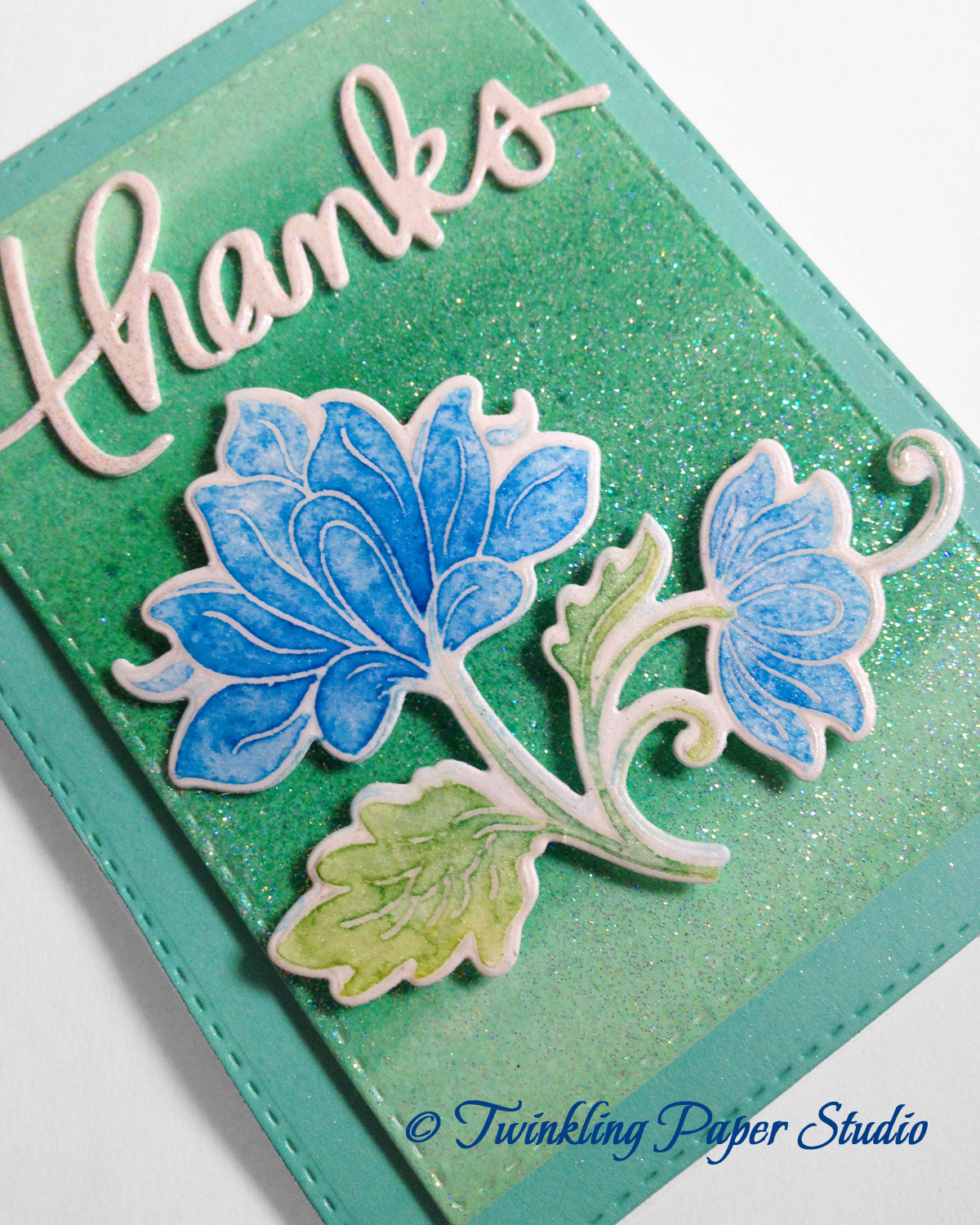
For this card, I started with a panel of Canson Water Color Paper.  When I was in class last week and the early part of this week, I played with some of my reinkers with some Perfect Pearls Solution mixed in.  I love the soft shimmer this gives to your paper, even with the water mixed in. My best guess is that the colors I used here are Bermuda Bay, Wild Wasabi and Tempting Turquoise.   You can make your Perfect Pearls Mist using a Mister Bottle with some Perfect Pearls Pigment Powder or you can just buy the ready made spray.  Another product you can use to achieve some sparkle and shimmer is Tsukineko Sheer Shimmer Spray.  These both use water in the spray, so you can't get too heavy handed with it.  It works best if you spray a light layer and then go back with another coat or two depending on your personal taste.   I love shimmer and sparkle so for me, it's usually three coats but it took me a while to go easier and in layers so my paper didn't warp too badly.  Next I embossed that using a We R Memory Keepers embossing folded in an arrow design.  I also used the Sheer Shimmer Spray after I cut this panel using the Simon Says Stamp Stitched Rectangles.  This size is the 2nd to largest frame.


The Scalloped Rectangle started as Soft Sky paper from Stampin' Up.  Using the Tim Holtz Mini Ink Blending Tool, I blended in SU! Bermuda Bay going in a circular motion and not paying too much attention to the center panel since I knew I was going to be covering it up.  I wanted the edges of this panel to be the dark part of the color.  The ink blending tool lets you do that without too heavy a concentration of whatever ink pad you are using.  It's a good idea to get a package of foam replacement pads and just have one for each color family of inks that you have.    There are so many blues that I have one for dark blues like navy, one for ocean blues and a 3rd one for light blues.  So far this is working for me.

Next I used Distress Marker in Peacock Feathers (with some Shabby Shutters for the leaves and stems) to watercolor my heat set Persian Motifs image.   Because my watercolor paper is not bright white, I use Simon Says Stamp Clear Embossing Powder.  You could also use any color you desire to be included in your final card front.  I haven't tried gold or silver yet, but it's on my to do list! Heat setting your image with embossing powder makes water coloring incredibly easy.  For the first layer of color on the flower, I used my water brush, but the 2nd and 3rd layers were blended using my Wink of Stella Clear Glitter Pen. That was another technique they used in my online card class.  Once I had the image colored in, I die cut it with the matching die.  This stamp set has three sizes and shapes of floral images and some separate leaves so you can build a scene if you like.

I like to attach the flowers with a small bit of foam adhesive in the center of the biggest part of the flower and then I used Ranger Multi-Medium Matte on all the other parts of the flower to stick them down. That makes it look a bit raised up/bigger in the center so it seems a little more realistic and dimensional.  If I don't have smaller squares on hand, I just cut a big one in half or in quarters.


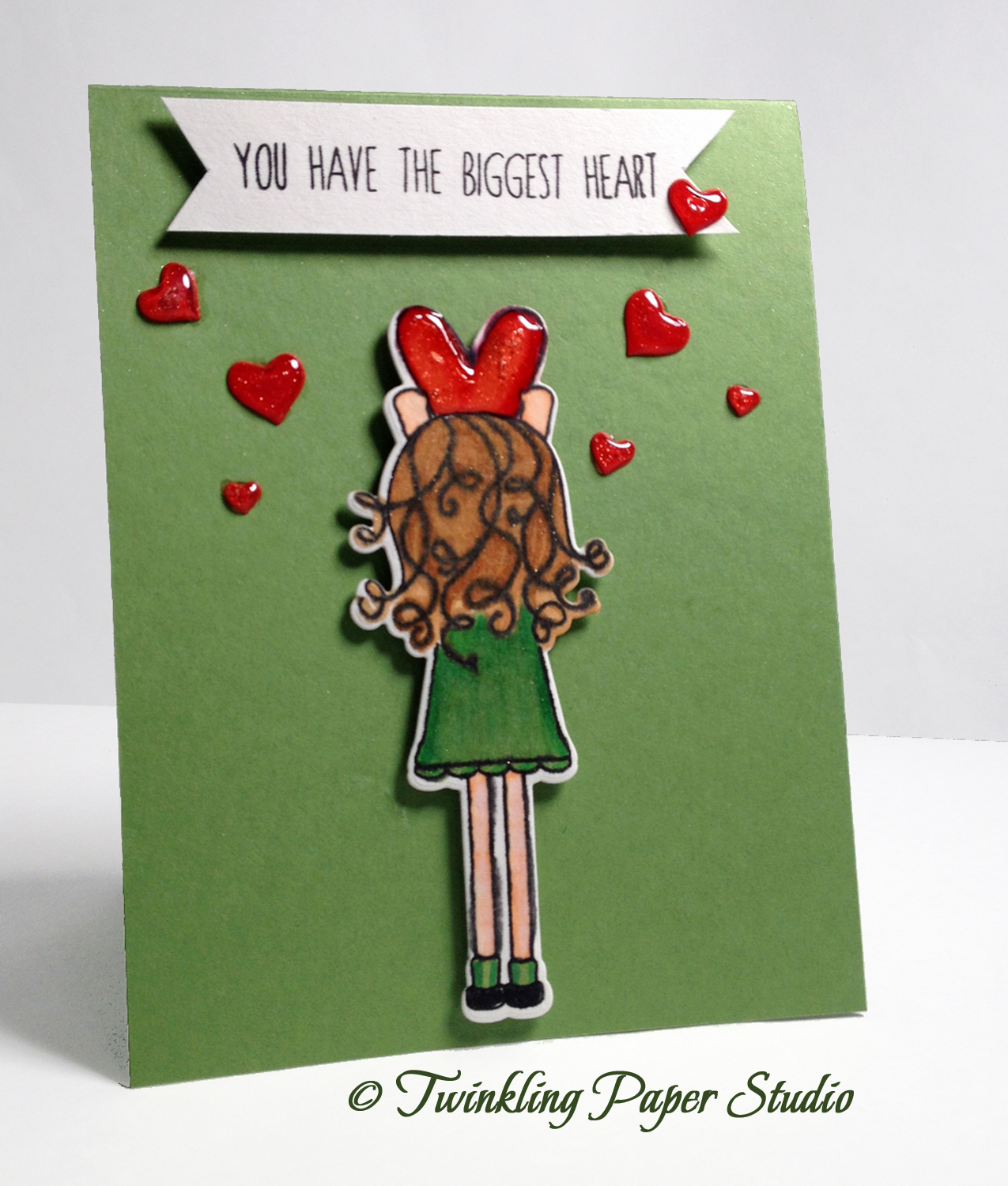
This butterfly die is one made by Impression Obsession and is a two piece die set. None of the stores I am affiliated with carry this die.  It was purchased at this year's local CK Scrapbook Convention.  Mine has a 3-inch wing span if you want to compare the sizes. 

I cut the butterfly's body with some paper scraps and the wings from vellum. Bazzill makes a really nice 40# vellum.  I like to use an adhesive down just the center of the body to attach the vellum layer.  I used Ranger Multi Medium Matte and it dried clear with no traces of adhesive showing either through the vellum or oozing out from the sides of the body.  I tried a different liquid adhesive first and that one was not very successful.  Once I had that adhered, I used my Wink of Stella Clear Glitter Brush Pen on the vellum layer and the base layer where the cut outs are.  If you haven't tried that product, I highly recommend it.  It's made by Zig and has a real brush tip just like the Zig Clean Color Markers.  I also use a dimensional adhesive to attach the butterfly to the panel in just the front center of the body.  This gives it a bit of lift up front in a natural looking way.  Next I put a little bit of Multi Medium Matte on each end of the wing and at the "tail" of the body.  I never attach the wings all the way to the body because I want to make it seem as if it just landed on the flower.  Even though it goes down in the mail, it pops back up a bit when the recipient opens it so it keeps that effect.  


Now I confess, I had to put my ink pad carousel on the card for a few minutes to get the flower stuck down because watercolor paper is so thick and heavy that it kept wanting to pop off.  That did the trick for me.  It was the heaviest thing in my line of sight so I figured it would work.  I added just a few Peacock colored sequins from the Rhythm & Blues Collection for the final touch. 

I also want to say that the Ranger Multi Medium Matte is incredible stuff.  It really does dry to a matte finish and becomes virtually invisible.  I could not understand why everyone loved that stuff so much when I started making cards. I mean, its only glue after all (LOL).  Well I have used it on some difficult to adhere things with fantastic results but the clincher here for me was the way it disappeared under the vellum when it dried.  I'm totally sold.  Thankfully, I have a couple of bottles on hand since they are not very big.  I'm always surprised at how little it takes for great sticking power.  Its also great to use for sequins or other embellishments you might want to add to your projects.  You do need to give it a minute to dry.  After that, you are good to go.  Do yourself a favor though and get some Fineline Applicator Tips.  These caps will fit right on your Ranger Glossy Accents and Ranger Multi Medium Matte and have a built in Cap/Wire system to keep it from clogging.  I have the 18 gauge and the 20 gauge but I find the 20 gauge is too small for me.  

I hope you enjoyed this card.  I'll be back soon with another project.  

Tuesday, September 29, 2015

Simon Says Stamp - Monday Challenge

The Simon Says Monday Challenge for this week is Ombre.  Ombre is a french word for color with a shaded tonal value, such as from light to dark or dark to light.  Since I've been working with watercolors for the past week, I stayed with that medium for this challenge.

I started with a panel of watercolor card stock.  Using 2 reinkers in Wild Wasabi and Tempting Turquoise I put one drop of each on an acrylic block and mixed it with a solution of Perfect Pearls to get this color.  I decided to do my Ombre in a slightly different way than you usually see it.  I went from light to dark to light again going in layers of watercolor so that it would get darker just where I intended it to.


Once my paint was dry, I used a Jennifer McGuire trick and put Versamark all over the whole panel then heat set it using Judikins Iridescent Sparkle Embossing Powder then cut it with one of my favorites, the Stitched Rectangles from Simon Says Stamp.  This panel was cut with the second to the largest size.  I cut three of the Mama Elephant "thanks" dies and glued them one on top of the other for a thicker embellishment.  Again, I put Versamark over the whole die cut and heat set it using the same Iridescent Sparkle Embossing Powder.  This makes it very dimensional so I could go ahead and attach to the top panel using Ranger Multi Medium Matte.

Next I cut a piece of fun foam slightly smaller than the Ombre panel and adhered it using my ATG gun.  ATG is a super strong adhesive, but there is no room for error so it always makes me a bit nervous.  You cannot lift it up and move it the way you can other types of adhesive.  But you need a strong adhesive when working with Watercolor Card Stock because of the 140# weight and usually a little warping from the water.  After that, I cut the largest Stitched Rectangle in Simon Says Stamp Mint Green Cardstock and attached all of that onto the panel using foam tape. The layers of foam really make it thicker and more dimensional. I'm sure extra postage will be required.


I used one of the floral die cuts from the class I took last week from an Altenew Stamp and Coordinating Die Set, and adhered it using dimensional foam squares.  This particular flower was colored using Mermaid Lagoon Distress Marker with a water brush.  I used Shabby Shutters on the leaves and stem.  

That finishes up this card but I might be back later with another post.  I have a special wedding card to make if I can ever get my idea fully formed.

Monday, September 28, 2015

Comparing Mediums

I never, ever thought I would say that water coloring relaxes me.  Something about doing it just seems to soothe my soul.  I am so glad I took the Online Card Class - Watercolor for Card Makers, Exploring Mediums.  I mean, who knew? While I am not water coloring freehand, I am very happy with the looks I've been able to achieve.  The class I took is specifically for card makers and it was well worth it.

This little beauty is going out in the morning mail along with a couple of others I've made.  I used a 4 x 11 Whisper White Card Base with a top fold at 5.5 inches.  The largest blue panel is Simon Says Stamp Exclusive Card Stock in Island Blue. The center panel is SU! Tempting Turquoise. Then I stamped this flower on my 140# watercolor paper and heat set it using Simon Says Stamp Clear Embossing Powder.   Once the image had set, I could paint it with my Mermaid Lagoon and Shabby Shutters Distress Markers  I worked quickly with lots of water to get the background watercolored in a super soft & pleasing way. Once that was done, I could cut the top panel with the die I wanted to use and assemble my card.  


In order to be able to give a fair comparison of the different mediums, I stamped and heat embossed several of the same images on the same exact watercolor paper to see how they compared to each other.  The picture below isn't the best, but you get the idea.

So starting at the top left, the two watercolor backgrounds were achieved with Kuretake Gansai Tambi (traditional Japanese Watercolors).  It is very hard for me to be patient and let the water and color do their thing, but I did not speed that up by using a heat tool this time.  The blue/green background was achieved using #58 - Evergreen and #63 - Persian Blue.  This is at least 3 layers of color.  Maybe more, but I wasn't counting, lol.  For the pink/coral background, I used (surprisingly) #34 - Dark Pink with a whole lot of water and #31 - Scarlet Red also with lots of water.  I was able to determine what colors I would need because I swatched them.  The die cuts are just laying on top of these as I don't know when I will use them.  I keep a Ziploc baggie of things I have stamped, cut or colored for use later if I don't use them when I initially start to. Sometimes my color comes out differently than I think it will and I decide it doesn't match well enough.  So if it doesn't match at first, I just save it for another time.


The top left flower was colored using Tim Holtz Distress Marker in Mermaid Lagoon.  I love that color so much. The  top center flowers are colored in Worn Lipstick Distress Marker.

The top right flowers were colored using Water Color Crayon (a water soluble Oil Pastel *I think*) in some Regal Rose and Eggplant scribbled on to an acrylic block with some water mixed into it.  From there, you pick it up with your brush and move it to the "canvas".  The watercolor crayons were my least favorite type of water color, but I can use them for backgrounds pretty easily and they cover a lot of ground quickly.

The middle row blue floral was painted with Twinkling H2O's in Sky Blue and Forest Green with a water brush.  I have had my H20's for at least 10 years if not longer. It was a lot of fun to get them out and rediscover them today.  I have several very bright and bold colors as well as some iridescent colors.  I had forgotten how beautiful they are.  They already have that pearly shimmer, so I did not need to use Perfect Pearls.  Let's face it, if I made it, then it is probably going to have some shimmer in it somewhere!  The only thing I don't make that way is cards for guys.

The center row pinkish color flower is colored with Prima Watercolor Pencils. While these were much easier to use than I thought they would be, I still prefer the high translucence of  the distress markers over every other type or medium I have tried.  The Twinkling H20's come in a close second.  Simon Says Stamp has a great selection of these if you're interested in trying them.  The Watercolor Pencils do have an advantage in one way.  Once the "paint" is dry, it forms a sort of waxy finish over the top that helps to protect it somewhat from stray water drops or mist.

The bottom right and left flowers were colored with Kuretake Gansai Tambi Watercolors while I did use Tumbled Glass Distress Marker for the soft blue sky. The bottom center image was colored completely with Distress Markers.  I have noticed that I'm also getting significantly faster at that method as well. Practice helps for sure!

I used Canson 140# Cold Pressed Watercolor Paper for all of these flowers. I absolutely love how thick and crisp it makes the die cuts. This Altenew Persian Motifs is my first set of stamps and coordinating dies that I have purchased in that brand.  I will definitely buy again.  The quality is fantastic.

Isn't sending cards in the mail just the best feeling?  The recipients always love that you have made them a card.  Fun mail in the mailbox is not a very common thing and I know people really enjoy receiving a card.

I'll be back soon with more information and comparisons.  Class wraps up on Wednesday and I'm still on the hunt for the perfect Christmas Card too.  So I'll have lots more to show you in a day or two.

Saturday, September 26, 2015

Class Practice Continues

I'm doing a whole lot of watercolor practice right now before class wraps up next week.  Some projects I feel hugely successful with and others not so much. Ninety-Nine percent of my card recipients are female so flower images are always good for those.

This image was colored using traditional Kuretake Gansai Tambi Watercolor in #36 - Wine Red, and #58 - Evergreen with a Perfect Pearls Solution and some clean water.  I make my own solution with Perfect Pearls Pigment Powder and some water in a little sprayer bottle that came from Stampin' Up!.  You can buy Perfect Pearls Solution already made up and in a spray bottle.  I used the tiniest amount of #63 - Persian Blue, along with a VERY watered down bit of the Red Wine to achieve the super soft background.  One thing I have really learned this week is to walk away and let it dry.  The colors really come to life when they have a chance to dry.  Being a control freak, watercolor is very hard for me.  I have a hard time letting the water and the pigment do their thing.  This class has been so worth it to me for the the sheer amount of practice I'm getting.  I'm able to achieve the looks I desire for card making.  Even though I know people won't criticize a card they get in the mail, I still want my cards to be as nice as possible.


I love Altenew Stamps for the lined images they design.  They also have matching dies for many of their floral images.  This particular set is call Persian Motifs and I have the matching dies although I haven't used them yet.  The Henna Elements set is very nice as well as Peony Scrolls.  The images stamp super clean also with a thin line rather than a thicker one which is great for the "Emboss then Watercolor " technique.   Some people like bright white embossing powder for this technique but I like using Simon Says Stamp Clear Embossing Powder so that the embossing will be the same color as my watercolor paper.  In case I forgot to mention it before, the heat embossing helps the watercolor stay in the image and not go venturing outside of that line.

You all should be so proud of me because I got my Gansai Tambi Watercolors swatched!  I love this set so much now that I have had a chance to play with it following instruction.  Simon Says Stamp has this set available in 12, 18, 24 & 36 color sets.  Being Japanese Watercolors, they are extremely high quality.


I have about three different types of watercolor card stock at this time, but this one uses Canson Watercolor Paper.  It is 140# and cold pressed.  I haven't seen hot pressed paper at any of my local stores.  The difference is that hot pressed watercolor paper is very smooth.  I prefer to use the smooth side to my regular paper but you can also use the more textured side.  It just depends on the look you are going for.  Simon Says Stamp carries a wide variety of Professional Grade Arches Hot & Cold Pressed Watercolor Paper.  It's fancier than I need just for cards but I like to know where I can get it should I desire to experiment further, *wink*.

This card uses a white card base cut at 5.25 x 8.5 inches and top scored at 4.25 inches.   I used the WPLUS9 Sunshine Layers Die Set for the scalloped panel and the interior panel as well.  The burgundy is some Bazzill Mulberry which is a 100# weight.  I looked through my sentiment dies, but I didn't feel like any of them were a good fit on this card so I left it off this time.  I'm sending this card to my sweet Mother-In-Law who is at an assisted living facility.  She always loved cards when she was still able to be home so I think she enjoys the ones I make and send off to her.


Friday, September 25, 2015

Water Color for Card Makers - Day 3

Yesterday was Day #3 of my class.  We've done Watercolor Markers, Watercolor Pencils, Traditional Watercolor and Watercolor Crayons.  We'll have a wrap up day next week so I have time to practice techniques before then.


I did finish this super simple card from the Elephant I painted yesterday plus I have a few others assembled and will have more before Wrap Up day next week. This elephant was painted with traditional watercolor and I finished off the card with some "paint" spatters by mixing the color with a #2 Script Brush and tapping it off on to my background.  The script brush works really well for this because it has long bristles.  To keep it off the elephant, I used a mask cut from Post-It Tape.


I have a gorgeous card I am making out of this painted panel.  The stamp set is Persian Motifs from Altenew.  The photograph was taken before I did any work on the background.  Altenew has several sets of stamps that are line images for painting or coloring, so I have a few sets put on my wish list.  They also have the coordinating dies which is really nice.


This morning I sat down to try a couple of techniques from Wednesday's class which use Watercolor Pencils and a Wink of Stella Brush Pen.  This image was completed using Distress Markers in Spun Sugar for the cheek and ears with Pumice Stone for the Elephant's body.  I also have a floral image that I colored with Distress Markers and Perfect Pearls Solution and I hope to get a card made in a day or two.

For class on Day #3, I used my watercolor crayons to create a soft, striped wash of color, so I wanted to use that with Miss Ellie here.  That was a super quick way to create a background for a card and I'm pretty sure I will use it again and again. You simply color across the background in the color or colors of your choice and then apply water using a wide brush.  Mine is a traditional paint brush that has a chisel tip and is 3/4 inch wide.  There's a Tim Holtz Wide Water Brush available at Simon's or you can pick one up at a local arts and crafts store.  It took much longer for that background to dry than it did to create it.

Once my image was dry, I cut it in a circle using the Simon Says Stamp Stitched Circles Die.  Next came a layer of pink cut with Simon Says Stamp Stitched Squares and then I cut the striped panel with the next size up Stitched Square. My top folding card base is made from SU! Pink Pirouette.

I want to show you this card with the background painted in on the oval panel.  I used the same shade of pink and green that I used for the flower to do the soft background.  I love that it uses the same colors in softer tones.  This card is not quite finished as I need a greeting or sentiment on it.  But the hardest part is done.


For me, heat embossing the images with clear embossing powder is a total winner.  It helps you to "stay in the lines" to keep your image really clean.  I love that I learned how to make these beautiful watercolor backgrounds.

I'll be doing more practice with the techniques I learned this week but I wanted to go ahead and wrap up this post before it gets any longer.  *Wink*

Wednesday, September 23, 2015

Day 2 Results


Today I have Part II of a post about the Watercolor for Card Makers class I'm in this week.  There's a lot of "homework" so to speak with this class.  After all, you can't expect perfection if you don't practice.

So far, I have not found the traditional watercolors to be nearly as transparent as Distress Markers and Water Based Inks, but I haven't tried nearly all of them. I'm simply trying to learn to use what I already have on hand.  Since I am not doing Fine Art Paintings, I think the ones I currently have will be more than adequate. Again, these are my observations and opinions only.  Everyone needs to use what works for them.  I feel like traditional watercolors are just a bit milky and I prefer the transparent color of water based inks and distress markers.

I think Sakura Koi Tube Watercolors might be a good option to try, but I don't have any plans to purchase those.  I'm fine with the options I already have.  A method not explored so far in this class is using water based re-inkers to paint with.  I have a few of these around in some of my more used colors like bright pink, some sea blues, a leafy green, a purple and a coral.  To use these, just touch the dropper from a re-inker to your acrylic block and add a mist or some drops of water to dilute it to the strength of color you want.   These are completely transparent.  You can also use a solution of perfect pearls to add water and shimmer to the color and or to your card stock.  I've also found that by using my reinkers, the color is in a shade I already like vs. a traditional pallet where I have to mix my own color or I have several colors that haven't been used at all.  Since I don't come from an art background, mixing colors isn't as easy as it might seem.  I seldom get the color I was going for, but watercolor is very inexpensive, so I haven't lost more than a penny or two.

Today's class used more traditional water colors and some that I was only made aware of fairly recently.  I have a traditional watercolor set like the ones we used in grade school that is made by Loew Cornell.  There are 36 different little cakes of color and you can always mix your own colors if you're in to that sort of thing. I am not, but I did mix some greens today. This set contained a purple, so that is what I went for today!  I haven't swatched my watercolors yet, but I may consider doing this once class is completed.

Peerless Watercolors are completely new to me in the past month or two.  These look a lot like paint chips but there's only one color to a small sheet.  Most people swatch these and cut a 1 x 1 inch square of that color with the swatch for reference. When they run out of that color, they just cut another 1 inch square and put it in their swatch book.   The color is extremely highly concentrated and activates instantaneously with a touch of a damp brush or a water brush.  Just touching your damp brush to the "paint chip", you can take it directly to your watercolor paper and begin painting.  You might want to consider a more permanent paint pallet for tube watercolors so you can mix your own colors.  I use the same thing Kristina Werner does which is a laminated sheet of white card stock.  Mine is about 5 x 8 inches which is good for the number of colors I normally use and you can get a really accurate picture of the color when it's on the white background.  Mine has really thick lamination on it so I can run it under water to clean it off.   If you could see how messy my studio is right now, you would know that I need sturdy because I have a tendency to push things aside when I am in the middle of a project.

There are things like watercolor cube trays with lids for anyone working on large scale items who need the same paint color through a work of art or who need to store or transport watercolor without it dripping everywhere. I seriously had no idea all of these accouterments existed!  My grandmother taught herself to watercolor with the 99¢ crayola variety watercolors several (15 or 20) years ago. They didn't have much money, so that's what she used. Her grandmother was a semi-famous artist from Tulsa and it was something she wanted to learn so she did.


I have traditional watercolors in two different kinds (found here and here), Distress Markers, Watercolor Pencils and SU! Watercolor Wonder Crayons which aren't even available anymore.  Simon Says Stamp has a set of 15 available here that includes a brush.  As always, you can also use a Water Brush.

I have a few traditional brushes (Size 3, 4, 6 & 9 round) that mostly came in this set from Ranger that are fine quality for the things I am doing.  I have just a couple of others including a size 2 script brush and one that is 3/4 of an inch wide for simple color stripes or washes.   I tried both and for me, I think the Water Brush was easier with less drying time.

It's been so much fun this week to get to use supplies that I already have but didn't necessarily know how to use. I've learned so many techniques.  I also learned that water color is far more about the impression of light, shadow and texture than about actually being able to draw well. For me, this class is a total winner.  

I wanted to take a photo mid-process so that you could see my board that I tape watercolor paper onto, and how truly small an amount of color it takes for watercolor.  Dawn Woleslagle, owner of WPLUS9, did a vintage storybook painting with the Unforgettable set that she designed and I have wanted to imitate it since then. I used traditional Kuretake Gansai Tambi watercolors for this.  For the gray of the elephant and the ground around him, I used #20-Black with a whole lot of water. For the pink of the cheeks and inside the ears I used #32-Red.  For the balloon I mixed the #50-Pale Aqua with a hint of #63-Persian Blue.  Just four colors in total.  The nice thing about this set is that you can remove the little pans of color to keep only what you are using near you.  The rest of them can stay out of the way.  The colors are highly concentrated pigments so I'm pretty sure I have enough paint here to last for the rest of my life and then some!


For this card, I stamped my images in SU! Smoky Slate and heat embossed in Simon Says Stamp Clear Embossing Powder.  You have to work very quickly to be able to get any embossing powder on the super fast drying ink, but I did manage.  That process makes watercolor simple for anyone, not just me.  It helps keep the water where it should be and doesn't let it creep beyond the outline of the image.  For me and watercolor to get along, this is a must do step!  It also helps to choose an image that will be simple to paint or color.  I have never really appreciated line images before now and I can't wait to check my stash to see other stamps that I can use.

I haven't completed a card yet, but I did use my Wink of Stella Glitter Brush Pen on the balloon. Today's class used Watercolor Pencils with Wink of Stella to color the images. I haven't tried that yet, but it's on my list to try this week.


There are still several mediums that haven't been explored in this class such as Brushos, Color Crystals, Dr. Ph. Martins Liquid Watercolors and I'm sure there are others that I've never heard of yet. If I haven't talked about it or mentioned it here, then I am not aware of it yet.  I'm a card maker rather than an artist so I don't really need more options.

I had another class today so I'll be back with more insights and observations in my next blog post.

Tuesday, September 22, 2015

Online Card Class - Watercolor for Card Makers

This is going to be a multi-part post! I'm not sure yet how many parts it's going to be.  When I started, I was planning to do only one post but it's too long and detailed for that.  Hopefully the others won't be quite as long.

More than a month ago, I signed up to take on Online Card Class which would be exploring watercolor mediums.  This class is taught by a few of my favorite papercrafters in the industry, including my absolute favorite, Jennifer McGuire.   I never knew there were so many ways and supplies to watercolor!  I'm going to get into a few of them with today's post.

These observations are from my practice after the classes.  By now, I have completed two of them.  Let me preface everything by saying that I do not have any kind of art background.  In fact, I never took art classes in school because I was never considered to be artistic in the very least.  So these thoughts come from a true novice.

There are so many mediums for watercolor that I never even knew or thought about.  Yesterday's class used Water Based Markers.  Who knew there were so many watercolor markers out there?  Not me although in the last 6 months, I had discovered Distress Markers which are quickly becoming my favorite because of their transparent color and ease of use.  A couple other types that were explored are ZIG Clean Color Real Brush Markers which actually have a real brush tip, Spectrum Aqua  and Tombow Markers.  The ZIG Clean Color Brushes are available in multi-packs of up to 60 as well as individually.  There are about 80 colors in all but so far they don't have a complete set available.  The same is true of Distress Markers. The Tombow and Spectrum Aqua Markers are sold in groups of colors.  The were no requirements to purchase anything for the class and we were encouraged to use what we already had on hand.  For me, that was Tim Holtz Distress Markers.  Any water based markers work for this technique although Tim Holtz Distress Inks seem to work particularly well. They are made to activate and reactivate with water so they are a great choice for watercolor. Copic Markers are alcohol based and do not work for this technique.

Earlier this summer, I purchased a set of 12 Tim Holtz Distress Markers using a coupon at an area Arts & Crafts kind of store.  I wasn't sure I would like them, so I didn't want to get too many or invest too much money to begin with.  I'm fairly certain the group I purchased were a "Vintage" collection rather than "Brights". This would be pretty consistent with my style.

I had originally purchased (several years ago) some 90# watercolor paper.  For how much water these techniques use, that paper is not heavy enough and it does pill after a kind of medium amount of brushwork.  It would be fine for simple color washes with no detailing.  I was, of course, initially trying to save money and really didn't understand why hot or cold pressed and why heavier might be better.  Part of my class was a video about the different types of paper and why you would choose one over the other so I had already gotten some 140# watercolor card stock.  For practice and simple color washes, the 90# is okay. There are other differences as well including how white or bright the watercolor paper is.  A lot of people seem to like Ranger because it is a fairly bright white.  I haven't tried very many, so you'll have to select what you personally like. Another thing to think about is the texture of the paper.  I thought I would like the rough side of watercolor paper for the texture it gives, but it turns out that I much prefer the smooth side for the techniques I use.

I want to talk a little about Distress Inks here.  These inks are formulated to work with water just like any other water based inks or markers. That makes them particularly well suited to use for watercolor methods and techniques.   I've done other posts where I talk about a few of the techniques.  I'm sure there will be many in my future as well.  Overall, I think Distress Inks tend to be a more "watered down" or "faded" color so it takes less time to get to a proper dilution of the color you were looking for than a traditional watercolor marker. You might have the ink pads and not the markers or vice-versa.  In my case, I have 5 of the ink pads from a class I did years ago and 15 or so markers.  If you only have the ink pads, you can "stamp" some color directly onto an acrylic block or your craft mat, then add water to get a soft color wash.  You can apply that using a traditional paint brush or a water brush.  I actually tried both ways during yesterday's class but ultimately went with the regular paint brush so that  I could control the amount of water.  A water brush will release a very slow but steady stream of water for you.  Go ahead and spend a little extra for a good brush that has a valve in it so it doesn't suck dirty water into itself; you'll be glad you did!

One of the things I like best about this class is the fact that I can produce consistent results.  Previously, it was a trial and error process to find what worked and then I had to actually remember what I had tried so I could replicate it.  This class teaches specific techniques to use with each type of medium.  A big factor in being successful is working on a very small area at a time.  I'm not going to go into a detailed description of each thing I did to make my cards. There are lots of "how to" videos already out there.  I'm just going to share whichever technique and medium I used and leave you to try what you want or what works for you.  We're all better when we do that versus someone saying it must be done "this way only".   Part of the reason that I liked this particular class is that I already had some form of each medium we will be using for the class and I wasn't required to purchase anything new.  That's always a winner for me.

For my card, I stamped my image in Versamark Ink and heat it set using Simon Says Stamp Clear Extra Fine Embossing Powder.  I could have used White or any other color of embossing powder, but clear makes it the exact color of my paper which can be different from brand to brand.  You can do whichever you like.  After that, I taped my stamped image to a small acrylic cutting board that has a handle so it can be easily moved between layers of color or drying time.   Next I gave my watercolor paper an all over mist with plain water and a wide paint brush to work it into the paper. This Water Brush from Tim Holtz is a nice one.  I feel that this helps keep the color from being too deep of a "stain" when you are first starting.  It's a matter of personal preference, not a requirement. Probably when I get more comfortable with watercolor, I won't feel quite so scared of it.  But for now, this is what I'm doing.

I took my distress marker and started coloring each petal of the flower with just a stroke or two of color.  I just put some color at the base of the petal where it would naturally be the deepest color because of shadows and highlights and then worked the color outward with a damp brush for each petal.  I did each petal in the soft color before adding my first color to my leaves and then added each color layer one at a time.  For my flowers I used "Worn Lipstick".   You absolutely have to use a piece of scratch paper to check the ink color for any marker you might choose.  It is seldom what the cap color indicates so always check to see that it's at least in the color family you were wanting.  Some colors may be more blue based while others may be more yellow based, which is the main difference between a cool color and a warm color.   As a former photographer, I am a color maniac.  Some other day I will explain what I mean by that, but not today - LOL!  Watercolor is all about interpretation so it's all preference from this point on.

Line images (images with little or no detail) make the best choice for watercoloring.   The WPLUS9 Design Studio "Unforgettable" Set is one I've used before and will be trying again with watercolor instead of Copic Markers later today.  In fact, I fell in love with it after seeing a video that Dawn Woleslagle watercolored using this set.  Altenew also has some great images and I am sure there are many other companies as well.  I'm just thinking off the top of my head here. The one I am using in this case is from Stampin Up and it's actually the first time I have used it.  It sure makes me wonder what else I have that can be used for watercolor sitting in the bottom of my studio closet to check out sometime.  For the leaves I started with Bundled Sage.  After my first layer of color dried, I mixed some Crushed Olive and Shabby Shutters on an acrylic block to get a less bright, more realistic green.  

For the background, I just put a couple of short strokes of  Tumbled Glass marker at a time directly to the paper and worked it outward with a lot of water. I've tried to get this effect previously but after my first class yesterday is the first time I've been successful.  I was surprised at how easy watercolor has been to achieve with just a bit of instruction.  Go Me!  When the color was completely dry, I misted it all over with a solution of perfect pearls to give it some shimmer and let the whole thing dry before removing it from my cutting board.

Once that dried, I cut the watercolor panel using a My Favorite Things Stitched Oval in the largest size. Next I cut the Stitched & Scalloped Rectangle Die from the Sunshine Layers set.   In keeping with the "painted" style, I used the Simon Exclusive Painted Hello die on some white shimmer paper.  I cut the word three times and glued them in a stack for added dimension.  I used Bazzill Card Shoppe Marshmallow for my card base.  This card stock is a 100# weight and makes beautiful cards.


I didn't take too many photos of this card as I have several in progress right now. I'll be back soon with more observations from my Online Card Class.

Sunday, September 20, 2015

Sending Thanks

Today's card is a simple thank you card using a couple different dies.  It gives a really fun look to be able to mix fonts and these two work particularly well. The Sending Die is a Simon Says Stamp Exclusive and the Thanks Die you've seen before as one of my favorites from Mama Elephant, also available from Simon Says Stamp.  


I used a few techniques today that I always love and I'm always happy with the results.  I started with a Canson Watercolor Card Stock Panel.  I try to keep several of these ready to go and I pre-cut larger sheets into approximately 3.75 x 6 inch panels.  I put some Tim Holtz Distress Marker in Peacock Feathers on an acrylic block, touched the very tip of my Aqua Brush into my Perfect Pearls Pigment Powder and mixed it all together with a mist of water.  Then I applied it to the watercolor panel for a soft wash of color.  When you add the Perfect Pearls, it adds a lovely shimmer to the water when then goes to the paper.  There are a variety of Perfect Pearls Pigment Powders in gorgeous colors and as a girl who likes sparkle and shimmer, I love using them.  A little goes a very long way and I feel it gives you a lot of subtle bang for your buck!   I planned to die cut this panel so I wasn't really trying to do any specific thing with the wash; just something lovely and soft.

Once I had the color wash applied to my satisfaction, I put more Peacock Feathers Distress Marker Ink on my acrylic block.  I have several acrylic blocks but my favorites are the wavy edged ones that have the finger grips on the sides for easy handling and maneuvering.   They also have a grid on them to help line up your stamps which is very handy as well!  I put just a drop of water on my block by squeezing my Aqua Brush until one drop of water came out.  I wanted a higher color concentration so that I could put spatters on my panel in a darker shade of the same color.  I use a #2 Script Watercolor brush for this.  It is similar to this brush found at Simon Says Stamp.  I already had this one.  If I wanted bigger drops, I could use a larger brush, but I was going for a speckled look rather than larger spots of water.  I just spattered the color mixture until I was happy with the results.


Once I had finished my speckling, I cut my panel using Memory Box Stitched Rectangles in the 2nd largest size.  It is important to note that you need to keep within the same set/brand of dies to keep the sizes proportionate to each other.  For instance, I can't use the Simon Says Stamp Stitched Rectangles Set which has the stitching on both sides of the cut line in combination with the Memory Box Stitched Rectangles because the sizes are not proportionate to each other.  So it does require a bit of pre-planning.   Next, I cut my largest rectangle using the same set of Memory Box Rectangle Dies.  For the outside mat, I cut a panel out of American Crafts POW Glitter Paper in Silver.  All of the hearts are from the same Silver Glitter card stock and are attached with Ranger Multi Medium Matte. My white card base is a top folding 120# 4.25 x 5.5 inch card. Simon Says Stamp has top scored or side scored card bases in this weight available for purchase as well as single sheets available in a 12 pack which can also be used with Copic Markers

Whenever I use watercolor paper, I have a bit of trouble with the watercolor panel warping a bit because I always rush it by using my heat tool to dry it.  I hear that if you let it dry naturally while it's taped to a flat surface that it doesn't do this, *Ü*.  So *I* have to use a super strong adhesive for my cards so the panels don't lift up.  That means I am using either a liquid adhesive like Ranger Multi Medium Matte or I'm using my ATG (Advanced Tape Glider).  The thing about the ATG is that you had better have your panel lined up when it touches your card base because there is NO repositioning it.   Coming from a scrapbooking background I was used to being able to reposition things until I pressed it down.  This is definitely not the case with the ATG.  But the biggest perk to it is how long I can go between adhesive refills.  With other adhesives, I go through quite a few of them, so I was trying to find a more economical adhesive.  I think it is, but it's also a little hard to get used to and handle.  


I had to edit this post to tell you that I used Wink of Stella Clear Glitter Brush Pen on the words (just in case you didn't notice)!

I wasn't trying to achieve any particular look with this card.  I only want the recipient to open it and think "FUN"!  I have to dash off and write a note, but I hope you enjoyed today's post.   Happy Sunday!

Saturday, September 19, 2015

Stamptember Continues!

Simon Says Stamp is currently hosting "Stamptember" which is an event held by them annually in September to inspire, educate, create and unveil lots of new products and tutorials.  It's a month long celebration which has been just awesome so far and we still have 10 days left for unveiling other new products. Everyone likes to get in on the act and even Tim Holtz has designed new products exclusively for Simon Says Stamptember.  I can't tell you how much fun all of the tutorials have been.  

I wanted to work on a card today for a friend of mine.  I'm using a new Simon Says Stamp Exclusive Set called, "Lila's Heart".   This set was designed by Shari Carroll with Jennifer McGuire's daughter, Lila, in mind.  There's a coordinating die set as well called, "Hearts for Lila".  I love this set for girly stuff and I know I will use it a lot since I have four granddaughters.  At Simon Says Stamp, nearly every new release seems to have coordinating dies these days.  This is a somewhat new thing, particularly in the last several months.  I've noticed this trend with other companies lately as well; AltenewWPLUS9Lawn Fawn and many, many others.  I remember the days when you only got matching die cuts a few times a year with only a very few stamp sets and wishing that someone would get busy making matching die sets for every stamp set!   While I was busy dealing with other things in the last 5 years, that actually happened.  It's a trend I love and hope will continue for as long as I am paper crafting.

One of the things I most appreciate about Jennifer McGuire is that she makes the seemingly impossible become possible.  I've had Copic Markers for about 7 or 8 years, but really, I hadn't used them except to take a few classes way back whenever I got them.  Jennifer makes them seem so easy and for the first time in my paper crafting journey, I feel successful using them.  There's lots of Certified Copic Instructors out there who make you feel like if you don't do it exactly as they teach it, then it is wrong.  Not with Jennifer. She makes it so simple and easy to duplicate a similar look.  Mostly, she just encourages everyone to do whatever works for them.

On today's card, I used the "Lila's Heart" set and coordinating dies.  This is a simple, straight forward design and technique.  I stamped "Lila" on the smooth side of a piece of 140# Canson Watercolor Card Stock using Versafine in Onyx Black Ink and waited for it to dry before coloring with my Copic Ciao Markers. I'm still in the process of trying different types of watercolor paper, but I think this might be my winner!  I buy the large sized pad and cut each sheet down into the size panels I need, several sheets at a time.


I cut a half inch wide strip of Simon Says Stamp Lipstick Red 100# Card Stock and ran Wink of Stella Clear Glitter Pen over it.  After letting that dry, I used my Simon Says Stamp Holiday Shapes Hearts and Stars to cut about 8 of the hearts. This made the perfect little accents.  I adhered "Lila" to my SU! Wild Wasabi, A2 top folding card using 3-D Foam Squares.   Then I stamped the greeting from the Lila's Heart set with part of the leftover watercolor card stock and snipped it so it has swallowtail ends for the banner.  I mounted this with 3-D Foam Squares as well.  I wanted it to feel like the hearts were overflowing and falling out of the banner so I attached them with Ranger Multi Medium Matte.  Once I had everything placed on my card panel I put glossy accents on the tops of the hearts for the "puffy" appearance.  I got a small acrylic cutting board with a handle so that I had a way to pick up and move the whole thing to an area for safety while drying.  I felt like I was forever getting "gunk" in my Glossy Accents so I hope this method works out for me!


I stamped a few "Lila's" to practice on, but I was pleased with how this first one turned out.

This was a super simple card, but it conveys everything I want to say to my friend in such a cute way!

About 99% of the time, I treat my paper to give it a sparkle or shimmer and this one was no exception.  You can use a variety of methods from Glimmer Mist to Perfect Pearls Spray to Shimmer Sprays.  You can make your own spray using a touch of Perfect Pearls Pigment Powder with some water and a few drops of reinker.  Simon Says Stamp has a great selection of these types of products, so just use whatever you like.  Some people may not like the shimmer and in fact, I would never use it on a man's card.  But I don't make too many of those, and my friends know that I am all about the bling, so I think I'm okay.   Use the products you love and feel comfortable with and you'll have a winner every time!  

Happy Saturday, everyone!


Monday, September 14, 2015

A Unexpected Surprise

It's already the middle of September!!  Wow - this year is just flying by in so many ways.  In my husband's family, we gather the whole family at Christmas every year.   My hubby is one of 6 children so by the time we all get together, there's already a dozen of us.  Then add in our kids and our grandkids--well, you get the idea.  It's nice that we still have this tradition.

Since I started making cards this year, I really want to make all of my Christmas Cards by hand. That requires planning so don't get too excited when you start seeing Christmas cards here.  I'm going to be trying several things so I can decide which one(s) I want to use.  It just so happens that the Simon Says Stamp Monday Challenge this week is to use a favorite technique.  I combined a couple that I really like; Watercolor and Emboss-Resist.  I first saw Jennifer McGuire use this technique and I love her style.  It is similar to my style.  


For this card I started with a piece of watercolor 3.75 x 5 inch card stock in a cold pressed 140# weight.  The first thing I did was to stamp my image in Versamark and heat embossed it with Simon Says Stamp Fine White Embossing Powder.  For the background I wanted to use my Pine Needles Distress Marker to make the color wash, so I put some color on an acrylic block, just touched the very tip of my Waterbrush into my Perfect Pearls Pigment Powder and gave it all a mist of water and mixed it up.  Next, I used my mister bottle to lightly spray my watercolor paper with water all over so that the color would soften a bit when I applied it.


Using a Water Brush, I picked some of the color off of the acrylic block and touched it to my paper.  Since my paper was damp, it makes a color wash rather than a solid color.  I love watercolor, but I've had to practice A LOT to let go of the control and let the color and water do their thing.  Not an easy thing for a control freak to accomplish! Ha ha! I still need more practice, but I did pretty okay for this card.  The Perfect Pearls Pigment Powder combines with the water and color to give a shimmery effect in the color.  It's really beautiful!  The Noel Stamp is one I have had for a number of years and I was determined to try to use it this year.  While I was letting the watercolor piece dry, I cut a card base of 5.5 x 8.5 inches scored and top folded at 4.25 inches in Simon Says Stamp Exclusive Mint Card Stock.  This card stock is a 100# weight and makes beautiful, crisp cards.  It seemed the best color match for the Pine Needles Distress Ink and I love that it's a non-traditional color for Christmas.  A little something unexpected in the recipient's mailbox.  


Next I cut the "Christmas Blessings" sentiment using a Simon Says Stamp Exclusive Die in Gold Foiled Paper.   I am pretty sure I would also like this card done in Silver and Pearly White and a combination of other shades of blue from light to dark.  I am particularly anxious to try some lovely, cool and wintry shades of blue like Audrey Blue and Seaglass, also from Simon Says Stamp. Simon has really nice 100# card stock in a great selection of colors and many colors also have matching Simon Says Stamp Exclusive Dye Inks.   It's always nice to have coordinating products in a wide variety of colors.  In fact, it's one of my favorite things about Simon Says Stamp.
  
For the final touch I cut several stars from Glittered Gold Card Stock using the Simon Says Stamp Holiday Shapes Hearts & Stars die.  That die is one that I use over and over again and I have the Simon Says Stamp Large Holiday Shapes - Hearts & Stars on my wishlist. 

Before I finished today's post, I got out my Mermaid Lagoon Distress Marker to try a blue variation that I was thinking of earlier.  I used yet another technique that I am enjoying which is paint (ink in this case) spatters using a small #2 script brush to pick up the color and then tap it over the water colored piece so it splatters on to the background in unique patterns.  There is no way to ever make two cards the same way, so each will always be unique.  


I used snowflakes and sequins for this card but I think I would like glittery stars equally well.


While I like the Blue with the Silver and White embellishments, I think I do prefer the gold better at this point so I'll be trying this in other colors over the next several days.

I confess - it's late when I am posting this, so if you see something wrong or missing, please leave a comment so I can fix it.

Have a blessed week, everyone!!

Tuesday, September 8, 2015

Simon Says Stamp Tattered Poppy Die Cut

I sat down yesterday afternoon to make a couple of cards for this week's birthday girls.  I had the new Simon Says Stamp Exclusive Tattered Poppy Die Cut that I really wanted to use so I put a transparent color wash on some watercolor card stock in hopes that I could get a sort of variegated look to my petals.  One of my favorite ways to do this is by using a reinker to put a drop (literally) of color on an acrylic block and add some water to it with my mister bottle.  In this case I also added just a tiny bit of Perfect Pearls to the color and water mix as well.  It's a lot easier to see what color the water is this way and you can add water to dilute the color wash.  I used a bit of orange on one block and a bit of melon on the other block to do the color washes.  Sometimes in this process I wet the watercolor paper before applying the color wash and other times I take it straight to the paper.  There's no rhyme or reason to it.  It just depends on the intensity of color you desire. After that, I let my water colored card stock dry naturally but you can also use a heat tool to speed up that process.  The paper has to be dry or you will not get clean cuts from your watercolor paper.  Once it was dry, I cut the poppies with my die cut.

So after I had all of my pieces cut, I sat down to assemble the poppies.  This is where I ran into a little bit of trouble.  No sooner would I get one petal adhered and move on to the next one than the first one would come undone.  So I solved this problem by taking one of my punches out of the drawer.  The one I chose just happened to be a 7/8ths inch circle, but any similar size or shape would have worked.  I then started assembling my petals on top of the circle.  This gave the pieces something to stick to that wasn't also trying to be placed in the correct position.  It's basically a foundation piece. It doesn't show, but it's important to the structure of the flower.  


It looks like this from the back side: 


It was a pretty easy fix to be able to build my flowers without the petals getting moved out of place.  I assembled 4 of these in a matter of minutes for the cards I was making using Ranger Multi Medium Matte


A few sequins in Rose, Watermelon and Metallic Gold give a fun & whimsical feel while a few glittered hearts lets the recipient know I'm sending love and hugs for their birthday.

I used a We R Memory Keepers Next Level Gemstone Embossing Folder for the pink paper prior to cutting it with a Scalloped & Stitched Rectangle from the WPLUS9 Sunshine Layers Die for the base panel of the card.   It is hard to capture the true 3D look of these particular embossing folders, but they are just fantastic!


I cut the "Happy" from this Mama Elephant die cut and the "Birthday" from this one.  This is by far my favorite font out there and Mama Elephant has several words available in this particular font.  I have a group of dies that I keep out all the time because they are my most used and these two are certainly in this group. I've done other cards using the "Friend" die also by Mama Elephant and I'm hoping for more words in this same font eventually.

I hope you all had a great Labor Day Weekend and have a great week.  Fall will be here at the end of this month!

Friday, September 4, 2015

Sweet September

I love this time of the year.  Cool, colorful fall days are ahead.  I spent quite a bit of time the last few days working on some cards for some of the special people in my life -- 3 of my grand girls! They have birthdays on September 11, 12, and 15th, so I have got to get going on their birthday cards!  I also have my Mom, one of my brothers and a couple of close friends who all celebrate birthdays in the early part of this month.

When your granddaughters' birthdays are so close together, often the gathering for cake and ice cream is on the same day at the same time.  I thought they might be comparing cards, so I wanted each one to be different.  I didn't photograph all of them, but I did take pictures of this one for you.


This was a really simple to do card and similar to one I did last weekend.  I originally tried to use a piece of actual silver wire for the balloon string, but that was not successful so I had to make a new balloon.  I'm not sure why I have 4 colors of wire in 4 different gauges each in my paper crafting supplies, but I did try to use it at least this once.  

I started with an ivory card base cut 4.25 x 11 inches scored and top folded at 5.5 inches.  Next I cut a Scalloped & Stitched Rectangle panel using the WPLUS9 Sunshine Layers Die set.  The bright pinky-coral color I used here was in my stash already, so I couldn't begin to tell you with any accuracy the name of the color.  It seems close to Bazzill Card Shoppe Candy Hearts, but I am not 100% sure.

This Unforgettable Clear Stamp & Die Set from WPLUS9 is getting to be one of my favorites to use for kids.  I also will use it for my daughter, Tiffany, as she loves elephants.  There's a sort of history with elephants in my family.  Giraffe's, too! Last year I let my daughter and both of my stepdaughters take home one of my treasures and of course, my daughter Tiffany chose my white onyx elephant that my grandfather brought home from India after World War II.  Her name is Ellie Mae.  Somehow in my way back when 5 year old mind, I had associated Ellie Mae with a trip to the zoo in San Antonio, TX where we rode an elephant and a visit to the Alamo during the same trip.  And so she became Ellie Mae.  She was used for several decades as a door stop in my grandparents house, so you can imagine the size of her.  Since I named her when I was little, I got to keep her after my grandparents were gone.

I used a 3rd generation stamp of Versafine Black Onyx Ink ,which is waterproof once it dries, to stamp my images before Copic Coloring them.   I used some DCVW Glitter Paper scraps to cut lots of gold hearts using this Simon Says Stamp Exclusive Hearts & Stars die.   I use this die so much!  I find it very handy to just have a few hearts and stars cut in shimmery or glittered paper as a quick touch to have on hand for general card making.  Anytime I have some scraps in gold I take a few minutes to make a few cuts.  The sentiment was stamped onto Stampin' Up Radiant White Vellum with Delicata Golden Glitz Pigment Ink and heat set with Simon Says Stamp Ultra Fine Clear Embossing Powder.   I cut swallow-tailed ends to make it a banner.  I added some Wink of Stella in Clear to the balloon and topped it off with Ranger Glossy Accents to give it that added dimension.  I let that dry overnight.  Mostly, I am only trying to convey that Papa and I are including lots of love in this birthday card!


So much of the fun with the cards this year is the fact that I have started making cards and also that little girls (and even bigger girls as the two older ones are teenagers) love shine and sparkle.  So it's been tons of fun making their cards.  I have more birthday cards to make this weekend, so I'll have another post up in a few days.

I'm wishing all of you a very happy Labor Day weekend!  It's the last long weekend of the summer, so enjoy!