Showing posts with label Thank You Cards. Show all posts

Wednesday, January 23, 2019

The Color Throwdown #527 - Guest Designer Post

Hey everyone!  I'm back with my week 4 post for The Color Throwdown Challenge this week, #527 with the colors Navy, Green, and Gray.  This is a color combination I wouldn't have thought of, but I love how it turned out and I plan to use it again in the future!

I have been wanting to play with a new stamp set I got recently from Altenew called Wild Ferns Stamp Set and this was a perfect time to try it out.  Each of the three ferns in the set has three layers so I started by laying out the arrangement of the ferns on my card front and then choosing the inks I wanted to use.  I used the three darkest shades from the Green Valley Mini Cube Set; Grass Field, Shadow Creek, and Mountain Pine working from lightest to darkest. These ferns are so realistic and I think they could work for several types of cards.  Today I chose to make a thank you card for some of the gifts received this Christmas.


I used Papertrey Ink Stamper's Select White, Weathervane, and Dark Indigo cardstock.  The "Thanks" die is from Simon Says Stamp.

This is super clean and simple cardmaking with a lot of white space and a bold design.  I'll be checking out your projects all this month to see the cards you've created using the color challenges.

Here's the Blog List:

Vicki Finger, January Guest Designer (You are here)

Wednesday, December 12, 2018

Altenew Educator - Last Minute Holiday Cards

Hello everyone!  I am back today with a few cards from my most recent class at Altenew - "Last Minute Holiday Cards" taught by Julia Alterman.  I have three different cards for you today!

One of the things Julia talked about the first day is how to go from very simple to very elegant by just making a few changes in your card.  She also talked about using Holiday images from your stamp sets to make other types of cards, thereby stretching your stamping dollars for more than just a single occasion.  I have a Christmas Card, a Thank You card and a more fun and festive card for you to send to a friend today.  The first two were from Day 1 of class and the last one happened to be from the bonus day of class.  I was enchanted with the way Julia used a Holiday Stamp for another type of card and knew that I wanted to try this.  All three of my cards use the Altenew Majestic Mistletoe Stamp Set.

As you probably know, I really enjoy cards with a lot of "white" space for the most part.  That also makes for quicker cards if you keep it very simple.  Majestic Mistletoe happens to be one of my favorites for Holiday Cards and is now one that I will reach for to create other occasion cards as well, like those Thank You notes for all the Holiday gifts you received?  I used just four  Altenew Crisp Inks for the first two cards of this post.  I chose the Green Meadows collection and I have to say I really love how vibrant these colors are.  The only color I did not use from this collection was Minty Mint but I brought in a cardstock that was a good color match it to use for a part of my background panel.  The colors I did use are Sweet Leaf, Just Green and Hunter Green.  I actually stamped 6 panels since I had everything lined up in my MISTI and a small stack of A2 Panels sitting right there.  For this, I used my Original MISTI and set the first layer up on the far bottom left corner, then set the next layer up using the far right bottom corner.  For the first panel, after I stamped the first two layers, I rotated my cardstock 180 degrees and did it again.  That way I could cut the piece on the diagonal to create two different cards.

I wanted to dress them up a little so I stamped the third layer of the greenery and then stamped the berries in Ruby Red Ink.  I could have gone ahead and stamped in the detail layers for the berries, but I knew that I wanted to use some Nuvo Drops for the berries, so stamping in the color was just a guide for where to place the Nuvo Drops.  I used Tonic Jewel Drops in the color Rosewater.  I let that dry overnight and then added just a touch of white to the top of each berry for a highlight.

Next, I took the panel and cut it diagonally then attached it to a piece of Mint Cardstock. I wanted to add a strip of glitter, so using Scor-Tape, I adhered that along the diagonal line. Once it was adhered, I die cut it with a stitched rectangle die.  This one happens to be a die that has been discontinued but it is 4 1/8th by 5 3/8th inches which leaves a very narrow border all the way around your front panel. I did this for both of the pieces.


After die cutting, I removed the release paper from the Scor-Tape and sprinkled gold glitter all along that diagonal line, then burnished it in with my bone folder.  This created instant elegance on my card.  Then because I wanted to create a card for two different occasions, I die cut a large word from Gold Cardstock - "believe" and "Thanks".  For the Believe card, I also added a smaller sentiment along the bottom of where that die cut would go.  It's important to do the heat embossing before you apply the die cut to eliminate the possibility of damage to your die cut.  The cardstock I used on these has a light layer of plastic film on the top to protect it.  This works great if you get a dab of glue where you don't want it because a tiny bit of alcohol on a Q-Tip will remove it.  But not so well if you melt the plastic coating during the heat embossing process.  Go ahead, ask me how I know this. *Ü*


Simply add the die cut word to your card front, attach that to a card base and voila, you have a clean and elegant single layer card that's easy to mail. I''m not sure if I have ever mentioned it before, but working on an A2 panel serves two purposes; 1) if you mess up during the stamping then you only destroyed a panel rather than a whole card, and 2) for some reason this makes the card stand up easier.  I like to do top folding Tent cards so they can be displayed if desired.  This is an important concept if you happen to be a card maker.

My third card for today used the Sea Shore Mini Ink Cube Collection although I only used three of the colors; Volcano Lake, Lagoon and Emerald.  If you look carefully, you can see that the stamp I used for this was the same all the way around and is also from the Majestic Mistletoe Stamp Set.  It is the top detail layer stamped all the way around using a mask to protect the center of the card.    Since I was planning to cover my circle area with the Teal Cardstock, I didn't have to use a mask, but if I had wanted to pop the circles up on foam tape, it would have been important to me for it to look cleanly stamped all the way around.


Julia did this card in a rainbow for the Bonus Lesson of this class and I just love it.  I'm planning to make a few larger cards for some upcoming birthdays that I will mail in a 5x7 envelope.  I learned a lot about looking at other ways to use a single stamp set in this class and really enjoyed it very much.

The sentiment for this last card is from the Gina K Designs All About You Stamp Set.  I stamped it with Versamark and heat set it with Antique Gold Embossing Powder.  The little hearts are from an older die from Simon Says Stamp called Mini Hearts.  There are three different hearts in three sizes each on this die and it's one I used to use a lot and will again now that it is back on my desk.

Thank you so much for stopping by today to see my projects.  I always appreciate it when you do.  I have just a few more classes now so I'll be back in a day or two with my next project for my next class.  Be sure to stop back by and check it out!


ETA:  I just had to try this last technique on a larger format card and share it with you as well!


And one more for your viewing pleasure.  Love these! 

Monday, August 27, 2018

Altenew Educator Certification Program - Easy Die Cutting Techniques

The last two weeks have been utterly crazy around my house.  Contractors are still coming in and out several times a week to do some of the upgrades we've been waiting on or for paint touch-ups and other things that were not finished in the house.  In between that, I drove over 400 miles last week just getting to doctor appointments as I get re-established with my doctors that I had before I moved away from this area 8.5 years ago.  Everybody wants their own labs, x-rays, etc. and it's a lot of running around since the doctors and their facilities for these tests are a minimum of 60 miles away and two of them are even farther at 75 and 80 miles away.  I try to book things back to back but it still takes a ton of time since everything is so far apart from each other, and I always have to allow drive time as well.  I am not scheduling anything for the next couple of weeks.

Anyhow, I wanted to continue on with my class work for the Altenew Educator Certification Program and this post is for "Easy Die Cutting Techniques" over at Altenew Academy.

We are getting a painting for our new home by an artist whose work I greatly admire and whose work I follow on Instagram. Her name is 
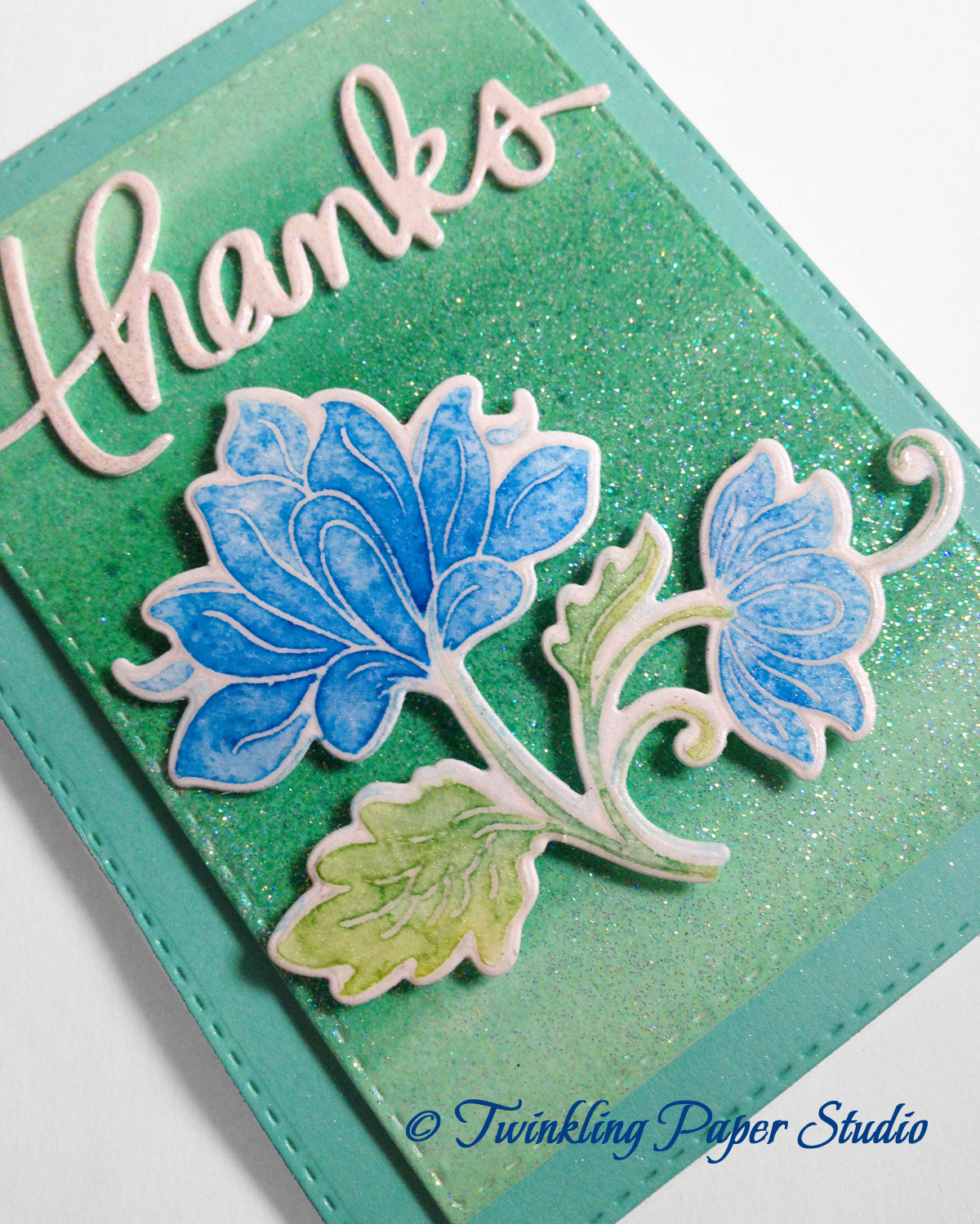
Karen Hall Nitz and she paints geodes. These are not just flat paintings, but are very three dimensional.  She lives in the Dallas area and I have been wanting one for quite a while now.  I am finally getting one.  I told her the colors and will leave the rest up to her.  In addition to that, I told her that I would make her a selection of cards as a little bonus.  She asked for "Thank You" cards.  I know I can always use lots of those.


In case you don't know what a geode is, you can look on Wikipedia to get a definition or explanation of how they are formed and then search for geode images on Google or Pinterest.

I happen to have an uncle in New Mexico who is a geologist and I have long had a fascination for geodes.  He gave my mom one at least 30 (Probably closer to 40) years ago.  On the surface, the rock just looks just plain and flat and pretty round, but when he broke it open, it has amethyst crystals inside, much like the one pictured here.

You can also search Pinterest for
Geodes and see the many varieties of crystals that form inside of the geodes like the one on the right. It's always fascinating to me to see the wide variety of colors and textures inside.

So when I first saw Karen's work, I became an instant fan! I've been following her for over a year now  and while I would love to have a smaller painting in the style of "Rose Quartz" that you can see in her gallery, I wanted something that goes with the house and will fill some space on a currently very empty wall.  We have very tall ceilings in our living room and it echoes pretty bad right now.  We are hoping the canvas will absorb some of the noise.  We really don't want to put blinds or curtains over the windows because we love all the light.

Geode Painting by © Karen Hall Nitz
I know this style of artwork wouldn't appeal to everyone, and honestly, it is difficult to capture in a photo, but it was love at first sight for me.  Let me also say, this is not our painting.  But I do love the sea blue colors with the silver and gold accents.  It's very similar to the colors we asked for but we said "heavy on the gold".  Our fixtures throughout the house are Brushed Nickel so we decided it needed to have at least some silver in there to tie it all together.  You have no idea how hard it was for me not to put gold or brass fixtures in this house given my love for gold.

If you've been following along on my blog, then you know that my grandson, Charlie, and I have been playing a whole bunch with Yupo Paper in Medium and Heavyweight Varieties along with glossy cardstock so I have a whole slew of backgrounds right now.  I have also been experimenting a lot with using my Minc to get "gold veins" onto the backgrounds as well.  I still haven't figured out exactly what makes it work, but because the backgrounds look like granite or some other type of stone, I think the style of them matches Karen's design aesthetic very well and so I chose to use the alcohol inked backgrounds to make all of Karen's cards. 


As I sat down this morning to figure out what I was going to do for my Easy Die Cutting Techniques project, I decided to do Die Cut Inlay so I used a particularly lovely background that Charlie had created to make a Thank You card for my personal stash.  It didn't turn out at all how he wanted it, so he gave it to me to use because, as you know, Pink is one of my favorite colors.  He likes the grunge effect and he also likes Red - all reds and variations of red including orange, pink and coral.  I knew it would be really pretty foiled and I was right.

As I mentioned in a few previous posts, there are lots of variables using the Yupo paper, but the biggest thing is that it's hard to die cut the #144 Yupo with an intricate die cut.  So I decided to do the next best thing.  I used a scrap from another background to die cut my word and a piece of gold foiled cardstock to cut the shadow or mat for the word.


Then I adhered the sentiment strip (both the white and gold layers) to the background panel, placed the shadow die onto that and ran it through my die cut machine, with a piece of printer paper over the top so it wouldn't leave marks in the foiling.  This did exactly what I thought it would which is that it cut through the top two layers leaving the heavyweight Yupo background panel completely intact while providing the recess for my inlay technique.  When you do this, be sure to save all the little white pieces that fall out of the die cut so you can put them in place once your die cut word is adhered to the card background.

I added a couple of views here for you so that you can see the gorgeous shine left by the Minc machine.  This is actually one of the classes I had taken early on at Altenew when I first started Cardmaking and it was taught by one of my favorite designers, Yana Smakula.  Yana has a way with Gold and she is probably the one person who most influenced my style.

This particular background used Flamingo Alcohol Ink with Gold Mixative with Alcohol Ink Blending Solution but there is just no way to predict how the foiling will come out of the Minc Machine and in fact, I don't have another background like it in the many that I've made now.   Simon Says Stamp has the entire collection of Alcohol Inks available as a group HERE or in individual colors at THIS link.

I hope you enjoyed reading my thought process of how all of these cards came to be.  I like for my blog posts to be more conversational rather than strictly technical in nature and I hope you enjoy that aspect as well.  Thank you so much for stopping by today to check out my project and post.  I really appreciate all of you who take time to comment or just visit.  I listed the supplies I've used below for your convenience (Affiliate Links may be used).

Cuttlebug Die Cutting Machine
Shop at:
SSS
Heidi Swap Minc Machine
Shop at:
SSS
Kokuyo Long Dot Runner Adhesive
Shop at:
SSS
Ranger Multi Medium Matte
Shop at:
SSS
Ranger Non-Stick Craft Sheet
Shop at:
SSS
Thermoweb Decofoil Sheets - Gold Value Pack
Shop at:
SSS | GKD
Tim Holtz Tonic Paper Trimmer
Shop at:
SSS
Tim Holtz/Ranger Alcohol Ink Blending Solution
Shop at:
SSS
Tim Holtz/Ranger Alcohol Inks
Shop at:
SSS
Tonic 6 Inch Personal Trimmer
Shop at:
SSS
WPLUS9 Gift Card Layers Designer Dies
Shop at:
SSS
Yupo Heavyweight Paper 144 lb.
Shop at:
SSS
Yupo Paper 74 lb.
Yupo Paper 74 lb.
Shop at:
SSS

Monday, October 30, 2017

Bountiful Thanks

My card today is for The Paper Players #368 - a Tic Tac Toe Challenge and The Fusion Card Challenge, Autumn Leaves. This card came out nothing like what I had intended when I started it.  I've been experimenting with Alcohol Inks and Alcohol Blending Solution on Yupo Paper (I got mine from Amazon) a bit this weekend and the particular one I used here didn't come out how I wanted it to.  It turned kind of reddish orange with my combination of inks (Gold Mixative with Red Pepper) which definitely felt more Fall than Christmas or holiday.  So I rolled with it and die cut the paper with Romantic Leaves from Spellbinders.

Before I move on, I want to talk about what I've learned with the Yupo Paper and the Alcohol Inks.  Initially, when I tried Alcohol inks, I didn't have any Yupo Paper so I used some of my SU! Glossy White Cardstock. I was pretty satisfied with those results but everyone talks about how you're supposed to use it with Yupo Paper.  Honestly, I didn't care too much for the Yupo Paper.  It's somewhat expensive, it's thin like vellum, and I didn't think it moved or worked very well with the alcohol inks. I purchased a single 11 x 14 pad with 12 sheets that I can cut down into 6 panels, but I would not use it again for this technique. I thought maybe I was using the wrong side, but there doesn't seem to be a right or wrong side and I tried both sides.  Also, I think it takes a lot of Alcohol Blending Solution to achieve good results and that is pretty pricey as well. So while I like having this tool in my tool belt, it isn't one I will use very often and when I do use it, I plan to stick with Glossy Cardstock. The best results I got by far were by smooshing the paper into the ink which I did on aluminum foil rather than dropping the ink directly onto the paper and adding blending solution to it.  I have several other backgrounds (including the ones I made with Glossy Cardstock last week) to use in a variety of colors that you'll see on upcoming projects and I used one here.

For this card, I wanted something that would work with the color of my leaves and I happened to have some paper out that would work perfectly.  I found this great 8.5 x 11 paper pad by Momenta at Hobby Lobby.  All of the prints in this pad are watercolor look and many of them have gold or silver paint splatters on them.  Since I have the touches of gold in the leaves, I chose this soft yellow/coral print for my background.  I die cut it with MFT Blueprints 15 Stitched Rectangle Die and gave it some healthy mists Iridescent Gold Shimmer Mist.  I arranged the leaves on that panel then adhered them with Ranger Multi Medium Matte.  To keep everything simple, flat and easily mailable, I cut a strip of vellum with the largest MFT Horizontal Stitched Strips and then stamped the sentiment from the Color Pop Autumn Stamp Set using Versamark and heat setting it with Simon Says Stamp Antique Gold Embossing Powder.  I used my powder tool first so that my embossing would stay clean.


To adhere the vellum strip, I put a skinny little line of sticky dot adhesive (Kokuyo) on the stitch line of the background panel and then gently pressed the vellum onto that.  The adhesive is light blue and if you put it directly onto the vellum, it shows through.

I die cut one of the Impression Obsession Butterflies that I use all the time from Gold Foiled Cardstock and put skinny strips of Scotch 3M Foam Tape under the body and a glue dot under the back end to make it seem as if the butterfly was about to be in flight.  I added a few Nuvo Drops in Copper Penny for a bit of contrast and let them dry overnight. 

I hope you enjoyed my card and will take time to stop by The Paper Players Challenge Blog and the Fusion Card Challenge Blog

Sunday, September 10, 2017

Simon Says Stamp's ®STAMPtember & Inspired By

It's STAMPTEMBER® at Simon Says Stamp!  This is a month long celebration of Stamping and features collaborations with many of the other companies in the industry like Altenew, WPLUS9, Tim Holtz's Stampers Anonymous, Gina K, and lots more too numerous to list here.  Each day there is a new product collaboration announced.  All of the collaboration items are limited edition so if there's something you really want, you better not hesitate to get it or it will be sold out.  This card is for the Simon Says Stamp Monday Challenge, the Simon Says Stamp Wedenesday Challenge and the Simon Says Stamp FLICKR Challenge plus the Inspired by... Challenge.

Several of the challenges have returned this week after a summer break including Inspired By All The Little Things. Darnell is well known from around Blogger and is helping Lesley to run the challenge this year while Lesley enjoys her new little girl.

I was waiting for the mail to arrive today because I knew I had a package out for delivery by the USPS. It was a happy mail day and I was very excited to get my STAMPtember® collaboration with Altenew called "Fabulous You". I was waiting for it to arrive after I saw the inspiration photo at Inspired By early this morning so I could use this set to make a card and enter a few challenges. Things didn't exactly go according to plan after that.  As I was studying how to stamp the main image in this set and looking at the various layers, my husband walked in and asked me a question.  When I turned back around to continue with reviewing everything, I could not find the stamp that I just had in my hand. I'll give you the prettier version of the story and tell you that after a lot of exasperation, grumbling some not so nice words and searching even the dogs' beds for the small stamp, I finally found it stuck to the dispenser of temporary adhesive I keep on my desk.  I use it on the back of my cardstock to keep it from moving around in the MISTI. I'm glad it ended okay and that I have it safely tucked away now.

For my card, I stamped the floral stem outline in Versamark and heat set it using Simon Says Stamp Antique Gold Embossing Powder.  The blooms are just a single layer as are the leaves, but in four different stamps. Can you imagine if I had lost one of the very small leaf stamps?  Trust me, I was maniacal enough....  I lost the bigger one on the top right but it wouldn't have mattered what size it was. New, unused and unstained stamps are difficult to see anytime.  I don't really like that some ink colors stain my stamps but I can totally see how it could also be a positive thing after this incident.


I stamped the bloom layer in Hawaiian Shores Ink and the leaves in New Leaf. Once the ink was dry I misted the panel with some shimmer mist and die cut it using the Simon Says Stamp Stitched Rectangle Dies in the largest size.  I cut a gold panel using the MFT Blueprints 15 die.  Next I made a top folding cardbase using Berry Sorbet Cardstock.  I cut one gold and two white Honey Bee Stamps Large Thanks words (without the shadow layer) and glued them together with the gold layer on top. I tried spray adhesive again but am just not sold on it and ended up having to redo it using Ranger Multi Medium Matte. For whatever reason the layers don't stick to each other. I don't know if it's the kind I have or what, but it just isn't working out for me. I have tried several times but I finally threw my can in the trash this evening since it is nearly empty. It was supposed to be a time saver but it hasn't worked out that way at all.

All in all, I'm surprised I got this card finished at all.  And it's early enough this morning that the dogs aren't out of bed yet which means I get to work in peace. There are so many new things to see over at Simon Says Stamp so be sure to check out what it still available in the collaboration items.  There are still 20 more days with a new release each day during the month.  Thank you for stopping by to see my product today and I hope you'll join in the many challenges there are!

Wednesday, August 16, 2017

Papertrey Ink August 2017 Create Along With Us

I am here today with a card I made for this month's Create Along With Us at Papertrey Ink.  I was inspired by Nichole's card using Beautiful Berries Autumn set pictured here. Nichole stamped her sentiment and berries directly onto a panel of Vintage Cream Cardstock.  It's hard to choose a single project each month to create because there are so many great ones.

I love the color of Autumn Rose Cardstock and Ink from Papertrey so I wanted to try to create a similar feeling card. Since the new products were just released last night, I don't have the Autumn Berries but I decided to use Beautiful Berries: Spring for my card. Betsy Veldman designed all of the stamps in the Beautiful Berries series and I can hardly wait to see the Winter version that will be coming in a few months.  

I started by die cutting two of the largest berry filled branches from white cardstock and then used the die cut negative as my placeholder in my Mini MISTI while I stamped the various layers.  I used Ripe Avocado for the first layer of foliage followed by New Leaf.  Prairie Grass would have been a better color but I actually just ordered that and I don't have it yet.  I tried Olive Twist but that wasn't right either so I stuck with New Leaf.  I'm looking forward to the addition of Prairie Grass to my Ink Cube Collection.


I used Autumn Rose for my top folding card base and my berries and accented with Scarlet Jewel. The Cover Plate: Stitched made the perfect backdrop for my berries and my sentiment.  I adhered the sentiment directly to the card base with Ranger Multi Medium Matte and popped the branches up on Thin 3D Foam Squares and that completed my card.  I looked at adding some Nuvo Drops or Liquid Pearls as Nichole did, but I felt the background was already busy enough with the stitching detail.

I buy ink cubes with a refill because they are more economical, easier for me to use than large ink pads and I really like that I have a choice when it comes to inks.  Because I've only invested in cubes at this point, I am able to have a wide variety of colors in a few different brands.  There are so many ink choices out there!  I had to just choose a couple of brands and stick with my decision. My one exception to size is the Distress Oxide Inks and only because they aren't making them in cubes. It has something to do with the stability of the ink formulation on such a small surface, but since its the only option, I'm glad they are only introducing the colors 12 at a time.

I am still swamped with work for my class and I have a few more weeks of instruction. Then I have to finish all the homework and take the final exam. I hope my crazy schedule gets back to normal by then. Right now I barely have time to think let alone make a card and write a blog post.  I miss doing the various challenges so I took some time today to participate in this one. Thank you for stopping by and I hope you'll come back soon!

Sunday, October 2, 2016

Simon Says... Anything Goes

I always enjoy playing in challenges that are "anything goes" because sometimes it's hard to make what I'm currently working on fit into a specific theme. Simon Says Stamp Wednesday Challenge Blog has an "Anything Goes" theme this week, so I'm all in.

The first time I saw Dawn Woleslagle make a card with one of the April 2016 WPLUS9 releases, I was enchanted! The set I'm talking about is "Freehand Florals". Last year, during Jennifer McGuire's Kindness Campaign, Dawn had hand illustrated a set of note cards that were auctioned off to raise a bit of money for the campaign which is an organization that works to stop bullying.  If you were online or on Instagram at that time, you saw them. This stamp set is based on a similar style design but keeps the integrity of Dawn's hand drawn set unique.

Freehand Florals by Yana Smakula
If  you've been around the Papercrafting world much, then you have seen Dawn's work and know that she is an incredible artist.  The first video of her I ever saw was one using her "Unforgettable" Stamp Set and she was showing how you could watercolor it. That one little YouTube video spawned my whole desire to learn how to do enough watercolor to not be ashamed of the cards I sent in that style.  Dawn also creates Fine Art Watercolor Paintings that she sells and did a fantastic class on Watercolor Techniques over at Online Card Classes. To say that I admire her work would be an understatement.  I'm actually in awe of her awesome talent but the thing that most impresses me about her is that she shares her techniques with other paper crafters and makes them seem achievable.  I doubt that I will ever be successful at freehand watercolor, but I can sure do a watercolor look thanks to her.

Then last month, my friend Yana Smakula, created a card using this same set that was absolutely stunning.  You can see that video here.  After that, my ship was sunk until I was able to get this set.  I've played with it a little, but yesterday I sat and devoted my entire day to attempting to make my card look as nice as Dawn's and Yana's.  I started by stamping the base layer of the roses and larger leaves onto Stamper's Select White #110 Cardstock and die cutting them. I watched Dawn's video several times to make sure I knew how to stamp each layer in the proper place and continued with my stamping.  A lot of the time, layering stamp sets are as much about the selection of ink colors for the various layers of one bloom as it is about knowing how to stamp it correctly.  When I got my first layering set this year, I sat and played with color combinations to find some that really work for me, so I already had this part figured out and had stamped roses in several color families the day before.

It was the background stamping that Dawn had shown in her video that really made me nervous. I had never done that before. I have a couple of  Dawn's Floral sets and she always gives you filler flowers to use for this purpose.  Freehand Florals is no exception but it is the first time I've attempted to actually use some of them. I should probably remind you all that I only started thinking of myself as a stamper in the last 6 months or so.  Before that, I was a card maker but I pretty much used only die cuts.  I still love die cuts, but stamps (like watercolor) have won my heart!


It's always a little scary to stamp directly onto a panel that will be showing on the front of your card and I wasn't happy with my first two attempts but truly, once I tried to do it for real, it couldn't have been any easier and I wonder what took me so long. Finding a balance is important and I felt my first two tries had too much filler in them but I wanted to get a feel for what I could accomplish with those stamps that seemed similar to what Dawn created so I kept stamping on those to perfect my skill using such small stamps and let me tell you, they are tiny! I never dreamed I could do so much with them.  So on my last try, I scaled it way back and had a good idea of what I'd add and how much when I started stamping on that panel. I feel my balance is perfect.  There is more texture without filling up all of the white space and I'm thrilled with how my card turned out.  I'm anxious to try again with some pink roses.

The colors I used here are Papertrey Ink's Lemon Tart, Harvest Gold and Bright Buttercup for the blooms; Rose Quartz from Altenew and Berry Sorbet from Papertrey Ink for the Rose Buds, Puffy Heart and Cosmic Berry Inks (from the Altenew Rose Petal Collection) for the pink filler flowers, Vintage Jadeite and New Leaf for all the larger leaves, and Aqua Mist for the smaller vines of leaves all from Papertrey Ink.  I LOVE Altenew's new colors, the Rose Petal Collection in particular.  I love Pinks with a blue undertone and these fit the bill perfectly.   For my card Base, I used Lemon Tart Cardstock from Papertrey Ink.  To finish my card I stamped the greeting onto the Tag Sale Quilted Banner Die and heat set it, then mounted it on Thin 3D Foam Squares.

As I said, I'll be entering this card over at the Simon Says Stamp Wednesday Challenge Blog. I will also be sharing this over at Word Art Wednesday where the theme is always Anything Goes. Thank you so much for stopping by my blog today. I truly cherish those kind and encouraging comments you leave for me. Have a great Sunday!

Tuesday, September 29, 2015

Simon Says Stamp - Monday Challenge

The Simon Says Monday Challenge for this week is Ombre.  Ombre is a french word for color with a shaded tonal value, such as from light to dark or dark to light.  Since I've been working with watercolors for the past week, I stayed with that medium for this challenge.

I started with a panel of watercolor card stock.  Using 2 reinkers in Wild Wasabi and Tempting Turquoise I put one drop of each on an acrylic block and mixed it with a solution of Perfect Pearls to get this color.  I decided to do my Ombre in a slightly different way than you usually see it.  I went from light to dark to light again going in layers of watercolor so that it would get darker just where I intended it to.


Once my paint was dry, I used a Jennifer McGuire trick and put Versamark all over the whole panel then heat set it using Judikins Iridescent Sparkle Embossing Powder then cut it with one of my favorites, the Stitched Rectangles from Simon Says Stamp.  This panel was cut with the second to the largest size.  I cut three of the Mama Elephant "thanks" dies and glued them one on top of the other for a thicker embellishment.  Again, I put Versamark over the whole die cut and heat set it using the same Iridescent Sparkle Embossing Powder.  This makes it very dimensional so I could go ahead and attach to the top panel using Ranger Multi Medium Matte.

Next I cut a piece of fun foam slightly smaller than the Ombre panel and adhered it using my ATG gun.  ATG is a super strong adhesive, but there is no room for error so it always makes me a bit nervous.  You cannot lift it up and move it the way you can other types of adhesive.  But you need a strong adhesive when working with Watercolor Card Stock because of the 140# weight and usually a little warping from the water.  After that, I cut the largest Stitched Rectangle in Simon Says Stamp Mint Green Cardstock and attached all of that onto the panel using foam tape. The layers of foam really make it thicker and more dimensional. I'm sure extra postage will be required.


I used one of the floral die cuts from the class I took last week from an Altenew Stamp and Coordinating Die Set, and adhered it using dimensional foam squares.  This particular flower was colored using Mermaid Lagoon Distress Marker with a water brush.  I used Shabby Shutters on the leaves and stem.  

That finishes up this card but I might be back later with another post.  I have a special wedding card to make if I can ever get my idea fully formed.

Sunday, September 20, 2015

Sending Thanks

Today's card is a simple thank you card using a couple different dies.  It gives a really fun look to be able to mix fonts and these two work particularly well. The Sending Die is a Simon Says Stamp Exclusive and the Thanks Die you've seen before as one of my favorites from Mama Elephant, also available from Simon Says Stamp.  


I used a few techniques today that I always love and I'm always happy with the results.  I started with a Canson Watercolor Card Stock Panel.  I try to keep several of these ready to go and I pre-cut larger sheets into approximately 3.75 x 6 inch panels.  I put some Tim Holtz Distress Marker in Peacock Feathers on an acrylic block, touched the very tip of my Aqua Brush into my Perfect Pearls Pigment Powder and mixed it all together with a mist of water.  Then I applied it to the watercolor panel for a soft wash of color.  When you add the Perfect Pearls, it adds a lovely shimmer to the water when then goes to the paper.  There are a variety of Perfect Pearls Pigment Powders in gorgeous colors and as a girl who likes sparkle and shimmer, I love using them.  A little goes a very long way and I feel it gives you a lot of subtle bang for your buck!   I planned to die cut this panel so I wasn't really trying to do any specific thing with the wash; just something lovely and soft.

Once I had the color wash applied to my satisfaction, I put more Peacock Feathers Distress Marker Ink on my acrylic block.  I have several acrylic blocks but my favorites are the wavy edged ones that have the finger grips on the sides for easy handling and maneuvering.   They also have a grid on them to help line up your stamps which is very handy as well!  I put just a drop of water on my block by squeezing my Aqua Brush until one drop of water came out.  I wanted a higher color concentration so that I could put spatters on my panel in a darker shade of the same color.  I use a #2 Script Watercolor brush for this.  It is similar to this brush found at Simon Says Stamp.  I already had this one.  If I wanted bigger drops, I could use a larger brush, but I was going for a speckled look rather than larger spots of water.  I just spattered the color mixture until I was happy with the results.


Once I had finished my speckling, I cut my panel using Memory Box Stitched Rectangles in the 2nd largest size.  It is important to note that you need to keep within the same set/brand of dies to keep the sizes proportionate to each other.  For instance, I can't use the Simon Says Stamp Stitched Rectangles Set which has the stitching on both sides of the cut line in combination with the Memory Box Stitched Rectangles because the sizes are not proportionate to each other.  So it does require a bit of pre-planning.   Next, I cut my largest rectangle using the same set of Memory Box Rectangle Dies.  For the outside mat, I cut a panel out of American Crafts POW Glitter Paper in Silver.  All of the hearts are from the same Silver Glitter card stock and are attached with Ranger Multi Medium Matte. My white card base is a top folding 120# 4.25 x 5.5 inch card. Simon Says Stamp has top scored or side scored card bases in this weight available for purchase as well as single sheets available in a 12 pack which can also be used with Copic Markers

Whenever I use watercolor paper, I have a bit of trouble with the watercolor panel warping a bit because I always rush it by using my heat tool to dry it.  I hear that if you let it dry naturally while it's taped to a flat surface that it doesn't do this, *Ü*.  So *I* have to use a super strong adhesive for my cards so the panels don't lift up.  That means I am using either a liquid adhesive like Ranger Multi Medium Matte or I'm using my ATG (Advanced Tape Glider).  The thing about the ATG is that you had better have your panel lined up when it touches your card base because there is NO repositioning it.   Coming from a scrapbooking background I was used to being able to reposition things until I pressed it down.  This is definitely not the case with the ATG.  But the biggest perk to it is how long I can go between adhesive refills.  With other adhesives, I go through quite a few of them, so I was trying to find a more economical adhesive.  I think it is, but it's also a little hard to get used to and handle.  


I had to edit this post to tell you that I used Wink of Stella Clear Glitter Brush Pen on the words (just in case you didn't notice)!

I wasn't trying to achieve any particular look with this card.  I only want the recipient to open it and think "FUN"!  I have to dash off and write a note, but I hope you enjoyed today's post.   Happy Sunday!