Showing posts with label Altenew Academy. Show all posts

Saturday, December 15, 2018

Altenew Educator Certification Program - Holiday Envelopes

Hello!  I'm here today with a project for my next class for my Level III Class, "Holiday Envelopes" which is all about creative ways to dress up your envelopes when you send out your Holiday Cards.  Since I made a particularly special card yesterday and I knew this Class was next in my lineup, I planned to create a matching envelope for that card.  Just as a little reminder of that card, here is that card that I made to put in with my daughter's Christmas Presents.  We normally get a Movie Gift Card for the family, but this year since we are closer, and are spending more time with them, we wanted to forgo the Movie Gift card and get a gift for each of them.  We have something special for our daughter this year and I wanted to make a special card to go with it.
No photograph could possibly capture the absolute elegance of this card but I still wanted to make an envelope to go with it.  The card is an unusual size (4 x 7) so it would need a special envelope to go with it to accommodate the size and thickness of the card.

I have an envelope punch board, but I prefer to make a different style so I learned a long time ago how to make my own.  I took photos along the way to show you how I do it.
Start with an 8.5 x 11-inch sheet of whatever paper you want to make your envelope from.  My primary choice is a Shimmer Vellum that is lightweight, but works really well for envelopes because it is not as heavy as even text weight paper.  Because most of my specialty cards are for Weddings, I have silver and a few different shades of gold.  This particular one is Antique Gold Metallic.  My mom picked up a bunch of these for me a few years ago at Hobby Lobby when they were on sale for .25 cents per sheet.  Placing the paper in your Scor-Pal horizontally, figure out where you want your first score line to be; somewhere between 3.5 - 4 inches is standard.  It will be different for a larger card, but for my card that is 4 x 7 inches, I chose 3.75 inches.  I have an older Scor-Pal and mine does not have a score line at the measurement, for that so I scooted my paper over ¼ inch and then score at the 4-inch line.  I wanted 4¾ inches in between the score lines to accommodate the thickness of the card.  You'll need to choose a width that will work for your card.  For instance, if you have a pretty flat 5 x 7 card, you will want to allow 5¼ inches between the score lines.  Score at whatever measurement you need.  You'll have something that looks similar to this image.

I have the card in a plastic sleeve so that it won't get messed up or dirty while I'm working on the envelope.  I put all of my cards in these little sleeves with envelopes that you can get lots of different places.  My last batch of these I got from Amazon here, but you can buy them by the case if needed at places like U-Line.  I put a lot of time and effort into my cards, so I don't want them dirtied up before I give them away or use them.  If you want to sell your cards, you really need to do this as well.  You can get various sizes so I usually order A7 and A2.  I only use A7 occasionally, so I only buy one pack of those at a time.  I make around 250— 300 cards a year, so I buy 3 or 4 packages of bags at a time.  Storage space for a case of bags would take way too much room so I like the option of the smaller 100 packs.  It's not as cost effective to buy them that way, but I'm okay with that.

Next, you want to rotate your paper 90 degrees to put it in a portrait orientation and score at the ½ inch mark on each side of the paper like the image on the left.  I usually rotate my paper 180 degrees to do the other side, but you can just as easily score it at 10.5 inches. Then crease all of your score lines firmly and open it back up.  Your paper should look like the image on the right-hand side.  
Next, you want to trim off the excess paper from the ½ inch score lines.  This is pretty much the only time I get out my Fiskars trimmer that has a wire guide but you can use scissors if that is what you have. When I first started making cards, I only had a smaller little guillotine trimmer, so I used Scissors to make envelopes back then. 

I start with my blade at the bottom of the paper and cut up to the horizontal score line.  Then I lift my blade, skipping the next section and place it back down at the top horizontal line, repeating the same process on the other side.  When you are finished, it should look like this.

I just snip those pieces off with a pair of scissors so that you have something that looks like this:


Next, you want to fold the side flaps behind the center section and round the 4 corners of the center section.  Then fold them back in the normal way and do the other four corners.  This just makes for a cleaner presentation. 


Now you ready to put the envelope together.  Rotate the paper so that the bottom flap is closest to you.  

If you put double sided tape on the flaps that are sticking out, you'll have adhesive where you don't want it.  You can use any type of dry adhesive for this like a tape runner.  Liquid adhesive is a bit messy so I don't recommend that.  Remove the release paper and fold the bottom section up onto the flaps.  
As you can see from this image, my measurements accommodated the additional layers and dimension and it slips right into the envelope very easily.  
Normally, you would also want to put a strip of adhesive along the top line as well, but since I am putting this in a box with her present, I'm going to use a small bit of temporary adhesive so she doesn't have to tear up the envelope to get to it.  Since I decorated the envelope to go with the card for my class project, I don't want her to have to tear it up.  But now you are ready to decorate your envelope.

I wanted to use the same stencil that I used for her card, so I carefully positioned the stencil and masked off the rest of the area to make sure it stayed clean.  Using the same Decofoil Transfer Gel, I carefully applied a layer, putting any excess back into the jar.  Since this is much thinner than cardstock, I should have used a thinner coat so don't get too heavy-handed.  It took quite a while for mine to dry.  Here's a photo of what it looks like when you apply the transfer gel.  It goes on white but dries clear.
Once it is completely clear, you are ready to run it through your laminator or Minc Machine with the foil.  I wanted to use the same Emerald Watercolor Decofoil, so I did.  Here is my finished Holiday Envelope that matches my card.

Thank you so much for stopping back by to see my 'Holiday Envelopes" class project.  You can use stamps, dies, stencils, shimmer sprays, and a whole host of other options.  We spend so much time making a special card and we should consider spending a little time for the much prettier presentation by embellishing the envelopes on special cards.  It might just be a simple stamp on the back of the flap that says "Snail Mail" or any other sentiment we want to use.  Give it a try and just think of how the recipient will smile before they even open the envelope.    

Friday, December 14, 2018

Altenew Educator - Let It Shine - Holiday Edition

I am here today with another project for my Altenew Educator Level III Certification.  The class is "Let It Shine —  Holiday Edition".  This class was kind of a no-brainer as a choice, because, as you know, Shiny and Sparkly are my two favorite colors! 

Carissa Wiley taught this class and you know she loves some glitter or shine as well.  I still needed to make one card to go with my daughter's Christmas gift and I want to pull out the big guns (a.k.a. the Minc Machine) for this card.  I'm getting excited because Christmas is just 11 days away!  She doesn't read my blog or look at Facebook or Instagram and even if she did, I would still share this card here because no photo could really match the WOW Factor of this card.  It was a labor of love for me this morning.  I woke up early and couldn't fall back asleep, so I started working on it very early.  To get every little detail absolutely perfect, was a lot of trial and error and it took me about 6 hours to complete the whole card.  Anyhow, let's get to it so you can recreate one if you wish. 

I started with a stencil from Tim Holtz called "Festive" and grabbed my Minc Machine and a watercolor foil that I have been wanting to try but hadn't found the time to do so yet.  I also grabbed my spatula and some of the fantastic Thermoweb Decofoil Transfer Gel.  I planned to make a wider than usual horizontal card because the stencil is about 4 inches wide and the area for the design is just under 3.5 inches by just under 7 inches so I decided to make my card 4 x 7 inches.  I can make my own envelope to put that in.  I'm holding off right now, because "Holiday Envelopes" is next in my class line-up, so I'm planning to tackle that over the weekend.  I will most likely use this same technique to add decor to that envelope. 

On a piece of Cougar Super Smooth Digital White #110 cardstock, I used frog tape to hold my stencil in place and applied a smooth layer of the transfer gel over the top of the stencil.  I made sure I had even coverage, and then carefully removed the stencil from the cardstock, setting it aside to dry.  Transfer Gel is White when you put it on, but dries clear and is then ready to take the foil. Immediately take your stencil to the sink and wash the transfer gel off.  If you let it dry, it will be very hard, if not impossible, to get off.  The particular foil I was using is called Emerald Watercolor and I must get more of it soon!  There's also Amber, Amethyst, Lapis, and Summer Rainbow.  I have all but the Summer Rainbow and I am anxious to get that one soon. 

While I was waiting for the transfer gel to dry so I could foil it, I worked on my cardbase.  I wanted to use the glitter with the Scor-Tape like in my previous card here but this time I used some Elizabeth Craft Silk Microfine Glitter in Solar Gold. When you burnish this into the adhesive, it feels like velvet and doesn't come off at all.  Most of the glitter I have is pretty fine, but I have a few (3) of the Elizabeth Craft Silk Microfine Glitters and they are my favorites.  I got them when a Scrapbooking store in my area was closing.  They are easily the nicest glitters I have used and with Scor-Tape, it is super easy.  Just make sure you have a Swiffer dusting cloth there for the "after party" clean-up!  I think of have gotten glitter in every room of my house in the past week as I was working on a few other projects as well.  It's time for Ruby (my Roomba) to go through the house.  I put .25 inch Scor-Tape along the top and bottom of the panel and then burnished it in.  Once I had that done, I ran my cardstock piece with the transfer gel through my Minc Machine and even I was blown away with the results.  This is my second time using the transfer gel for one of my Altenew classes and I am every bit as smitten as I was in the beginning.   


The photo above is a pretty straight-on shot of this card and you can already see the dimension of the foiling but just wait until I turn this card into the light!  I tried several different things to go with this card from gold mirror cardstock to everything in-between.  In the end, I chose to use a piece of the black toner sheets that are available from Thermoweb and ran that through the Minc with some of the same watercolor foil.  I only had a small piece of the toner paper left, but for future reference, you should adhere the foiled piece of toner paper to a piece of white heavyweight cardstock so that the elements are a bit thicker.  The toner paper is so thin that it wouldn't emboss the detail in the holly leaves, but I didn't have any left to repeat the process, so I went ahead and used the small pieces I had already die cut.  You can see the vague impression of where I tried to emboss them, but that's it.

For me, a large part of this card challenge was figuring out how to enhance what was on the cardstock without covering up that beautiful watercolor foil!  Check out the beautiful color you can see when I tipped it toward the light from my window. 


I stacked 3 of the "Merry Christmas" white die cuts for a thicker embellishment and then put gold on the top.  That really didn't add anything so I checked my mirrored cardstock and found this teal colored one so I die cut another and added that to the top.  This looks way better than the gold did and I think it really helps to bring out the green and teal shades of the foil.  Here's a closer view of the dimension when you lay the card flat. 


I used a smaller stitched rectangle to cut a piece of vellum for the greeting so that you could still see the color behind it.  I tucked slivers of foam tape behind the sentiment on the back of the vellum so that it would be slightly more dimensional.  Then I added the holly leaves which are a Spellbinders Jolly Holly Die and did my usual grouping of three little berries using iridescent teal sequins with a gem in each one plus a couple more on the card panel to get that visual triangle.  I like to add gems to my sequins most of the time which added yet another element of sparkle and shine.


I made a lot of Christmas card this year, but this one is my favorite by far!  Isn't it just lush and rich and dreamy?  It is perfect for my mermaid-loving daughter. 

I used several of the techniques Carissa talked about in the class such as foiling, using Scoretape with Glitter and adding foam tape behind the letters on the vellum panel.  I do heat embossing all the time with Gold Embossing Powder or glitter embossing powder so I wanted to really kick my card up a notch and I think this might be my best project yet!  In fact, there is zero stamping on this card but it is so beautiful.  Even my husband loves this one although he doesn't pay a whole lot of attention to what I'm doing.  But I took a quick picture with my phone and sent him the photo.  He really loves this one and I can't wait for him to see it in person tonight.  Heck, if he plays his cards right, I might make one using the Amber Watercolor foil to put in with his gift. 

I hope you enjoyed today's project and be sure to check back to see my next project for the Holiday Envelopes class at Altenew.  I feel it's worth mentioning that classes at Altenew Academy run about $9.00 US Currency.  I have found them to be well worth the time and you always have access to the classes you take so you can revisit the lessons anytime if you want a refresher.  Thanks so much for stopping by to check out my project. 

Wednesday, December 12, 2018

Altenew Educator - Last Minute Holiday Cards

Hello everyone!  I am back today with a few cards from my most recent class at Altenew - "Last Minute Holiday Cards" taught by Julia Alterman.  I have three different cards for you today!

One of the things Julia talked about the first day is how to go from very simple to very elegant by just making a few changes in your card.  She also talked about using Holiday images from your stamp sets to make other types of cards, thereby stretching your stamping dollars for more than just a single occasion.  I have a Christmas Card, a Thank You card and a more fun and festive card for you to send to a friend today.  The first two were from Day 1 of class and the last one happened to be from the bonus day of class.  I was enchanted with the way Julia used a Holiday Stamp for another type of card and knew that I wanted to try this.  All three of my cards use the Altenew Majestic Mistletoe Stamp Set.

As you probably know, I really enjoy cards with a lot of "white" space for the most part.  That also makes for quicker cards if you keep it very simple.  Majestic Mistletoe happens to be one of my favorites for Holiday Cards and is now one that I will reach for to create other occasion cards as well, like those Thank You notes for all the Holiday gifts you received?  I used just four  Altenew Crisp Inks for the first two cards of this post.  I chose the Green Meadows collection and I have to say I really love how vibrant these colors are.  The only color I did not use from this collection was Minty Mint but I brought in a cardstock that was a good color match it to use for a part of my background panel.  The colors I did use are Sweet Leaf, Just Green and Hunter Green.  I actually stamped 6 panels since I had everything lined up in my MISTI and a small stack of A2 Panels sitting right there.  For this, I used my Original MISTI and set the first layer up on the far bottom left corner, then set the next layer up using the far right bottom corner.  For the first panel, after I stamped the first two layers, I rotated my cardstock 180 degrees and did it again.  That way I could cut the piece on the diagonal to create two different cards.

I wanted to dress them up a little so I stamped the third layer of the greenery and then stamped the berries in Ruby Red Ink.  I could have gone ahead and stamped in the detail layers for the berries, but I knew that I wanted to use some Nuvo Drops for the berries, so stamping in the color was just a guide for where to place the Nuvo Drops.  I used Tonic Jewel Drops in the color Rosewater.  I let that dry overnight and then added just a touch of white to the top of each berry for a highlight.

Next, I took the panel and cut it diagonally then attached it to a piece of Mint Cardstock. I wanted to add a strip of glitter, so using Scor-Tape, I adhered that along the diagonal line. Once it was adhered, I die cut it with a stitched rectangle die.  This one happens to be a die that has been discontinued but it is 4 1/8th by 5 3/8th inches which leaves a very narrow border all the way around your front panel. I did this for both of the pieces.


After die cutting, I removed the release paper from the Scor-Tape and sprinkled gold glitter all along that diagonal line, then burnished it in with my bone folder.  This created instant elegance on my card.  Then because I wanted to create a card for two different occasions, I die cut a large word from Gold Cardstock - "believe" and "Thanks".  For the Believe card, I also added a smaller sentiment along the bottom of where that die cut would go.  It's important to do the heat embossing before you apply the die cut to eliminate the possibility of damage to your die cut.  The cardstock I used on these has a light layer of plastic film on the top to protect it.  This works great if you get a dab of glue where you don't want it because a tiny bit of alcohol on a Q-Tip will remove it.  But not so well if you melt the plastic coating during the heat embossing process.  Go ahead, ask me how I know this. *Ü*


Simply add the die cut word to your card front, attach that to a card base and voila, you have a clean and elegant single layer card that's easy to mail. I''m not sure if I have ever mentioned it before, but working on an A2 panel serves two purposes; 1) if you mess up during the stamping then you only destroyed a panel rather than a whole card, and 2) for some reason this makes the card stand up easier.  I like to do top folding Tent cards so they can be displayed if desired.  This is an important concept if you happen to be a card maker.

My third card for today used the Sea Shore Mini Ink Cube Collection although I only used three of the colors; Volcano Lake, Lagoon and Emerald.  If you look carefully, you can see that the stamp I used for this was the same all the way around and is also from the Majestic Mistletoe Stamp Set.  It is the top detail layer stamped all the way around using a mask to protect the center of the card.    Since I was planning to cover my circle area with the Teal Cardstock, I didn't have to use a mask, but if I had wanted to pop the circles up on foam tape, it would have been important to me for it to look cleanly stamped all the way around.


Julia did this card in a rainbow for the Bonus Lesson of this class and I just love it.  I'm planning to make a few larger cards for some upcoming birthdays that I will mail in a 5x7 envelope.  I learned a lot about looking at other ways to use a single stamp set in this class and really enjoyed it very much.

The sentiment for this last card is from the Gina K Designs All About You Stamp Set.  I stamped it with Versamark and heat set it with Antique Gold Embossing Powder.  The little hearts are from an older die from Simon Says Stamp called Mini Hearts.  There are three different hearts in three sizes each on this die and it's one I used to use a lot and will again now that it is back on my desk.

Thank you so much for stopping by today to see my projects.  I always appreciate it when you do.  I have just a few more classes now so I'll be back in a day or two with my next project for my next class.  Be sure to stop back by and check it out!


ETA:  I just had to try this last technique on a larger format card and share it with you as well!


And one more for your viewing pleasure.  Love these! 

Monday, December 10, 2018

Altenew Educator Level III - One Layer Wonders

Hello!  Now that I have been certified for my Altenew Level I and II Classes, it is time to move on to Level III Classes, which means I am nearly finished.  Just a few more classes and then I will complete my final challenge and be fully certified as an Altenew Educator.

Today's project is all about One Layer Wonders which was taught by Kelly Latevola.  For my project, I chose a technique from Day 5 of class, which was to create a "quick" background using multiple stamps and minimal masking.  As you probably know by now, I'm not a lover of masks because fussing cutting is difficult for me due to having Rheumatoid Arthritis, but I liked the look and style of Kelly's project for today and I wanted to try to come as close as possible to the feel of her project.

© Kelly Latevola
It also required a lot of Copic coloring to get the feel I wanted for my card.  I love the large floral bouquets that she creates, so I took my own spin on her technique to create my card which is pretty but doesn't look the same as hers.  This is really okay.  For me, the classes I've been taking for my certification have all taught me new and different ways to look at my stamps.

Last week one day, as I was reading the Altenew Blog, I saw that there was a big sale on a few stamp sets and one of them has been on my wishlist for quite a while. Frosted Garden Bundle is a set I love, but at $72.00 regular retail price, it's not one that I would normally purchase.  When I saw it for 40% off, I knew it was now or never, so I snatched it right up.  Happily, it arrived on Saturday and when I finished watching the last two videos for this class on Sunday, I knew this would be my choice for my class project.  Even though I didn't use the dies for my card,  I will be quite happy to have them in the future.  My cards are typically pretty clean but lightly layered in style, so making a single layered panel is definitely a challenge for me.   Copic Coloring is also not one of the things that I am great at, so this was an additional challenge.  Again, because of the Rheumatoid Arthritis, I have to do my coloring in multiple sessions.  This was also my very first time using Copic Markers to completely fill in a background.  This is some scary stuff for me, due to inexperience with Copic Markers.  Kelly's card is bold and dramatic!  While mine is nice, I don't think you could call it dramatic.  I guess Dramatic is not really in my wheelhouse, but as Kelly pointed out, that's okay.  We each have our own style and that's one of the best things about this industry.

When I started working on the layout of my card, I stamped on some Neenah Solar White because I have precut panels lying on my desk.  I wish I would have used X-Press It Blending Cardstock because it takes a whole lot less ink than Neenah but once I started, I wasn't turning back.

Stamped with Fine Linen Distress Ink
Using my MISTI Creative Corners, I arranged my stamps onto my panel and then stamped them down.  At first, I thought I wanted to use Distress Inks for a no-line look, but when I stamped the first panel, I felt the ink was too dark.  So I stamped another panel using Simon Says Stamp's Barely Beige Ink.  I was planning to color in everything, so I just needed a light colored ink to act as my outline for the coloring.

Please keep in mind, that I am just a novice with Copics, but I am happy with my resulting card.  Since I give cards to my Sisters-In-Law each year during the Annual Finger Christmas Gathering, my stash is basically gone, so now it's time to replenish my supply of the cards I use most which are Thinking of You, Birthday and those that I send to let someone know I am thinking about them.  I sent a lot of heavily embellished cards for Christmas, so I wanted something that would be fairly flat for my card.  I used Ranger Liquid Pearls to add centers to my blooms.

The sentiment I used is from Altenew Build A Flower: Sakura Blossom Stamp and Die Set.  There are several very nice sentiments in that set. I double heat embossed this particular card as I didn't get a very good impression the first time around.  That's the beauty of the MISTI - saved again!  I could never match it by hand.


Thank you so much for coming by to see my project today.  I enjoy sharing my thought processes with you and hopefully, that helps you to learn that different is okay.  We each have our own sense of style and it's okay not to exactly duplicate someone else's style.  Our style is what makes the same stamp look so vastly different; that special touch that you want to use will be different from what I want to use, which is why there are so many versions of cards from the same set.  Each of us has our own thoughts and inspiration that we take away from seeing what others do.  I love how light and airy this card turned out and I hope you do too!

Tuesday, November 20, 2018

Altenew Educator - Masking Unleashed

THIS POST HAS BEEN EDITED TO ADD CONTENT!

Hello everyone!  I am here today with my last project for the Altenew Educator Certification Program Level II Classes.  Once this is submitted I will be assigned my class project for my "final" exam.

My project for today uses very simple masking to create the look of a flower with a lot of foliage behind it.  I used Versamark to stamp and heat emboss all of the outline images in this set and that can get super tricky as your mask will leave some sticky residue on your image, so you must use lots of powder between each stamping to make sure your image stays nice and clean.  I also did mine on Arches Hot Pressed Watercolor Paper because it is smoother for heat embossing and stamping.

Because I have RA, I have a difficult time cutting masks by hand, so I kept my card very clean and simple so I only had to cut one mask for the bloom.  I love the bloom and the leaves in this set, so I still stamped the additional layers but after that was done I took a plain water brush and blended all the color around.  The leaves first and then the bloom.  It just makes it so the lines are softened out a bit and the color blends a bit more.  For my leaves, I used Sweet Leaf and Just Green Inks and the bloom was done in Rose Quartz and Pinkalicious which are all from Altenew.  I wanted something very soft for the bloom which is why I chose to blend everything out with a water brush.  It gives it the look of watercolor without the work.  I'm not very good with watercolor and I haven't had much time to practice this year, but I have a couple of classes that I plan to go back and revisit with the colder temperatures setting in.


I did not get a very good picture of my card this time before the sun moved (with the shorter daylight hours) into my window, so I apologize for the image quality this time around.  For a touch of sparkle, I added some Ballerina Pink sequins with some gems in the center and also some Tonic Nuvo Shimmer Pen to the bloom and leaves.

Thank you so much for stopping by today and checking out my project.  I hope you'll come back soon.  Wishing all of my American friends a very Happy Thanksgiving weekend.  I'm both dreading and excited to see what the Black Friday or Cyber Monday Sales bring to us this year.

I have sent about 80 Christmas Cards today and still have a few more to make to finish up for the season plus I have the Keeping Christmas Blog Hop and the Papertrey Ink Blog hop on the 25th so I'll be back soon with more projects for you to see.


*Edited 11/22/2018:  So after sitting on my desk for a few days, I decided I really needed more color and contrast in my focal image.  Using my stamping as a guideline, I went back in with my Pink Zig Clean Color Real Brush Marker and added some additional color and details to my water-brushed image.  I like this much better.  I would encourage you to try adding some color if you aren't satisfied with the way an image turns out.  In my case, the greens seemed very vibrant while the bloom was too soft and pastel to compete with the leaves.  I'm much happier with the way the bloom looks now.

Wednesday, November 14, 2018

Altenew Educator - Magical Marker Techniques

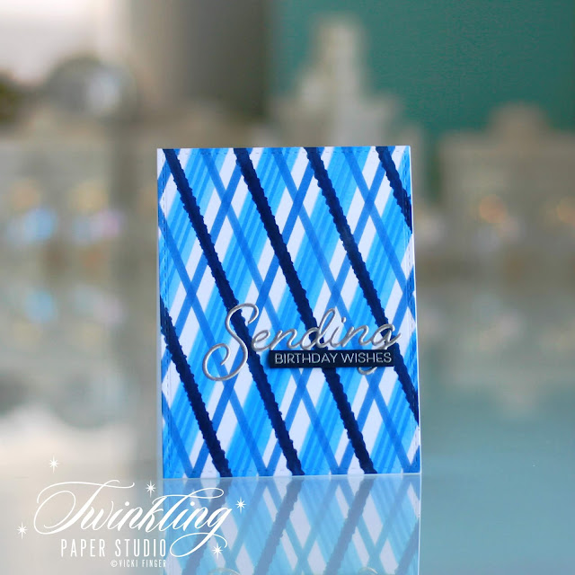
Hello everyone!  I am back today with another project for my Altenew Educator Level II Certification Classes.  This class was all about Magical Marker Techniques.  I always love it when I find a new way to use products that I already have and this class showed lots of ways to use Alcohol Based Markers.  My particular project was done using Alcohol Markers with Stencils to get a really bright and vivid background for my card.  As always, there are a few birthdays coming up soon and I needed a masculine card in particular for this occasion.  I need a feminine one as well, but I'll have to work on that another day. 

For today's project, I started by using a 4.25 x 5.5 panel of Cougar Digital White Cardstock which is a #100 weight.  It is super smooth and I love how bright the white is.  I also like Xpress-It Blending card, but it is much thinner and I wasn't sure how well it would die cut for a background panel, so I stuck with the Cougar Digital White Cardstock. 

I also pulled out my notebook that I keep all of my stencils in and had a look through to see what I could use with my markers to make a masculine background.  I just slip them down inside a page protector with a label stating the manufacturer and how many stencils are in the particular set.  In this case, I chose the Perfect Plaid Stencil Collection from Papertrey Ink.

I sat down with my drawer of blue markers and a scrap of cardstock to see which colors I would use and to make sure the tones all worked well together.  I used B32 - Pale Blue for the widest stripe, B23 - Phthalo Blue for the skinny three striped line, B24 - Sky for the single middle width stripe and finally B39 - Prussian Blue for the darkest stripe.  In some cases, I rotated the stencil 90 or 180 degrees to get the reverse look to create the plaid. I love how bold and bright this turned out and I think I will be getting more uses out of my stencils from now on.  I enjoy using them, but I don't often reach for them automatically.  I keep them in an easily accessible place so they are handy, but they aren't right at my fingertips like many of my other supplies are such as inks.   I love the look though, so I know you'll be seeing more of them in the future.


Once my background was colored in with my markers, I let it dry completely before heat embossing the "Sending" sentiment directly onto the panel.  I actually triple heat embossed this with silver embossing powder so that it would stand out more from the background.  Using a strip of Dark Indigo Cardstock, I stamped the "Birthday Wishes" sentiment onto that using the same silver embossing powder and adhered it with a skinny strip of foam tape.  This is a super clean and simple look (even with the busy background) and also very graphic which guys always seem to really love. 


Isn't this just a fun and graphic look for a card and imagine all the possibilities with all the various markers available for this look.  There are also multiple ways to rotate the stencils for a variety of different looks. 

I hope you all have a great day and come back soon to see my next project.  I'm getting adjusted to less daylight in the winter months and also the light in the sky is coming from different angles than it did over the summer so I have shorter windows for photographing my images.  But, I'm working it out.  I just really like to have as much natural light as possible and not use flash, so it's taking a little bit of adjustment.  Mid-morning continues to be my favorite time with the best light. 

Thanks so much for stopping by today!  I hope you'll come back soon. 

Sunday, September 9, 2018

Altenew Educator - Beyond Basic Backgrounds

Hi Everyone! I'm back today with my first project for the Altenew Educator Certification Program Level II classes.  This particular project is from Beyond Basic Backgrounds and is from the Day 2 Class where we learned about perfect spacing.  I absolutely loved this class and I played around with many different shapes until I found one that gave me a "double" design.

Card by Lydia Evans
Lydia showed us how to create our own background paper with perfect spacing and inks to create our designs.  You can make a grid design for perfectly spaced patterns that also are a perfect match to the inks you might be using for your decorative elements.  In my case, that is what I did.

A few years ago (2-3) I got a freebie stamp set with an order that I placed from Winnie & Walter called Bigger Bang Confetti.  I also have Simple Shapes and Simple Shapes XL from Altenew and you'll probably see some of those coming in the future.  This is the absolutely perfect thing to do when you don't have a matching card stock or patterned paper and that is what you want.  In my case, I made a grid as Lydia showed in the class and then playing with different shapes, I discovered by stamping this one in a certain way (diagonal vs up and down) that I got a two-fer.  First you get the main design with the pointy/curvy squares (Sorry, don't know what you'd actually call this shape) but then you get a secondary pattern in the white space of the card.  How fun is that?  I thought I'd make a not so fancy birthday card as I seem to be needing lots of those lately.  A lot of my designs are too feminine and/or fancy to give to a guy, so I tried to go in a more fun direction for this challenge and use something with a more clean and graphic feel to it.  I used the Altenew Sea Shore Collection of inks for this card which contains Mountain Mist, Volcano Lake, Lagoon and Emerald. 


There were lots of ways that Lydia showed us how to stamp and create our own background paper, from graphic like the one I created to florals and everything in between.  I personally have no problems using my designer papers, but I don't always have an exact match to what I am wanting to use, so I loved learning this technique. I used a Customer Appreciation Gift from Papertrey Ink that is a few years old as well but I felt the graphic style fit well with my background.  And hey - look - no gold on this card!!  heat embossing so it's hard for me usually, but this card is perfect just the way it is.

This was a great class and as always, well priced also.  You can find Beyond Basic Backgrounds at THIS link.  The class is $8.95 and well worth every penny.

I hope you enjoyed a different type and style of card from me today!  Thank you so much for stopping by.  I really appreciate your visits!

Thursday, August 30, 2018

Altenew Educator - Level I Final Challenge

Hello everyone!  Today I am back with a more detailed tutorial of how I created today's card for my AECP Level I Class Final Project Assignment.  The three techniques I decided to use are Easy Die Cutting Techniques, All About Layering, and Let it Shine and although I'm pretty sure I had the Let it Shine part down pat already it is always great to see additional ideas and inspiration.

As you know if you're a regular visitor to my blog, I have been playing around a lot with alcohol inks and also regular Reinkers with 91% Rubbing Alcohol and Alcohol Blending Solution.  By this time I have many lovely backgrounds to use on cards and on most of them I have used my Minc to add foiling after they dry for that extra sparkle and shine that I love so much.  I had one that was particularly beautiful and large enough to make a 5 x 7 card, which I only do when making something for a special person or occasion such as a wedding or that type of thing.  This particular occasion is my daughter's 38th Birthday.

Sterling Silver Rose
I started with a beautiful purple & rose alcohol inked blended background as my starting point for the flowers I wanted to put on it.  The Build-A-Flower Rose is an absolutely beautiful set that comes with dies and I love the finished product, but I needed more colors than I had in a single color family because there are 6 layers for the roses and 4 for the leaves, so I had to improvise.  Let it be said that a Misti or other stamp positioning tool is a must for this set.  I tried roses in several colors as I was initially planning to try to recreate Sterling Silver Roses which are a pale, kind of mauve-y purple and my daughter's favorite.  None of the colors seemed right and I even mixed in inks from other companies trying to achieve the look I was going for so I changed directions and went with a pink rose, which meant I also had to select a different background.  No problem, I had a favorite one in pink tones so I went ahead. 

I really wanted a more vibrant pink for my base color rather than Rose Quartz or Pink Diamond would have been for my pink roses, so I used Bubblegum Pink from Gina K Designs as my first layer on these roses.  The rest of the colors I used were all Altenew Crisp Ink colors from the Cherry Blossom and Rose Petals Mini Cube Collections.  Layer 2 was done in Pinkalicious, Layer 3 was done in Rubellite, Layer 4 in Razzleberry, and Layer 5 in Purple Wine.  This combination was exactly what I was looking for.  I did not stamp the 6th layer from this set.  It is very small and hard to see where it goes, so I didn't want to mess up all my work by putting it in the wrong place.

Now that I finally had the colors I was looking for I could stamp out the leaves in the Green Fields Collection of Crisp Inks Inks using Frayed Leaf for Layer 1, Forest Glades for Layer two and Evergreen for layers 3 and 4.  I stamped multiples of these so I could have some for the additional blooms I had stamped in an attempt to get a perfect match to the background.  I just tuck them into the stamp pocket for future use if I need to pull a card together quickly.

Now that I had all of my elements, it was time to decide what greeting to use and I also knew I wanted to use a frame for this card so I chose the Sweet Friend Stamp and Die Bundle which has a frame die with a coordinating stamp for it.  I took a piece of gold foiled cardstock and die cut the frame out of it.  I stamped the frame with the coordinating stamp using Versamark and Antique Gold Embossing Powder.  Now this does get a bit tricky because the foil wants to curl up so I ended up double stamping it to make sure I didn't have any gaps in the design.  To do this, you have to use the negative pieces as a placeholder and add a dot of adhesive on the back of each piece to hold it in place while you stamp.

At this point, things went horribly wrong!  As soon as I tried to die cut the frame out of the background, I realized I had forgotten one important thing. You cannot die cut the 144 lb. Yupo with any type of intricate die.  If it isn't a basic shape like a square or rectangle, there is no way. Not in any die cut machine - not even the Gemini Die Cutting Machine. The 74 lb Yupo cuts beautifully, but not so much with the heavy weight.  All it did was stretch out and warp my Yupo leaving it unusable.  I decided I needed to walk away for a little while but I also realized I would have to try to recreate the background in those same shades using the lighter weight Yupo or Glossy Cardstock.

The thing about alcohol inks for me, is that it's more "playtime" than actual work time because you will never get two backgrounds that look the same. I don't keep track of the colors I use because even using the same colors you will still get different looks. It's kind of like watercolor in that you can't make duplicates.  I didn't have a clue what colors I had used to get the background, but I was willing to play around for a while.  I finally had to shred the other background so it wouldn't sit there taunting me, ha ha.  It did go through my shredder with no problem - but not my Gemini or Cuttlebug.  After about an hour I came back to create a new background in similar colors.  It's not nearly as lovely as the other one, but it's the closest I could get.  I also ran this through my Minc Machine to get some of the gold veins although most of them are covered up with the other elements of the card.


My card is 6.75 inches by 4.75 inches and will fit perfectly into a 5 x 7 envelope.  I don't have one the right color, but I can definitely make one using my Scor-Pal.   To get  a card this size that is vertical in orientation, I cut two panels of the plum cardstock  - one at 7.25 inches by 4.75 and the other at 6.75 by 4.75.  I scored the longer piece at the ½ inch mark and folding it over, creased it well which leaves a little flap.   Then I put a piece of 1/4 inch score tape on that flap, then and adhered the front to the back.  I was very careful when doing this but you can trim away any uneven edges if needed. I had to cut about ⅛ inch from the back to have the front just a tiny bit longer.  I learned this nifty little trick from Yana Smakula.

I used a frame die from Spellbinders (due to the larger size card) to die cut the frame which also cuts a center panel in a rectangular shape.  I added little dots of Multi Medium Matte all around the frame working quickly, then set it carefully into place on my plum cardbase.  I lined it up with the card base creating the frame all the way around.

Slightly sideways view so you can see the inside the card with
the white panel and the embossed detail on the interior frame.  
Then I die cut the center piece from the marbled and foiled lightweight Yupo cardstock.  You can cut a rectangle from the heavyweight Yupo, but nothing with any detail at all.  Using a piece of fun foam, I added the center panel with Score tape on both sides of the fun foam to keep it in place.  I used the white negative piece from the additional frame I had cut from white cardstock to heat emboss my sentiment which came from the Build-A-Flower Sakura Blossom.  I inlaid that into the frame and taped it together on the back side with a bit of micro pore tape.  I like using this in this type of situation because it's very flat and doesn't add bulk.  I also added the positive white frame to the heat embossed foiled frame to make it a little bit sturdier.  Then I laid the blooms, leaves and the framed sentiment on the cardbase until I had a design that was pleasing to my eye.  I really struggle to do arrangements that are not from left to right.  It's the obvious choice for those of us who read English because we read from left to right.  So I challenged myself to do one that started on the right and went to the left.

Once I had my design, I used a piece of Press N Seal over the top and rubbing it into place, then picked up all of the elements and flipped it over so I could put adhesive on the back side.  Then I flipped it over again and carefully set it into place, rotating as needed before actually putting it on there.  Because the Press 'N Seal is semi-transparent, it's a great way to see the the layout to make sure you have it lined up the same.  Once you lay it down, press everything into place walk away for a few moments to let it set.  When you come back, gently pull the Press 'N Seal away from itself.  The top pieces will probably be loose, but you can hold them in place as you are peeling the film back, then add foam tape or adhesive under them and put them in place.  Fold the used piece of Press 'N Seal in half and save it for the next time around.  I use the same piece over and over until it loses it tackiness.

Anytime I use a darker cardstock, I die cut a panel of white cardstock to put on the interior of the card for my message or in case I want to add a greeting there.
The 2nd to largest die in the Spellbinders 5 x 7 Matting Basics A set is perfect for the inside of the card.


Once I got this card finished and nearly completed this post, I decided it needed a special touch since it is for my daughter after all.  She loves shiny and sparkly things also. A quick layer of Tonic Nuvo Shimmer Pen and a few gems did the trick. In case I haven't mentioned it before, I love to use Flat Backed Swarovski Crystals in the colors Crystal and Aurora Borealis in the 12 and 16 millimeter sizes.  I watch for a sale and buy a few packages at a time.  I don't use them for every card and it takes so few to make a big impact on a card. For the smaller size, there are 50 in a package and for the larger size there are 40 in a package.  A small package goes a long way.  If you did big crystals, they would just be gaudy and ugly, but these small ones give you a whole lot of bang for your buck.

I am late getting this card done but she asked me to make something that I haven't completed yet and I want to give it all to her at the same time.  So I better skedaddle off and clean up the rest of my "Craftermath" so I can finish that project as well.  Thank you so much for stopping by.  I've linked the supplies I've used below for your convenience (Affiliate Links used).

Altenew Antique Gold Crisp Embossing Powder
Shop at:
ALT
Altenew Build-A-Flower Sakura Blossom
Shop at:
SSS | ALT
Altenew Cherry Blossom Mini Cube Collection
Shop at:
ALT
Altenew Green Fields Mini Cube Collection
Shop at:
SSS | ALT
Altenew Green Fields Reinkers
Shop at:
ALT
Altenew Rose Petal Mini Cube Collection
Shop at:
ALT
Altenew Sweet Friend Bundle
Shop at:
SSS | ALT
Cuttlebug Die Cutting Machine
Shop at:
SSS
Gemini Full Size Die Cutting Machine
Shop at:
SSS
Heidi Swap Minc Machine
Shop at:
SSS
Kokuyo Long Dot Runner Adhesive
Shop at:
SSS
Marvy Jewel Picker
Marvy Jewel Picker
Shop at:
SSS
Mini MISTI Stamping Tool
Shop at:
SSS | ALT | GKD
MISTI Stamping Tool
MISTI Stamping Tool
Shop at:
SSS | ALT | GKD
Press 'N Seal
Press 'N Seal
Shop at:
SSS
Ranger Multi Medium Matte
Shop at:
SSS
Scor-Pal Scoring Board
Shop at:
SSS
Scor-Tape 1/4th inch
Shop at:
PTI | SSS
Scotch 3M Foam Tape
Scotch 3M Foam Tape
Shop at:
SSS
Spellbinders Matting Basics 5 x 7 Set A
Shop at:
SSS | SPB
Spellbinders Renaissance Labels 52
Shop at:
SPB
Teflon Bone Folder
Teflon Bone Folder
Shop at:
SSS
Tonic 6 Inch Personal Trimmer
Shop at:
SSS
Tonic Aqua Shimmer Pen
Shop at:
SSS
Versamark Ink
Versamark Ink
Shop at:
SSS
Wagner Heat Tool
Wagner Heat Tool
Shop at:
SSS