Tuesday, March 29, 2016

Watercolored Peonies

For many years I have claimed that Pink is my favorite of all the colors.  And that is still true but I have many colors that I love; Teal, Purple, Turquoise and many others but lately I have been on a Coral kick.

I had been hoping to receive a stamp set I had ordered last week in time for a challenge I was participating in but it never arrived until Monday afternoon. Turns out, I love it even more than I thought I would.  My regular one-stop shop for card making supplies doesn't carry this particular manufacturer.  In fact, so far, it's only available for purchase through their own company called "The Ton" which is a historical reference to "Couture Style" in the British Aristocracy.  It's Effie's desire to bring couture style to the stamps she designs.  I think it is interesting to note that Effie also happens to be a lawyer.


One of the things I most like about The Ton Stamps is their size.  My primary complaint with most of the stamp sets I have is that the images in them are so small.  I love these big bold and beautiful images in The Ton's Peony Series that I can watercolor. This particular one is called Large Peony 2.

I colored this last night using Abandoned Carol Distress Marker with Forest Moss and Mowed Lawn for the leaves.  I know y'all might get tired of seeing Watercolor, but I never get tired of doing it. Even when I do two of the same image in the same colors, they are never the same.

My favorite medium for watercolor is Ranger/Tim Holtz Distress Markers which come in a whole slew of colors - 60 in all I think.  But I recently worked on a project where I was trying to stay with one brand of coloring medium and couldn't because I didn't have an orange color in a Distress Marker. I actually have more yellows than oranges and if you you know me very well at all, that is somewhat amusing, *wink*. Anyhow, I added a new color to my Distress Markers in what appeared to be a nice shade of orange called Ripe Persimmon. I'm not really a "pumpkin orange" kind of girl although now I need one that color. Thank goodness for Simon Says Stamp who sells the colors individually so I can add one or two at a time and not have to buy a whole set in one shot. This also allows me to buy only the colors that I personally will use.

So, I got this Ripe Persimmon Distress Marker a few weeks ago but I like to take time to know how each color reacts with water before actually starting a project with it. Distress Markers are ideal for watercoloring as the formulation is designed to react with water each and every time. But I learned early on that they aren't that predictable for watercolor if you haven't used a particular shade before.  I have to know what it does and how it behaves with the water.  And with any watercolor medium, you have to let it dry before you can see the end result. I always talk about how Seedless Preserves is a favorite Distress Ink color and I like to call it "My Little Extrovert" because what goes down as purple becomes pinky purple or a color I would call Thistle.  Well, as I was finishing up some work last night in my studio, I grabbed the Ripe Persimmon really quick with a strip of watercolor paper that had been cut off of a big sheet. I made a mark on the scrap of watercolor paper and then added water to it with a brush.  Oh my goodness - this wasn't the color I was expecting AT ALL!   I'm adding a little swatch here for you to see. There's that orange, then that hint of peachy pink and the golden edges all dependent on how much water you use with the color.  This color needs it's own little nickname too although I can't think of one at this moment.  

When I was a little girl, I used to go and spend the night with my great-grandmother sometimes and there was a persimmon tree in her yard.  That was the sole basis for my color selection of this particular "orange". It was a happy memory and I thought it would remind me of her every time I use it.  And so it will.  *Ü*

The finishing touch on each of these cards is the sentiment from the Papertrey Ink Stamp Set called "Scripted".  The first card also used a technique I learned in a previous class and is one that Laurie Willison taught for this week's Make it Monday at Papertrey Ink.

 The Simon Says Stamp Wednesday Challenge is Anything Goes featuring Ranger Products.  I'll be entering the top card for the Papertrey Ink Challenge and the second card for the Simon Says Stamp Wednesday Challenge as well as the Challenge over at Inspired By All the Little Things #8. I was also invited to participate in a Challenge that is new to me called Word Art Wednesday. Thanks for the invite!

Thank you so much for stopping by today and I appreciate all of the kind comments you leave.

Masculine Style Birthday Cards

This week over at Always Playing With Paper Challenge #66 we have this Nautical Style Masculine inspiration image.  I confess, I struggle with masculine cards but one of the things I've decided for myself is that bold & graphic is better when it comes to men.  I really love stripes for masculine cards and I have this great paper that has foiled stripes on it. When I saw the inspiration image I knew I wanted to pair that up in some way for today's card.

I started with a 5.5 x 4.25 inch top folding notecard made from the Navy & Gold Striped paper.  I mounted that to another fairly thin white notecard as neither was thick enough on their own to make a very good card.  Using a Simon Says Stamp Stitched Rectangle Die, I cut a smaller panel from the Gold & White stripe paper.  To give a fun feel without going to extremes I adhered this panel skewed to the right but lined up somewhat with the gold stripes on the background paper.  I cut a Papertrey Ink Text Block - Horizontal Birthday die cut from Gold Foil Cardstock with a piece of SU! Night of Navy cardstock behind it and then adhered that skewed in the other direction. I also cut 2 candles from a QK Revolution Die.  I put a solid gold candle behind the star cut out candle and covered the navy card stock with Wink of Stella Clear Shimmer.  My photo doesn't really show this very well, but I promise - it's there.


This turned out to be a bold graphic image that is perfect for a masculine card.  I used a scrap of glitter card stock for the center of the candle which is about as much glitter as I dare to put on a masculine card.

This was a super fast and easy card to make and there was no stamping at all. A couple of die cuts made for quick work.  Thanks so much for stopping by today and be sure to check out the other great cards inspired by this image over at The Challenge.  There are some great ones there already!

Monday, March 28, 2016

Simon Says "We Can See Clearly"

Over at the Simon Says Stamp Monday Challenge Blog this week the theme is "We Can See Clearly" and the idea is to use a transparent or semi-transparent "medium" on your project.  For me, most of the time, it will be vellum.  I love the effect of getting a softer shade of the same color family that using vellum provides.

For this card, I used a piece of Papertrey Ink Stamper's Select Vellum with the Anna Griffin Acanthus Embossing Folder.  This is a thick vellum that will hold up to embossing although some care is required.  If you use a thinner vellum, it essentially "breaks" the vellum into pieces making it unusable.  The effect of embossing this vellum is that it gives a raised outline in a soft white to add texture to your card or project.

I especially liked it on this card because my Mondo Magnolia Die leaves a narrow white outline to match.  This magnolia is part of the Essentials By Ellen Collection and was designed by Julie Ebersole for Ellen Hutson, LLC and is a favorite of mine.  One of the things I like best about it is the size. Once you have that image colored how you want, it is very quick to pull a card together. No fuss, no muss as it does the talking for you (mostly).

I also used my Totally Fabulous Die, from Ellen Hutson, LLC. Mine was a gift with purchase from Black Friday, but it is available for purchase now. The die comes with a pop up "Totally" but I cut my words apart so I could use just the "Fabulous" by itself.

For the Mondo Magnolia image, I stamped the image using Versamark and heat set it with Ranger Gold Tinsel Embossing Powder. I watercolored it using Worn Lipstick Distress Marker in a few layers to get the depth and interest in the petals. I finished it off with a coat of Wink Of Stella Clear Shimmer Pen.

I have lots of projects up to do this week so I will be back very soon with another.  Thanks so much for stopping by!

Sunday, March 27, 2016

Always Playing With Paper Challenge #65

They had a gorgeous inspiration image this week over at Always Playing With Paper.  I had hoped that a new stamp I ordered would arrive in time to use it, but its still in transit and I'm almost out of time to get this post up so I finally worked on it a bit yesterday morning after checking the status of that order.

I think it would surely be no surprise to anyone that I really love peonies. They have so many ruffled and gorgeous layers with hints of light and dark shades and highlights running through them.  They are indeed one of Nature's finest.

One of my grandmothers loved them and had several in her yard that she had shared with my mom at some point in time when I was in Elementary School. They have the most heavenly smell. I've noticed lately that they seem to come in many more colors than they used to and the ones in this photo are stunning in shape and color.  I don't think Peonies grow very well in Oklahoma as I have never seen any here. This bouquet makes me want to plant some for sure.  They are probably around somewhere, but you just don't see them.

I used the color in the bouquet as my starting inspiration for this card.  I didn't have a peony bouquet so I used a tulip bouquet from the Papertrey Ink Tulip Time Stamp and Die Set.  I also wanted to try to mimic the stack of books somewhat so I made the horizontal stripes using a My Favorite Things Striped Background Stamp with Versamark Ink and heat embossed them using Simon Says Stamp Antique Gold Embossing Powder.  I cut that down to the band size I needed by using a Simon Says Stamp Stitched Rectangle Die and repositioning the paper in the die for the 2nd pass.


I used the Mama Elephant "Scripty Hello" Die for my greeting and finished the card off by adding the faceted enamel dots to the upper right hand side of the card. Everything is attached to a 5.25 x 4 inch top folding card base.  The pink cardstock I used here is Strawberry Slush; it's a no longer available SU color.

Happy Easter Everyone!  Enjoy some family time today if you can.

Saturday, March 26, 2016

Color Throwdown #385

Today I am playing over at the Color Throwdown Challenge #385 which is Teal, Aqua and Gold.  This is truly one of my favorite color combinations. Actually, I like Gold with a lot of colors -- pink, purple, red, black - you name it, I like it. I am much more of a gold girl than a silver one.

For this Challenge I kept things pretty simple and didn't even do any stamping.  I chose Papertrey Ink Tropical Teal and Hawaiian Shores Cardstock and Simon Says Stamp Surf Blue with some gold foil cardstock.  I treated each of the three colored cardstocks with Iridescent Gold Glimmer Mist and allowed it to dry before cutting it with my favorite, Simon Says Stamp Stitched Rectangle Dies in the two largest sizes. You could probably use the Tsukineko Gold Shimmer Spritz to get the same effect.

I taught myself a new trick with these dies tonight.  I really wanted a triple mat on this card to incorporate all three colors of card stock but there isn't an in between size in the dies.  So I cut two of the colors with the largest stitched rectangle and one from the 2nd largest.  Then by repositioning the positive piece into the die and realigning it to take a bit off of two sides, it cut just enough off to make the middle size mat.  I'm sorry for so many pictures, but I know just the words may not be enough for you to understand what I did.

By  taking just that little bit off of two sides, it made a mat for the in between size that still has the stitching lines in place. You could do this with any dies that have straight edges like squares or diamonds.  I've used a similar method to this in order to get a narrower rectangle for my cards. My Simon Says Stamp Stitched Rectangles are already my most used dies so I'm happy that I can stretch them even further now.

I love this new die from Impression Obsession that says "Wishes" and I think it paired perfectly with the Make a Wish Die from Spellbinders.  You could add your choice of other words to it like Birthday, Happy, Best, Easter etc. and cover a whole bunch of different occasions.  My style tends to run more towards elegant than cute so I really like the way this card looks. It was really simple to make but very elegant with the gold dandelion and word die.  Everything is mounted to an A2 Card Base made from Papertrey Ink Stamper's Select White #110 Cardstock which is my hands down favorite.  It's super smooth and heavy enough to make a nice crisp card.


Thanks so much for stopping by to check out my project. I have several others in the works this weekend.  If you have any questions or comments, I do read every single one.  Have a great Easter Weekend everyone! 

Friday, March 25, 2016

March 2016 Papertrey Ink Blog Hop


Today is the Monthly Blog Hop for Papertrey Ink. The inspiration image is from Izziyana Suhaimi who combines embroidery with paper crafting to create some incredible images. If you'd like to see more of her work, follow this link!

For this challenge, I created a card that used a few different techniques on it including the one that Danielle Flanders showed in her "Make it Monday" for this week. It's Emboss Resist with Ink Blending which you know is one of my favorite techniques. To begin with, I partially stamped this background stamp called "Filigree" (a way old SU background stamp) over the lower right hand side of a piece of watercolor paper using Versamark. Then I rotated my paper 180 degrees and did it again. To create the resist, I covered the stamping with Simon Says Stamp White Embossing Powder and heat set it. Once the ink is dry, go over your embossing with a baby wipe or an absorber to keep it nice and white.
 
To color the background panel, I used a Mini Ink Blending Tool with Papertrey's Perfect Match Lavender Moon Ink and applied it using circular motions.  My, how I love this color!  When you start your ink blending, you always need to use a light touch and then increase the pressure with additional layers to deepen the color. I also inked all the edges for a more defined look to my background panel.


I die cut a few of each size flower in the Embroidered Blooms coordinating die collection called Beautiful Blooms II. Then using my negative as the place holder, I stamped them in Lavender Moon and Plum Pudding Inks.  I just love both of these colors although I am partial to the Lavender Moon.  Let me just mention here that I hadn't realized it before, but there is only one correct way that the positive fits into the negative. Keep rotating it until the fit is perfect. The petals seem identical, but they are not. I didn't get the stamps lined up perfectly on the smaller flowers, but they remind me a bit of pinwheels which I thought added to the whimsical feel. For the leaves I first die cut and then stamped the solid image from Turning a New Leaf Stamp Set in Mint Julep and then stamped the "embroidered" image from Embroidered Blooms. I love that these two stamps set work together with the same set of coordinating dies. What a fantastic idea and I hope to see more of this!

To finish up my card, I cut the Simon Says Stamp "Smile" circle greeting from some gold foiled card stock. I chose this greeting because people always smile when they realize that you've been thinking of them and just wanted to let them know. A note card is the perfect way. I mounted the ink blended panel to my card base made from Stamper's Select #110 White top folding card base, then took all of the pieces I had stamped and arranged them how I wanted them on my card front. Once I had them all arranged to my liking I applied small foam squares to the back of the leaves and in the center of the flowers. The top piece of the stem is glued down with Ranger Multi Medium Matte. Since the foam adhesive is only at the center of the flowers, I could bend all of the petals slightly forward to give a bit more dimension to my project.

I've got a few other projects on my radar this week so be sure to check back! Thanks so much for stopping by and taking time to leave a comment if you like! 

Monday, March 21, 2016

My Little Chickadee

The theme over at the Simon Says Stamp Wednesday Challenge Blog this week is "Cute and Cuddly".  I don't normally do critters for the most part, so I have very limited supplies in the cute and cuddly category and what I have tends to lean in the direction of Christmas. However, I just happen to have this New Day Stamp Set from WPLUS9 Design Studio.

I love Chickadees. Just the name sounds happy and cheerful. There are so many trees budding and blooming this time of year and so many little birds surveying the landscape from their branches. It's definitely one of my favorite times of the year with all the blooming flowers and trees.  There's the Redbud, Crabapple, Plum and Pear trees all providing fragrance to the air around us and signaling the new day.  Last year we had so much rain that my magnolia blooms only lasted a few hours before they were so heavy that they fell off the tree.  I'm hoping this year we get to enjoy it more.


I water colored this little Chickadee using Distress Markers in Pumice Stone, Gathered Twigs, Black Soot, and just a hint of Worn Lipstick.  For the halo effect around the bird, I used a combination of Tumbled Glass and Spun Sugar to try to convey the feeling of a new day. For the buds on the tree I used Light Pink Zig Clean Color Real Brush Pen with Mowed Lawn Distress Ink for the early Spring leaves. I also put a dot of white gel pen on each little bloom for a highlight.  To help make the mask a little bit whiter and brighter, I used a White Prismacolor Pencil with my water brush.


I also wanted to participate in this week's challenge over at The Paper Players #287 with the "Celebrate Spring" theme.  The design is to be Clean and Simple (CAS).  

Happy Spring Everyone!  Have a great week and please feel free to comment if you stop by as I treasure each and every one of them.  

Sunday, March 20, 2016

Use Some Lucky Stars

I'm popping on here with a really quick card today for the Simon Says Stamp Monday Challenge for this week which is "Use Some Lucky Stars".  I started this card by cutting a 4.25 x 5.5 inch panel of watercolor paper and water colored it using my Gansai Tambi Watercolors in #58 - Evergreen, #55 - Green, & #90 - Gold.  I wet the entire surface of the paper with water. Then I "dabbed" paint on it first in the evergreen and then in the green.  I spritzed the whole thing lightly with water after applying the color and just let the water and color move however it wanted. I had taped it to my small cutting board, so I could set it aside to dry and do some other things for a little while.

Once all of the green was dry I dabbed more paint on in a random pattern with the gold paint.  This time, I didn't add any water, but just let the paint settle where it wanted to. When dry, this gives you a fantastic marbled looking background which is great for a Clean & Simple (CAS) Card.  Since I also wanted to play over at the CAS Mix Up, it was important to me to keep it to a single layer.

Next I stamped my greeting and the moon and star from the WPLUS9 Lucky Stars Stamp Set using Versamark and heat embossed it with Ranger Gold Tinsel Embossing Powder.  I love the sparkle this adds to any card. I cut several stars from the Simon Says Stamp Large Holiday Hearts and Stars Die from scraps of gold foil card stock.  Using a Versamarker, I added a few dots with WOW! Platinum Sparkle Embossing Powder to give the appearance of some larger stars. For my final touch on the background panel I misted it with a light mist of glycerin water and then took a pinch of Iridescent Sparkle Embossing Powder and sprinkled it on the card front & heat set it.  It gives a beautiful sheer sparkle imitating a starry night sky.  Unfortunately I was not able to capture than in the photograph.  Still, it makes for a very pretty card.


I die cut the panel with the largest Simon Says Stamp Stitched Rectangle then adhered it to a Bermuda Bay top folding card base.  Single layer cards are by far the easiest to mail and don't require extra postage or hand cancelling.  My best friend loves green so this is going out in tomorrow's mail for her!

Thanks so much for stopping by.  I really appreciate it when you take time to comment.  Have a great rest of the weekend.

Thursday, March 17, 2016

The Legend of the Dogwood


"At the time of the crucifixion, the dogwood had reached the size of the mighty oak tree. So strong and firm was the wood that it was chosen as the timber for Jesus' cross.

To be used for such a cruel purpose greatly distressed the dogwood. While nailed upon it, Jesus sensed this, and in his compassion said, "Because of your pity for my suffering, never again shall the dogwood tree grow large enough to be used for a cross. Henceforth, it shall be slender, bent, and twisted, and its blossoms shall be in the form of a cross–two long and two short petals.

"In the center of the outer edge of each petal will be the print of nails. In the center of the flower, stained with blood, will be a crown of thorns so that all who see it will remember."


There is nothing in this world that says "Easter" to me more than seeing a Dogwood Tree and Pink Dogwoods are (of course) my favorites!  We saw lots of them on our 2015 vacation as we drove through Tennessee, Virginia, and North Carolina. My husband had not seen pink ones before and it was a definitely a treat for me as well.

As I worked on another card for the The Card Concept Challenge #51 and was admiring the inspiration image, it occurred to me that I should be using some "Kraft" Cardstock with a Pink Dogwood Bloom to create an Easter card. I have had this Dogwood Bloom stamp by Impression Obsession for a number of years but I hadn't ever used it before.  These days you can buy the cling mount version of this stamp which is fantastic. Now that I have fallen in love with water coloring, I had to try it with this stamp. It's not an outline image, but I figured I could work with it.

I stamped the image in Versamark on Canson Bristol 96# Watercolor Paper and heat set it using Simon Says Stamp Antique Gold Embossing Powder.  I love the soft white of this paper over some of the others out there on the market. Since the petals are mostly white, I painted the entire flower using a solution of Perfect Pearls & water, then let that dry.  Once it was dry, I took my lightest pink Zig Clean Color Real Brush Pen in Sugared Almond Pink and went around the outer edge of each petal and blended that with more Perfect Pearls Solution. One of the nice things about the pigment powder is that you can make your solution as shimmery as you like.  I just touch the very tip of my damp brush into the powder and mix it with a bit more water on an acrylic block.

I went back in with the same color to add depth to that area for my second and third layers. The final touch on the blooms was using Pale Rose for the indication of each nail in the petals.  The leaves were mostly covered with gold embossing powder but for what was showing, I used Mowed Lawn Distress Marker. When it was dry, I die cut it using the largest of the Simon Says Stamp Stitched Rectangles.  The mat was a scrap of Pink Pirouette Cardstock that was laying next to my die cutting machine that I cut down to be 4 1/8th x 5 3/8ths.  I adhered it to a top folding A2 Kraft Card Base.


I die cut the Simon Says Stamp Exclusive "Easter" sentiment from some gold foiled cardstock and adhered it using Ranger Multi Medium Matte.  This card is Perfect for the Classy and Elegant Category on The Card Concept #51 Challenge, AAA Cards, the CAS Mix Up March 2016 Challenge and the Double D Challenge to make an Easter Card.  I made quite a few Easter cards this year, but this one is a favorite. It was the simplest to do but really makes an impact.

Thanks so much for stopping by.  Please feel free to leave me a comment.  I really enjoy reading them.

The Card Concept #51

Today I am playing over at The Card Concept Challenge #51.  I love pink so you can see why this image inspired me.  Not that I ever really need a reason to do pink...*Ü*.  I love the Easter Eggs in the inspiration image as well as the bright pop of pink.  I'm also thinking I need to do another card for this challenge utilizing Kraft Cardstock.

I started by cutting some of the flowers and leaves (which is a QK Revolution die) from Stamper's Select White and some watercolor paper.  I wanted to create multi-layered flowers with different colors for each layer. I inked up the ones that had been done on watercolor paper using a Mini Ink Blending Tool and Melon Mambo Ink.  I knew it had to be a pretty vibrant pink or it would get lost on the pink and gold diagonal striped paper.  The color blended more or less depending on how much shimmer mist I added after inking it up.  I used the lighter color layers for the top followed by a dark pink flower, then the white outline and the pink outline for the bottom layer. The leaves were inked up using Papertrey Ink Vintage Jadeite and misted as well. The mist I used is Iridescent Gold from Tattered Angels.  I don't think they make this anymore but there are other shimmer mists out there.  Another favorite is Tsukineko's Shimmer Spritzes.


I added a bit of bling to the centers of the flowers with some sparkly bling dots that I had on hand.  These dots have their own adhesive dot on the back, but I attach them with Ranger Multi Medium Matte for the super strong hold.  The "Hello" greeting is Papertrey Ink's Noted Die.  I cut a 4.25 x 5.5 inch panel from the pink and gold foiled paper and attached it to a Stamper's Select White A2 top folding card base using Scortape. It's important not to mess up your alignment because Scortape is so strong, you cannot reposition it.

Overall, this was pretty quick to put together and it packs a lot of springtime punch guaranteed to make the recipient smile. Thank you so much for stopping by today to check out my project!

Wednesday, March 16, 2016

Create Along With Us - March 2016


For one of the cards I created today, I was inspired by a few sources. The first one is Kay Miller from the Papertrey Ink Design Team featuring new March Release items. She made this gorgeous card and the colors were so appealing that I just had to include a bright green and blue on my card.  Once I saw The Challenge #64's Color Scheme over at Always Playing With Paper, I went with it.

I started by stamping the butterfly image  onto Canson Bristol Watercolor Paper in Versamark and heat embossing it with Ranger Gold Tinsel Embossing Powder. This Pen Patterned Butterfly is from Stampendous and it came with a set of masks for each of the three butterfly images in this set.  There are also coordinating dies found here.  After I did the heat embossing, I placed the mask over the image and created the soft blue background using a Mini Ink Blending Tool with Simon Says Stamp Maliblue Ink trying to keep the most intensity near the immediate area surrounding the butterfly.  Once I had that completed, I colored in the Butterfly using my Zig Clean Color Real Brush Pens in May Green, Persian Blue, Cobalt Blue and Deep Blue (Navy) for the body and the spots on the wings.  Let me add here, that the Japanese seem to have a couple of their colors mixed up from what I am used to. What they call Cobalt is what I would call Persian Blue and what they call Persian Blue, I would call Cobalt.  There's a few other colors that don't seem the same as what I'm used to so I'm glad I have all my caps swatched.

Once the butterfly was dry, I used my powder tool on the upper right side to make sure there was no moisture left and stamped and heat set the greeting which is part of the Tulip Time Stamp Set from Papertrey Ink.  I just love that font!


Once that was all dry, I still felt it was missing something so putting a drop of reinker with a mist of water, I picked up some of that and created the navy spatter.  I let that dry and then added some spatter using Martha Stewart's Liquid Gilding in Gold and let that dry.  It dries quickly but has some pretty significant fumes and should only be used outdoors.  And it's best to use a throw away kind of paint brush unless you want to have to get a cleaner from your hardware store. Just do whichever one works for you.  It's a very pretty touch.  I could have used my Finetec Mica Gold Watercolors, but I wanted to try the Liquid Gilding.

When everything was dry, I cut a top folding card base from Papertrey Ink Vintage Jadeite Cardstock and a mat from Audrey Blue Cardstock from Simon Says Stamp which has turned out to be the exact same color as Hawaiian Shores from Papertrey.  I assembled it all together and got inspired to make a second card in the same design but different colors.

For this one I used the Zig Clean Color Real Brush Pens in Light Carmine, Deep Violet, Purple and Light Violet.  Purple is more along the lines of what I would call Magenta and is one of only 4 colors I added to my set of 36 pens.  I also added Persian Green, Light Sugared Almond Pink, and Emerald Green.  I added this watercolor panel to a top folding note card made from Papertrey Ink Berry Sorbet Cardstock which seems to be my current favorite color.  Both of the cards are bright and springy and will make someones day a bit brighter.


I'll be entering the top card into the Always Playing With Paper Challenge #64 as well as the Create Along With Us March 2016 Papertrey Ink Challenge. There are lots of challenges this week and next week has a challenge and blog hop for Papertrey Ink so I'll be back soon with my next project.  I hope everyone is getting to enjoy some gorgeous Spring weather today!

Monday, March 14, 2016

Inkspirational Challenge #104

Today I am sharing a card that I made for the challenge over at Inkspirational; #104 Pink and Grey.  This happens to be a combination that I love and always makes me think of Art Deco Architecture & Decor.  That is probably because the first time I actually saw any Art Deco Decor in person was at The Rock House on the Laura Ingalls Wilder Estate. I drafted a blog post about that once before, but it got to be soooo long that I deleted it.

For this card, I started with a piece of Smoky Slate Card Stock from Stampin' Up! since it was the only grey I have.  It wasn't nearly dark enough as I was going for a Pewter color.  To fix this, I used a Mini Ink Blending Tool with my Smoky Slate Ink and applied it to the panel until I had achieved the color depth I wanted. Once that was done, I misted the pewter, rose and pink cardstocks with Pearl Glimmer Mist.  When they were dry, I dry embossed two of them using a Cuttlebug Embossing Folder from Anna Griffin called Elaborate Quatrefoil. Really, I need to use my embossing folders more often as another quick way to add lots of texture. I cut all 3 panels with the largest of the Simon Says Stamp Stitched Rectangles Dies but I realigned the Pink and Pewter panels within the same die to make narrower panels.  You can keep the pieces that you cut off as it will all have the stitch lines and you can probably use it later.  Next I started assembling my card onto a Smoky Slate Top Folding A2 Card Base.

I had previously stamped the Tulips using SU's Pink Pirouette, and Papertrey Ink's Lavender Moon and Autumn Rose from the Papertrey Ink Tulip Time Stamp Set.  For the Stems I used Mint Julep and Vintage Jadeite from Papertrey Ink.  This is a layering stamp set and was the first thing I attempted to stamp in my MISTI.  I don't have my technique perfected yet, but I didn't have to throw a single one of the stamped tulips away and I have made several cards.  This is definitely progress. It was also nice to have the matching cardstock in the Autumn Rose.  I'm truly looking forward to not throwing away so much stamped cardstock because I didn't get everything aligned correctly.  While I think the quality of Papertrey Ink's Perfect Match Cardstock is impeccable, it's also nice that they have it available in 12, 24 or 50 sheet packs so you can buy bigger or smaller based on what you use. That's always a win for me.

To finish up this card, I cut the little embossed greeting from some silver mirror cardstock and tied the stems of the tulips with the silver and black ribbon. Most of the supplies are linked except for the sentiment die and the ribbon.

Thank you so much for stopping by today to check out my creation.  We are supposed to hit a high today of 87 degrees so I think I'm going to go sit on my porch swing!

Saturday, March 12, 2016

Tic Tac Toe Challenge #5

Today I am playing over on the Tic Tac Toe Challenge #5. So you select your row and then you need to incorporate everything from that row into your card. My row is upper left to bottom right and includes having an inspiration photo to base your card on. I went searching on Pinterest for some Green & Gold inspiration and settled on these cups with a very art deco feel to them. I found gorgeous photos from home decor, stationary, invitations, fine china, front doors, wedding color schemes and just about anything else you can think of right down to green and gold wedding cakes and fancy wedding shoes. It is a beautiful combination and I happen to really like gold. I always prefer it over silver.
 
I die cut the Cover Plate: Twist from gold foiled cardstock to go over the top of my Vintage Jadeite Cardstock from Papertrey Ink.  This is a "new to me" color and I love it.   One of the things I really like about Papertrey Ink's Perfect Match Cardstock is that it is available in packs of 12, 24, or 50 sheets. So if it's a color I don't use as often, I can buy a smaller pack. This is so important to me because of the smaller amount of storage space required.  I cut a piece of the Vintage Jadeite to 4 3/16ths x 5 7/16ths, ran it through my die cut machine with the same die and the embossing mat to give it that inlaid look, then attached the die cut using Ranger Multi Medium Matte.

Cover Plate Dies are a fantastic way to make gorgeous cards with a whole lot of impact in a short period of time. Papertrey Ink carries a good selection and they are very reasonably priced. Once I had that adhered, I carefully laid the whole piece back into the die and ran it through with the embossing mat again to deepen the impression and make it look even more inlaid.  Fair warning - you can mess the whole panel up by doing this.  Trust me when I tell you this because I am the voice of experience.  Ahem....


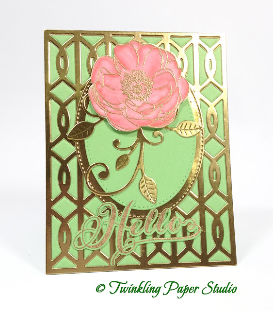
I also used a My Favorite Things Oval Stax in two sizes and the Leaf Filled Flourish Die to go with my Peony. The peony is from Papertrey Ink's Peonies on Parade and I watercolored it using Worn Lipstick Distress Marker. The sentiment is from Graceful Greetings and I used the Graceful Greetings Coordinating Dies to cut it out after I stamped and heat embossed it with Simon Says Stamp Antique Gold Embossing Powder.

I'll also be entering this card over on the Simon Says Stamp Wednesday Challenge Blog for their "A Bit O Green" theme.

After my initial post I found "The Card Concept" Challenge #50 and this card is just the perfect thing for the Classy and Elegant Style Category. This is my first time playing over there, so I hope they like my entry. I also found another new challenge blog called Double D Challenges!  So excited to participate in more challenges.

Have a great weekend everyone and don't forget to set your clocks ahead one hour.  It's time to "Spring Forward".

Friday, March 11, 2016

Fusion Challenge - Lucky Days

Hi Everyone!  For this week's Fusion Challenge I wanted to keep the sentiment simple and to the point while really trying to do a combination of both the inspiration images.

For this card I wanted to incorporate the word "Lucky" to participate in this challenge and the Simon Says Stamp Wednesday Challenge as well.

When I see clover, it makes me think of all the lucky, four-leafed ones I have found over the years.  My mom has a knack for spotting them and I do as well.

I used Simon Says Stamp Lucky Ink with a Mini Ink Blending Tool all over a panel of watercolor paper.  I wanted to spray it with some Iridescent Gold Glimmer Mist to really blend the colors and this works the best on watercolor paper.  I buy the large 11 x 14 pads and cut them down to make them pretty economical. I have several different ones around right now.  Arches Hot Pressed, Arches Cold Pressed, Canson XL Watercolor Paper, and Canson Bristol Watercolor Paper which for my purposes, is my favorite.  You can't overwork it or it will start to pill sooner than the others I have, but once you kind of know what you're doing and know how to control the water, it is the smoothest. Occasionally I want something with more texture and the other ones I have around work great for this.  One of the reasons I like the Canson Bristol is that it is whiter and brighter than regular watercolor paper.  I don't have to have stark white but I don't usually want off white. It works for some things but I'm glad I have a choice.


I happened to have just this one single piece of the star vellum in an A2 size and when I saw the inspiration photo, I thought of it right away.  So with the green and the stars, I had "Lucky Stars" which seems the perfect fusion to me.  The sentiment I used is from the WPLUS9 Design Studio Lucky Stars Stamp Set and it was perfect for this card.

I heat embossed the sentiment using WOW! Metallic Platinum Sparkle Embossing Powder. With the kind of pale silver stars, I thought it was perfect.  I attached the vellum using Ranger Multi Medium Matte.  You can see it in a few places, but I hope the recipient won't pay too much attention to it.  This is for my best friend, Gloria.  She loves green!

I'll be back soon with another project.  Thanks so much for stopping by today.