Sunday, April 30, 2017

Gran's Garden

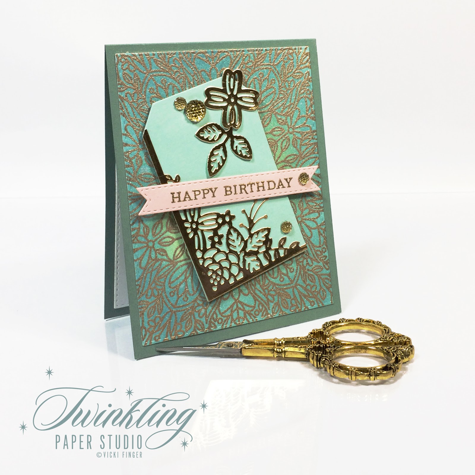
The card I created today is for The Paper Players Tic-Tac-Toe Challenge.  I wanted to play with a new stamp set from Papertrey Ink so I chose the bottom row. When I looked at the other rows, it so happens that I have everything on the middle as well including a sprinkle of Sparkling Clear Sequins.

Gran's Garden is a set designed by Dawn McVey for Papertrey Ink.  It has a coordinating set of dies available as well. Nichole and Dawn (actually all of the Design Team) had fantastic examples using this set udring the most recent release. One of the things Nichole did was to die cut colored card stock for her leaves, buds and blooms and stamp with one shade darker ink.  I actually wanted to try that today but I forgot all about it until I started writing this post. Guess I'll have to save that for another day.

For my flowers I used Hibiscus Burst with Raspberry Fizz and Bright Buttercup for the centers with New Leaf for the leaves on Stamper's Select White Cardstock.  It seems like it always takes me stamping with a new set a few times before I have the hang of getting it lined up really well, but I don't really want to toss my first few in the trash since it's my good paper. Plus, there's that new stamp thing too where they stamp better once they have been seasoned a bit. I don't have a preferred method for this so far.  Most of the time I end up using my hand to "condition" my stamps.  They stamp a whole lot better if you muck them up a bit the first time or two with something.  You can use a plastic eraser or your hand, but since my hand is attached to my arm, it's always handy and easy to find. Ha Ha! You can also stamp into Versamark first and then into your ink color which also helps to provide a better surface for your ink to stick to with new stamps.  


This set has the long stem of leaves and a shorter one so it's easy to put together a bouquet with the three different blooms and the buds. I put a bouquet together on top of the card and then picked it up with Press N Seal and that allowed me to put things on in the order I wanted.  I use one piece of Press N Seal over and over until it isn't sticky anymore so I think I might be on my 4th or 5th different piece of it now.  It's a handy item to keep in the craft room when working with any floral sets that have a variety of different pieces.  I used foam tape on the sentiment banner only.  I could have used it with the flowers as well, but I try to keep my cards pretty flat for mailing since most of them do get mailed.  

That's it for this quick post today. I'm still having some computer issues so I'm not linking the products but Gran's Garden is a new release in the Papertrey Ink store.  There's a link in the right hand side bar.   I have a really busy week but I have a few posts planned.  You know, it takes so much more time to write the post than it does to make the cards, but that's one of the things I do to keep my mind active. Thank you for spending a few minutes with me today and I hope you'll come back soon.  

Saturday, April 29, 2017

Muse Challenge #213

Today's card is for the Muse Challenge #213 this week featuring my extremely talented and crafty friend, Kay Miller. Kay's work is always so inspiring but what I particularly loved about this card is the bright pops of color.

I don't know about you, but here in Northeastern Oklahoma, we have had rain for days and days and days. Everything is lush and green (including the skies) and I am ready for some bright pops of color.

I am totally smitten with Papertrey Ink's Tulip Time Stamp Set and chose to do these in the bright Coral and Red tones as well.  I started by die cutting the tulips from Stamper's Select White Cardstock so I could use the negative as my placeholder in the MISTI tool for stamping.  I have found this to be a mostly fool proof way of stamping any of the layering stamps.  Another method I've been using a lot lately is stamping my initial layer of color on the blooms using Brilliance Pearlescent Pigment Ink. For these tulips I used "Pearlescent Coral".  I keep all of my pigment inks in the same container, so while I had them out, I used Pearlescent Thyme and Pearlescent Ivy for the leaves. The 2nd and 3rd colors for the blooms were Berry Sorbet and Pure Poppy, both from Papertrey Ink.  With the base layer (a.k.a. the most solid image) being done in the pearlescent ink, it makes the whole bloom pearlescent.


During the latest release from Papertrey Ink, there was this sentiment about "paper hugs" that I loved in the stamp set "Pen & Ink".  I asked on the forum if anyone was interested in doing a "split" since I only wanted this one sentiment. To my surprise, someone was all in for that and I was able to get this sentiment. I'm a hugger, as are many crafters, so this sentiment was perfect for many of the cards I send.  In fact, most of the cards I send are signed "Hugs" so again this is perfect and what I think a "Thinking of You" sentiment always makes me think of.  As always, I used a lot of powder tool on my cardstock before stamping it with Versamark.

The note card is made using the Noted: A2 Die Set, also from Papertrey Ink.  I don't make many side folding cards, but it's what I felt like making today.  I also wanted to check out my new Cuttlebug Magnetic Mat for the extended plates.  In case you didn't know, Anna Griffin came out with these magnetic mats for the Cuttlebug and you can buy the set of 2 (one regular and one for the extended plates) at HSN.com.  I am over the moon. I am still really careful and sometimes use a bit of delicate surface masking tape, but the dies do not shift around.  Let me qualify that by saying that my largest and second largest stitched rectangles have been used so much that they are bowed, so they don't lay flat on the magnetic mat and are the ones I'm using the masking tape with.  The sandwich order is A Plate, Magnetic Mat, B Plate, cardstock, die and another B plate. There is pretty much no need for the C Plate unless you are not using the magnetic mat. You do have to remove the Magnetic Mat for Embossing Folders, and I'm guessing that I will also need to remove it for some of the Cover Plate Dies, but it's really easy and has been a fantastic solution for how much die cutting I do.

I started making cards just about 2 years ago now and I've made more than 500 cards, so my stitched rectangle dies get quite the workout.  In fact, I've wondered if they will need to be replaced because I use them so much, but so far, they still work perfectly.

Thank you for spending a bit of time here on my blog today.  I'm sorry I am not putting in many products links right now since I am having computer issues but I'll get back to doing it soon.  Be sure to stop over at the Muse Challenge to see the inspiration and the entries as there are always so many great takes.

The Fusion Card Challenge - Musical Butterfly

The Challenge this fortnight is Musical Butterfly.  As always, we have the option of using the sketch, the photo or combining the two of them to get a Fusion of some sort.  I chose the image as my inspiration. While I don't have quite the rainbow of color as in the image, it was still a good place to start.

Using a Hero Arts Music Background stamp, I stamped in Versafine Onyx Black Ink on Arches Hot Pressed Watercolor Paper and heat embossed it using Simon Says Stamp Clear Embossing Powder. I chose this particular paper because I wasn't sure how much color I was going to use, but it would stand up to the water I might want to add.  In the end, I added a bit of Broken China Distress Oxide Ink to the center of the panel, misted it with Iridescent Gold Shimmer Mist and set it aside to dry without adding any more color to it.  I was pretty happy with how it looked even though I know you can't see the shimmer here. You can definitely see it in real life!


I die cut this swallowtail butterfly (I'm sorry I don't know who the manufacturer is.  The solid butterfly is a scrap of pink cardstock and the top layer is cut from Clear Sparkle Shimmer Spritz and then I put a little crystal on the pink solid butterfly in the exact spot where the tiny little circles are on the outline butterfly. There are 8 of those little circles on each wing so there are 16 Aurora Borealis Swarovski Crystals on that butterfly.  That is how I pulled in the rainbow color for the butterfly.  It doesn't photograph particularly well, but again, in real life you can see it!  


I'm not going to draw this post out with a lot of unnecessary details as I am fighting computer issues this weekend.  We have a wedding next weekend and I won't be able to be online at all, so I'm trying to get some work done before hubby continues his diagnostics on my desktop.  I can't even imagine trying to write a blog post by tapping in one letter at a time on my iPad but I may have to do that yet.  So, I have a few more posts to write.

Thanks so much for stopping by today.  Be sure to check in over at The Fusion Challenge to see all the projects.

Wednesday, April 26, 2017

Card Concept #72 {April Showers}

It's time for our next project over at The Card Concept and this is Challenge #72 with the theme April Showers.  I was inspired by all the color and the fun galoshes to create a bright and cheerful mixed media card for the challenge. I love to send cards for no particular reason at all.  So a card that says "Hello" or "Smile" or "Just a Note" are the ones I use most often.

I started my card by stamping two of the the daffodils from Papertrey Ink Year of Flowers - Daffodil Stamp Set in Versamark and Heat Embossing them in Simon Say Stamp Antique Gold Embossing Powder onto Canson Bristol Watercolor Paper. This daffodil is such a nice size that one would be plenty on a card front but because there were so many flowers in the inspiration photo, I really filled that card front up by using two.  I watercolored the blooms with Zig Clean Color Real Brush Markers in Yellow and Orange and the leaves in Mowed Lawn Distress Marker. I went over the leaves and flowers with Wink of Stella for a bit of shimmer.  Once everything was dry, I die cut them them with the coordinating Year of Flowers - Daffodil Die.

For my background panel, I wanted a lot of color like the inspiration image so I cut a stitched rectangle from the Lawn Fawn Perfectly Plaid Paper.  I used the Simon Says Stamp Stitched Rectangles Die in the largest size which makes your panel about 4 x 5.25 inches.  I mounted the background panel with tape runner and then glued the daffodils to the background panel using Ranger Multi Medium Matte.  The circle "Smile" is an older Simon Says Stamp Die and the circle behind it is from a plain circle die set made by Quickutz several years ago that I already had in my tools.


Thank you so much for stopping by today.  Be sure to check in over at the Card Concept Challenge Blog to see all the inspiration from the Design Team and fellow cardmakers!

Tuesday, April 25, 2017

Papertrey Ink April 2017 Blog Hop


It's time for the monthly Papertrey Ink Blog Hop!  Nichole selected this as our inspiration for this month's hop. Now, I confess, I am not crazy about putting all these colors together but I think it works in this particular instance.  I am very much looking forward to seeing what other participants in the hop do. This reminds me of styles and colors we wore back in the 60's and it has two colors I almost never use - Yellow and Orange - and absolutely never wear. I always try to do each challenge in my own style while still following the color scheme or technique that attracted Nichole to the inspiration image to begin with. To that end I created a card using the colors in the image.  I even used Ranger Liquid Platinum Embossing Powder for the Sentiment Strip to stay with the grey tones. I used soft colors of cardstock in my card to try and mimic the look of the print.  In that, I think it is pretty successful.  I used Papertrey's Smokey Shadow, Sweet Blush, Stamper's Select White and Lemon Tart and SU's Crisp Cantaloupe cardstock. As far as actually liking the end product, eh, not so much.  So I was messing around with another option and ended up discovering a cool little trick to give you the look of die cut inlay with a lot less effort.

I started with a stitched rectangle panel of Sweet Blush Cardstock. I used the Simon Says Stamp Stitched Rectangles to die cut that panel. I die cut that with a Tim Holtz Mixed Media II Thinlit Die. Rather than using all of the positive pieces I wanted to add a color behind the cut outs. Just as in my previous post, I had Rose Gold, Smokey Shadow and Sweet Blush papers sitting on my desk from a scrapbook project I've been working on.  I put a panel of the Rose Gold behind the cut out and then gave the front panel a spritz of shimmer mist kind of as an after thought.  This resulted in a warped panel, so I did what I often do and ran it through my die cut machine with an embossing sandwich. Except, this time I had a different result!! Because I put my panel in the sandwich face up rather than face down, it pushed the Rose Gold Cardstock through the openings in my card stock, making it look like I had inlaid each of those pieces into the sweet blush cardstock.  It was late on Saturday night when I did this, but I was super excited to get back to my project on Sunday morning.   My sandwich order was A Plate, B Plate, Embossing Mat, card front panel face up, and a clean, unmarked B Plate on top.  If you use a marked up cutting pad, it will leave those marks in your cardstock so make sure you use a clean cutting plate. I have one I keep exclusively for this purpose and I leave it on a shelf away from the rest of the cutting plates so I don't pick it up by accident and cut into it.


Picking up where I left off the night before, I tried this with several different adhesives for the negative piece of the cardstock.  Originally, I used Multi Medium Matte to adhere the card stock to the Rose Gold Foiled Cardstock. When I returned the next morning I used Stick It Adhesive Sheets and Xyron to try this technique out.  They all worked fairly equally well but for me it seemed easiest with the Xryon 5 inch Sticker Maker. The trick for this is after you run the negative piece through the Xyron, run it through the embossing sandwich immediately and before you put the secondary paper on the back side.  This firmly put the adhesive on the negative piece without all the little extra bits having to be cleaned off afterwords.  I tried this a few times to do different things to see how it was easiest and this was it. I really love how this looks. When I first ran it through the embossing sandwich on Saturday night, I realized I had put it in wrong but when I saw the result, I had to go back and experiment so I could make sure I'd be able to duplicate this look in the future and so I'd be able to tell you all how I achieved it.


Here's another card done in Gold Foil Cardstock and Hawaiian Shores Cardstock.  I only ran this one through the embossing sandwich one time with my grey embossing mat. The Sweet Blush and Rose Gold card front was run through first with the grey embossing mat and a 2nd time with my Tan embossing mat.  The grey one is a bit thinner and doesn't push the paper through quite as far as the tan mat does so the WOW factor is more visible with the Tan Mat.  If you use plain cardstock rather than a foiled cardstock for the underneath layer, you can very lightly mist that panel on the back side with plain water which just helps the fibers to stretch a bit when you run it through with the embossing mat.

So there you have it - a happy accident that gives you the look of die cut inlay without all the tedious and time consuming effort.  While I enjoy the process of cardmaking, I don't want it to be difficult.  I want to use all the tools at my disposal to make my cards look the best they possibly can. It can look like I spent a lot of time when in reality I used a "trick" to accomplish that look!

Thank you so much for stopping by to see my cards for the blog hop.  Be sure to head over to Nichole's Blog to see all the projects for the blog hop!

Sunday, April 23, 2017

Papertrey Ink's Make It Monday #281

Today's card is for the Papertrey Ink Make It Monday #281 "Patterns Behind Die Cut Windows". The pattern can be Patterned Paper, Stamped Paper, Stenciled Paper or anything that has a pattern.  One of the participants did a gorgeous card with dry embossed paper in the background and it is beautiful.

I've been working on a very special project for the last few weeks and at long last I found Rose Gold Cardstock at Michaels the other day when I had to go to Tulsa for a doctor's appointment. So for right now I am on a Rose Gold Kick along with Smokey Shadow and Sweet Blush Cardstocks. I actually have used nearly all of the small pack of Sweet Blush Cardstock that I initially purchased. I always start with a 12 pack to see if I like the color and then if I do, I get the 24 pack the next time around. I haven't ever ordered a 50 pack yet but that is due more to space constraints than anything else.  A 24 pack of Sweet Blush is in my order that will be delivered tomorrow.   Anyhow, Sweet Blush has become a favorite now that I've been using it quite a bit.   I've been making Decorative Page Elements for a 12 x 12 Wedding Scrapbook Album for a young lady who is getting married Saturday after next.  Her Colors are Blush, Peony, Coral and Rose Gold.  I've also used quite a bit of True Black, Smokey Shadow and Pale Peony.  I am here to tell you, as a very long time scrapbooker, these are some of the most beautiful and elegant page elements I have ever made.  I'm super pleased with how they have come out and Scrapbooking is how I know Ashley. Her mom and I are very good friends and I've known Ashley since she was in High School.  I'm putting a couple of sneak peeks in here for you.  All the ones with Sweet Blush Cardstock have already been put in baggies so they will stay nice.  These elements all use Rose Gold Foiled Paper and Cardstock.  They are absolutely gorgeous.


I'm already worried about how I will manage when I no longer have Rose Gold Cardstock!  I'm going to have to plan another trip to Tulsa to get some.  Anyway, all this to tell you how I arrived at my color choices today; it's what is on my desk right now.

I started with a card base made from Smokey Shadow Card Stock.  Next I die cut a panel from Sweet Blush Cardstock using a stitched rectangle die.  From that I used the stitched scalloped rectangle from the Noted: A2 Vertical Scallops Die Set to cut the window.  I cut a piece of patterned paper 1/8th inch smaller all the way around than the pink stitched rectangle.  The paper is from the selection of papers that I've been working with on the scrapbook borders and has Rose Gold Foiling on it. It's a small design on a very pale pink background.  I stamped a rose from a Clearly Besotted set and heat embossed it with Rose Gold Embossing Powder from The Ton and watercolored it with Zig Clean Color Real Brush Markers in Pale Pink and Deep Green then finished it off with a light layer of Wink of Stella for a touch of shimmer then die cut it with the coordinating die. I stamped the sentiment from an Altenew set and heat embossed in in the same Rose Gold Embossing Powder and started assembling my card.

I used tape runner to apply the patterned paper to the card base and then mounted the window panel over that using foam tape.  The rose was also attached with foam tape and then the sentiment was stretched across the window panel. Initially, I put some of the Fancy Foliage die cuts around the frame but it was too distracting and honestly didn't add anything to the card so I took them off. Thankfully, I had not pressed down yet so they came right up!


If you have any questions, be sure to leave them in the comments and thank you so much for stopping by today.  I read each and every comment you leave for me and appreciate it when you take time to leave a sweet note of encouragement.

Thursday, April 20, 2017

Curtain Call and Simon Says Stamp Wednesday Challenge

Hello everyone!  Today I have a card for the Curtain Call Inspiration Challenge with this week's theme of "Tulips" and the Simon Says Stamp Wednesday Challenge with their theme of "Showers or Flowers".  You know how much I love Papertrey's "Tulip Time" Stamps and Dies so it was no problem deciding which stamp set to choose for these challenges.
 
I started by die cutting 4 of each die cut from Stamper's Select White Cardstock.  I always cut and stamp extras in case of a goof.  I wanted some pretty vibrant color so I decided to use my Brilliance Dew Drop Pigment Inks for most of the stamping.  I did the first layer of leaves in Pearlescent Thyme and the second layer of leaves in Pearlescent Ivy.  I allowed a few minutes between the stamping of each step. Although these inks are fast drying pigment inks, I wanted to make sure I wouldn't get any blending where I didn't want it. For the blooms, I started by using the Brilliance Pearlescent Coral (a fairly new shade in the Brilliance line up) on the most solid image. This color isn't yet being offered in a Dew Drop Ink Pad. It's okay as I have a few colors in the larger pads so I can keep it with those. For the other two layers of the bloom I used Papertrey Ink's Berry Sorbet and Pure Poppy inks. Since the base layer was stamped with the pearlescent ink, it makes the dye inks shimmery as well.

While I set those aside to dry, I started thinking about what kind of background I wanted for my card. Grabbing a piece of watercolor paper, I put a drop of Berry Sorbet Re-inker on my round acrylic block and gave it a couple of drops of water. Then I flicked the water off the edge of my acrylic block using a #2 Silver Black Velvet Round Brush which makes a very fine splatter on your cardstock below. The smaller the brush, the finer the splatter. Because this is a somewhat messy process, I have a shallow box that I lay the panels into when I am doing this with a paper towel underneath.  I used the same method with a slightly larger brush for the gold spatter.  I like to have a bit of both sizes in the gold spatter for the added texture.  There are a lot of ways to get texture in your background panel, from dry embossing to embossing paste to paint to watercolor, but I like this way because you can customize it to go with the inks you used to do your stamping and it is fast and easy.


I created a top folding card base from Berry Sorbet Cardstock and adhered my background panel to it once it had dried.  I arranged my tulips how I wanted and finished off with the greeting stamped from Altenew's Beautiful Day Stamp Set. You could change the greeting to be "Birthday", "Just a Note", or any type of card you like to suit whatever the occasion.  The tulips do take a bit of time to stamp but the effort is always worth it.

Thank you so much for stopping by today. I'll be back soon with a new card and I hope you'll come back as well!

Tuesday, April 18, 2017

Inspired By All The Little Things #52

I'm going to try to have a really quick post for today that is for the challenge at Inspired By All The Little Things. This image made me think of one of my favorite prints ever, that I only have bits of sheets left.  I bought it at a local Scrapbook Store that was closing their business and I bought what they had left, but that was a few years ago. So I have about a 6 x 6 piece of the patterned cardstock left that I can hopefully squeeze another card or two out of.

I combined the patterned paper with a card base made from Smokey Shadow Cardstock and a panel of  Sweet Blush Cardstock. The Watercolor Magnolias are some left from a previous project using Altenew's Magnolias For Her Stamp Set.  They were stamped in Versamark and heat embossed with Antique Gold Embossing Powder. I wanted to use those blooms so I chose my cardstock based on what would look good with those soft blush colored blooms. I was really wanting to try out my new Select a Size Edge Dies from Concord & 9th so I needed a few colors to show them off to an advantage.  I love these papers together.  I always try to have a few of my favorite sentiments stamped and ready to go that can be put on just about any card.  It saves time later if I do extras when I already have the stamps out and can do a few at a time, especially since I tend to like them on skinny strips or little banners.


I almost always heat emboss my greetings, so it just saves me having to stop down the road.  My creative process is pretty chaotic so if I have a sentiment ready to go, it is all good.

I'm really anxious to try these edge dies out for banners.  They were designed to work both ways. In the meantime, I hope you'll stop by Inspired By All The Little Things and see what your imagination can dream up for this challenge and to see all the projects there.  Have a great day everyone!!

Monday, April 17, 2017

Fusion Card Challenge

We have a fun inspiration image to work with this session over at the Fusion Card Challenge.  Most of the time I am far more inspired by the photograph than I am by the sketch and much more so this week although I did a pretty good job of combining the two.  I just love this cascading bouquet coming out of the classic pick up truck and I wanted to try to portray that feeling in my card.

To accomplish this, I used Papertrey Ink's Fresh Bouquet Stamp Set and Fresh Bouquet Coordinating Die.  I cut several of the bouquets from Stamper's Select White Cardstock and heat embossed the outline image using some Simon Says Stamp Antique Gold Embossing Powder.  I do this using by using the negative as a placeholder in my Mini MISTI.  Then I did all the stamping using my Brilliance Pigment Inks in Pearlescent Orchid, Pearlescent Purple, Pearlescent Thyme and Pearlescent Coral. I have most of these colors in the little dew drop sized ink pads although there are a few colors that don't come in the smaller size yet, like the Coral.  One of the really nice things about pigment inks is that one stamping is typically enough ink for a very good, even coverage.  But because I used the MISTI, I can fix it if I didn't get it the first time.

Just like in the photograph, I wanted the focus to be on the bouquet, so I used the pearly inks there rather than adding the shimmer to some other part of the card. I really liked the somewhat sedate color of the pick up and the bright pop of color against it, so again, I tried to mimic that in my card by using a background panel of Ocean Tides Cardstock.  The striped print of the center panel is a piece of cardstock from the Make It Market Don't Forget to Write Kit.


The sentiment is from Altenew's Beautiful Day and is one of my favorites.  You can use it for a special day such as a wedding day or just to wish someone a nice day for no special reason at all. Those are my favorites to send out.

Thank you so much for stopping by and I hope you have a great week!  I'll be back soon with another card for you.

Saturday, April 15, 2017

Bokeh Backgrounds

Tracey McNeely is our Muse over at The Muse Challenge #211 this week and she used a rainbow of colors along with the Altenew Halftone Circles Stamp Set. I'm not sure why, but this made me think of a Bokeh Background so that is what I made.

I started with a panel of Canson Bristol Watercolor Paper and ink blended a background using Cracked Pistachio, Salty Ocean and Mermaid Lagoon Distress Inks. It was done very randomly with no rhyme or reason to how I did it.  I used the Studio L2E Bokeh Builder Stamp Set from Simon Says Stamp plus some "guts" from some Stampin' Up stamps that I kept.  That is where the large circle came from.  The rest are in the Bokeh Builder Stamp Set.  You should always start with the largest circle and work your way to the smallest. Also, there will be fewer of the large circles and they should increase in number as your circles get smaller.  I hope that makes sense. I used Brilliance Moonlight White Pearlescent Ink to stamp all the circles since it would dry faster than White Pigment ink plus I helped it along a bit with my heat tool *Ãœ*.  Making a Bokeh Background was one of the first techniques I tried when I started making cards 18 months or so ago and I was pretty tickled when it worked how I thought it would.  I think that gave me the confidence to try other techniques even though sometimes they fail.  I also still love the dreamy look.

For the butterfly, I layered the solid image behind the open image.  I used a scrap of vellum to cut it that had been inked up with Altenew's Ocean Waves Ink for another project that you can see here.  I put a touch of Wink of Stella in all the openings to give the butterfly that shimmer that is so often present when you see a butterfly in real life.

The leaves are a Spellbinders Die called Romantic Vines that I found at my Hobby Lobby Store yesterday and used my 40% off coupon for.  I've actually never seen anything there before that was "new" to me and I loved this on sight. I loved it even more after I cut it the first time and saw that I didn't have to make a 2nd pass in my die cut machine to get the embossed detail. A single pass for cutting anything is always good.


It's been a while since I've had time to participate in the Muse Challenge.  If you came from there, thanks for stopping by to see my card and thanks to those who come by regularly.  I hope you'll all come back again another time.

Thursday, April 13, 2017

Papertrey Ink's April 2017 Create Along With Us


Hello everyone! Today I have a post for the Papertrey Ink Monthly Create Along With Us Challenge. There are so many projects during release time every month and my card for this Challenge is inspired by Nichole Heady!  Nichole made this gorgeous tag using this month's Mix & Mat Die Release which has an  optional lace panel this lace inset panel that you can cut. It can be cut into a card base or used in conjunction with the outer frames of the die set.  This is the 2nd in a series of "to be released" dies each month for an unspecified period of time.  I think as long as the designers have ideas it will continue. Nichole introduced this month's set on April's Release - Day 1.  You can read more about it here.  

Since the release doesn't go live until the 15th of the month at 10:00 p.m. Eastern Time, I obviously don't have that exact die yet, but it did make me look around to see what I have that I could use to mimic that feel. I don't need too many gift tags but I am wishing I would have put a messy "nest" of gold thread on my card.  By the time I thought of it, it was too late to do it without tearing up my card.  I tried lifting the banner up to tuck a bit under there, but I used foam tape so it was stuck!  I have a pretty good size zipper baggie that has all kinds of bling embellishments in it from pearls to "jewels" so I've been trying to remember to use them and I'm happy that I remembered them today.  


When I started out with a tag for today I used the same colors as Nichole did since that is part of what inspired me; Aqua Mist and White Cardstock with a touch of Sweet Blush.  But then I saw a corner of something from yesterday laying on my desk next to the tag and it all kind of just morphed from there.  I had stamped a background stamp yesterday and did some ink blending on it in Cracked Pistachio and Broken China Distress Oxide Inks but I didn't get it stamped very well so the whole center of my design didn't get the embossing powder which means I don't have a clean design on the background to use as a card front.  But after I had cut my lacey piece of Stamper's Select White from the Garden Guild Cover Plate Die (part of the Make It Market Garden Gild Kit) and used Multi Medium Matte to attach it to my tag, I set it aside to dry.  This background panel was laying there next to it.  Laying side by side, you can see that the Aqua Mist is a good match for the ink blending I had done.  Actually, there's not too many things that Aqua Mist doesn't work with.  It's not really a combination I've thought of before, but I always have extra or stray "Parts & Pieces" on my desk that I try and eventually use.  So, because it was laying there I was thinking how pretty the lacey piece would be cut from gold cardstock and from there, its easy to see what happened. I promise, I really can make a card without gold, but I simply don't want to; it's part of my signature style.  

The outline of the background stamp works well with the outline of flowers and leaves from the cover plate die.  I also cut a couple of the individual flowers and a leafy stem to go along with it on the tag. In the final project, I changed out the aqua colored brad for a larger gold bling dot.

The background panel was ink blended and spritzed with shimmer sprays in the same method as always. I used Ocean Tides for my card base which was also inspired by Nichole Heady.  The little touch of Kraft cardstock makes for a nice contrast.  I used the little strip of Sweet Blush Cardstock for my sentiment banner, just as Nichole did for her Gift Tag. Both of Nichole's projects inspired me so I tried to do a blend of both her projects into my single card.  I'm happy with my results. I think this card is beautifully understated with it's more classic color and the gold.  I find more and more that I don't care for the look of Gold Mirror Board.  It's way too much for me, but I do love using Gold Foiled Cardstock which fits perfectly with the warmer tone of the embossing powder I use most often.  I hope that my card is as classy and elegant looking as Nicole's.  The Mix & Mat: Scallops are definitely going on my wish list. It would be easy to use a different sentiment and change the card up for other occasions or any occasion as I like to call it.


Thank you so much for stopping by my blog today.  I appreciate the time you took to be here and to read through my blog post.  I also appreciate it when you take the time to comment.


ETA:  I liked this card so much that I made a second one to send to a friend.  This one has genuine Sworovski Crystals in the flower centers!  How much fun is that!?!

Wednesday, April 12, 2017

The Card Concept "Fresh Flutters"

Hello everyone! Today is my first post as a member of the Design Team over at The Card Concept and we have this beautiful inspiration image for Challenge #71, Fresh Flutters. Nearly every card I make is for a female and pretty much any of them could have a butterfly on it and be okay for anyone. Whatever our age, we seem to find them magical.

For my card today, I started by inking up some Stamper's Select Vellum with Tropical Teal Ink and then dried it with my heat tool.  Then I stamped 3 of the butterflies from an older Stampin' Up set I have using Versamark and heat set them with Simon Says Stamp Antique Gold Embossing Powder.  I punched them with the coordinating punch, also from Stampin' Up. Normally, I would use a larger butterfly, but I like the dreamy delicate quality of the butterflies and Baby's Breath in the inspiration image so I wanted to have a few smaller butterflies for my card today.

Next I cut a Stitched Rectangle using the Simon Says Stamp Stitched Rectangle Die in the largest size from this scrap of the blue and white paper.  Then I cut the Basic Bookmark #3 from the wide stripe patterned paper. Both pieces of this paper are from American Crafts and were literally scraps a bit larger than the size of a card front.  I had just enough for the background panel and the bookmark (aka banner) which is one of my favorite ways to use this die. With the pierced and eyelet looking details, it makes a beautiful banner.


Next I die cut 3 of the Penny Black "dream" die cuts so I could glue them one on top of the other for a thicker embellishment and also die cut one of the Simon Says Stamp Calliope Flourish.  I have a lot of brads around from before and I never got to actually use them much before since they don't lay flat in a scrapbook.  I have these small little brads with the glittered tops and I used them for my flower centers to help define where the flowers are in the flourish.


The rest was simply a matter of assembly.  I made a Top Folding A2 Card Base from Stamper's Select White Cardstock. You can't see it in the photos, but the card front has been given a few mists of Tsukineko Sheer Sparkle Shimmer Spritz to aid in creating that dreamy look.  I finished this card off with a few Sparkling Clear Mix Sequins.  This particular package has a mix of 4 sizes in the pack.

This card has a different feel to it than what I normally do, but it feels so fresh and "crisp" that I just love how it turned out.  In fact, I loved it so much that even though I already had another card made and the blog post written, I wrote this new one for today's post.

I'm also entering this into the Sunday Stamps Challenge with their theme of Banner Love - Take Two.

Thank you so much for stopping by today!  Be sure to check all of the Design Team's Inspiration over at The Card Concept Blog and be sure to share your project with us in the gallery.  

Friday, April 7, 2017

Simon Says Happy Birthday

This week at the Simon Says Stamp Wednesday Challenge, they are celebrating their 8th birthday as a Challenge Blog. Simon Says Stamp gets hundreds of entries to their challenges each week and they are one of the two main places that I go to for my one stop shopping. They have their own brand of exclusive stamps and dies plus inks, papers, sequins and much more. They carry a wide variety and full line of general crafting supplies including some of the most popular brands out there like Tim Holtz's Distress Line of Products which you know are some of my favorites. In fact, I can hardly wait for the next release of Distress Oxide Inks which I hope is not a whole year away.

I've mentioned in the past that when I get supplies out for Fresh Bouquet, that I stamp extras so they are ready to go when I need a quick card at the last minute. I just stamp them using color combinations that I like which is what this already stamped image is. This bouquet was stamped in Sweet Blush, Pale Peony and Berry Sorbet for the flowers with Vintage Jadeite for the leaves. The embossing is done in Simon Says Stamp Antique Gold Embossing Powder.  The Fancy Butterfly is from Impression Obsession and is my favorite of all the ones that I have. It was cut from Gold Foiled cardstock.  The banner is also cut from Stamper's Select White using the banner from Tag Sale: Quilted Dies.  The Happy Birthday Sentiment is from Botanical Blocks.  I really like the size of the sentiments in this set and they are among my most used.  This design would work for any number of occasions.

My card base was cut from Stamper's Select White Cardstock using the Noted: Scalloped A2 Die Set.  The Berry Sorbet colored panel is half of a WPLUS9 Sunshine Layers Die that has been cut to fit on the horizontal card.  I actually messed up a corner when I was die cutting the panel originally, but I saved the piece to see if I could use at least some of it later. I'm always happy when that works out, but I swear I need less paper scraps in my work area!  I used Thin 3D Foam Squares to assemble the card.


At some point every couple of months I go through the pile of scraps and eliminate pieces that I shouldn't have tried to salvage in the first place. But even after that, I still have a large amount of scraps. I use a 12 x 12 paper pocket and keep that folder right next to my desk so I can look there first when I start trying to pull colors together for a cards. I'm getting ready to play with some new dies and I'm going to start with the scraps since it is a multi layer design.  Wish me luck in using some of them up!

Thank you for stopping by today and I hope you'll come back soon.  I always appreciate it when you take time to leave me a comment or word of encouragement.

Thursday, April 6, 2017

Feather Finery With A Bookmark

I am popping in today with a card for the Challenge over at the Word Art Wednesday Blog.  Their challenges are always Anything Goes so long as it is positive and or uplifting in nature.  They provide a new digital word art each challenge (every 2 weeks) that is from scripture.  I haven't had a chance to play in quite a while but I knew this project would be perfect for their challenge.

Two years ago about this time my daughter got diagnosed with Multiple Sclerosis.  I was diagnosed with MS about 6 months before her and we both have Rheumatoid Arthritis as well.  I have a few more auto immune diseases to go along with those two. So far, she only has the two, but she still has littles at home.  Her youngest is 5 and will go to kindergarten this coming fall.  I understand, first hand, how difficult these diseases can be and I try to encourage her every chance I get.  We got matching tattoos last year of a feather on the inside of our wrists so when I got these two stamp sets, I knew I wanted to make something for her.  I did some other cards using the Feather Finery Stamps and coordinating dies here, which she saw and loved. We live in different states so she doesn't get to see my work too often except here on my blog and on my Instagram.

Whenever I see feathers I automatically think of a poem and a bible verse.  The poem starts like this:


You can see the Bible verse on the card and bookmark I made her; Psalm 91:4 which is from the new Year of Psalms by Betsy Veldman for Papertrey Ink. I thought she could tuck these into her bible that she uses for bible studies. Whenever she sees them she will know that I was thinking of her when I made them.  The feathers are heat embossed in gold on Stamper's Select Vellum and die cut.  The purple is some cardstock I've had for a long time and it shimmers. One side of the bookmark has the purple and the other side is True Black Cardstock from Papertrey Ink. The sequins are black iridescent from who knows where.  I have a whole container of them and they give just a little touch of elegance here but allows the card to be, for the most part, flat.

I love this verse from Emily Dickinson so much that I've sent it as a suggestion to one of the Papertrey Product Designers who always does the most incredible typography.  The verse goes so well with Feather Finery and I hope she will consider it.  I might have to break down and order it if that doesn't happen.  I'm not going to link products in this post as you can easily look them up on the Papertrey Website.  Have a great day everyone!

50th Celebration at Inspired by....

This week's challenge over at Inspired By All The Little Things is for their 50th Challenge. Lesley is the creator of several challenges in the card making world and this is one of them that I frequently play in.  She also created some of the others you've seen me play in, including Fusion, Always Playing With Paper and The Card Concept to name just a few.  I really enjoy Lesley's Challenge Blogs so you can imagine how excited I was when she asked me to join the Design Team at The Card Concept this week. That challenge begins next Wednesday, so I have plenty of time to participate in this challenge today.  I love the soft peach color and especially the twinkling lights of the inspiration image.

I started by stamping the Altenew Garden Treasure floral and leaf images in Versamark and heat setting them using Simon Says Stamp Antique Gold Embossing Powder.  I water colored them using Kuretake Zig Clean Color Real Brush Markers in Light Carmine and Deep Green - easy stuff here.  Once those were dry, I die cut them with the Garden Treasure Coordinating Dies.  The stamps and the bundle sold out on the first day, so be sure you sign up for notifications at whichever place (or both places) that you wish to purchase them.  Altenew does have the dies still in stock, but everything else is sold out.

Next, I made a top folding cardbase from Berry Sorbet Cardstock.  I die cut a Fresh Snow Linen Cardstock panel using the largest Simon Says Stamp Stitched Rectangle Die and then a smaller rectangle from the Noted: Scalloped A2 Vertical Dies.  This uses the largest stitched rectangle from that particular set set. I stamped the "Just a Note" sentiment from Botanical Blocks and heat set it, then laid it in that same rectangle die to cut off the ends so they would be stitched like the rest of the card.


I finished the card by adding some 6 mm Gold and some 4, 8, and 10mm Sparkling Clear Sequins from Pretty Pink Posh.  That way, you get a touch of the twinkle like in the background lights in the inspiration image!  The fresh snow panel was also spritzed with Tsukineko Sheer Sparkle Shimmer Mist and the flowers and leaves got a coat of Wink of Stella on the top. Happy 50th Challenge to Inspired By All The Little Things and may we see many more!

Thanks for stopping by today! I'll be back soon with a new card.

Tuesday, April 4, 2017

Papertrey Ink Make It Monday#280

This week for the Papertrey Ink Make It Monday Challenge#280, we are using a technique called Stamping Outside of the Box hosted by Lexi Daly.  You can find her video here. This is a very simple way to highlight your focal image.


My card uses Fresh Bouquet Stamps with the coordinating die and was stamped in Sweet Blush, Berry Sorbet and Vintage Jadeite for the leaves.  My card base is made from Sweet Blush Cardstock, the background panel is Pale Peony and the "box" is cut from Stamper's Select White with a bit of ink blending in Pale Peony.  I used a Simon Says Stamp Stitched Rectangle Die in the largest size and a mid sized Stitched Square Stax Die from My Favorite Things.  The greeting from Botanical Blocks was stamped onto the Banner Die from Tag Sale: Quilted using Versamark and heat embossed with Antique Gold Embossing Powder.

Whenever I get out the Fresh Bouquet stamp and die set, I always cut several and stamp them while I have the supplies out.  Since I like to heat emboss the outline part of the image before I stamp it, this takes a bit more time to do.  I just do a variety of colors that I like and that way when I need to pull a card together quickly, I have some of these ready to go.

Be sure to stop over to the Papertrey Ink Blog to see everyone's projects!  There are sure to be some fantastic cards!

Sunday, April 2, 2017

Simon Says and The Card Concept

* I wanted to add the following edit to this post.  This will be my last week participating in the Challenges over at The Card Concept because I'll be joining the Design Team there starting April 12th!  I'm so excited!  

If you've visited my blog in the past month, then you will know that lately I am obsessed with the Simon Says Stamp Emma Background Stamp right now. This week's Simon Says Wednesday Challenge is "Anything Goes". Then when I saw the inspiration image for The Card Concept Challenge #70 - Purple Haze, I chose to use the color purple as my jumping off point for this Challenge. Pink and Purple are my two favorite colors (besides shiny and sparkly, of course).  My daughter even has a collection of Amethyst Glass and Black Amethyst Glass pieces that I got for her over the years while I was collecting Pink Depression glass for myself.  Black Amethyst Glass looks black until you hold it up to the light and then you can see that it's actually a deep purple.  Once you've realized that, then you start picking up everything that looks like black glass in flea markets and antique malls and stores to see if that's what it really is. I've found a few remarkable pieces for her that way.

My color preference in purple ink is Seedless Preserves Distress Ink and lately I've been loving it combined with Papertrey Ink's Ripe Avocado Ink and Cardstock.  I started by heat embossing the Emma Background Stamp onto a panel of white cardstock.  I did not use watercolor paper here like I usually do because the foam pads on my Mini Ink Blending Tools is well used and loved in both of these colors right now and also because I wanted pretty deep color saturation. 

Starting in the middle of the design, I blended Seedless Preserves Distress Ink onto the center of the panel and when that area was filled in, I went all around the outside of the panel with Ripe Avocado Ink from Papertrey.  I misted the panel with a little bit of Tattered Angels Iridescent Gold Shimmer Mist and then some Tsukineko Sheer Sparkle Shimmer Mist and set it aside to dry while I stamped my banner greeting and die cut the butterfly.  The sentiment is from the Botanical Blocks Set by Papertrey Ink and I use it a lot. "Just a Note" is a good all around sentiment for a variety of purposes. The butterfly is from Concord & 9th's Floral and Flutter Dies and is cut from gold foil cardstock.  The outline design just works fantastically well with the outlines in the background stamp.


After my panel was completely dry, I die cut it using the second largest die from the Simon Says Stamp Stitched Rectangles. Then I cut the purple shimmer panel using the largest die in that set. I made a top folding card base from Papertrey Ink Ripe Avocado Cardstock and assembled most of this card using Kokuyo Adhesive. I used to always use this adhesive for scrapbooking but several years ago (7-10) I began not being able to find refills for it.  Since its return to the market in recent months they have not only the refills for my dispenser (the same one that I was using 10 years ago) but they also have a new dispenser that is an extra long one; 36 meters (118+ feet). The regular one has 43 feet of adhesive so it's more than twice as much on a roll.  It's also the same one that Jennifer McGuire uses since they are no longer making refills for the Stamp Runner.

I used a piece of fun foam (1/16th inch thick) on the back of the ink blended panel to pop it up just a touch from the background panel which was adhered directly to the card base. I used Scor-Tape to adhere it. I have not found a tape runner that works well when trying to apply it to fun foam. It pretty much just wastes the adhesive that you are trying to get on there. Scor-Tape works well and I have it in a few different widths but I like the 1 inch width for this purpose. Scor-Tape also tears pretty easily. It a good thing because the other day I tried using regular scissors to cut it and then remembered that is the reason I have Tim Holtz Scissors. Go ahead -- laugh, and I'll laugh with you. *Ãœ* It took quite a bit of Undo to get all the sticky stuff off my Fiskars Scissors! Anyhow, a strip down each side of the foam holds it in place quite securely.  I used a narrow strip of black foam tape behind the sentiment so that it would pop up just slightly but the white foam wouldn't show up behind it.  There's nothing complicated here, it's just a matter of assembly.

Thank you so much for stopping by to see my project today.  I appreciate that you took time to be here and I hope you'll come back soon.  

Things with Wings

This week's Simon Says Stamp Monday Challenge is "Things With Wings". Normally, I would do something with Butterflies and I might still do that if I have time before the Challenge ends. But I've been anxiously awaiting the arrival of my Papertrey Ink order and that is the set I wanted to play with today.  I have a few girlfriends that fit the sentiment in this set so I couldn't make just one card but I ended up making three for today.  I think I will still need to make a few others but I wanted to get these posted for the Simon Says Stamp Monday Challenge.  I am also entering this up at the Curtain Call Challenge with their theme of "Speckled".

For all of the cards I have here today, I used the Papertrey Feather Finery Stamp Set with the Feather Finery Coordinating Dies and Limitless Layers - Ovals.  I also used Simon Says Stamp Stitched Rectangle Dies and a WPLUS9 Sunshine Layers Die.

The Feathers were stamped on to 44# Vellum and heat embossed with Simon Says Stamp Antique Gold Embossing Powder or Simon Says Stamp Gold Embossing Powder.  The card with the brown and soft white label is the regular Gold Embossing Powder.  I rarely use the two powders side by side, but I hope that in my pictures you'll be able to see the difference. I can, but I know what I'm looking for. My preference is still for the Antique Gold because it is a rich, warm gold.

Simon Says Stamp Gold Embossing Powder
On two of these cards, the background is Speckled because that is the challenge this week over at Curtain Call.  To make my speckles, I touch a drop of re-inker onto an acrylic block and added a drop of water to it to make my color.  Using my brush, I flicked the water off the edge of my acrylic block using a #2 Silver Black Velvet Round Brush which makes a very fine splatter on your cardstock below. The smaller the brush, the finer the splatter. Because this is a somewhat messy process, I have a shallow box that I lay the panels into when I am doing this with a paper towel underneath. For this first card, I used Dark Chocolate, Berry Sorbet and Sargent Art Gold Watercolor to create the splatter.

Simon Says Stamp Antique Gold Embossing Powder
On this second card, I created the spatter with True Black, Dark Chocolate and Gold Metallic. I also added a few more speckles using Irresistible Pico Embellisher in Gold. For each of these cards, I worked on the background panel and then adhered that to the card base made from Papertrey Ink Rustic White Cardstock.  I used Papertrey Ink's Limitless Layers 2¼ Ovals for stamping the sentiments onto and backed it with one of the ovals from the set. Each of the Limitless Layers sets has 4 exterior labels with an interior layer, that is a bit smaller. You can also use any of the pieces by themselves, but I wanted the layered look on these particular cards.  I recently got the Circles, Squares and Ovals Limitless Layers in the smaller sizes and I really like them. They are becoming "tool basics" for me in much the same way that banners and tags are, so I ordered the larger Ovals, Squares and Hearts last night to add to my tool box.


By stamping the feathers on the vellum, I could die cut after they were stamped and heat set. Since Vellum is transparent, it was easy to see to line them up.  I also did a few feathers that are stamped in ink and I did those by using the negative as a place holder with my MISTI tool.  I just didn't happen to use any of those for these cards.

The last card here uses Stamper's Select White Cardstock for my card base and the background panel is cut from Simon Says Stamp Audrey Blue Cardstock. The small oval is cut from a scrap of Simon Says Stamp Surf Blue Cardstock.

Everything here is super easy to do and duplicate.  I really like how the "speckles" came out on my background panels so I made a few more while I was at it.  I've done similar backgrounds to this before but with a different technique which resulted in larger spatters. Each way has their time and place in card-making depending on the look you want, so I will use this new way as well.

Supplies are linked in the post or you can find shopping links on the right hand sidebar.  If you have any questions, be sure to ask and I will get back to you right away.  Thanks so much for stopping by today.  I read and cherish each of the sweet comments you leave for me.  Happy Sunday Everyone!