Showing posts with label Make It Monday Challenges. Show all posts

Thursday, November 2, 2017

Papertrey Ink's Make It Monday #302

Hello there!  Today's card is for this week's Make It Monday #302 with Stephanie Gold showing us less traditional ways to use twine, ribbon, and the like on our cards. Since we were using less traditional techniques I made my colors a little less than traditional by using Pine Feather with Autumn Rose and Scarlet Jewel Inks and coordinating patterned paper.

I started by die cutting a few of each of the die cuts from Spruce & Sprig Stamp Set and Spruce & Sprigs Coordinating Dies.  I used a negative as my place holder in my Mini Misti and stamped the die cuts in this way.  I prepared 2-3 of each piece as this makes it easy when you start assembling your arrangement.  I used Pine Feather for the dark green, Scarlet Jewel for the dark red berries and Autumn Rose for the rose colored springs.  This makes me think of when you do a planter and you need Pillars, Fillers and Spillers.  It's kind of the same philosophy.

I die cut a banner using the Number the Stars Banner Die, then stamped my sentiment from Beautiful Berries: Winter on the banner using Versamark and heat embossed it with Antique Gold Embossing Powder. 

I die cut a stitched rectangle panel from Scarlet Jewel Bitty Big in the wide stripes and attached it to my top folding card base made from Stamper's Select White Cardstock.  If you haven't seen the new Bitty Big Patterned Papers from Papertrey Ink, they are awesome. There are stripes, plaids and polka dots.  There is a wide stripe on one side of the paper and a narrower stripe on the opposite side so you can use whichever side you want. It's the same with the plaids and polka dots, so you just use whichever side you want. So far, 9 of the Papertrey Colors have been released, but each month a few more get released. I'm ready for some pink ones - Hibiscus Burst for instance.  The Spring Rain is just the most awesome color.  In fact, I think I might take it to do a color match for paint for my studio in the home we are building although I have already selected a similar color.


Next I die cut Rustic Wreath 3 times from Ocean Tides Cardstock.  Rather than stacking them one on top of the other, I staggered them to make my wreath appear fuller.  I put about 6 dots of Ranger Multi Medium Matte on the back side of each one and let them dry for a couple of minutes before moving on.

I had some Hemp Cord in burgundy that I tried out first but I didn't care for the look so I switched gears and used some thread.  I unwound enough of the Gold DMC Thread to make a messy "nest" of thread in front of my wreath.  I wrapped a small piece of Scor-Tape (with the release paper intact) around the side where the ends met so I could kind of keep it in the shape I desired without having to hold it constantly. I knew that my arrangement of greenery would cover that up so it was no big deal.

I adhered the striped paper to the card base and then using 1/8" Scor-Tape, stuck about 4 pieces on the back of my wreath layers to adhere it to the card front.  Using another skinny piece of Scor-Tape, I attached the gold thread on top of that at the left side.

I created the arrangement by using a combination of Scor-Tape, Kokuyo Dot Liner Adhesive, and Ranger Multi Medium Matte.  In the 2nd photo you can really see all the different layers.  The only part that I used foam tape for is the big cluster of berries.  The rest of the layers are laid on top of or tucked under the other parts. Even the banner is just stuck down with Kokuyo Adhesive.  It looks dimensional because it's laying on top of more layers.


In my attempt to really use ribbon and twine (albeit elevated quality twine) I made a small bow from some white sheer ribbon that has a gold accent thread.  Once I got the card finished and photographed, I decided it need a little something more so I added a few sequins from Lucy's Rose Gold Shaker Selection.  It even has those tiny stars in the mix like the one I added to the banner.
Before Sequins
Just for the sake of comparison,  the image on the left was before sequins.  I'm so happy with how this card turned out that I am planning to make a few more that are similar in design for a special blog hop that is coming to you this weekend.  We will be honoring Papertrey Ink's very own Designer and Design Team Member, Dawn McVey with a blog hop starting this Saturday at 7:00 a.m. over on the Papertrey Blog.  Everyone will be using stamps and dies designed by Dawn who received a small intestine transplant early last Sunday Morning.  She has a long recover so we are surprising her with the blog hop.  The linky will be open for 1 week and you can link up as many projects as you wish, as long as they all use one of the products that Dawn has designed. We hope to see you there!!

I am also linking this up to the challenge over at The Paper Players.  They have a Tic Tac Toe Challenge this week and I used the center row across: Christmas, Die Cut, and Wreath.

Tuesday, October 3, 2017

Faux Epoxy Embellishments

In this week's Papertrey Ink Make It Monday #298, Betsy Veldman showed us how to create a faux epoxy looking embellishment using clear embossing powder in a few layers to achieve the look of a store bought embellishment.  I have used this technique many times but with a lot more success than I did for this card.  I guess I was having an off day because I was a mess in the studio yesterday!  I burned myself a few times (not too seriously) before I finally got a small little embellishment done that I could use on my card. I have die cut and stamped a whole big bunch of the berry branches from Betsy's Beautiful Berries: Winter Collection in all kinds of different colors (red, blue, teal, pink, etc.) and I knew I wanted to use some for my card this week.

As I have time, I've been adding touches of glitter to all of the berries on all of my branches and knew I wanted to use some that I had stamped using Pinefeather for the branches, Tropical Teal for the berries, and Enchanted Evening for the shadow on the berries.  I added glitter to that shadow area using Recollections Peacock Glitter.  That small area gives just the right touch of glitter without being too much.  For that type of fine detail, I used a Quickie Glue Pen.  I got started using those about 15 years ago and I still have a lot of them on hand although by now, the glue isn't flowing too well in the open ones.  If they are still new in the package with the protective tip on there, they work just fine. I'm just guessing, but I'd say I still have about 25 of these on hand from my scrapbooking days.

I also knew I wanted to use a white or silver snowflake for my "epoxy" embellishment to go with this so I used a white and silver foiled background paper for my card.  This paper is from a big stack from DCWV called Silver Linings. I use much more gold than silver so I'm pretty sure I have a decade's worth of silver foiled paper in that one pack. I die cut all the different elements I was planning to use like my background, the fancy silver circle, the Aqua Mist circle that goes behind it, the banner for my sentiment, and a few different snowflakes. Truthfully, I really wanted a white snowflake but by the time I got a third or fourth layer of clear embossing powder on there, my white snowflake was no longer white.  I tried several different things and since then have thought of a few more to try.  I just couldn't get the look I was going for without compromising my design so ultimately I did clear embossing over the small silver snowflake that I attached to the banner.  I cut the snowflake from Silver Mirror Board and put three layers of clear embossing powder on there.  That little snowflake is really fragile and it took several tries to get a snowflake that came out unscathed and with no missing parts.  I was having the same issue with the larger snowflake as well which is why I only used the small one as my "epoxy" embellishment in the end. I also heat embossed my sentiment using WOW! Platinum Sparkle Embossing Powder with one of the sentiments from Beautiful Berries: Winter and then assembled everything together.


My card base is made from Stamper's Select White.  Next I added a background layer of Hawaiian Shores with the white and silver paper on top of that.  The Circle element is from the 2014 Stamp-A-Faire Renaissance Collection.  I love this little die and use it often as a way to create a focal point.

The branches were attached with Scor-Tape at the base and then some skinny strips of Foam Tape to pop the ends up a bit for dimension.  The snowflakes were adhered using Ranger Multi Medium Matte.

Thank goodness, that completes my card.  You can stop by the Papertrey Blog to see Betsy's Make It Monday Video Tutorial.

Wednesday, September 6, 2017

Repeating Designs with Papertrey Ink

This week's Make It Monday #296 with Lexi Daly shows us how to use the small filler images included in many stamps sets to create repeat designs.  I love the whole concept because I love clean lines and graphics.  In fact, because of this I chose to use a stamp set that was designed to use on repeat.  I checked and this particular set is no longer available but there are many other sets that can be used to create a repeating or image card. Here are just a few of the sets that have all small images if you like this look.

For my card, I starting by making a card base from True Black Cardstock.  Next I cut a panel of patterned paper that I had from a pad I picked up at Hobby Lobby recently.  The entire pad is Black and White and many of the designs have Gold Foil.  Next I treated a piece of Stamper's Select White Cardstock with my powder tool and stamped several of the little images leaving space in between to cut them out.  I sprinkled on Gold Embossing Powder and heat set the images.  Once that was done, I used a .75" square punch to cut them out.  Because this is a birthday card for my youngest brother I wanted to mat the squares onto black cardstock for that really bold graphic look. I used a 1" punch to cut those out and attached them with tape runner.   I also really like diamonds vs. squares so of course, I had to attach them in that way.  


I die cut the Big Basics: Wish Big from Gold Foiled Cardstock.  I really love Papertrey's Gold Luxe Cardstock with this Patterned Paper but I didn't think to check the color until after I had assembled the card.  Then I started assembling my card.  I cut a second rectangle of paper for the inside of the card.  Whenever I use a dark cardstock, I try to remember to do this but occasionally, I do forget.  I also cut a stitched square to put another "diamond" behind the Sentiment to help it really pop.

I wanted to create another card in this design using dimensional foam tape and I had enough of the small heat embossed design pieces left to do it.  I used the "Happy" from the Tipped Top Dies and the "Birthday" from the Birthday Cheer Dies. I cut two of the MFT Horizontal Strips Dies using the two largest sizes to put the sentiments on this card. Again, it helps the gold to pop off the background.  This time I used a Stamper's Select White to create my top folding card base.


It is always incredibly hard to capture this much gold on a card accurately so I did a close up for you where the lights were not directly on the card and I do think that is slightly better.  I promise -- I did not use yellow! I love this style and design for masculine cards in particular.

Be sure to hop over to Nichole's Blog and check out all the entries in this week's Make It Monday. Thanks for stopping by today.  For those of you who have asked, I am finally finished with my class so I can get back to blogging regularly with all the details that folks seem to really want.

Monday, June 19, 2017

Papertrey Ink Make It Monday #288

Hi all!  I posted my project for this week on Instagram, but then decided I wanted to post it on my blog as well.  Lexi Daly did this week's technique and you can find it on the Papertrey Ink/Nichole Heady's Blog here. The general idea is to be inspired by Pantone Color Chips and we are to mimic that art form in our project. If you enter Pantone Chip Style into the search box on Pinterest, you'll see lots of examples of some of the art that is being done with these.

The basic look of the Pantone chip is a block of color with a narrower white box underneath.  In very simple text it lists the color number and name in the white part of the box.  For my "chip" I made it 2.25 x 3 inches and the color part of the chip is 2.25 x 2.25.  I used Limitless Layers 2.25 inch square to cut my shape. Since the overall size of the focal point is smaller, I also cut an A1 Scalloped Notecard from Stamper's Select White since I was planning to make a Thank You Note. I wanted something that was the right scale for the paint chip but the only dies I have in that size are older ones from Quickutz.  I've tried them a few times with my Cuttlebug but I don't get very clean cuts normally.  I had recently made an anniversary card for my husband where I used one of these dies but I took all of the foam off and it cut perfectly in my Cuttlebug then.  So I thought I'd give it a go for this small butterfly this morning and it worked perfectly.

I still have the small Sizzix Sidekick from 10 or so years ago and I saw new ones at CHA in Phoenix this year, but so far, I haven't seen the cutting pads available yet and my old ones are worn and cracked.  Those pads were scheduled to be out out sometime this summer, so I'm on the lookout for them.

Edited to add:  I thought I would check the Simon Says Stamp Store again and they do indeed have the cutting pads in stock for the Sizzix Sidekick. I ordered three pairs to get me started.


Anyhow, if you're like me and have lots of dies from your scrapbooking days, this is a way to use them in the bigger die cut machines.  I've always loved these little butterflies and I was happy to get them out and use them again this morning.  I used True Black Cardstock for the butterfly bodies and antennae and some watercolor smooshing with Tropical Teal and some Hawaiian Shores reinkers for the cardstock that the sparkly butterfly parts are cut from.  Since I was using black ink for the stamping, I wanted a narrow 1/16th inch black mat around the color chip.


The sentiment I used here is from Bitty Bouquets.  I really like the clean lines of this card and I can see this style working great for masculine cards as well.  I had to add another picture because this card is really hard to see on the white background.  It's side folding and I normally do Top Folding cards so the table top seemed the easiest solution to the problem.

Thanks for stopping in to check out my project!  Be sure to see all the projects at Nichole Heady's Blog and you can also find Lexi's Video there as well.

Thursday, May 4, 2017

Papertrey Ink's Make it Monday #283

Hello there!  I have a few cards made for the Papertrey Ink Make it Monday Challenge #283 this week which features a Watercolor Wash Background. Laurie Schmidlin did her first Make It Monday Video since joining the Design Team at Papertrey Ink.  You can see her video tutorial here.

I've done this technique before, but it's been a while and I had forgotten how much I enjoyed seeing the end result of the watercolor part.  Especially since I like to add in a "twist" by using gold watercolor from my Finetec Palette once the color is at least partially dry from the first round.  This makes some pools in the watercolor and gives you some hard edges on the watercolor paper which resembles veins like you might see in marble.  It's really a nice option if you like to use gold, which you know I do.

I'm not going to spend a lot of time here telling you how I created these backgrounds because you can pop over to the Papertrey Ink Blog and watch for yourself.  I used my Kuretake Gansai Tambi Watercolors in #42 Yellow and #34 Dark Pink Watercolors as well as Arabic Gold from the Finetec Gold Palette for this first one and Yellow and Red for the other one. I first learned this technique from Jennifer McGuire but it's been well over a year since I have used it, so it was good to use some supplies that sit on my desk all the time but only get used occasionally.

I used Arches Hot Pressed Watercolor Paper for the cream colored background and Fabriano Artistico Extra White Watercolor Paper for the whiter background. While the Canson Bristol is my favorite for water coloring floral images, it doesn't really hold up to the amount of water you need to create watercolor washes so I have other types around for just this reason. And for the amount of water it will hold and stay smooth, Arches Hot Pressed is my favorite.  I wish they had a whiter brighter paper but I've not seen one so far.


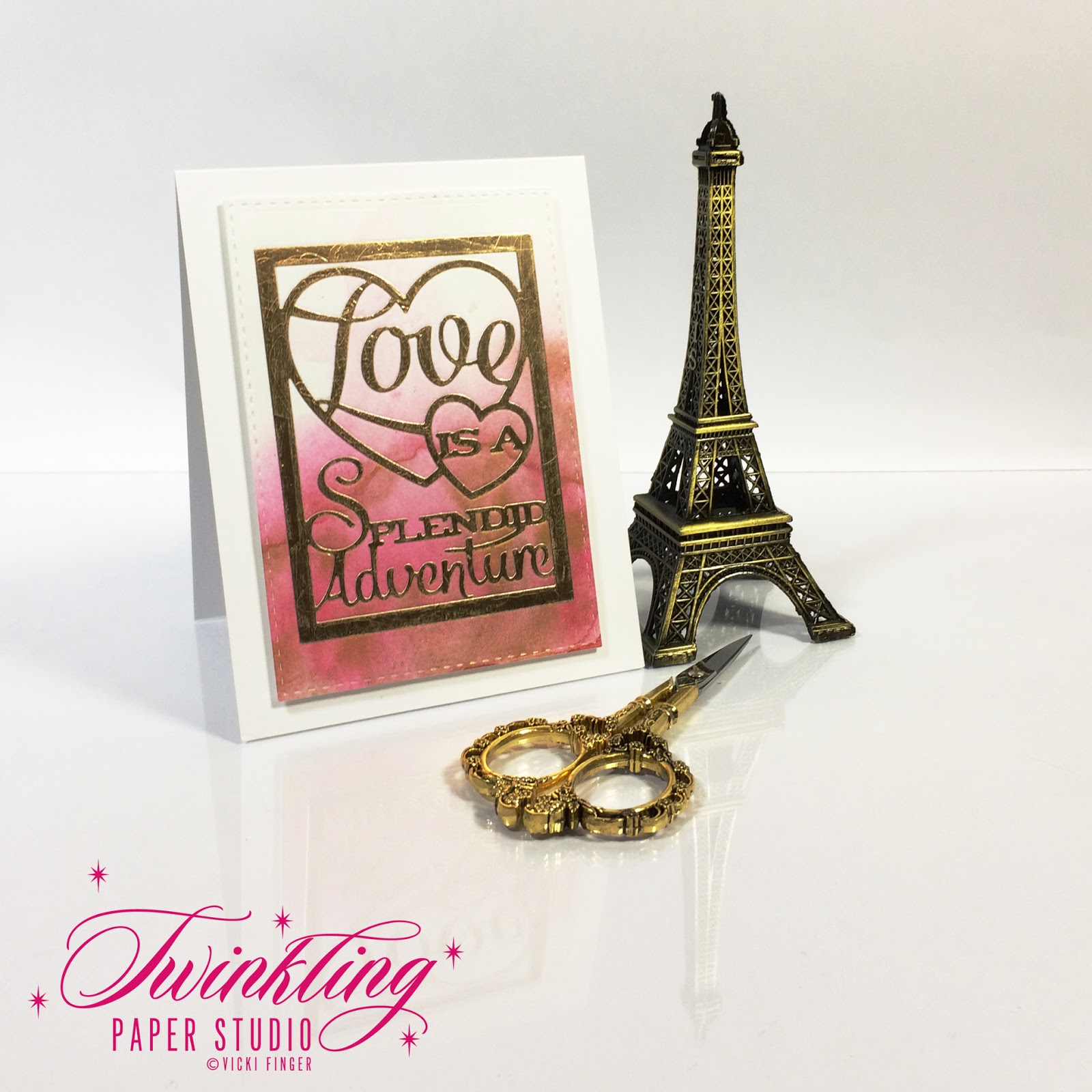
I love how the pink one came out and it is my favorite.  After I trimmed down my panel with a stitched rectangle, I lost one of those veins that I like so much but there is still one left that is really visible. Since we are attending a wedding in Texas this weekend and I have been working on a scrapbook album for the bride, I have lots of love themed things still laying on my desk.  I thought that I would make a card to tuck into the album so I die cut the Love Text Block from Gold Paper to match my Gold Watercolor.  Since the text block has a lot of open space, it was the perfect fit to show off the watercolor wash in the background.


My husband's favorite color is Orange, so I am planning to give this one to him at the start of our "Weekend Adventure".  Traveling anywhere with him is always an adventure and not always one that is fun. Sometimes I just want to get there without the adventure but I'm trying to be a good sport about this one because we have plenty of time to get there.  So, a little side adventure won't be any big deal.

Thank you so much for stopping by to see my cards for this week's Make It Monday Challenge. Have a great weekend everyone!

Tuesday, April 4, 2017

Papertrey Ink Make It Monday#280

This week for the Papertrey Ink Make It Monday Challenge#280, we are using a technique called Stamping Outside of the Box hosted by Lexi Daly.  You can find her video here. This is a very simple way to highlight your focal image.


My card uses Fresh Bouquet Stamps with the coordinating die and was stamped in Sweet Blush, Berry Sorbet and Vintage Jadeite for the leaves.  My card base is made from Sweet Blush Cardstock, the background panel is Pale Peony and the "box" is cut from Stamper's Select White with a bit of ink blending in Pale Peony.  I used a Simon Says Stamp Stitched Rectangle Die in the largest size and a mid sized Stitched Square Stax Die from My Favorite Things.  The greeting from Botanical Blocks was stamped onto the Banner Die from Tag Sale: Quilted using Versamark and heat embossed with Antique Gold Embossing Powder.

Whenever I get out the Fresh Bouquet stamp and die set, I always cut several and stamp them while I have the supplies out.  Since I like to heat emboss the outline part of the image before I stamp it, this takes a bit more time to do.  I just do a variety of colors that I like and that way when I need to pull a card together quickly, I have some of these ready to go.

Be sure to stop over to the Papertrey Ink Blog to see everyone's projects!  There are sure to be some fantastic cards!

Monday, February 27, 2017

Make it Monday #276 - Kraft with Colored Pencils

This week for the Papertrey Ink Make It Monday #276, Melissa Phillips showed us a technique using Colored Pencils on Kraft Cardstock. Melissa used White Heat Embossing for her projects and I did try that but ultimately decided I liked the Gold Heat Embossing much more (big surprise, I know).  I was actually surprised at how well the colored pencils show up on the Kraft and the Black.  For both of the projects shown here, I used Faber Castell Polychromo Pencils and Derwent Studio Colored Pencil in Olive Green for the foliage.  Melissa also mentioned wondering how this technique worked on black cardstock so I gave that a try.  

For the first card, I used gold heat embossing with Library Ledger Patterned Paper, Stamper's Select Vellum and Rustic White Cardstock. The ribbon is a bit of Grosgrain Stampin' Up Ribbon I already had on hand in Tempting Turquoise.

The second card uses the same Rustic White Cardstock for the card base, Smokey Shadow Cardstock that was stamped tone-on-tone with Smokey Shadow Ink using a background stamp that I've had for several years, and another panel of vellum to help soften that up. I stamped the same Poppy from Botanical Blocks III onto True Black Cardstock, coloring it with Polychromo Pencils.  The "Praying For You" sentiment that is stamped onto the vellum is part of the same stamp set.

Faber Castell Polychromo Pencils are different than other colored pencils in that they have a very hard lead which can be sharpened to a very sharp point that doesn't break too easily.  Lot of folks like Prismacolor Pencils for their blendability while others like Polychromos for their ability to put in the fine details.  I also have a different set of Derwent Inktense Watercolor Pencils that worked nicely on the Kraft Cardstock.

I really like the way these cards turned out and that the challenge stretched me outside of my "normal" box - whatever that is.  Gold heat embossing is my "normal".  Some people like yellow gold jewelry, others like white gold and still others prefer to have lots of costume jewelry in a variety of colors and finishes.   In real life and in cards, I'm a yellow gold kind of girl.  I'd rather have less of the good stuff than more of the costume jewelry.  Neither way is wrong, it just depends on the person.

You can stop by Nichole's blog to see Melissa's Video Tutorial and all of the projects that everyone adds to the link up all week.  Have a great week, everyone!