Monday, August 28, 2017

Papertrey Ink's Stamp-A-Faire 2017 Take Ten Challenge

Hello all!  As some of you know I have been taking a class this summer and it has kept me so busy that I've barely had time to make any cards much less participate in other challenges. I wasn't home this weekend to participate in Papertrey Ink's Stamp-A-Faire event although I have finally gotten to watch all the videos since we got home last night about 5:00 p.m.  Now I need to go through each one of them again and see if I have the materials needed to try each of the projects.  I did get a project finished on Friday Night for the very first challenge called "Take 10 Warm Up Challenge".

This project is quite large as it has been framed in a 16 x 16 frame with a mat.  I had been experimenting for several days with using clear embossing powder on ink jet printing and when I saw the Inspiration Image on the left, that was just the push I needed to finish this project up.  I had already ordered the frame and gotten the black mat cut the night before.


For the most important part of this project, I treated the vellum with my version of a powder tool (Baby Powder with a fluffy brush) onto a Piece of 44# Vellum from Papertrey Ink.  I had several trial versions of this in the 4 days before Stamp-A-Faire started; I think I used (wasted) about 10 sheets of vellum until I found a way to print and emboss the saying in a way that was acceptable to me. Vellum is definitely on my next shopping list from Papertrey.  The way I got it to work the best was to print in presentation mode with "best" quality. That meant the ink was still very wet when the vellum came out of the printer so you have to be careful not to touch it.  I poured clear embossing powder on top of the ink and carefully heat set that, moving my heat tool around a lot so I wouldn't scorch the paper or embossing powder. You also have to be very careful not to warp your paper if you decide to try this. The mat is black with a black core (most mats come with a white core). To maintain the translucence of the vellum, I completely covered the back of the half sheet with Stick It Adhesive.  I went over this thoroughly with my Teflon bone folder to smooth out any air bubbles. I removed the release paper from the back and carefully set it in place over the globes of the Black, White and Gold background paper. The little photos corners cut from gold mirror board using Papertrey Ink's Mix & Mat Herringbone was the perfect touch!  After that, I only had to assemble everything in the frame and my project was finished.

As I mentioned, this is a birthday gift for my daughter whose birthday was Friday the 25th.  Even though I knew we would see her at the wedding we attended this past weekend, I couldn't take it as they didn't have enough room in their vehicle to take this and her other gifts home.  We'll be making a trip to their house next month and will take all of her goodies with us then.

I will be finished with all my class work and take my final on Friday of this week, so I am still super busy.  And then comes the practical application but I'm looking forward to having time to participate in more of the challenges.  In the meantime, I hope you all are having a peaceful time getting your kids back to school!

Thursday, August 17, 2017

Gold IS The New Black!

I don't often buy patterned paper because I mostly use solid color cardstock. Recently I went looking for some patterned paper at Hobby Lobby while they were having a 50% off sale.  I found so many cool papers to add to my stash and a lot of them have themes that will work great for guys.  Many of the papers in this collection (more than half) have gold foil accents and you know how much I love that!  For me, Gold is as basic a color as black and is also the perfect neutral.  I wouldn't be without black cardstock in my supplies and the same is true of gold for me.  It adds an instant touch of class and elegance to any card.

I picked up two paper pads from The Paper Studio (Hobby Lobby's Brand) in the 4.5 x 6.5 size pads.  One is called "The Getaway" and has lots of maps and travel themed papers all done in black & white with half of them having gold foil accents. The other is called "Black Tie Optional", again with many gold foiled accents. I split these out when I get them home and store them in a big 12 x 12 Cropper Hopper Paper Holder.  The plain Black and White patterns (without gold) go in one section of the Paper Holder and the ones that do have gold accents go in another pocket in the same Paper Holder. These particular paper holders have three pockets; a full 12 inch pocket in the middle with half pockets on the front and back.  These work well for the smaller sized papers.  I have extra folders from my scrapbooking days so I haven't had to buy any new ones although I could really use a better way to store them.  The ones I use all the time are sitting upright on the floor next to my desk.  I have to walk around them constantly. Eventually, I hope to be in a place where I can get better organized and geared more toward card making than scrapbooking.


Now, on to my card for the Stamps, Ink, Paper Challenge #112.  The map paper is one from "The Getaway" paper pad.  Cutting narrow strips from another sheet of paper so that the words "Not All Who Wander Are Lost" could be repeated a few times down the front of my card.  I made my card base quite a bit larger than A2 Sized so that I didn't have to waste any of the paper.  I actually had a couple of this size card bases laying around from when I was working on a Wedding Card for my niece so I am planning to make another card in this size. I ended up using a specialty cardstock for my niece's card but not wanting to waste my good cardstock, I kept these to use another time.  I just didn't know that would happen so soon.

The sentiment came from a different 12 x 12 paper pad from Die Cuts With a View Gold & White Premium Stack.  There's a full sheet of sentiments that can be cut up for cards like I did on this one.  The rest of the card was adhered directly to the card base but I mounted the sentiment strip with Foam Tape. Even though the gold doesn't photograph all that well, this is a really striking card and I will definitely use all of these papers again.  Have a great day and I'll be back soon.

This card was chosen as a Winner at Stamps Ink Paper!

Wednesday, August 16, 2017

Papertrey Ink August 2017 Create Along With Us

I am here today with a card I made for this month's Create Along With Us at Papertrey Ink.  I was inspired by Nichole's card using Beautiful Berries Autumn set pictured here. Nichole stamped her sentiment and berries directly onto a panel of Vintage Cream Cardstock.  It's hard to choose a single project each month to create because there are so many great ones.

I love the color of Autumn Rose Cardstock and Ink from Papertrey so I wanted to try to create a similar feeling card. Since the new products were just released last night, I don't have the Autumn Berries but I decided to use Beautiful Berries: Spring for my card. Betsy Veldman designed all of the stamps in the Beautiful Berries series and I can hardly wait to see the Winter version that will be coming in a few months.  

I started by die cutting two of the largest berry filled branches from white cardstock and then used the die cut negative as my placeholder in my Mini MISTI while I stamped the various layers.  I used Ripe Avocado for the first layer of foliage followed by New Leaf.  Prairie Grass would have been a better color but I actually just ordered that and I don't have it yet.  I tried Olive Twist but that wasn't right either so I stuck with New Leaf.  I'm looking forward to the addition of Prairie Grass to my Ink Cube Collection.


I used Autumn Rose for my top folding card base and my berries and accented with Scarlet Jewel. The Cover Plate: Stitched made the perfect backdrop for my berries and my sentiment.  I adhered the sentiment directly to the card base with Ranger Multi Medium Matte and popped the branches up on Thin 3D Foam Squares and that completed my card.  I looked at adding some Nuvo Drops or Liquid Pearls as Nichole did, but I felt the background was already busy enough with the stitching detail.

I buy ink cubes with a refill because they are more economical, easier for me to use than large ink pads and I really like that I have a choice when it comes to inks.  Because I've only invested in cubes at this point, I am able to have a wide variety of colors in a few different brands.  There are so many ink choices out there!  I had to just choose a couple of brands and stick with my decision. My one exception to size is the Distress Oxide Inks and only because they aren't making them in cubes. It has something to do with the stability of the ink formulation on such a small surface, but since its the only option, I'm glad they are only introducing the colors 12 at a time.

I am still swamped with work for my class and I have a few more weeks of instruction. Then I have to finish all the homework and take the final exam. I hope my crazy schedule gets back to normal by then. Right now I barely have time to think let alone make a card and write a blog post.  I miss doing the various challenges so I took some time today to participate in this one. Thank you for stopping by and I hope you'll come back soon!

Friday, August 11, 2017

Cards for Friends

Hello everyone!  My blog is being a bit neglected right now while I am taking a class.  I got way more than I bargained for and spend several hours a day and pretty much my entire weekends doing my homework.  I think in the end that I will be happy I took this class, but it's keeping me so busy I have not had as much time to spend making cards and participating in challenges.  I am taking a break this morning long enough to write this post.  I'm also hoping to have a few more in the next 3 or 4 days.

Today's card is for a challenge that is new to me called CAS-ual Fridays. CAS-ual Fridays is another stamp company.  I don't have any of their products but by participating in their challenges I have a chance to win some.  I have seen quite a few of their products that I would like to have. This week's challenge is to make a card for a friend. This card was made to send to one of my best friends in Texas. I have learned to love stamping but I still like an occasional card made using only die cuts which is what I did here. Once the die cutting is done you can get right to assembly.


I have these pretty coordinating papers and I wanted to use them together to create a card.  The papers all come from a collection from Hobby Lobby's Paper Studio Line called "Mint To Be Fab". Half of the papers in this pack have gold foiling on them and ya'll know how much I love my Gold. The papers are done in shades of peach and mint for the most part although there are several black and white patterns that will work well for masculine cards.

I started my card by making a top folding card base from Stamper's Select White Cardstock.  I used a variety of dies to create my card starting with MFT's Blueprints 15 for the background Stitched Rectangle Panel.  The vertical piece was die cut using MFT's Horizontal Stitched Strips, matted with a thin Gold Foiled Border, and the banners were cut using the Tag Sale: Quilted Die from Papertrey Ink. I cut about half of the banner 6 times so all of the gold triangles were facing the same direction.

To keep everything simple, I used a Prima Hydrangea Flower with a little jewel added to the center and die cut the Simon Says Stamp Smile Circle Die.  I really wanted a vertical word but I don't have any.  In fact, I don't remember seeing any so I'm thinking I need to design a few.

This card was originally made for The Challenge Sketch this week but The Challenge has come to an end for now. Lesley has a new baby girl and is finding it impossible to keep running The Challenge while being a new mom.  Family comes before everything else and she'll still be doing her Sugar Pea and Verve Design Teams. I'm also not doing much linking to products at this time but will get back to it as soon as I possibly can.  In the interim, there are links in my sidebar to Simon Says Stamp, Papertrey Ink, Altenew and Concord & 9th.  For now, I better get back to my homework.  I'm hoping to have a new card for tomorrow as well!

Thank you so much for stopping by today.  Please bear with me while I am taking this class.  It will be finishing up in about 1 month.

Friday, August 4, 2017

Neutrals With Texture

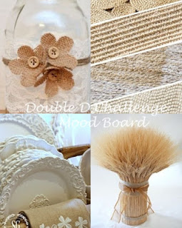
Double D Challenges has a new theme up this week for the bi-weekly challenge. This time around the theme is Tan/Neutrals such as Cream, Kraft, Off White, Tan and Beige with Texture.  I don't always have time to participate at Double D but I liked the "Textural " challenge because I forget, (often) to add texture to my cards for a bit more visual interest.

Sadly, it has been a week where I needed to send some "paper hugs" to a couple of friends and I used this challenge to create the second card this morning.  

For my card, I started with a Card Base made from Papertrey Ink Classic Kraft Cardstock.  Next I die cut a panel of Papertrey Ink Rustic White Cardstock and used an Anna Griffin "Foundry" Embossing Folder to add texture to the background. Rustic White Cardstock is an "Eggshell" colored cardstock with some specks of tan color in it. I misted this all over with Iridescent Gold Glimmer Mist from Tattered Angels. Once it dries, it is easy to adhere it to the card base.


While I was waiting for the Rustic White panel to dry, I die cut all of the flowers from Spellbinders Urban Blooms Dies using Vintage Cream Cardstock from Papertrey Ink. I also cut two of the vines from Spellbinders Romantic Vines Dies.  Using a Mini Round Ink Blending Tool, I just touched the tips of the petals and leaves with Vintage Photo Distress Oxide Ink, then misted them with Glimmer Mist and set them aside to dry for a few minutes while I fished out a cream colored button for the flower center.

I cut a label from the Stampin' Up Labels Collection.  I've had this set of dies for several years and I don't know if it's still available.  I stamped the sentiment from the Simon Says Stamp Friendship Blooms Stamp Set and heat embossed it with Simon Says Stamp Antique Gold Embossing Powder.  I did a bit of distressing on the outside edges with Vintage Photo Distress Oxide Inks and gave it a mist of Glimmer Mist as well. I would have to say that Shimmer/Glimmer Mist is my very favorite accessory.  Because this is a card for a somewhat somber event, I wanted to keep the look soft and understated. The Sparkle Shimmer Mist that I use often is much more attention grabbing. I assembled the flower with glue dots and put the button in the center then fluffed up the petals a bit.  I mounted the label using Thin 3D Foam Squares and everything else using Ranger Multi Medium Matte.  Because the button is fairly thick, I am planning to mail this card in a padded mailer with a bit of extra postage.

Thank you so much for stopping in to see my project today.  There will be lots more projects at the Double D Challenge so be sure to stop and take a look.

Thursday, August 3, 2017

The Color Throwdown #454

I have a clean and simple card for The Color Throwdown Challenge #454 this week. One of my closer friends in Texas has been in the hospital this week with some awful bacterial infection that is leaving her totally dehydrated among other things so I wanted to get a card put together to mail her this morning. Jenica is partly responsible for my card making by introducing me to stamping many years ago. I always loved the instant gratification of card making but I was not very good at stamping. I'm a lot better at stamping now although I didn't do too much stamping today.  The challenge colors for this week are Green, Kraft and White.

There's nothing in the least bit complicated in this card. The background is a Kraft/White patterned paper, the green flourish is from a scrap and the sentiment was stamped in Versamark on a scrap of white cardstock. I heat set that with Antique Gold Embossing Powder and then die cut it with a label die.


Occasionally, I like to do more involved card making, but when I need something fast and easy, I try to let the patterned papers do most of the work for me.  I used Papertrey Ink Classic Kraft Cardstock for my card base.  I die cut the patterned paper using My Favorite Things Blueprints #15 Stitched Rectangle Die. I got this die because of it's specific measurements being 4 1/8th by 5 3/8ths inches which leaves a narrow mat around the outside of the stitched rectangle, showing the color of your card base.  I have one just under this size and one just over this size from two other sets. The flourish is an old Boss Kuts die and in fact, I had taken the foam off of the die. With Boss Kuts, this doesn't work because it is sticky under that foam so I grabbed a scrap of 2 mm White Fun Foam and ran it through my little Sidekick die cutting machine, effectively re-foaming it. Thankfully, this worked. With my old QuickKutz dies, they don't work very well unless you take the foam off of them but I hadn't realized the Boss Kuts would be different.  It's a good thing I had some fun foam on hand.

Have a great day everyone and I hope you see that a simple card can still make an impact.

The Challenge #94


Hello Everyone!  Today's card is for The Challenge #94 over at the Always Playing With Paper Blog.  There are some gorgeous cards over on Lesley's Blog, so be sure to go over there and check them out. We have a guest designer this week as well, Kerin Sylvester.

ETA - Ha ha!  Just Kidding! The joke is on me. I changed my card but didn't get the new one to Lesley in time so there's another one over on her blog!

As you can see, I used the Inspiration Image Colors for my card. I have these fun foiled papers in Pink and Turquoise, so I decided to use them and let them be the "star" this week. These Papers are all from The Paper Studio (Hobby Lobby's brand) and I have them in 8.5 x 11 and a 6x6 Paper Pack. The large Polka Dot is from the 6 x 6 pad.  I created a card base that is 5.5 inches square so that I could use a larger background panel of the large polka dots.  I wanted a totally fun feel, just like the inspiration image and the Polka Dots do that for sure.  For the layers, I die cut those panels using some Simon Says Stamp Stitched Rectangle Dies.  In fact, both of those pieces had a balloon shape cut from the center of the panel but I knew the large flower would cover it up so I could go ahead and use them.  I always save my paper scraps for just such an occasion and these foiled papers even have their own pouch.  The colors are the same from the larger pad to the smaller, so it works great to store them together.

The flowers are white ones from Prima and were colored with color sprays. The center turquoise flower also has some gold watercolor spatter on it and the jeweled brad is one I've had around for quite a while; maybe as long as 10 years. I was excited to get to use it finally! 

For the card I made first, I used the Nature theme with similar color families.  I hope you enjoy both of my cards! 


There are so many great Design Team cards to inspire you at Lesley's Blog, so go ahead and check them out here.  We hope you'll join us this week! As always, thank you for stopping by to see my project!  Here's a list of The Challenge Designers.  Be sure to check out their blogs for details.  

Lesley Croghan (Challenge Creator)