Showing posts with label The Color Throwdown. Show all posts

Sunday, December 3, 2017

Color Throwdown #471

Today's card is for The Color Throwdown Challenge #471 where we are to use Grey, Gold, Black, and White for this challenge. Normally, I wouldn't think to put these colors together but when I saw the inspiration photo it reminded me (for a still unknown reason) of this really unusual Christmas paper that I have which has gold foil on a grey background.  I thought it would work great for this challenge!  The Simon Says Stamp Wednesday Challenge is Anything Goes This Week and they are featuring Tim Holtz Products so I will also be linking up over there.  I keep thinking of a few more folks that I would like to send a holiday card to and that is what most of the challenges are right now, so it's working great for me to keep making them.


I always enjoy doing techniques but right now I am  focusing on making my cards using some of the beautiful foiled papers I have in my supplies.  I do love my gold and they make it so easy to pull a card together quickly for the most part.


For this card, I selected the foiled background paper and built the design around that for this challenge.  The color of the paper is a perfect match to Papertrey Ink Soft Stone Cardstock but I wanted more contrast that that without being too dark so I also cut a mat for that paper from SU! Smoky Slate Cardstock which is a medium grey color.  My card base is made from Papertrey Ink True Black Cardstock.

I wanted to give the impression that one of the trees was in front of (or closer) than the other so I used the Tim Holtz Woodland Dies and cut 4 layers from True Black Cardstock and glued them one on top of the other, then ran a 4.25 inch piece of gold cardstock through my Xyron 5" Creation Station Sticker Maker.  I die cut the sticky paper using the same Woodlands Dies.  This was a lot easier that trying to add dots of glue and is more affordable than using Stick-It adhesive sheets.  I personally don't have that much success with Stick It because I can't seem to get the release paper off.  I still have some Xyron Refills on hand and I'm thinking I might start using it more again.  I used to use it all the time for scrapbooking.  It definitely works better if you make your paper sticky and then die cut it.  Most of the time, Ranger Multi Medium Matte is okay, but it was easier to do it this way for so many layers and such intricate die cuts.  I used glue for the black ones but I was happy that I had done the Xyron for the gold layers.


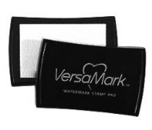
The sentiment was stamped in Versamark onto a scrap of white cardstock and heat set with Simon Says Stamp Antique Gold Embossing Powder three times to make it really stand out and pop.  I adhered it with Thin 3D Foam Squares.

This is a clean and simple card with a lot of visual impact and the colors would make it a great choice for a masculine Christmas Card.  It is elegant without being too fussy.  This paper came from the DCWV Cranberry Christmas Mat Stack found at Michaels.  You can see it all online here but it is only available in stores at this time.

Thanks so much for stopping by.  The supplies I used are linked below for your convenience.

Simon Says Stamp Antique Gold Embossing Powder
Shop at:
SSS
Simon Says Stamp Maliblue
Shop at:
SSS
Simon Says Stamp Stitched Rectangles Dies
Shop at:
SSS
Scrapbook Adhesives Thin 3D Foam Squares
Shop at:
SSS
Papertrey Ink Keep it Simple Frames
Shop at:
PTI
Versamark Ink
Versamark Ink
Shop at:
PTI | SSS
Wagner Heat Tool
Wagner Heat Tool
Shop at:
SSS
Ranger Multi Medium Matte
Shop at:
SSS
Papertrey Ink True Black Cardstock
Shop at:
PTI
Tim Holtz Woodlands Thinlits
Shop at:
SSS

Saturday, September 9, 2017

The Color Throwdown #459

© Lynn Put
I always love Black, White & Red Color Combinations so I had to play along with this week's Color Throwdown Challenge. The Design Team had lots of inspiration and I had thought I would use Papertrey Ink's "Gran's Garden" for this challenge. That was before I saw Lynn Put's Design (The Queen's Scene) on Instagram Wednesday Night.  That was a tough act to follow since she also used Gran's Garden to make her gorgeous card! This card was quite the topic of conversation on the Papertrey Forum yesterday but I have long admired Lynn's work. I mentioned that I would need to come up with a new game plan and I was basically challenged to use the same stamp set as Lynn (like I originally intended to) and put my own spin on it. So I gave it a whirl.

I started with a card base made from True Black Cardstock.  I die cut a panel of White with Black and Gold Polka Dot Patterned Paper for the background. The Gold dots are metallic.  I also cut several of each of the die cuts for the Gran's Garden Stamps from Stamper's Select White Cardstock and a Spellbinders Floral Oval frame from gold metallic cardstock.

Using one of the negatives from the Gran's Garden die cuts with my Mini Misti, I stamped the leaves first using Smokey Shadow Ink and then the blooms using Pure Poppy and Scarlet Jewel. For the very center dots on the flowers I stamped them in Versamark and heat set using Antique Gold Embossing Powder. so that I could tie in my stamped elements with the gold foiled frame.  A little reminder here to let the ink DRY before doing this or it makes a mess of the embossing powder. Guess who forgot and also forgot to use the powder tool on the first round! Its a good thing I had stamped extras.

Once I had the embossing done, I sat down with all the pieces to make my arrangement. Once I had it how I wanted, I put a piece of Press N Seal over the top and then picked it up and flipped it over to put adhesive on the back. I used Ranger Multi Medium Matte and put several dots on the back side of the pieces then placed the whole thing in position on my card front.  This doesn't get glue every where you need it, but it does keep your arrangement intact so you can place additional dots of glue where needed. as long as you give the adhesive a minute to set first.  I have a Small ScraPerfect No Clog Writing Tip on mine which lets me have access to my die cuts with it's longer tip. The one I linked to here is for the .5 oz bottle of Multi Medium Matte.  Simon also carries a Medium ScrapPerfect No Clog Tip for the 2 oz. bottles of several other adhesives like Glossy Accents.  I have been using the same tip on each of my bottles for about 18 months now and I love them. With the little Quilled Creations Tip, I tore it about a week in, so I had to look for a more durable alternative and this has been it. The price is the same too, so I've been super happy with the durability of it. Anytime I get a new bottle of adhesive, I just soak it for a few minutes in warm water and then rinse it clean before I put it on the bottle.


The sentiment is one that I stamp lots of at one time and is my favorite for many of the cards I send.  Its from the Altenew Beautiful Day Stamp Set and I stamped in onto a banner from Number the Stars Banner Die.  I actually like this a bit better before I snipped off what was hanging over the edge of my card, but it wouldn't have fit into the envelope if I would have left it there.  Since I made my card base from black cardstock, I also put a white panel on the inside of the card for a message.

Thanks for stopping in to see my project today.  Be sure to stop and see all of  the projects at The Color Throwdown Challenge Blog.

Thursday, August 3, 2017

The Color Throwdown #454

I have a clean and simple card for The Color Throwdown Challenge #454 this week. One of my closer friends in Texas has been in the hospital this week with some awful bacterial infection that is leaving her totally dehydrated among other things so I wanted to get a card put together to mail her this morning. Jenica is partly responsible for my card making by introducing me to stamping many years ago. I always loved the instant gratification of card making but I was not very good at stamping. I'm a lot better at stamping now although I didn't do too much stamping today.  The challenge colors for this week are Green, Kraft and White.

There's nothing in the least bit complicated in this card. The background is a Kraft/White patterned paper, the green flourish is from a scrap and the sentiment was stamped in Versamark on a scrap of white cardstock. I heat set that with Antique Gold Embossing Powder and then die cut it with a label die.


Occasionally, I like to do more involved card making, but when I need something fast and easy, I try to let the patterned papers do most of the work for me.  I used Papertrey Ink Classic Kraft Cardstock for my card base.  I die cut the patterned paper using My Favorite Things Blueprints #15 Stitched Rectangle Die. I got this die because of it's specific measurements being 4 1/8th by 5 3/8ths inches which leaves a narrow mat around the outside of the stitched rectangle, showing the color of your card base.  I have one just under this size and one just over this size from two other sets. The flourish is an old Boss Kuts die and in fact, I had taken the foam off of the die. With Boss Kuts, this doesn't work because it is sticky under that foam so I grabbed a scrap of 2 mm White Fun Foam and ran it through my little Sidekick die cutting machine, effectively re-foaming it. Thankfully, this worked. With my old QuickKutz dies, they don't work very well unless you take the foam off of them but I hadn't realized the Boss Kuts would be different.  It's a good thing I had some fun foam on hand.

Have a great day everyone and I hope you see that a simple card can still make an impact.

Monday, July 17, 2017

The Color Throwdown & Fusion Challenge

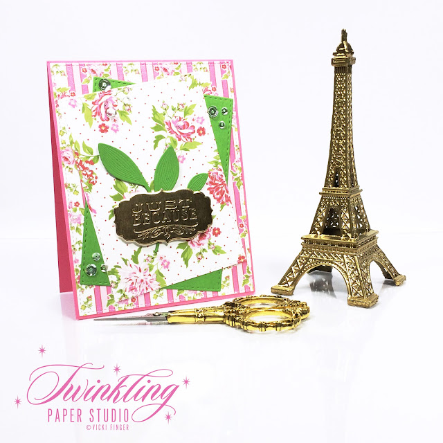
I am popping in with a quick card this morning. I made this card yesterday but I didn't photograph it until this morning. The Color Throwdown #451 has these pretty colors of dark pink, light pink, green and white.  The Fusion Challenge has a great sketch this week and I wanted to try mixing a couple different patterned papers which I am not that great at doing.  I wanted to give it a shot so I selected two coordinating patterned papers and decided to incorporate the two challenges into one card by combining the key elements of color and sketch.
I started with a top folding card base made from Hibiscus Burst Card Stock. I die cut the My Favorite Things Stitched Rectangle from Blueprints #15 from the pink and rose striped paper for my background layer.  Next I cut two smaller Stitched Rectangles using the second largest of the Simon Says Stamp Stitched Rectangle Dies; one from a different patterned paper and one from New Leaf Cardstock.  I adhered everything using the sketch as my layout design.  I wanted something simple to bring that pop of green onto the foreground so I die cut one of the Spellbinders Romantic Leaves and then popped the sentiment on top of that.


I finished off the card with a few sparkling clear sequins from Simon Says Stamp.  The ones I have are an assortment of sizes in one package which works best for how I use them.

This is it for now.  I have a few other projects on my desk this morning to finish but I am getting dental work done this afternoon so I don't know if I'll be back today or not.  I might come back and work until the anesthesia wears off.  LOL! Have a great day everyone!  I hope you'll come back soon.

Monday, February 6, 2017

Love You, Yes I Do!

Today I have one card for three different Challenges.  The Color Throwdown Challenge #428, Inspired By All The Little Things #42 and one for the Simon Says Stamp Flickr Challenge #64, "Love Is In The Air". I keep thinking I am done making all of my Valentine's Day Cards, but there are still a lot of challenges for those color schemes and occasions.  I'll be honest with you - I really wasn't too sure about this color combo until I started trying to pull this card together.  The inspiration images are fantastic but it isn't a typical palette in my arsenal.  I do the challenges to stretch myself artistically and that was certainly true for these colors.  I saw a picture in the last day or two where someone had made soft pink marshmallows that were peppermint flavored. Doesn't that just sound delicious? You could cut them in any shape you want including little hearts. It makes me want to run to Starbucks for the biggest hot chocolate on the menu!

I have made so many Valentine's Day cards for my girlfriends but I thought of one more today that I wanted to make and this will be perfect for her.

I started my card by creating a top folding card base from Stamper's Select White Cardstock. Next, I embossed a 4.25 x 5.5 piece of Dark Chocolate Cardstock with a wood grained embossing folder and then cut it with the largest Simon Says Stamp Stitched Rectangle Dies.  I love the clean finished edge that using a die gives to paper. There's never a raggedy edge from a dull paper trimmer. I use my Stitched Rectangles Dies more than any other dies I have.  In fact, I use them so much that I'm beginning to wonder if I can wear one out!!

Using the Simon Says Stamp All About Love Stamp Set (No longer Available), I stamped the letters in Versamark and heat embossed with Antique Gold Embossing Powder. I used my Cherub Hearts Dies from Memory Box to cut the heart from Pure Poppy Cardstock.


The tulips are a stamp set from Papertrey Ink called Tulip Time and I have the coordinating dies. The easiest way to stamp these is with the MISTI Tool because there are lots of layers.  I place the die cut negative in the MISTI and then lay the positive piece back into the negative. For these, I stamped the lightest layer in Sweet Blush, the medium layer in Pure Poppy and the darkest color in Scarlet Jewel. The leaves are stamped with Vintage Jadeite and New Leaf Inks, all from Papertrey Ink.

I attached the wood grain background to my card base with ATG Adhesive and then I attached the Love Panel and the Tulips with Foam Tape.  That finishes up this card.

I hope you like my interpretation of the inspiration images. I'm glad you spent a few minutes here on my blog today and if you'd like to leave a comment, I really appreciate each one of them.  Have a happy Monday everyone!

Sunday, August 28, 2016

Color Throwdown #407

Hey everybody!  I have a quick (hopefully) post today for the Color Throwdown Challenge #407, in the colors Teal, Lime Green and Yellow. What a bright summery combination this is for the challenge.

Once again, I fell in love with Wanda Guess's project this week as the Guest Designer for August over at The Color Throwdown, so I wanted to make something in similar colors. I started by stamping this Pen Pattern Butterfly from Stampendous onto a piece of Canson Bristol Watercolor Paper and heat embossed it using Ranger Gold Tinsel Embossing Powder.   There are coordinating dies for this set but I didn't use them today.  They are really nice and cut right up to the edge without leaving a white border.

I am currently stocking up on my glittered embossing powders (Ranger Gold Tinsel, WOW! Platinum Sparkle and WOW! Neutral Ultra Shimmer) because last year I waited too long before ordering and everything was out of stock when I wanted to make my Christmas Cards. I'm also making sure that I have plenty of Simon Says Stamp Antique Gold Embossing Powder because that is my favorite warm gold embossing powder.  I also really like the Simon Says Stamp Gold Embossing Powder but I tend to use the warmer tone more often.  I heat emboss on pretty much every single card I make! It is my favorite technique after stamping, of course.

For my color palette I used Persian Green (Teal) and May Green in Zig Clean Color Real Brush Markers with some Papertrey Bright Buttercup Ink smooshed onto an acrylic block and a waterbrush.  I love how Wanda has watercolored her paper and then cut her butterfly out of it and I think the butterfly I am using is actually large enough to do that with.  For some interest in the background, I used the mask that comes with the stamp set to protect my watercolored image and used a stencil brush to put a very soft layer of Aqua Mist Ink over the background.  I left the mask on and then created some spatter with a #4 Silver Black Velvet Round Brush by mixing a drop of Tropical Teal Reinker and a few drops of water then tapping the brush (really, it was more like whacking) against the handle of another brush. Once that dried, I created some additional spatter using my Finetec Gold Metallic Paint in Tibet Gold.  Can you tell I like spatter?  LOL! Once everything was dry, I cut the panel with the largest Simon Says Stamp Stitched Rectangles dies.


I cut a panel of Simon Says Stamp Audrey Blue Cardstock for a narrow mat around the main panel and mounted everything on top of a Top Folding 5.5 x 4.25 inch top folding note card made from Papertrey Ink Kraft Cardstock using my ATG.

I stamped the greeting from the Papertrey Ink "Scripted" Stamp Set onto the "Number the Stars Banner" die cut.  I also cut one from coaster board for the extra thickness and for the finishing touch I added some Gold Sequins from Pretty Pink Posh using Ranger Multi Medium Matte.

Thanks so much for stopping by to look at my project and double thanks if you take the time to comment! I have so many projects on my dersk right now so I will be back very soon!

Saturday, August 20, 2016

Color Throwdown #406

Hello everyone!  Today I created a card for the Color Throwdown Challenge #406 featuring Green, Orange and Light Pink with White. Actually, I created two cards while I had the supplies handy.

When I saw this card created by Wanda Guess, I loved it and looked around for a couple of minutes to see what I had that would be suitable for something in a similar color scheme. That meant I had to look at my patterned papers - something I don't have much of because I don't use them much. The patterned paper I used is from SEI and I got this pad of 6 x 6 papers at last year's scrapbook convention in Tulsa. This is one of those designs. Wanda used a Chartreuse cardstock for her card base and I don't have anything that color so I used some SU! cardstock in Wild Wasabi for my card base.  Wanda got her gingham paper from Amuse Studio but they no longer have it because I checked.  I know -- it's super cute!

When I started my project this morning, I wanted to compare 2 different brands of white embossing powders that I have so I heat embossed each image with one of the 2 so I could compare them.  One of the ones I have was "inherited" from a girlfriend but the WOW! Opaque Bright White Super Fine Embossing Powder was the hands down winner.  It melted really quickly and was super smooth.  I use a lot more clear embossing powder than I do of white so that it matches the color of my paper or cardstock perfectly but I wanted to use the white today because I know that is what Wanda used here.  The floral branch I used is from Altenew's Best Mom Stamp Set and has a coordinating die.  I love those Concord & 9th Stamp sets that Wanda used but I don't have either of them.  Wanda has great light in her studio.  The light in my studio is blocked by the three enormous pergolas on the west side of our house so I am using artificial lighting in my studio.  I can see out the windows just fine, but I don't ever have good light for photographs.

To color the blooms, I used Ripe Persimmon Distress Marker for one and Ripe Persimmon Distress Ink with just a hint of Zig Clean Color Real Brush Marker in Sugared Almond Pink.  You can't really see the pink in the photos so you'll just have to trust me that it's there.  I love Ripe Persimmon because it is orange with a touch of pink in it but it also has enough yellow in it to be a warm color.  It brings back so many sweet memories of spending the night with my great-grandmother when I was a really little girl.  She had a Persimmon tree in her yard.

Anyhow, sometimes when you add water to the mix you can get some golden edges but that happens more with the marker than with the ink from the pad.  I did one of each today. Smooshing the ink onto an acrylic block gave a higher concentration of color to my wash and not nearly as much variegation   The orange "hello" die cut is from Mama Elephant and I did a watercolor wash using the the ink from the Distress Ink Pad onto watercolor paper before die cutting it. The other is cut from plain watercolor paper.  I use Canson Bristol Watercolor Paper the most and one of the things I love about it is that it is a soft white rather than being cream colored. Since I'm not actually "painting" in a traditional sense, it works great for me.  I rarely use cream colored cardstock although I have a project coming up that might.


There's no special techniques here, just some ordinary coloring of the floral branch with some cute patterned papers that were die cut with coordinating dies and Simon Says Stamp Stitched Rectangles Dies.  I actually didn't use quite enough water with my inks to get a true watercolor feel, but these cards still turned out pretty just the same.  It's not my typical look but it was good to do something different.

Thank you so much for stopping by today. Be sure to check out Wanda's bog.  I linked it in the 1st sentence of the 2nd paragraph.

Tuesday, June 21, 2016

Color Throwdown #398

Hello everyone!  Last week I won The Color Throwdown Challenge #396 which means that this week, I get to be the guest designer for The Color Throwdown #398.  Using lots of bright color is always somewhat of a challenge for me so when I saw the challenge graphic, I knew I had to really get into gear and use some color! This image has some cool refreshment on a hot summer day and I wanted to be equal to that challenge. Doesn't it look just divine?

Last weekend we had picked up a yellow watermelon at our local Sprouts and my husband had cut it up last Friday night and put it in the fridge.  When I went to get some a little while ago, I found that it was pretty much slush, so I continued that trend by tossing it in my blender with some ice and a bit of Vanilla Rum.  This was a very small (personal sized) melon so there wasn't much there once it went into the blender since watermelons are 92% water. It was the perfect icy refreshment for a hot summer day.  Our heat index is only 95° today! It's been at 115° for the last few days.  Let's just say I'm glad I work inside. *Ü*

For my challenge card this week, I started with some Canson Bristol Watercolor Paper and the Papertrey Ink Painted Petals Stamp Set.  I had only used a sentiment from this set previously but I really wanted to give it a good test run for this card so I also pulled out my MISTI. One of the things I really like about using the MISTI is the ability to double stamp everything to get a really vibrant concentration of color.  This was just the thing I was looking for to create this card.  The colors in the inspiration image are soooo vibrant and I wanted to create a card equal to that.

The Painted Petals Stamp Set has 4 different flowers with between 4 and 5 layers for each one.  It's a way to use layered similar colors on an image.  The color interpretations for the challenge are Red Raspberry, Hot Pink, Lime Green and Yellow but I also threw some coral into the mix. You don't have to use the exact colors, just something in that vicinity.  My flowers are a combination of  Hibiscus Burst, Berry Sorbet, Pure Poppy, Scarlet Jewel, Raspberry Fizz, Vintage Jadeite with some Gold Embossing tossed in there for the "yellow" in the flowers.  I used SU!'s So Saffron Cardstock for the background panel.  By double stamping each of the colored layers, I was able to achieve this very vibrant color and by using the MISTI, I didn't goof them up when I was doing that.  When you use watercolor paper and you double stamp your images, that paper will stay damp longer than usual so don't forget to let the images dry all the way before you add that final layer of heat embossing to the blooms.  I almost forgot!  Once that part was done, I die cut everything using the coordinating Painted Petals Dies.


I made a top folding 5.5 x 4.25 inch card base from Stamper's Select White.  This is my absolute favorite, go to card stock.  It is #110 and super smooth.  Using the WPLUS9 Design Studio Sunshine Layers Dies, I cut a scalloped, stitched rectangle background panel from SU!'s So Saffron cardstock then arranged my flowers.  The "Sending" stamp from Painted Petals was a little large for my card design so I used the Simon Says Stamp Exclusive Sending Die with the Sunshine & Hugs sentiment stamp from Painted Petals.

I'm thinking of sending this card to a crafty friend in Europe who is not yet into these dog days of summer that we are experiencing here in the Southwest.  Have you seen how hot it has been in Arizona this year already? Crazy weather for sure.  If it's 115 actual degrees, how hot is the heat index?  My nephew posted yesterday that it was 115 degrees in Cottonwood, AZ where he lives. That is too hot for me!

I hope you all have a great week and be sure to check out the current challenge over at The Color Throwdown.  They have a new challenge every Wednesday.