Showing posts with label Distress Inks. Show all posts

Monday, March 27, 2017

Sunday Stamps Challenge # 149

This past week was not a great one for me creatively and the week before was a little bit sketchy as well.  I seem to be making up for it this weekend cranking out a record number of posts in just two days.

Last weekend, we ending up making a quick trip to Dallas to see our daughter and grandkids.  It was unexpected and a bit unplanned, so I forgot all about taking something to her that I'd made for her. When I came across it this morning I decided I would make a card for her so I could send them. After looking around at all the challenges that are currently going on, I quickly decided on a color scheme for my card following the inspiration image at the Sunday Stamps Challenge with the Rich Succulents Color Palette. Keep in mind they don't give us color names but ask us to follow the example to the best of our ability. The color is only ever going to be as good as your monitor or device and might be limited by the selection of colors in your crafty stash.  I have no cardstock or ink that is the same shade, color or value of green as the photo but I did the best I could with colors I do have.

I said once to a friend, that I would probably never use Ripe Avocado Cardstock and lately, the joke has been on me and I'm thinking I need to order another pack in the next month or two because it goes so well with so many colors.  The richness of this green pairs perfectly with the Sugarplum (purple shimmer) Cardstock.  Both colors are rich and regal.

Once again, I inked up the Simon Says Stamp Emma Background Stamp with Versamark and heat set it using Simon Says Stamp Antique Gold Embossing Powder.  One of the things that makes Ink Blending successful is a well used and loved foam on your ink blending tool.  It's always so much easier if it's not a new pad.  Seedless Preserves is my favorite color of Distress Ink, so mine gets used fairly often giving me well used pad.  My Distress Inks are the only inks that each have their own foam pad.  It fits right in the bottom of the ink cube and my Distress Oxide pads have a piece of Velcro on bottom to attach the foam to when I am finished using it. That way you just change out the pad and you don't need to have an actual tool for each color. I only have four Mini Ink Blending Tools and just change the foam pads out as needed. I could probably get by with just two as a matter of fact.  For the rest of my inks, I use one foam pad for each color family because I tend to have the same go to colors pretty consistently.  The Distress Oxide Inks blend so easily on cardstock or watercolor paper but for this card I used Stamper's Select White Cardstock. You can see it is a very seamless transition from one color to the next.

To get this particular look I start in the center of the panel and work my way out around the edges. Once I had the ink blending done, I misted it with some shimmer spritz then cut the panel with the 2nd largest Simon Says Stamp Stitched Rectangles Dies and cut a background panel from the Sugarplum Shimmer Cardstock using the largest rectangle from this same set.  I got this cardstock many years ago at a scrapbook store that is no longer in business. I'm pretty sure I've seen some similar to this at the Joann's or Michaels stores in Frisco, Texas but I haven't looked for several years. I do love the color so I need to remember to look next time I am there.  I stamped the greeting on a 1/2 inch wide piece of the same purple shimmer cardstock with the "Just A Note" sentiment from the Botanical Blocks Stamp Set from Papertrey Ink. The gold die cut flower is from Concord & 9th's Flutter and Floral Dies and lends itself well to the outlined background image.  There's also a butterfly die in the set if you prefer that.

Next, I made a top folding card base from Ripe Avocado Cardstock. I mounted the ink blended panel to the Sugarplum panel and then using a slightly smaller sized piece of Black Fun Foam, I mounted the background on to that using Scor-Tape (Sookwang Paper Tape).  I use 1 inch because it covers a lot of the surface but make sure of your placement before you press that down. It will ruin a card base if you try to move it.  Go slow and have an easy touch because once it's adhered, it is not going anywhere! I also used Black Foam Squares to pop the sentiment panel up just a bit.


The hardest part of this design is getting clean embossing.  I couldn't do it without my MISTI Stamping Tool or without using a powder tool of some kind. It doesn't matter what kind you use, only that you do.  And while I am at it, I try to heat emboss a few at a time.  I did not do that this time, but the stamp is still in my MISTI so I can stamp a few more tonight or tomorrow.  I am fortunate enough to have the MISTI Mini and MISTI Original and the background stamp does not fit in the Mini.  This stamp makes for an absolutely gorgeous, elegant card no matter what colors you choose.  You could use it on colored cardstock or color your own as I prefer to do.  As always, when I use a a darker card base, I cut another stitched rectangle to put on the inside of the card for my note. With these colors I used a cream colored panel but most of the time I use a white insert.

The supplies I used are linked in my post or you can find shopping links in the right hand sidebar. Thanks for stopping by and I hope you'll come back another day soon.

Sunday, December 11, 2016

Hoping Your Holidays Sparkle

Today's project is for the Simon Says Stamp Wednesday Challenge, the Simon Says Stamp Flickr Challenge #60, and the Muse Challenge #195. The theme at Simon Says Stamp this week is Ice Inspiration and Muse provided us with this lovely card to inspire our projects.

For my card I started with a 4.25 x 5.5 inch panel of Canson Bristol Watercolor Paper.  I love to use this for most of my card front panels because of how well it works for so many techniques such as the one I used here, Ink Blending.  The blend is far superior to anything I could do on cardstock, no matter how high the quality is. The Bristol Paper is smoother and takes color very well in addition to being able to stand up to the shimmer mist.  I started by using the Simon Says Stamp Snowflake Border Die to impress or emboss the design into my card stock.  You can do this by using an Embossing Sandwich in your die cutting machine.  It will emboss rather than cut. I also die cut three of the borders from Stamper's Select White Cardstock so that I could I put those together, stacking one on top of the other using a bit of spray adhesive between each layer. I keep a shallow box in my studio for just this purpose so I don't spray adhesive all over. This makes for a nice thick embellishment. Once I had that done, I gave it another coat of spray adhesive and sprinkled Nuvo Pure Sheen Glitter in the color Diamond all over it and set it aside to dry while I continued on my project.


Taking my embossed front panel, I did ink blending using Cracked Pistachio and Mermaid Lagoon Distress Inks all along the embossed area, letting it blend out very softly. Next, I die cut the panel with the largest Avery Elle Postage Stamp Die which gave it the decorative edge, but I kept the paper in the die while I took it to my desk and adhered the center panel to the frame using a bit of Micro-pore tape. You can use Washi Tape, Scotch Tape or whatever.  Micro-pore is what I had handy.  I just wanted to keep the center rectangle with the frame for this card. Next I used the Simon Says Stamp Snowflake Border Die on an extra rectangle to cut the top wavy piece so that I could pop it up on foam tape for added dimension.  I'm going to have to think of a better way to explain this.  I guess I should have taken some pictures along the way. It's just an extra interior rectangle piece from another project and I used it for the underneath piece so that I could pop up the top layer that had the ink blending on it. Clear as mud I'm guessing.  I'm planning to use this technique again soon on another project and I will try to take pictures along the way so you can see what I mean.  I wasn't sure it would work while I was making this card, but in real life, it is just gorgeous. You may be able to see it better in this image.


Once I had that done, I heat embossed my sentiment from the Sparkle & Shine: Holiday Additions Mini Stamp Set with Ranger Gold Tinsel Embossing Powder and assembled the card onto a top folding card base made from Simon Says Stamp Audrey Blue Cardstock. This is one of my absolute favorite colors. The front of the card got all all over spritzing with Tsukineko Sheer Shimmer Spritz and then I was able to set the glittered die cut snowflakes right into the impression that I had previously made using the embossing sandwich.  If I would have kept it one layer, it would have fit down inside and been flush but it pops up because I had the extra layers for thickness.  I finished it off with a few turquoise sequins!

Thank you for stopping by to see my project today and especially if you take time to comment on my post.  I have a very busy few weeks ahead with the holidays and family, but it's my goal to still have at least 3 new posts per week until I leave for CHA in January.  It's just a month away now and I am getting super excited.

Saturday, August 20, 2016

Color Throwdown #406

Hello everyone!  Today I created a card for the Color Throwdown Challenge #406 featuring Green, Orange and Light Pink with White. Actually, I created two cards while I had the supplies handy.

When I saw this card created by Wanda Guess, I loved it and looked around for a couple of minutes to see what I had that would be suitable for something in a similar color scheme. That meant I had to look at my patterned papers - something I don't have much of because I don't use them much. The patterned paper I used is from SEI and I got this pad of 6 x 6 papers at last year's scrapbook convention in Tulsa. This is one of those designs. Wanda used a Chartreuse cardstock for her card base and I don't have anything that color so I used some SU! cardstock in Wild Wasabi for my card base.  Wanda got her gingham paper from Amuse Studio but they no longer have it because I checked.  I know -- it's super cute!

When I started my project this morning, I wanted to compare 2 different brands of white embossing powders that I have so I heat embossed each image with one of the 2 so I could compare them.  One of the ones I have was "inherited" from a girlfriend but the WOW! Opaque Bright White Super Fine Embossing Powder was the hands down winner.  It melted really quickly and was super smooth.  I use a lot more clear embossing powder than I do of white so that it matches the color of my paper or cardstock perfectly but I wanted to use the white today because I know that is what Wanda used here.  The floral branch I used is from Altenew's Best Mom Stamp Set and has a coordinating die.  I love those Concord & 9th Stamp sets that Wanda used but I don't have either of them.  Wanda has great light in her studio.  The light in my studio is blocked by the three enormous pergolas on the west side of our house so I am using artificial lighting in my studio.  I can see out the windows just fine, but I don't ever have good light for photographs.

To color the blooms, I used Ripe Persimmon Distress Marker for one and Ripe Persimmon Distress Ink with just a hint of Zig Clean Color Real Brush Marker in Sugared Almond Pink.  You can't really see the pink in the photos so you'll just have to trust me that it's there.  I love Ripe Persimmon because it is orange with a touch of pink in it but it also has enough yellow in it to be a warm color.  It brings back so many sweet memories of spending the night with my great-grandmother when I was a really little girl.  She had a Persimmon tree in her yard.

Anyhow, sometimes when you add water to the mix you can get some golden edges but that happens more with the marker than with the ink from the pad.  I did one of each today. Smooshing the ink onto an acrylic block gave a higher concentration of color to my wash and not nearly as much variegation   The orange "hello" die cut is from Mama Elephant and I did a watercolor wash using the the ink from the Distress Ink Pad onto watercolor paper before die cutting it. The other is cut from plain watercolor paper.  I use Canson Bristol Watercolor Paper the most and one of the things I love about it is that it is a soft white rather than being cream colored. Since I'm not actually "painting" in a traditional sense, it works great for me.  I rarely use cream colored cardstock although I have a project coming up that might.


There's no special techniques here, just some ordinary coloring of the floral branch with some cute patterned papers that were die cut with coordinating dies and Simon Says Stamp Stitched Rectangles Dies.  I actually didn't use quite enough water with my inks to get a true watercolor feel, but these cards still turned out pretty just the same.  It's not my typical look but it was good to do something different.

Thank you so much for stopping by today. Be sure to check out Wanda's bog.  I linked it in the 1st sentence of the 2nd paragraph.

Thursday, August 18, 2016

Mimosas for the Summer Fun Challenge

This week over at the Simon Says Stamp Monday Challenge the theme is "Summer Fun".  My idea of Summer Fun at this stage of my life is hanging out on our back patio with a glass of wine (or maybe a Mimosa on Sunday Morning) and listening to music while I sip my drink. For the last two years we have had extensive work done on or around our back patio in the late winter through early spring. There was a nice sized covered patio to begin with compared to anything we've ever had before but now it goes more than halfway across the length of the house and there are three very substantial pergolas out there. We have white Christmas Lights hanging around where the sitting area is to add a bit of atmosphere.  My hubby worked pretty hard get a stereo system wired and speakers hung out there this past spring which makes it really nice.   The back of our house is on the west side and we have lots of windows so as you can imagine, it would really raise the temperature in the late afternoon or evening hours in the summer.  Now the Pergolas shade that area for most of the day.  It is really gorgeous out there in the mornings! 

Now I confess, I could not visualize how it would look out there before the work was done, but I really can't imagine it any other way now.  We extended our patio and driveway areas with concrete, and there is a sidewalk that runs from the patio to the other end of the house all the way to the driveway and garage.  It's very nice and I'm glad my husband could envision it because I know we'll enjoy it for years to come.  When our kids and grandkids come home, we can hang out there which is really nice.  We have some really nice chairs, a porch swing and a fire pit all in a grouping out there.  It's a really great entertaining space although we don't get to do much entertaining.  When I think of the fun times we've had out there with the kids, it makes me smile remembering things like roasting weenies and making Smores.  So I wanted some definitely happy colors for today's card.  

I started with a 4.5 x 5.5 inch panel of Canson Bristol Watercolor Papers and stamped the Background Basics: Sheet Music using Versamark and heat set it with Ranger Super Fine Gold Embossing Powder.  Using a Ranger Mini Round Ink Blending Tool, I blended in color using Distress Inks in Cracked Pistachio and Twisted Citron.  I wanted the Cracked Pistachio to go from the lower left corner to the upper right and then I blended the Twisted Citron on each side of that. I am still always amazed at how vibrant the colors of Distress Inks are after misting them.  In this case I used Tsukineko Sparkle Sheer Shimmer Spritz so I set that aside to dry for a bit while I figured out the particulars for the rest of my design.

I die cut two of the wine glasses from Stamper's Select Vellum using the Taylored Expressions Raise Your Glass Die Set.  The biggest challenge was trying to figure out how to make it look like the wine glasses had something in them.  I tried using a colored insert behind the vellum but it just didn't look right with the vibrancy of the gold background stamping so I masked off the stems of the glasses with a post-it note and then applied Versamark onto the bowl of the glasses.  Then I put Perfect Gold Perfect Pearls all over them and buffed it. To set the Perfect Pearls, I gave it just a very light mist of water.  I don't know that I needed to do that since I used Versamark Ink, but it didn't hurt anything.  

I also tried out several sentiments today and my original plan was to stamp part of the greeting and have a die cut for the other part but in the end, I chose the Painted Hello and Painted Summer Dies that are Simon Says Stamp exclusive dies.  I die cut the ink blended background with the largest Simon Says Stamp Stitched Rectangles die and mounted it to a card base made from Simon Says Stamp Mint Cardstock which came from the Simon Says Stamp Sweet Treats Cardstock Pack which includes 4 sheets each of 5 colors.  I don't use a lot of Mint Cardstock but this is a really nice color when I do need it.  It is actually an absolute perfect match to Cracked Pistachio Distress Ink.
  

In the end I hope when you look at this you will imagine some sparkling wine, juice or champagne in the glasses.  And if you have any ideas for a better way to do this, PLEASE, let me know!

I'll also be entering this in the Addicted to Clean and Simple Challenge with the code word "Music" this week.  Adult beverages and great music is my idea of Summer Fun.

Thanks you for stopping by today and as always, I appreciate uplifting and supportive comments if you'd like to leave one.  

Sunday, August 14, 2016

AAA Cards Challenge - Ink Blending

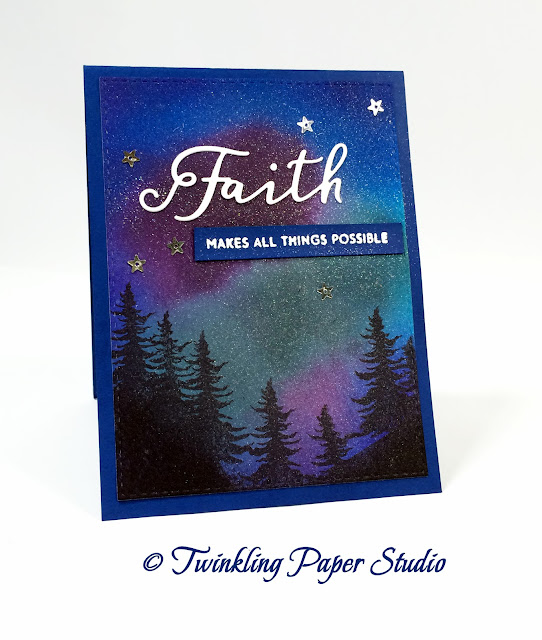
Recently I made a card during Papertrey Ink's Stamp-A-Faire 2016 that was inspired by Vincent Van Gogh's "Starry Night".  I've made a couple of night sky cards before but I've mailed both of them which means I don't have any more to send out until I make some.  Night skies are a fantastic way to practice and play with ink blending techniques to find out what you like and what works best for you. It is also a really good way to find out how the inks you are using behave when they come in contact with water. Distress Inks are formulated specifically to react whenever they come in contact with water.  Most inks are designed not to react once you've let them dry or you heat set them.

While I have done a bit of playing previously, I really wanted to sit and play with different types of watercolor paper, different types of ink and lots of water vs. very little water and everything in between.  The challenge this week over at AAA Cards was just the thing I needed to entice me to take extra time out to do this today.  I actually made four of these cards but the two I feature first are my favorites although I'm happy with all of them.


For the background panels I made, I used a combination of Distress Inks, Simon Says Stamp Inks, and Papertrey Inks and for the silhouette of the trees and hills I used Hero Arts Black Ink.  I was realizing today how intense their black ink is but when I went to get a refill, I couldn't find one.  The Hero Hues Black Ink provided superior coverage on my watercolor paper.  I was using the Direct to Paper (DTP) method with a corner of the ink pad for the hills, and I stamped the trees in the same ink with the Altenew Pine Trees Stamp.  I got it specifically to use on this type of card.  I also have the small Winter Cottage Stamp Set which I think was a gift with purchase last year around Christmas & New Year's and I plan to try that on this same type of card in the future.

This first card used Simon Says Stamp Island Blue Ink which is the closest color I've found to SU!'s Pacific Point. I combined it with Ocean Tides, Hibiscus Burst, Seedless Preserves, and Chipped Sapphire around the perimeter. The card base is made from Bazzill Whirlypop Cardstock.


The second card uses Wilted Violet, Seedless Preserves, Ocean Tides, Hibiscus Burst, and Royal Velvet.  I have a friend who is a photographer in North Pole, Alaska and she has hundreds of images of the Northern Lights.  This is so like what she captures that I am going to send this card to her.  All of these cards feature the Inspired: Faith Stamps and Dies from Papertrey Ink.  The card bases are made from Papertrey Ink's Royal Velvet Cardstock.

The last two cards used the same color combinations as the first two with one difference; I used Pine Feather instead of Ocean Tides.

I used Canson Bristol, Fabriano, Arches Hot Pressed and Arches Cold Pressed Watercolor Paper, applying ink with a Mini Round Ink Blending Tool.  I used both circular motions and back and forth "scrubbing" type of motions.  The paper is not as heavy or as thick as the other 3 but also doesn't hold as much water. The Canson Bristol paper would pill much easier than the others but since I knew this going in, I didn't over work it.  And really, since you are going to spray water on the whole thing to let the colors move and blend, it doesn't really matter how smoothly the ink is blended initially.  Especially in the case of Distress Inks, the inks blend effortlessly.  The hard part is waiting for that to dry once you've misted it.

That said, I really liked how much easier it was to get this depth of color on the Canson Bristol which is a 96# paper. In other words, it took less ink to get the same results as the 140# papers. I could spray the 140# papers with more water, but it also took more time to dry. I liked the Hot Pressed and Bristol papers the most but this was not a surprise to me. I most often use the Canson Bristol in the other things I make and if I need a paper to hold more water, my preference is for the Arches Hot Pressed Watercolor Paper.  It is incredibly smooth for watercolor paper. This is totally personal preference.  Don't let any one opinion decide what is the right thing for you.  You really just need to experiment to find what works for you and what you like.


Once I had all of my background panels made, I spritzed the paper with Tsukineko Sheer Sparkle Shimmer Spritz and set it aside to dry one last time before assembling my cards.  I attached the background using my ATG Adhesive.  The "Faith" words were die cut from Stamper's Select White Cardstock and the sentiments were all heat embossed using Versamark Ink and WOW! Opaque Bright White Super Fine Embossing Powder.  I adhered a few Darice Tiny Silver Star Sequins with Multi Medium Matte to finish off my cards.

I'll also be entering the second card at Stampin' Royalty for their "Anything Goes" challenge.

Thank you so much for stopping by to check out my blog.  I really appreciate it when you take the time to leave such nice and encouraging comments.  I hope you'll be inspired to sit and experiment with your own inks and some watercolor paper.

Friday, August 5, 2016

Simon Says: Fabulous Florals

This week over at the Simon Says Stamp Wednesday Challenge the theme is Fabulous Florals. Most of the cards I make are florals so this is always a good theme for me.  I've been wanting to try this stamp from Penny Black with a technique that I've used a few times before.  I must say, I have never met with as much success as I did today.


I've spent a lot of time over the last year learning about how various mediums work with the watercolor style of techniques I do.  Honestly, I was surprised at how well today's "test" image worked out. This stamp, "The Unfolding" reminds me of a Black Tulip Magnolia Tree like the one pictured above, and I'm sure that is what it's meant to portray. So I wanted to do my best to capture that color on my project.

To get my stamped image, I colored directly onto the rubber of the cling stamp in Gathered Twigs and Pine Needles Distress Marker and then used my Seedless Preserves Ink Cube directly to the stamp for the blooms of the image.  I wanted a heavier concentration of ink on the blooms so they would be the main focal point.  I misted (and I really do mean misted, not spritzed) the stamp with plain water then stamped that onto my panel of Canson Bristol Watercolor Paper.  I'm using a bottle that sprays a very fine mist and doesn't typically have any larger splatter.  It's one that had Tattered Angels Glimmer Mist in it but I only have water in it now. I'm not retaining much of the detail from the stamp but that is the look I was going for i.e. a loosely watercolored, more organic feel.  It was very easy to achieve this look.  I think it is only a matter of practice.  Don't be afraid to waste some watercolor paper.  It will happen but the more you understand your medium the less that will happen.


I die cut the panel with the largest Simon Says Stamp Stitched Rectangle Die and then realigned it in my die again to take a bit off the top and one side.  The next size down in the dies is quite a bit smaller and I just wanted a narrow mat so this is how I accomplish that.  It's important to line up the stitch marks when you do this. I cut another Stitched Rectangle for the mat from SU! Rich Razzleberry Cardstock and made a card base from Altenew's Spicy Yogurt Cardstock.

The greeting is a favorite from the Papertrey Ink's Friendly Flowers Stamp Set. I stamped it and heat embossed using Simon Says Stamp Antique Gold Embossing Powder.

I really love Altenew's Spicy Yogurt Cardstock and I'm planning to get another package soon. Because I like layers, this is becoming my "go to" cardstock for masculine cards or anything for a special occasion and you can order it from Altenew here.

I've been doing a little bit of research on the properties of some of the coloring mediums I use. Normally I wouldn't care much about a card but since I actually watercolor so many of my images, I want it to be fade resistant. Ranger Industries was founded in 1929 and originally manufactured an exclusive line of commercial ink products for the U.S. banking industry. In 1979, Ranger developed the first art stamp pads in unique, vibrant colors.  Until 1998, Ranger manufactured many private label inks but was able to begin developing it's own line of inks and eventually other products like the familiar Distress line of products and their embossing powders and is now known worldwide. There is no information on their website about the Distress Markers being "fade resistant" like the ink pads are, but I have submitted an inquiry and will let you know in a future post.

I'll also be playing along at the AAA Cards Challenge this week. Their challenge is Stitching - faux or real.

Thanks for stopping by and taking a look at today's project.  Have a really great day and please come back soon!

ETA: I just heard back from Ranger Industries and they said the Distress Markers are non-permanent and aren't fade reisitant.  I haven't had any issues but Kay Miller had mentioned a couple of weeks ago that she noticed the Zig Clean Color Real Brush Markers fade really quickly.

Sunday, July 17, 2016

Stamping Patterned Backgrounds

I have to say, one of the hardest things for me to do is to use patterned papers. Very often, they simply are not the colors I want or I feel that they are "watered down" versions of the colors I'm using. So when I saw the video that my friend Yana posted on her blog yesterday morning, I wanted to give it a try.  What could be better than stamping your own patterned paper in bold and vibrant colors?  I enjoy participating in Challenges and I saw that the CAS on Sunday Challenge Blog the theme is Sequins with a Clean & Simple card.  There is nothing simpler than a single layer card but that doesn't mean it can't also be pretty.  

Having had a portrait studio before, I have used the rule of thirds or what many in this industry call a "visual triangle" since I started making cards last year.  It's just a guideline for what is naturally pleasing to the eye. We're human and while precision and symmetry is admirable, it's often not as pleasing to us as something that has a more asymmetric or random look to it.  Yana mentioned this as one of the guidelines to use when stamping your own backgrounds in addition to using a stamp that has a lot of surface area.  With these two things in mind, I looked through my stamp sets to see what I had that could be used in this way.  It was pretty easy to decide on the Friendly Flowers Stamp Set from Papertrey Ink.

As I continue on this card making journey, I find that the one thing to pay the most attention to is those in this industry whose work you admire.  I love everything Yana creates and I enjoy watching her creative process. I also feel that her style is a pretty good match for what I like and what I want produce in my own studio.  So, imitation being the most sincere form of flattery, that is what I do.

I was so happy with the first two of these backgrounds that I made, that I went ahead and did 4 more.  I make sets of note cards as Christmas gifts and this year I am planning to make a bigger variety rather than just "thank you" or "thinking of you" cards.  I'm planning to include this style in that selection.  Additionally, they are a single layer which makes them easily mailable.  

Since I was experimenting with color combinations I really decided to go for broke this time and get really out of my wheelhouse for these.  For the blue toned colors, I used SU! Pistachio Pudding, Cracked Pistachio, Ocean Tides, Hawaiian Shores and Peacock Feathers.  I wish I would have used Vintage Jadeite instead of Pistachio Pudding, but there's always next time.  


Next I used a combination of pinks & rose with Spun Sugar, Lovely Lady, Hibiscus Burst, Autumn Rose, and Picked Raspberry.
  

And last but not least I used Pale Peony, Melon Berry, Berry Sorbet, Worn Lipstick, and Ripe Persimmon.  This turned out to be my favorite.  As Yana mentioned, the most important thing is stamping in a visual triangle.  It's less important how many colors you use although I think having four to five is awesome.  You don't have to worry about colors overlapping, or masking which I mostly don't like doing.  I love how the colors overlapped and became a new color in those areas. For the sentiment I used a smaller size of flower in the set with the sentiment, stamped them in Versamark and heat set them using Simon Says Stamp Antique Gold Embossing Powder.  


I really like the variety of colors I was able to use to achieve these backgrounds. Someone on Instagram commented that Yana's looked like watercolor while mine don't.  I used much more vibrant and varied colors than Yana did because that is what I wanted.  You can change up the look by using more muted colors, more vibrant colors, soft pastels or any combination of colors you like.  The sky is the limit so give it a try.  I'm planning to try this technique using only Distress Inks on a piece of watercolor paper this week.

To finish off the cards I mounted them to a top folding 5.5 x 4 inch top folding note card and placed one 6 mm. gold sequin to the right just below the sentiment. The background stamping only took a few minutes to do.  It actually took me longer to figure out which colors to use.

This concludes the first card of "The 12 Cards of Christmas". These won't be Christmas Cards, but the set will be a Christmas Gift.  I'm planning to showcase each card as I complete it for the set of 12 that I give to each of my sister's in law. July is half over already and I like to get an early start on the cards I make for them. I am not a procrastinator.

I hope you enjoyed today's cards and I'd love to see any cards that you try using this technique. Just be sure to leave me a link in your comment so I can follow you back and see what you've done.  You can also follow me on Facebook and Instagram.  I read every comment and it means the world to me when you take time to do it.  I'll be back soon with another project.

I decided to edit this post to show one more card I created with a colored casrd base. I used the Noted: Scalloped A2 Dies to cut a card from Hawaiian Shores Cardstock.  I love this look and will be creating more of these.

Thursday, May 5, 2016

Favorite Colors


Seriously, I can't help myself. Two of my favorite colors are Shiny and Sparkly and I'm automatically drawn in if those words are in my view, whether it be real life or my computer screen.  So naturally when I found the Sparkle & Shine Challenge Blog, I had to participate.  I was already aware of the Color Throwdown Challenge and it also has a beautiful inspiration image this week.  I'm pretty certain that the images are different views of the same flowers.  There's just too many of the same exact things in the image like the succulents, how the stems are wrapped, and even the container is identical.


The image on the left is our inspiration photo for this week and I tried to incorporate several of the colors into the design of my card.  I got a card this week from my friend, Joyce, and I thought her lovely design so pretty that she was also a part of my design inspiration. You can see her card here.

I started by doing some ink blending on a piece of watercolor card stock using Tumbled Glass Distress Ink and a Ranger Mini Ink Blending Tool.  I intentionally left it slightly splotchy to mimic the sky outside my studio window but still darker around the outer edge all the way around. This gives you a nicely "lit" area in your card's "sky".  Once I had that inked up, I gave it a slight mist with some Tsukineko Sheer Shimmer Spritz and set it aside to dry.

I took another piece of watercolor paper and inked blended it very randomly as well using Papertrey Ink's New Leaf and Lucky Clover Distress Ink to get a blend of the two inks.  It didn't need to be well blended as I was going for a more natural and organic feel of the greenery with light and shadow. After letting it dry for a few minutes, I cut the Friendship Jar Flowers foliage from it. Next I used the Friendship Jar Flowers Stamp Set to stamp the leafy greenery in New Leaf Ink on the background of the blue "sky" panel. Since the stamp was previously unused, I stamped it on a piece of scrap paper first using Versamark and then without cleaning it inked it up.  The ink can bead up on the surface of the photopolymer when it's brand new but if you stamp off once with Versamark it helps the ink to stick to it.


Since I am trying to make it appear that there's some background foliage, I laid my die cut leaves differently than the stamped image.  In this way, I hope it gives the impression of shadows in the background.  I used two of the smallest butterflies from the Color Pop Butterflies Kit and drew in the stitched lines with a White Signo Uniball Pen for the butterfly's paths through the sky then adhered them with Ranger Multi Medium Matte.  I had some of these small paper flowers from long ago and I thought they'd be perfect for this card.  I attached the buttons to them with Multi Medium Matte as well.  The sentiment is part of the Color Pop Butterflies Kit as is the little banner. I stacked 4 layers of the sentiment, gluing them one on top of the other, and then did the bottom layer offset in Navy Blue cardstock to act as a kind of shadow and help the white sentiment to stand out from the light colored sky.


This is such a cheerful card for someone who is retiring after 30+ years of teaching. Thanks so much for stopping by my blog today and I hope you enjoyed this card.  The end of the week is nearly here so enjoy your weekend!

Wednesday, May 4, 2016

So Many Challenges, So Little Time

Challenges aren't a bad thing; they are an opportunity for others in the industry to see my work and hopefully like it.  They are also how I create new card designs and color combinations, so they are all good in my opinion. There are lots of them out there, but I try to find challenges that fit my style and I've noticed I pretty much participate in the same ones over and over.  I'll be linking this card up over at Double D Challenges, The Card Concept, Sparkle & Shine and Word Art Wednesday.

I sat down last week and made quite a few bouquets and stamped quite a few butterflies with the Bitty Bouquets Stamp Set and Dies and the Color Pop Butterflies from Papertrey Ink. The Color Pop Butterflies were designed by Betsy Veldman and I am enjoying using many different color combinations when creating my own using the multiple step stamps that are part of the design.

I've started doing these bouquets by cutting several out in Stamper's Select 110# White Cardstock from Papertrey Ink and using the negative as my placeholder for the positive pieces with my MISTI.  This is my favorite White Cardstock and trust me when I tell you I have tried many different ones.

I know that it will most likely take a couple of tries to get the stamps lined up perfectly in my MISTI and I use the same die cut over and over for this purpose. It's fairly easy to tell which layer is the newest by the way the ink looks.  Dye based inks like the ones I use 99% of the time, absorb into the paper (dyeing it) and soften as they dry which makes it easy to tell which one you just stamped to see if it is lined up correctly. I try to do each round of stamping in one shot by moving the positive die cut in and out of the negative place holder. I do all the greenery first, then the larger flowers and if there are smaller flowers I do them last.  Not all of the bouquets have the smaller flowers but the Tulips do and they are my favorites from the four varieties in the set.  

Color Pop Butterflies Kit
I have always liked the look of soft pastels but I have definitely learned to appreciate the more vibrant colors as well and I'm finding that I really like them in card making.  I used a couple of Distress Inks and a couple of Papertrey Inks to stamp the Bitty Bouquets and get these really rich colors.  One of the best things about the MISTI is that you can re-ink and stamp the images a 2nd time to get a more intense and vibrant color.  For the flowers on this card, I used Seedless Preserves with Mowed Lawn and Vintage Jadeite with Hibiscus Burst.  The flowers were all double stamped to increase the color saturation. The butterfly is from the Color Pop Butterflies Kit and is done with one of the printed butterflies from the kit that you can cut out using the coordinating die that comes in the kit.  I just added some Wink of Stella Clear Shimmer over the top.


I die cut the polka dot paper using the largest Simon Says Stamp Stitched Rectangle.  Next I cut an oval from the Stitched Oval Stax by My Favorite Things out of Gold Metallic Poster Board and then a smaller Stitched Oval out of coordinating card stock. The sentiment is from Altenew's Beautiful Day Stamp Set and was heat set using Versamark and Simon Says Stamp Antique Gold Embossing Powder.  This was a scrap of cardstock but I am pretty sure it is Stampin' Up! Melon Mambo.  I like the graceful curve of the oval for flower placement and it makes it easy to adhere the arrangement using Multi Medium Matte.  Everything was adhered to an A2 card base made from Stamper's Select White.

These are the inspiration photos I worked with today.  How can I go wrong when they used my two favorite colors?

Thanks so much for stopping by my blog today.  I hope you enjoy the card I made for my daughter and that perhaps it will inspire you to create one of your own.  I always enjoy reading your comments if you'd like to leave one. Have a great day everyone!  

Tuesday, April 5, 2016

Inspired by All the Little Things #9


Over at Inspired By All The Little Things Blog, they have this bright spring floral this week.  I also wanted to play a bit more with my Happy Wishes Stamps and Dies by WPLUS9 Design Studio.

Recently, I was able to purchase several Distress Ink Cubes for $2.00 each and get free shipping at the same time, so I picked a couple of handfuls in some colors that I already knew I liked because I have Distress Markers in those colors and use them regularly for water coloring. Spun Sugar, Worn Lipstick, Peacock Feathers, Ripe Persimmon, Picked Raspberry, Dusty Concord, Mowed Lawn and Seedless Preserves were all in my top picks. These colors are rich and vibrant and I love the small size that allows me to try more colors with a lot less space to store them in than traditional ink pads.  More and more I am finding that I am switching over to the small size and they are really fantastic to use with the MISTI.  While the colors are very rich and vibrant, I am also finding that I like to double stamp my images to get the deeper color which is of course, only possible since I am using the MISTI Stamping Tool.

For today's cards, I am using the Simon Says Stamp Wavy Scallop Stitches on a piece of Stamper's Select White 110# Cardstock.  After I made one cut, I rotated the die 180 degrees and cut in the other direction to give me the swoopy element for my flowers and leaves. This was a fun way to add some visual interest to an otherwise plain card base.  All of the flowers and leaves are cut from Stamper's Select White 110# Cardstock as well. The Happy Birthday Sentiment Die is from Penny Black. Both note cards (Berry Sorbet & Autumn Rose) were spritzed with Iridescent Gold Shimmer Mist and allowed to dry before I started adhering the decorative elements.

Really.... I do try to make cards without shimmer or glimmer or sparkle, but I don't like them as much, so why bother?  There is, after all, a reason it's called "Twinkling" Paper Studio. *Ü*


Happy Tuesday, everyone!   I hope you have a chance to stop by the Challenge Blog and play along with us or just look around to see all the designs. It's always inspiring to see how other designers view the challenges.

Sunday, April 3, 2016

Happy Wishes

My favorite kind of card to send is a card for no particular reason at all.  Those are the nicest to receive in my book and they let the recipient know that you have been thinking of them.

I've been experimenting a little bit with a stamp set that I got recently called Happy Wishes from WPLUS Design Studios.  It's another great set designed by Dawn Woleslagle but it's a bit different from other sets I have because of the amount of white space left after the images are die cut.  

I'm still in a learning environment as I try new techniques figuring out what does and does not work for me. With images that have this much white space, the MISTI is the perfect tool if you have one.  I would actually really like to have a Mini MISTI at some point in time because of how much desk space the regular size takes, but I'll happily deal with it for the time being.  The biggest bonus for me has to be the fact that I can stamp the image again if I didn't get it inked up correctly the first time or that I can double stamp to get a more vibrant and intense color like I did on today's card.  

I made this card with a couple of challenges in mind.  Over at Color Q #335, they have a 5-color palette using Calypso Coral, Only Orange (Ripe Persimmon Distress Ink), Cool Caribbean (Creative Memories Sea Glass cut with a Simon Says Stamp Stitched Rectangle Die) and Bermuda Bay with White. Then on the Color Throwdown Challenge #386, they are using Lime Green, Teal and White.  I used the closest to lime color I have which is Vintage Jadeite with Tropical Teal, both from Papertrey Ink.  I must say, I am really enjoying my ink cubes, especially using them with the MISTI since I am taking the ink to the stamp in those cases rather than the stamp to the ink.  Their one inch size makes them ideal for handling and their less expensive price point means I can try more colors than I could if they were full sized pads.  If you catch them on sale with free shipping like I did, well that is my idea of magic! 

The ideal way to stamp these images is to die cut from white card stock (I'm using Stamper's Select White 110# Cardstock from Papertrey Ink) then use the negative as a place holder to stamp the images.  Remember, they don't have to be perfect.   

  
This isn't a color scheme that I would normally choose, but one of the reasons I participate in challenges is to stretch myself out of my comfort zone and try new techniques or color combinations.  These particular colors make for a bright and cheerful card.  

I'll also be entering this card over at the Simon Says Stamp Wednesday Challenge Blog for the "Anything Goes" theme.  

I thank you all so much for stopping by and taking time to comment.  Those comments just make my day!  Have a great rest of the weekend, everyone.