Showing posts with label Distress Oxide Inks. Show all posts

Thursday, July 27, 2017

The Challenge #93

Hello and Happy Thursday!  It's time for a new challenge at The Challenge over on the Always Playing With Paper Blog! This week is Challenge #93 and it is a Keyword Challenge which means you can use one or more of the words from the graphic to incorporate into your card.

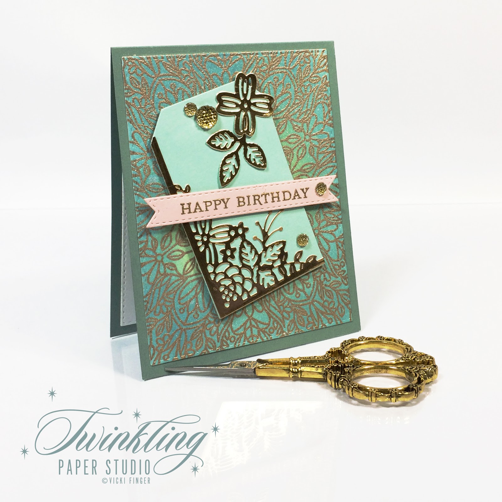
For my card this week I kept things simple for the most part.  I started by stamping the Simon Says Stamp Rebecca Lace Background Stamp onto Watercolor Cardstock in Versamark and heat embossing it in Simon Says Stamp Antique Gold Embossing Powder.  I prepped my surface beforehand very well by brushing baby powder all over the card front.  Because this stamp is very intricate, this step is more important than usual.  In fact, I even messed mine up a little bit but it's probably not noticeable to the average person.  I use a Wagner Heat Tool. I previously used a heat tool from Darice but the Wagner Heat Tool gets much hotter, much faster and that means less warping of my paper if I'm not having to hold it on my paper as long.  It took me a bit of time to get used to it and not scorch my paper if that tells you how hot it gets. *Ü* The Wagner Heat Tool does not have the protective cap on it so be careful if you get one.

The newest release of Distress Oxide Inks came yesterday and I had spent some time yesterday morning after the dentist and before my hair appointment doing several of these heat embossed backgrounds so that I would hopefully have time to play with the new inks. I only had time to play with this one color so far as my last few weeks have been very busy.  Knowing that Seedless Preserves is my favorite color in Distress Inks, you know I had to try out the Seedless Preserves in Distress Oxide first!  The Distress Oxide Ink Pads are available in individual pads or your can buy the bundle. You can lighten or intensify the ink color by how much or how little ink and then again by how much or little water you add into the mix.  For this card, I barely added any water because I wanted to retain the true purple color.  If I wanted to have a chalk or suede look, I would have used more water. The water causes the oxidation in this ink formulation. I'm not into the random drops, splatters or mists of water to "Bleach" out or distress the color so I did not do that.  I like it once in a while but not all the time. It's got to be right for the project.  I did use a touch of Tsukineko Sheer Sparkle Shimmer Mist after the ink was dry which is a water based product.  But I kept the mist high above so it would not leave drops.

Next I used the WPLUS9 Gift Card Layers Die to cut the background panel and the Concord & 9th Floral & Flutter Dies to cut a single butterfly for gold floiled cardstock.  I heat embossed the "Happy Birthday" sentiment from the Papertrey Botanical Blocks Stamp Set onto a banner cut from Papertrey Ink Tag Sale: Quilted dies.  I try to make sure I always have banners cut in white, black and watercolor cardstock so I don't have to stop in the middle of a project to cut one out. It's easier to cut several at a time than to have to dig it out each time I want to use it.  I assembled everything to a top folding white card base made from Papertrey Ink's Stamper's Select White Cardstock.  All of Papertrey's Card Stock is 110 lb and super smooth.  It's my favorite.


You probably didn't notice it at first but the background design is done in a circle incorporating a 3rd keyword into my card.  I love using background stamps to make my card front any color I want.  I'm going to be testing this particular one out again soon for a niece's wedding coming next month.  Be sure to stop over and see all of the Design Team's Inspiration for you at the blog.

Lesley Croghan (Challenge Creator)

Don't forget to check back each week on Thursday to see a new challenge posted. We hope you'll find time to play along.  

Saturday, April 29, 2017

The Fusion Card Challenge - Musical Butterfly

The Challenge this fortnight is Musical Butterfly.  As always, we have the option of using the sketch, the photo or combining the two of them to get a Fusion of some sort.  I chose the image as my inspiration. While I don't have quite the rainbow of color as in the image, it was still a good place to start.

Using a Hero Arts Music Background stamp, I stamped in Versafine Onyx Black Ink on Arches Hot Pressed Watercolor Paper and heat embossed it using Simon Says Stamp Clear Embossing Powder. I chose this particular paper because I wasn't sure how much color I was going to use, but it would stand up to the water I might want to add.  In the end, I added a bit of Broken China Distress Oxide Ink to the center of the panel, misted it with Iridescent Gold Shimmer Mist and set it aside to dry without adding any more color to it.  I was pretty happy with how it looked even though I know you can't see the shimmer here. You can definitely see it in real life!


I die cut this swallowtail butterfly (I'm sorry I don't know who the manufacturer is.  The solid butterfly is a scrap of pink cardstock and the top layer is cut from Clear Sparkle Shimmer Spritz and then I put a little crystal on the pink solid butterfly in the exact spot where the tiny little circles are on the outline butterfly. There are 8 of those little circles on each wing so there are 16 Aurora Borealis Swarovski Crystals on that butterfly.  That is how I pulled in the rainbow color for the butterfly.  It doesn't photograph particularly well, but again, in real life you can see it!  


I'm not going to draw this post out with a lot of unnecessary details as I am fighting computer issues this weekend.  We have a wedding next weekend and I won't be able to be online at all, so I'm trying to get some work done before hubby continues his diagnostics on my desktop.  I can't even imagine trying to write a blog post by tapping in one letter at a time on my iPad but I may have to do that yet.  So, I have a few more posts to write.

Thanks so much for stopping by today.  Be sure to check in over at The Fusion Challenge to see all the projects.

Thursday, April 13, 2017

Papertrey Ink's April 2017 Create Along With Us


Hello everyone! Today I have a post for the Papertrey Ink Monthly Create Along With Us Challenge. There are so many projects during release time every month and my card for this Challenge is inspired by Nichole Heady!  Nichole made this gorgeous tag using this month's Mix & Mat Die Release which has an  optional lace panel this lace inset panel that you can cut. It can be cut into a card base or used in conjunction with the outer frames of the die set.  This is the 2nd in a series of "to be released" dies each month for an unspecified period of time.  I think as long as the designers have ideas it will continue. Nichole introduced this month's set on April's Release - Day 1.  You can read more about it here.  

Since the release doesn't go live until the 15th of the month at 10:00 p.m. Eastern Time, I obviously don't have that exact die yet, but it did make me look around to see what I have that I could use to mimic that feel. I don't need too many gift tags but I am wishing I would have put a messy "nest" of gold thread on my card.  By the time I thought of it, it was too late to do it without tearing up my card.  I tried lifting the banner up to tuck a bit under there, but I used foam tape so it was stuck!  I have a pretty good size zipper baggie that has all kinds of bling embellishments in it from pearls to "jewels" so I've been trying to remember to use them and I'm happy that I remembered them today.  


When I started out with a tag for today I used the same colors as Nichole did since that is part of what inspired me; Aqua Mist and White Cardstock with a touch of Sweet Blush.  But then I saw a corner of something from yesterday laying on my desk next to the tag and it all kind of just morphed from there.  I had stamped a background stamp yesterday and did some ink blending on it in Cracked Pistachio and Broken China Distress Oxide Inks but I didn't get it stamped very well so the whole center of my design didn't get the embossing powder which means I don't have a clean design on the background to use as a card front.  But after I had cut my lacey piece of Stamper's Select White from the Garden Guild Cover Plate Die (part of the Make It Market Garden Gild Kit) and used Multi Medium Matte to attach it to my tag, I set it aside to dry.  This background panel was laying there next to it.  Laying side by side, you can see that the Aqua Mist is a good match for the ink blending I had done.  Actually, there's not too many things that Aqua Mist doesn't work with.  It's not really a combination I've thought of before, but I always have extra or stray "Parts & Pieces" on my desk that I try and eventually use.  So, because it was laying there I was thinking how pretty the lacey piece would be cut from gold cardstock and from there, its easy to see what happened. I promise, I really can make a card without gold, but I simply don't want to; it's part of my signature style.  

The outline of the background stamp works well with the outline of flowers and leaves from the cover plate die.  I also cut a couple of the individual flowers and a leafy stem to go along with it on the tag. In the final project, I changed out the aqua colored brad for a larger gold bling dot.

The background panel was ink blended and spritzed with shimmer sprays in the same method as always. I used Ocean Tides for my card base which was also inspired by Nichole Heady.  The little touch of Kraft cardstock makes for a nice contrast.  I used the little strip of Sweet Blush Cardstock for my sentiment banner, just as Nichole did for her Gift Tag. Both of Nichole's projects inspired me so I tried to do a blend of both her projects into my single card.  I'm happy with my results. I think this card is beautifully understated with it's more classic color and the gold.  I find more and more that I don't care for the look of Gold Mirror Board.  It's way too much for me, but I do love using Gold Foiled Cardstock which fits perfectly with the warmer tone of the embossing powder I use most often.  I hope that my card is as classy and elegant looking as Nicole's.  The Mix & Mat: Scallops are definitely going on my wish list. It would be easy to use a different sentiment and change the card up for other occasions or any occasion as I like to call it.


Thank you so much for stopping by my blog today.  I appreciate the time you took to be here and to read through my blog post.  I also appreciate it when you take the time to comment.


ETA:  I liked this card so much that I made a second one to send to a friend.  This one has genuine Sworovski Crystals in the flower centers!  How much fun is that!?!

Monday, March 27, 2017

Sunday Stamps Challenge # 149

This past week was not a great one for me creatively and the week before was a little bit sketchy as well.  I seem to be making up for it this weekend cranking out a record number of posts in just two days.

Last weekend, we ending up making a quick trip to Dallas to see our daughter and grandkids.  It was unexpected and a bit unplanned, so I forgot all about taking something to her that I'd made for her. When I came across it this morning I decided I would make a card for her so I could send them. After looking around at all the challenges that are currently going on, I quickly decided on a color scheme for my card following the inspiration image at the Sunday Stamps Challenge with the Rich Succulents Color Palette. Keep in mind they don't give us color names but ask us to follow the example to the best of our ability. The color is only ever going to be as good as your monitor or device and might be limited by the selection of colors in your crafty stash.  I have no cardstock or ink that is the same shade, color or value of green as the photo but I did the best I could with colors I do have.

I said once to a friend, that I would probably never use Ripe Avocado Cardstock and lately, the joke has been on me and I'm thinking I need to order another pack in the next month or two because it goes so well with so many colors.  The richness of this green pairs perfectly with the Sugarplum (purple shimmer) Cardstock.  Both colors are rich and regal.

Once again, I inked up the Simon Says Stamp Emma Background Stamp with Versamark and heat set it using Simon Says Stamp Antique Gold Embossing Powder.  One of the things that makes Ink Blending successful is a well used and loved foam on your ink blending tool.  It's always so much easier if it's not a new pad.  Seedless Preserves is my favorite color of Distress Ink, so mine gets used fairly often giving me well used pad.  My Distress Inks are the only inks that each have their own foam pad.  It fits right in the bottom of the ink cube and my Distress Oxide pads have a piece of Velcro on bottom to attach the foam to when I am finished using it. That way you just change out the pad and you don't need to have an actual tool for each color. I only have four Mini Ink Blending Tools and just change the foam pads out as needed. I could probably get by with just two as a matter of fact.  For the rest of my inks, I use one foam pad for each color family because I tend to have the same go to colors pretty consistently.  The Distress Oxide Inks blend so easily on cardstock or watercolor paper but for this card I used Stamper's Select White Cardstock. You can see it is a very seamless transition from one color to the next.

To get this particular look I start in the center of the panel and work my way out around the edges. Once I had the ink blending done, I misted it with some shimmer spritz then cut the panel with the 2nd largest Simon Says Stamp Stitched Rectangles Dies and cut a background panel from the Sugarplum Shimmer Cardstock using the largest rectangle from this same set.  I got this cardstock many years ago at a scrapbook store that is no longer in business. I'm pretty sure I've seen some similar to this at the Joann's or Michaels stores in Frisco, Texas but I haven't looked for several years. I do love the color so I need to remember to look next time I am there.  I stamped the greeting on a 1/2 inch wide piece of the same purple shimmer cardstock with the "Just A Note" sentiment from the Botanical Blocks Stamp Set from Papertrey Ink. The gold die cut flower is from Concord & 9th's Flutter and Floral Dies and lends itself well to the outlined background image.  There's also a butterfly die in the set if you prefer that.

Next, I made a top folding card base from Ripe Avocado Cardstock. I mounted the ink blended panel to the Sugarplum panel and then using a slightly smaller sized piece of Black Fun Foam, I mounted the background on to that using Scor-Tape (Sookwang Paper Tape).  I use 1 inch because it covers a lot of the surface but make sure of your placement before you press that down. It will ruin a card base if you try to move it.  Go slow and have an easy touch because once it's adhered, it is not going anywhere! I also used Black Foam Squares to pop the sentiment panel up just a bit.


The hardest part of this design is getting clean embossing.  I couldn't do it without my MISTI Stamping Tool or without using a powder tool of some kind. It doesn't matter what kind you use, only that you do.  And while I am at it, I try to heat emboss a few at a time.  I did not do that this time, but the stamp is still in my MISTI so I can stamp a few more tonight or tomorrow.  I am fortunate enough to have the MISTI Mini and MISTI Original and the background stamp does not fit in the Mini.  This stamp makes for an absolutely gorgeous, elegant card no matter what colors you choose.  You could use it on colored cardstock or color your own as I prefer to do.  As always, when I use a a darker card base, I cut another stitched rectangle to put on the inside of the card for my note. With these colors I used a cream colored panel but most of the time I use a white insert.

The supplies I used are linked in my post or you can find shopping links in the right hand sidebar. Thanks for stopping by and I hope you'll come back another day soon.

Saturday, March 25, 2017

Fancy Easter Eggs

I am trying to be very disciplined with myself today and not play with the new stamp set that came in the mail from Altenew this morning.  If you haven't checked out their release from this week, be sure to stop over and check it out. Garden Treasure Stamp, Die and Bundle is already sold out at Altenew and Simon Says Stamp is waiting for their shipment to arrive and has it on reserve.  It's always a good idea to sign up for e-mail notification so you'll know when either place has it back in stock if you want it. This was fastest shipping from New York - EVER! It normally takes at least 10 days for me to get an order during release week so I was shocked when I got an e-mail saying it was out for delivery.  I'm still waiting on this month's Papertrey Ink order and that was from March 15th.  Anyway, let's get on with the Fancy Easter Egg card!

Today's card is for the Simon Says Stamp Flickr Challenge #67, the Simon Says Stamp Wednesday Challenge and also for the Inspired By All The Little Things Challenge #49. Nancy Penir is the Guest this week at Inspired By and the bunny immediately made me think "Peter Rabbit" which then makes me think of Easter and Easter Eggs.

I actually got this idea from watching my friend, Yana, make an Easter card this week using Spellbinders Dies. You can see her video here. After watching this, I wanted a way to mimic those fancy eggs without the dies she used since I don't have them.  I grabbed my Simon Says Stamp Emma and Elizabeth Background Stamps and stamped three A2 sized pieces of Stamper's Select White Cardstock with Versamark and heat set them using Simon Says Stamp Antique Gold Embossing Powder. Using a Mini Round Ink Blending Tool, I blended Distress Oxide Inks to quickly color these up in Cracked Pistachio, Broken China and Wilted Violet then misted them with a bit of Tsukineko Sheer Sparkle Shimmer Spritz.  Even on white cardstock, these inks blend like a dream.  While I didn't have the fancy filigreed dies, I do have a set of nesting egg shaped dies made by QuicKutz from way, way, waaaayyyy back.  A lot of my dies from waaaayyyy back are made for 12 x 12 inch scrapbook pages and I've got them in my closet, but I've kept my nesting dies handy for easy access on occasions just such as this. *Ü*  

For my sentiment, I used leftover pieces of the ink blended cardstock to cut my word, the "Easter" Die from Simon Says Stamp.  The word cuts in two pieces rather than just one so it was easy to do part of the word on one color and and the rest of the word on another.  Because these are the heat embossed leftovers, there is a ton of extra texture there. This die is frequently sold out this time of year so consider getting the e-mail notification for this as well.  


I often do battle with myself over how much dimension to add because I mail nearly everything I make but this is one time I wished I would have listened to that little inner voice.  The thing is, because I make cards for other people to send, I know that most people don't have the knowledge of the postal system that I do, so I want to keep my cards simple and mail-able. I was the Company Training Coordinator at the company I worked for in Topeka, Kansas and we used to have to do training on everything associated with mailing/shipping via the USPS. This might be a good time to do a little checklist here for my friends.  
  1. A typewritten address label will always be easier for a machine to read, no matter how fantastic your handwriting is.  If it's someone you mail things to often, consider making a sheet of address labels for them.
  2. If you have the ZIP + 4 Zip-Code, use it.  It will speed up shipping by at least 1 day. 
  3. Always use a return address so that whatever you are sending can make it somewhere, even if it's only back to you.  No point in having it completely lost. 
  4. You can use Click-N-Ship for Priority Mail Shipping from your home if you sign up for a USPS account.  This provides you with a small discount since you will be using a "typewritten" and bar coded label printed from your printer that is easy to read.  The post office can collect your packages from your porch or mailbox or anywhere that you specify on the next regular mail day.  I have a small food scale that I use to weigh my mail.  That way I know whether or not to add extra postage.
  5. Mail Art Envelopes along with unique sizes, shapes (squares) or greater thicknesses require extra postage.  The post office has something they can show you so you will know.  I mostly use Thin 3D Foam Squares for exactly this reason.
These are the things that pop into my head automatically but if you think of anything else, you can go to the USPS.gov website and check it out.

Thank you so much for stopping by today to see my project.  I hope you'll come back very soon! 

Friday, March 24, 2017

Inspired By All The Little Things #48

I am a little slow this week getting things finished for all of the challenges I want to participate in but I need to get this particular show on the road as I only have a matter of hours left to participate over at the Inspired By All The Little Things Challenge Blog.

The image on the left reminds me of a setting sun in an evening sky with all the different colors. For my card, I used Distress Oxide Inks in Faded Jeans, Broken China, Wilted Violet, Fossilized Amber and Peeled Paint to create my evening sky background. The colors aren't as deep as in the picture, but I really like how it turned out. Truthfully, it is hard to get Distress Oxide to be as dark as one would want because there are only 12 colors so far and once you mist it with water or whatever solution, the oxidation starts which is what makes these inks blend so well.

Once I had the background panel finished, I used Hero Arts Unicorn White Spray to spritz on top of an acrylic block and then spattered it on to my card base for the starry sky using a Silver Black Velvet Brush in size 4. Since I was putting a Vellum panel over the top, I didn't get too excited about placement of the spatter and it was easy to do.


I stamped the vellum panel with a sentiment and the shooting star from WPLUS9's Lucky Stars Stamp Set. The sentiment is heat embossed in Hero Arts White Embossing Powder and the shooting star is done in Metallic Platinum Sparkle Embossing Powder from WOW!.  I cut a few stars from Silver Glitter Paper to accent and placed them around in a visual triangle, which also gave me a place to hide a bit of adhesive behind the vellum panel. I attached everything to a top folding card base made from Papertrey Ink's Aqua Mist Cardstock.  This was really quick to pull together and is a perfect card to send to one of your friends.

I hope you have a fantastic Friday everyone.  Thanks so much for stopping by to visit today.

Friday, March 10, 2017

Color Throwdown #433

Today's card uses fresh, crisp, Springtime colors; Cornflower Blue, Green and White for The Color Throwdown Challenge, hosted by Broni this week. I've been playing since yesterday afternoon with the new Distress Oxide Inks that Tim Holtz introduced at CHA this year so I whipped up a project in the challenge color scheme.

Yesterday I had stamped several of these Emma Background Stamps from Simon Says Stamp onto Canson Bristol Watercolor Paper in Versamark and heat set them using Simon Say Stamp Antique Gold Embossing Powder.  If I stamp all at once and heat set all at once, then I can just grab and new panel and continue on without having to stop and stamp again in between colors.  If I am experimenting with new colors or new product, this is what I like to do.  I'm usually so engrossed in the discovery process that I don't like to have to stop when the momentum is going strong.

I started with Faded Jeans Distress Oxide Ink in the center of the medallion and once that was ink blended (literally seconds) I went all around the outer portion with Peeled Paint Distress Oxide. One of the really cool things abut Distress Oxide is that you can mix it with other mediums such as the regular line of Distress Inks or any dye inks for that matter. I'm not really one for having a bazillion colors on anything anyway, so two colors is pretty simple but effective with this huge medallion stamp.  There were three of these medallions that all came out at the same time; Emma, Elizabeth and Elinor and they were part of the Simon Says Stamp Hey Love Release which I think was in January.

Once I had the ink blended on there, I misted it with Iridescent Gold Glimmer Mist from Tattered Angels. Another thing about these inks is that they are opaque rather than transparent but the oxide in them reacts when you spritz or spray the ink with water or water based products such as shimmer mist or just a spritz of water.  It's a completely different effect than just misting a piece of colored cardstock.  Most people probably won't want to use it with shimmer spritz as much as I do, but you totally could.  These inks are so vibrant!


Once I had the ink blending done and the Glimmer Mist was dry, I die cut the panel with a Simon Says Stamp Stitched Rectangle in the largest size.  I also cut one of the Concord and 9th Flutter Dies and stamped my sentiment from the Papertrey Botanical Block Stamp Set.  It's a bit larger font than most I've seen and I really like the size.  Even I can read what it says without my glasses although it is a bit fuzzy.

That is it for me today.  I hope you enjoyed my card and that you'll stop over at the Color Throwdown to see the challenge, the inspiration and all of the Design Team projects.

The Beauty of Distress Oxide Inks

Hello everyone!  Today I got to sit down with a new tool and play for the Simon Says Stamp Monday Challenge and the Simon Says Stamp Flickr Challenge #66. For this challenge, we are supposed to "color" something.  I hope ink blending counts as a type of coloring.  I actually made 4 cards today; two with dye inks and two with the new Tim Holtz Distress Oxide Inks.  It wasn't that I was planning to compare them, but when they came in today's mail, I could not resist stamping a couple more backgrounds to play with.

The original 2 cards were white heat embossing on Canson Bristol Watercolor Paper which is what I use 95% of the time for my card fronts. They take ink much better than cardstock when you want to do ink blending and I use a lot of shimmer mists in my cards so this paper works better and helps to achieve that seamless transition of color.  Once I learned to ink blend, it's a technique that I use often.  I almost had those cards finished when the mail arrived and I set them aside.

I stamped two panels using the Simon Says Stamp Emma Background in the original MISTI on the watercolor panels using Versamark and heat embossed them with Simon Says Stamp Antique Gold Embossing Powder.  I simply can't help it - I love how rich and elegant the gold embossing looks. I do use other colors from time to time, but I use embossing on almost every card I make and I'm never as satisfied with any other embossing powders as I am with gold. The Simon Says Stamp Antique Gold is my favorite because it's a bit warmer and reminds me of WOW!'s Gold Rich Pale.  I used a very pretty sapphire blue the other day and I did like how that looked, but it would have looked equally as good in gold. For me the struggle is how to make cards without gold and that struggle is real my friends.  *Ü* I don't use shimmer mist on masculine cards, but it's hard to restrain myself when I think of how much more awesome it would be with shimmer.

I grabbed a couple of new foam pads for my Mini Round Ink Blending Tools and opened the Broken China and Cracked Pistachio Distress Oxide Inks and started blending the Broken China in the center of the panel. Since I watched Jennifer McGuire's Video from last week, I knew that I could start in the middle and be able to blend it out.  If you've tried this, you know it can be quite tricky with Dye Inks.  I blended the Broken China Distress Oxide all in the center of the panel and then went around the the rest of the panel with the Cracked Pistachio.  One of the first things I noticed was that while initially I thought I wasn't getting very good coverage, it only took seconds for it to saturate the paper.  Then once you hit it with the shimmer mist (or water), it oxidizes and becomes so creamy and smooth. It is very beautiful. For both of these cards I used Tattered Angels Glimmer Mist in Iridescent Gold. It's my favorite, but it takes some work to find it. Happily, I saw it at CHA in the 7 Gypsies Booth and I got a business card so that I can order direct from their site.  Canvas Corp Brands owns Tattered Angel so you can go directly to their website to order.  They have about 50 colors, but I primarily use just Iridescent Gold.  I have some copper, pearl, silver and a couple of others but I had been on my very last bottle of Iridescent Gold when I left for CHA in January, so I was super happy to see it and no that I could still get it.

I grabbed my other embossed panel with Peeled Paint and Worn Lipstick Distress Oxide Inks and did ink blending in the same way, first with Worn Lipstick in the center and Peeled Paint around that. These were so easy and took so much less time (literally minutes) to get a beautiful, vibrant ink blended background. I'm telling you - I am in love!  Because of the busy the background is, I wanted to keep the rest of the card simple.


I cut the Concord & 9th Floral and Flutter Dies from gold cardstock and heat embossed the sentiment from Papertrey Ink's Botanical Blocks Stamp Set onto the same watercolor paper. Then I die cut both of the backgrounds panels using a Simon Says Stamp Stitched Rectangle Die in the largest size.  One is mounted onto a card base made from Papertrey Ink Ripe Avocado Cardstock and the other card base was made from Papertrey Ink Vintage Jadeite Cardstock. Papertrey Ink's Perfect Match Cardstock is super smooth and heavyweight at #110. It is also the most reasonably priced cardstock out there costing just $5.00 for 25 sheets of colored cardstock.


Thank you so much for stopping by today.  Be sure to stop over at the Simon Says Stamp Monday Challenge and the Simon Says Stamp Flickr Challenge to see all the great projects and the Simon Says Stamp Store to order supplies! Happy Friday, everyone!