Showing posts with label Ranger Mini Ink Blending Tool. Show all posts

Friday, August 3, 2018

AECP - Easy Ink Blending Techniques

Hello all!  I am so happy to say that I now have Unlimited Internet Access which means I can get back to doing what I love - learning new techniques and sharing projects with all of you here!  I feel so behind on everything, but I can at least work now without having to stop because I reached my data limit for the day!  There's nothing like having to stop when you have a good flow going.

Today's project is for the Easy Ink Blending Techniques Class which is part of my Altenew Educator Certification Program.  I love Ink Blending and I did a couple of layers of that with some stamping and paint splatter for today's card.

I actually made a card for this class already, but I felt the need to give it to someone right away and then remembered that I hadn't photographed it yet.  So it's a good thing I had some roses and leaves already stamped to pull a new project together. This project uses the Build-A-Flower Rose Bundle.  On the previous one I made, it was hard to see the ink blending, so it worked out okay to make a new one.  For the blue roses, I used Ocean Waves, Aqualicious, Teal Cave, Galactic Stream, Dusk and Desert Night in that order for the blue blooms.

I started today's project by ink blending on a piece of Canson Bristol Cardstock.  I like to use this because it is very easy to blend on and also because I like to add shimmer mist to everything, so it can take the water better than regular cardstock does.  I started every so gently in the center of the panel and worked my way out in a circular motion.  Next I blended Aqualicious in just the outside circular area to give a little more depth.  I always feel that ink blending adds another layer of depth to the card without actually adding another actual layer making it more expensive to mail, so love it.  I work on a large glass mat that is 24 x 18 so I have plenty of area to work in without getting ink everywhere.  When you start in the center, it really isn't an issue but if I was going all the way to the edge, I would have a piece of printer paper underneath.


In the class, Amy Lee did a technique where she did emboss resist and then added in some splatter and I like this look so I want to incorporate a bit of that into my piece.  I used Ocean Waves Re-Inker for the first layer of splatter.  Then I wanted to add a really bold color so I used Desert Night Re-Inker.  I just put one tiny drop of color onto an acrylic block, dip a long bristled brush into a bit of water and essentially remove all of the excess on the side of the water container, and that makes it fluid enough to create the spatter by tapping on the brush handle.  I used a Silver White Paintbrush is Size 4 for this.  Once I had the two colors of blue splatter, I heat set it and then mixed a bit of pearl white paint in a pretty thick mixture so that it would be a little more dimensional.  I heat set that and then die cut the front panel with a stitched rectangle die.  Of course, I added a layer of Shimmer Mist to the panel.

I heat set that layer as well before I added a sentiment from the same stamp set using Versamark with Antique Gold Embossing Powder.


Because I have been wanting to try Distress Micro Glaze, I put a layer of that on top of everything which makes it waterproof.  I don't feel it was nearly as effective as it is with Distress Oxide Inks, but you don't know if you don't try so I figured it wouldn't hurt anything to try it and I was right.  It didn't really add anything in this case either so it was a "no harm, no foul".


After putting together my floral arrangement, I wanted to add some bling so I added a few small pearls with a few sequins. The pearls are very hard to see but if you look for them near the sequins, you'll find them.  I have another project in mind using an ink blending technique that I love but haven't done for a while so I am hoping to find time to do that as I finish each of my classes.

Thank you so much for stopping by today.  I always appreciate it when you and especially when you take time to comment!

Altenew Antique Gold Crisp Embossing Powder
Shop at:
ALT
Altenew Build-A-Flower Rose
Shop at:
ALT
Altenew Crisp Ink Cool Summer Nights Collection
Shop at:
ALT
Altenew Crisp Ink Sweet Dreams Collection
Shop at:
ALT
Canson Bristol Paper
Shop at:
SSS
Carta Bella Spring Market Paper Pad
Shop at:
SSS
Cuttlebug Die Cutting Machine
Shop at:
SSS
Kokuyo Long Dot Runner Adhesive
Shop at:
SSS
Mini MISTI Stamping Tool
Shop at:
SSS | ALT | GKD
Scotch 3M Foam Tape
Scotch 3M Foam Tape
Shop at:
SSS
Teflon Bone Folder
Teflon Bone Folder
Shop at:
SSS
Tim Holtz Distress Micro Glaze
Shop at:
SSS
Tim Holtz Mini Round Ink Blending Tool
Shop at:
SSS
Tsukineko Sheer Sparkle Shimmer Spritz
Shop at:
SSS
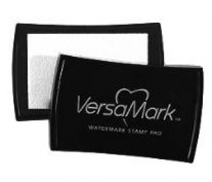
Versamark Ink
Versamark Ink
Shop at:
SSS
Wagner Heat Tool
Wagner Heat Tool
Shop at:
SSS
WPLUS9 Gift Card Layers Designer Dies
Shop at:
SSS

Wednesday, January 25, 2017

Hey Love -- Your Heart Is My Home


Hello Everyone!  This is my last post as the Designer in the Spotlight for the Simon Says Stamp Wednesday Challenge in January 2017. I have a super fun project for you today featuring items available in the Simon Says Stamp Store.

If you've been to my blog before, you probably know I really love using gold on most of my projects.  It instantly adds an elegant touch to anything. It's pretty easy to find foiled Designer Paper at your local craft store but they are often white with gold foil which always makes me think of a wedding.*Ü* If they come in a color other than white, they are often difficult to match to supplies you already have on hand.

For today's card, I used one of my "go-to" techniques which is to ink blend on the white paper and get a match for whatever color I'm planning to use. In this case I used some Simon Says Stamp Teeny Bikini Ink with a Ranger Mini Ink Blending Tool to color the paper in the shade I wanted. Once I had the ink blended to the depth of color I wanted, I gave it an all over spray with some Tsukineko Sheer Gold Shimmer Spritz and set it aside to dry while I worked on the rest of my card.  So far, I've never messed up a piece of the foiled paper but on the off chance that I might, I do cut the large sheet down to 6 x 6 sheets once I get it home and store it that way. Once I did get a bit carried away and bent the foiled paper, but I was able to smooth it out with my Teflon Bone Folder and salvage it.  I've just been a bit more careful since then not to do it again.


I've also done this ink blending technique with some other foiled papers I have in my stash have that are colored.  If you use a darker shade of ink in the same tone, it works great without having to have an exact match in colored cardstock. I tried this technique in desperation once to get a match for a project and I've been doing it on purpose since then. If I see a white and gold foiled paper I like, I don't hesitate to buy it because I can make it match whatever color I need it to.

Each time I look at this Heartstrings Die from Concord & 9th, I think of the saying that "Home is where the heart is".  I wanted a clever way to use this die for a Valentine's Day card for my hubby because no matter where I am, he needs to be there for it to feel like home.  To keep all the pieces together after die cutting, I used some Micro-Pore tape on the back side after I had cut it out.  You could also use Washi Tape or Painter's Tape.  My banner sentiment came from the Simon Says Stamp Love Makes a Home Stamp Set and the love die is, of course, Kristina's Love Die in Kristina Werner's fantastic handwriting. I can hardly wait to see what Kristina Werner designs this year for Simon Says Stamp although there are a few more dies that have already been released that I'd like to have. All of the word dies from the Hey Love Release are designed to mix and match and work with each other except for the Love 2 Set.

For the sentiment banner, I used Versamark Ink to stamp it then heat set it with Simon Says Stamp Antique Gold Embossing Powder. This is my go-to choice for embossing powder.  I love metallic gold, but not if it is really yellow gold so I opt for Antique Gold tones. I attached the background panel to a Bazzill Marshmallow Card Shoppe Card Base using Scor-Tape. If your background panel gets a bit warped you can flatten it out by running it through your die cutting machine with an embossing sandwich (minus the embossing folder). Next, I attached the Heartstrings Die Cut onto a slightly smaller heart shape made of Fun Foam and then attached that to my card base using Ranger Multi Medium Matte. The smaller heart is attached using two of the small sized Thin 3D Foam Squares.

The Concord & 9th Heartstrings Die is in two pieces so you can set the inside piece how you want it.  For my first card, I offset it quite a bit to make it seem like the strings were being "tugged" closer to the heart. I centered it more for the 2nd and 3rd cards I'm showing here.  The small center heart was inked up using the same ink on a scrap of the same paper.

For my second card, I inked up the designer paper with Simon Says Stamp Merlot Ink on what was originally an ivory colored stripe. You can really make it any color you want. I also centered the inside of the heart rather than off setting it. On my third card, I inked it up using Simon Says Stamp Island Blue and assembled everything on on a Navy Card Base but I kept the banner and word die white. The Heartstrings Die and the Love Shadow were cut from the same Die Cuts With a View Gold Foiled Cardstock although it might be a bit hard to see here.
I hope I've inspired you to give this a try next time you need a certain color but don't have the time or inclination to go looking for it at your local craft store.

Thank you so much for stopping by my blog today. I've so enjoyed being on the Simon Says Stamp Wednesday Challenge Blog this past month. Thanks to Heidi and the gang at Simon Says Stamp as well as Lols and all of my teammies! It's been a blast! Don't forget to create your own project and enter it at the link-up for your chance to win a $50.00 gift voucher to the Simon Says Stamp Store.  

Thursday, August 18, 2016

Mimosas for the Summer Fun Challenge

This week over at the Simon Says Stamp Monday Challenge the theme is "Summer Fun".  My idea of Summer Fun at this stage of my life is hanging out on our back patio with a glass of wine (or maybe a Mimosa on Sunday Morning) and listening to music while I sip my drink. For the last two years we have had extensive work done on or around our back patio in the late winter through early spring. There was a nice sized covered patio to begin with compared to anything we've ever had before but now it goes more than halfway across the length of the house and there are three very substantial pergolas out there. We have white Christmas Lights hanging around where the sitting area is to add a bit of atmosphere.  My hubby worked pretty hard get a stereo system wired and speakers hung out there this past spring which makes it really nice.   The back of our house is on the west side and we have lots of windows so as you can imagine, it would really raise the temperature in the late afternoon or evening hours in the summer.  Now the Pergolas shade that area for most of the day.  It is really gorgeous out there in the mornings! 

Now I confess, I could not visualize how it would look out there before the work was done, but I really can't imagine it any other way now.  We extended our patio and driveway areas with concrete, and there is a sidewalk that runs from the patio to the other end of the house all the way to the driveway and garage.  It's very nice and I'm glad my husband could envision it because I know we'll enjoy it for years to come.  When our kids and grandkids come home, we can hang out there which is really nice.  We have some really nice chairs, a porch swing and a fire pit all in a grouping out there.  It's a really great entertaining space although we don't get to do much entertaining.  When I think of the fun times we've had out there with the kids, it makes me smile remembering things like roasting weenies and making Smores.  So I wanted some definitely happy colors for today's card.  

I started with a 4.5 x 5.5 inch panel of Canson Bristol Watercolor Papers and stamped the Background Basics: Sheet Music using Versamark and heat set it with Ranger Super Fine Gold Embossing Powder.  Using a Ranger Mini Round Ink Blending Tool, I blended in color using Distress Inks in Cracked Pistachio and Twisted Citron.  I wanted the Cracked Pistachio to go from the lower left corner to the upper right and then I blended the Twisted Citron on each side of that. I am still always amazed at how vibrant the colors of Distress Inks are after misting them.  In this case I used Tsukineko Sparkle Sheer Shimmer Spritz so I set that aside to dry for a bit while I figured out the particulars for the rest of my design.

I die cut two of the wine glasses from Stamper's Select Vellum using the Taylored Expressions Raise Your Glass Die Set.  The biggest challenge was trying to figure out how to make it look like the wine glasses had something in them.  I tried using a colored insert behind the vellum but it just didn't look right with the vibrancy of the gold background stamping so I masked off the stems of the glasses with a post-it note and then applied Versamark onto the bowl of the glasses.  Then I put Perfect Gold Perfect Pearls all over them and buffed it. To set the Perfect Pearls, I gave it just a very light mist of water.  I don't know that I needed to do that since I used Versamark Ink, but it didn't hurt anything.  

I also tried out several sentiments today and my original plan was to stamp part of the greeting and have a die cut for the other part but in the end, I chose the Painted Hello and Painted Summer Dies that are Simon Says Stamp exclusive dies.  I die cut the ink blended background with the largest Simon Says Stamp Stitched Rectangles die and mounted it to a card base made from Simon Says Stamp Mint Cardstock which came from the Simon Says Stamp Sweet Treats Cardstock Pack which includes 4 sheets each of 5 colors.  I don't use a lot of Mint Cardstock but this is a really nice color when I do need it.  It is actually an absolute perfect match to Cracked Pistachio Distress Ink.
  

In the end I hope when you look at this you will imagine some sparkling wine, juice or champagne in the glasses.  And if you have any ideas for a better way to do this, PLEASE, let me know!

I'll also be entering this in the Addicted to Clean and Simple Challenge with the code word "Music" this week.  Adult beverages and great music is my idea of Summer Fun.

Thanks you for stopping by today and as always, I appreciate uplifting and supportive comments if you'd like to leave one.  

Friday, August 12, 2016

Sweet Elephants for a Sweet Baby Girl

I've been working on a project for the last week or so a little bit at a time for a friend who also happens to be my new hairdresser.  My other one moved to a salon in Tulsa and I didn't want to drive that far, so I've started going to a new one that I knew slightly before because she works at the salon where I get my nails done.  Bekah was scheduled to have her labor induced on August 9th due to pregnancy complications and bring a sweet baby girl into the world.  That happens to also be my oldest grandson's birthday only he turned 25 this year. Norah Michelle was born around 8:00 in the evening bringing much joy to her Momma, Daddy and three siblings.  She's still in the NICU and could use some prayers if you feel like doing that!

I knew that I wanted to make a personalized card for Bekah that she could put into a frame for the baby's room if she wanted.  Actually, I have been dying to make a card for the birth of a baby since I first saw Dawn Woleslagle watercolor these baby elephants from the WPLUS9 "Unforgettable" Stamp and Die sets more than a year ago.  I was excited to get to do that, finally!

Dawn was the first person I ever saw on YouTube using Distress Markers and Distress Inks to watercolor images with and is what made me want to try it. I did try the "Vintage" Collection of 12 markers at Hobby Lobby using a 40% off coupon to purchase. I figured that way I could try it to see if I could come anywhere close to what Dawn did.  She made it look so easy and achieveable. That started my love affair with creating watercolor looks in my cards. Happily, the success of that first set of "Vintage" Distress Markers led to getting other colors a few at a time.  I think there are about 62 colors in the Distress line of colors.  I've only purchased the ones that I am sure I will use such as pinks, corals and purples. Distress Markers continue to be my most used medium for watercolor although I have a few other choices.  I find them to be the most predictable in terms of how they react with water on the watercolor papers I use. I never use cardstock for watercolor.

So I started this project with a piece of 5.5 x 8.5 Arches Hot Pressed Watercolor Paper and using a stencil brush, gave the entire panel the once over with some Lovely Lady Ink. I love the Arches Hot Pressed because it is so smooth.  Lots of people like the texture in watercolor paper but I am not one of them so my choice is always the smoother Hot Pressed Paper. The benefit of using the Stencil Brush to apply color is that you can get the color so much softer than with an Ink Blending Tool and softer still when you mist the panel with a bit of water.  Since it's for a baby girl, I want just the softest, most delicate pink for her.  Next I stamped with Versamark and heat embossed 4 little elephants from the Unforgettable Stamp Set (2 different styles) on Canson Bristol Watercolor Paper.  I watercolored them by scribbling some ink from my Pumice Stone Distress Marker onto an acrylic block and picking that up with my waterbrush. Watercolor is all about layers so each little elephant has about 4 layers of watercolor.  The Small (fine) Kuretake Fude Water Brushes are my favorites to use for watercoloring.  I have a couple of the medium sized ones but I have never actually used them. I also have regular watercolor brushes in the Silver Black Velvet brand in sizes 2, 4, & 8 but I really like the portability of having the water in the handle of the brush and not having to put a separate container of water on my desk.  It's important to understand here that I am a bit of a klutz! "Contained" water is a better option for me, personally. I also used a tiny amount of Worn Lipstick Distress Marker for the cheeks and inside of the ears on the elephants.  These elephants are just so cute. Additionally, the balloons are also from the "Unforgettable" Stamp Set and are colored in Worn Lipstick.

If you read my blog very often, you know that the current trend of cute little critters that seems to be everywhere isn't my favorite but Elephants and Giraffes are excepted.  I am also totally taken with Kay Miller's cute Halloween Set that has been previewed at Papertrey Ink this week and is coming out on the 15th. But that is the exception rather than the rule.  I just don't have occasion to send many cards with critters on them.  Now if they came out with a stamp for Yorkies, that would change the whole dynamic. *Ü*

For the background panel, I think that pink and gold is so ultra feminine and elegant and I wanted to mimic some "wallpaper" from a previous Papertrey Ink Challenge here.  So I chose to do a Harlequin Background which is a favorite look of mine.  Again, like I did on my previous day's card, I used a T-Ruler with a Gold Stardust Pen to draw on the geometric pattern. For Harlequin diamonds, taller is better so I measured in from the bottom left corner over 1.5 inches and then made the first diagonal line from the upper left corner to the first mark and used the width of my t-ruler to keep the lines the same distance apart all the way across. Then I went from the upper right corner to the bottom, 1.5 inches to the left from the bottom right side and made that line all the way down.  This gave me all of the lines I needed all the way down.  By using my T-Ruler as my guide for the width between the stripes, this kept everything nice and neat all the way across.


I used Encore Gold Pigment Ink (similar to Delicata Gold Glitz found here) to stamp baby's first name on the front of this card and then heat embossed it using Ranger Gold Tinsel Embossing Powder.  The first time I tried stamping this using Versamark, but I couldn't tell where I had stamped to connect the letters so I tried a few different way combining dye inks with Versamark before I remembered that I had this pigment ink. It didn't need to show except to line up the letters but because it is pigment ink, it is slow enough drying to add embossing powder.  I used Concord & 9th's Sophisticated Script Upper and Lower Stamp Sets. The little sentiment strip is embossed in Simon Says Stamp Antique Gold Embossing Powder and came from the Altenew Sentiments & Quotes Stamp Set.

I'm going to try to enter this card in the Simon Says Stamp Flickr Challenge this week with their theme of embossing.  You can do dry embossing, heat embossing, embossing paste or any kind you want.  My favorite technique is heat embossing so that is what I chose for this challenge. My favorite all around embossing powder is Simon Says Stamp Antique Gold.

Thank you so much for stopping by, taking time to leave a comment or an encouraging word.  It means the world to me when you do!

Thursday, August 11, 2016

Watercolor Surprises & Grounding Sentiments

Last month for the July 2016 Papertrey Ink Blog Hop, Nichole Heady gave us a beautiful inspiration piece of a photograph of home decor in some soft corals and misty blues.  In my initial attempt to capture the look of that wallpaper, I have what some would consider a failed attempt but what I call a "Watercolor Surprise".  I liked it so much in fact, that I saved it to return to another day, that being today.  For the particular piece I did today, I did some very random ink blending with a Mini Ink Blending Tool in Soft Stone Ink (like the rug in the photo) all over a 4.25 x 5.5 inch panel of watercolor paper, misted it with water, let it air dry and then added in some more random ink blending using Lovely Lady Ink.  I misted the panel again with a bit more water this time to really let the colors blend and merge how they wanted and set it aside for a while to air dry.

Next I stamped the large bloom and leaves from the Beautiful Day Stamp Set (a favorite that I use often) in Versamark onto watercolor paper and heat embossed them using Simon Says Stamp Antique Gold Embossing Powder.  I colored those images using Ocean Tides and Lovely Lady inks.  I stamped a sentiment on Stamper's Select White using Altenew's Sentiments & Quotes (I love this particular quote from Abraham Lincoln) and heat embossed it using the same embossing powder. This is a very wide quote but I wanted it to be slightly narrower than my card front width of 4.25 inches. I eyeballed it at the time but measured it for you just now and the width of the sentiment strip is 3 7/8ths inches by .75 inches tall.  I also cut a label from gold foiled cardstock using Spellbinders Labels 42 and Labels 42 Decorative Elements to go behind the floral elements.

For the background panel, I went back to my original piece of ink blended watercolor paper and carefully drew in the lines for the "wallpaper" of the original inspiration image.  When you are using ink, you don't get a do-over.  I used a T-Ruler and a "Stardust" Pen from Sakura in Clear. I wanted to recreate the geometric pattern of that wallpaper which is visible but still subtle.  Once I had that done, I misted the panel with Tsukineko Sparkle Sheer Shimmer Spritz and let it dry. I noticed this shimmer spritz is becoming very popular lately with some of the more well known cardmakers in the industry but I have been using it all along and it is the reason I chose the name "Twinkling Paper Studio".  *Ü*

Once that panel was dry, I could go ahead and put my card together.  I started by trimming my background panel down to 4 1/8th x 5 3/8ths so that just a narrow border of the Stamper's Select White Card Base would be showing.


I really like using frames or labels to ground my other images and the sentiment strip also helps with that.  In fact, that is the theme of this week's Make It Monday over at Papertrey.  Normally I try to use a lot more Papertrey Ink products when I participate in their Make It Monday's but I met the required "at least one" Papertrey Ink Product for this card by using their inks and their cardstock. I decided to go ahead and use this card as a further example of grounding images on your card fronts. The frame and the sentiment strip both do that rather than making your images look as if they appeared from out of nowhere and are just floating by.

As always, I have linked the products I used in my post and you can click on the affiliate links on the right hand side bar to shop for supplies.  Feel free to leave any comments or questions for me here or in the contact me form.  I read every comment and appreciate each and every one. Thanks for stopping by today and I'll be back very soon with another project.

Sunday, May 29, 2016

Cup Full of Love


This week's challenge at The Card Concept (#56) gave us this sweet image as our inspiration. I gave up coffee several years ago and drink hot tea in the mornings.  I love pretty little cups and I've used tea cup images before as my inspiration.  In fact, another challenge that I participate in, Inspired by All The Little Things (#17) also has a tea cup for inspiration this week.  It's always nice when I can combine one card for 2 challenges.

I wanted to include some of the elements into both images; the teacup first and foremost.  I happen to have this little tea cup die from Papertrey Ink called "Fancy Teacup" so that was where I started.  The first image feels totally vintage inspired so I channeled my inner Melissa Phillips and that was the look I chose for my card today.  Melissa usually combines Shabby Chic with Vintage.  I don't know that I was particularly effective at getting the look of both, but I gave it my best shot.

I started by die cutting all the elements I wanted to use - the Fancy Cup (cut from a scrap of Audrey Blue), a metallic gold oval frame, Bookmark #3 (also from Papertrey Ink), and lots of little hearts using the Mini Hearts Set Craft Die from Simon Says Stamp for the "Cup Full of Love".  I used the soft teal color from the first image for my cup.  It is a two part die so I used metallic gold cardstock for the bottom solid layer and also inked up the edges of the assembled cup with a Gold Cat's Eye Pigment Ink Pad. I could have used my bigger ink pad but the smaller one made it easier to get into the small places and also control where I actually put the ink.

I wanted to use an oval frame like in the first inspiration image so I cut a Spellbinders Oval Floral Frame in the middle size from Metallic Gold Cardstock. I could have left the bookmark off, but I felt like it also helped to ground the image of the tea cup.  I used Rustic White Cardstock rather than the stark white of Stamper's Select White Cardstock for the bookmark, the banner and the card base because I felt it was more in line for the feel of the card. Using my Audrey Blue Ink from Simon Says Stamp with a Ranger Mini Ink Blending Tool, I softly blended the ink around the outside area onto the bookmark, the banner and the card front then inked up the edges of those things with the Gold Cat's Eye.  The blue behind the frame is Surf Blue Cardstock from Simon Says Stamp and the "You" (stamped in Tropical Teal Ink) is from the Scripted Stamp Set from Papertrey Ink as is the sentiment on the banner.  To continue to tie in the gold, I stamped the sentiment line in Versamark and heat set it with Simon Says Stamp Antique Gold Embossing Powder.  Finally I began to assemble my card using a variety of mediums - Multi Medium MatteATG, and Foam Squares.

The overall color tone of this card is very soft in much the same way that Melissa achieves on her Shabby Chic cards and projects.  I'll also be entering this in the Simon Says Stamp Wednesday Challenge "Anything Goes".  I hope you enjoyed this card and that you are having a great Memorial Day Weekend.  Thank you so much for stopping by today.  It means a lot to me when you take time to comment, so please feel free to do so.

Thursday, May 5, 2016

Favorite Colors


Seriously, I can't help myself. Two of my favorite colors are Shiny and Sparkly and I'm automatically drawn in if those words are in my view, whether it be real life or my computer screen.  So naturally when I found the Sparkle & Shine Challenge Blog, I had to participate.  I was already aware of the Color Throwdown Challenge and it also has a beautiful inspiration image this week.  I'm pretty certain that the images are different views of the same flowers.  There's just too many of the same exact things in the image like the succulents, how the stems are wrapped, and even the container is identical.


The image on the left is our inspiration photo for this week and I tried to incorporate several of the colors into the design of my card.  I got a card this week from my friend, Joyce, and I thought her lovely design so pretty that she was also a part of my design inspiration. You can see her card here.

I started by doing some ink blending on a piece of watercolor card stock using Tumbled Glass Distress Ink and a Ranger Mini Ink Blending Tool.  I intentionally left it slightly splotchy to mimic the sky outside my studio window but still darker around the outer edge all the way around. This gives you a nicely "lit" area in your card's "sky".  Once I had that inked up, I gave it a slight mist with some Tsukineko Sheer Shimmer Spritz and set it aside to dry.

I took another piece of watercolor paper and inked blended it very randomly as well using Papertrey Ink's New Leaf and Lucky Clover Distress Ink to get a blend of the two inks.  It didn't need to be well blended as I was going for a more natural and organic feel of the greenery with light and shadow. After letting it dry for a few minutes, I cut the Friendship Jar Flowers foliage from it. Next I used the Friendship Jar Flowers Stamp Set to stamp the leafy greenery in New Leaf Ink on the background of the blue "sky" panel. Since the stamp was previously unused, I stamped it on a piece of scrap paper first using Versamark and then without cleaning it inked it up.  The ink can bead up on the surface of the photopolymer when it's brand new but if you stamp off once with Versamark it helps the ink to stick to it.


Since I am trying to make it appear that there's some background foliage, I laid my die cut leaves differently than the stamped image.  In this way, I hope it gives the impression of shadows in the background.  I used two of the smallest butterflies from the Color Pop Butterflies Kit and drew in the stitched lines with a White Signo Uniball Pen for the butterfly's paths through the sky then adhered them with Ranger Multi Medium Matte.  I had some of these small paper flowers from long ago and I thought they'd be perfect for this card.  I attached the buttons to them with Multi Medium Matte as well.  The sentiment is part of the Color Pop Butterflies Kit as is the little banner. I stacked 4 layers of the sentiment, gluing them one on top of the other, and then did the bottom layer offset in Navy Blue cardstock to act as a kind of shadow and help the white sentiment to stand out from the light colored sky.


This is such a cheerful card for someone who is retiring after 30+ years of teaching. Thanks so much for stopping by my blog today and I hope you enjoyed this card.  The end of the week is nearly here so enjoy your weekend!

Tuesday, May 3, 2016

Tulip Magnolias

I've been working on Mother's Day cards since last week and I want to make a few more for the Moms of my grandkids. I haven't really decided on a design at this point in time so I'm kind of winging it.  I'm using a technique that I'm already comfortable with for my girls' cards -- watercolor with heat embossing.

I used a couple of different stamp sets from Altenew to get the look for today's cards which was inspired by this image from the Inspired by All the Little Things Challenge Blog for last week.  Although I didn't have time to participate in that Challenge, I kept the image because it inspired me.

My daughter, Yuovonne, has a Tulip Magnolia at her house and I love it when I get to see it blooming.  The delicate pink blooms are just beautiful. I have a traditional Magnolia Tree in my yard that we put in a few years ago, but the blooms are totally different in shape and color and y'all know how I love my pink and purple.

Last year it rained so much in the spring that the blooms got pelted off my tree within hours of blooming and I never got to enjoy them. This was a fairly mature tree when we put it in at approximately 18 feet tall, but the first winter after that it got hammered by an ice storm which broke several of the branches off.  It seems to have recovered from that and this will be its 3rd spring with us.

Yuovonne is the mother of all my grand girls; Kaylan, Kylie, Cameron, Lauren and Emily as well as Grant and Christopher while Shelli is mom to Lance and Tracen.  I don't really have a sentiment specific to give a card to your daughter on Mother's Day so I'm used the SUPERMOM sentiment from the Magnolias for Her Stamp Set.  It used to have an exclamation point on the end, but it always just looked like an extra line so I preformed "Stamp Surgery" on it the last time I used it. The two cards I made today are for them.  I still have one more to make and mail, but I really want to get these out today if possible.  I don't think I'm in any danger of my girls seeing them before they receive them in the mail.  They don't read my blog and one of them doesn't use social media at all.

On a piece of watercolor paper, I stamped the Tulip Magnolias from the Altenew Magnolias for Her with Versamark and heat embossed them using WOW! Copper Pearl Embossing Powder.  I watercolored them using Papertrey Ink's Lavender Moon Ink smooshed onto an acrylic block and picked it up using a water brush. There are so many different ways to watercolor and I use several of them. Do whatever is comfortable and achievable for you.


I also stamped the branch from the Altenew Winter Cardinal Set with Versamark and heat embossed it using the same Copper Embossing Powder. The branch is not an outline images so I stamped it on a different piece of Watercolor Paper and then did some ink blending with a bit of Tumbled Glass Distress Ink to resemble a sky background. I used a Ranger Mini Ink Blending Tool for that. Watercolor Paper works really nicely for ink blending.  The magnolias were cut out with the Magnolias for Her Coordinating Dies and adhered to the panel using Tombow Mono Adhesive.

I also used a sheet from the Lawn Fawn Perfectly Plaid 6 x 6 Collection for the mat on my cards.  I really struggle to use any kind of printed paper.  The butterfly is from the Papertrey Ink Color Pop Butterflies Kit. Of course, everything has a coat of Wink of Stella on it which you can't see in the photo, but I assure you it is there. *Ü*

Thanks so much for stopping by my blog today. I'll be entering this card over on the "Anything Goes" Challenge at Simon Says Stamp Wednesday Challenge Blog.  I hope to have a few more projects ready for you before the end of the week especially since I have more daughter to make a card for.