Showing posts with label Bazzill. Show all posts

Wednesday, November 11, 2015

Pretty Purple Poinsettias

Today's post is not really a new technique, but I don't think I've shared it on here before.  And even if I have, a refresher is always a good thing.  I'm actually combining a few techniques from my class this week.

I started by masking off the top two thirds of my card with the same strip of Post-It Tape that I used for my homework for Monday's class. Using a Tim Holtz Mini Ink Blending Tool, I started inking up the bottom portion of my front panel using Simon Says Stamp Thistle Ink.  I really love that color a lot. It's a cross between pink and violet and it makes me happy to just see it.  It did take several layers to get the intensity and depth I wanted and honestly, I could have started with a darker colored ink but it's okay.  I had plenty of time and I was not in a rush.  Once I had my ink blended on the bottom portion, I sprayed a solution of Tsukineko Sheer Shimmer Spray just on the ink blended portion then set it aside and moved on to my die cutting.

I used the Spellbinders Layered Poinsettia Die and cut all of the layers plus one leaf using my 100# Bazzill Marshmallow Card Stock.  I used my metal shim so that I would not need to emboss in a separate step.  I took the same ink blending tool and started by putting it down in the very center of each layer of the flower and turned back and forth right on the center very gently so I wouldn't bend up the layer.  For this I used SU! Blackberry Bliss Ink. It is a much deeper color and took seconds to do.  This left my flower layers still white on about the outer half so I came in with Simon Says Stamp Hollyhock Ink to finish up the ink blending. I did get out my already inked "pink" foam for this to keep the color pretty pure. I finished inking the outer half of the layers then took the purple blending tool and inked the edges of each petal. This gave me great shadow and depth.  Since the embossing makes hills and valleys on the paper and the hills are the highest points, it deposits more ink on those areas than on the valleys.  I set those aside to dry.  I've learned the hard way that even though the ink may feel dry to the touch, it really needs time to become completely dry.  With the dye based inks, the color smooths out while it is drying even though it may seem blotchy when you first stamp it. That's just the nature of the dye ink vs. a pigment ink that will stay pretty true to however it looks when you stamp it.  I started with Simon Says Stamp Beanstalk Green Ink for the leaf but eventually moved to SU! Garden Green to get the deeper shade.


I had recently (in the last 6 months or so) taken two Stampin' Around Wheels off their round little wheels and remounted them on some cling foam. The one I used here has always been a favorite.  It's 7 inches long all stretched out so it could also be used on larger cards  I have a  2 x 12 inch acrylic block that I got several years ago from Close To My Heart but Lawn Fawn has one here that is 2 x 8 inches.  Using Versamark Ink, I stamped that just beneath my line where the ink blending is and heat embossed it using Simon Says Stamp Silver Embossing Powder.

For the sentiment, I die cut that in Bazzill Marshmallow Card Stock then inked it up with Versamark.  I sprinkled the same Silver Embossing Powder all over it and heat set it then repeated that same process to get a double layer of the silver powder melted onto my die cut.  It gives the die cuts so much dimension.  I hadn't done that in so long I had forgotten how much I like it!  *Ü*

Using Ranger Multi Medium Matte I adhered the die cut sentiment along the diagonal line on the front panel.  Then I assembled the poinsettia layers just in the center with Multi Medium Matte and topped it with a Silver Sequin using a mix from Stampin' Up that I got a few years ago.  I attached that to the card front with one foam square in the center of the flower and one under the leaf.   I used the same SU! sequin mix for the small and large silver sequins and a Sparkling Clear Sequin in the 10mm size from Pretty Pink Posh for the embellishment on the right hand side of the front panel.


I tucked in the leaf, then trimmed the left side of the panel to fit on my 4.25 by 5.5 inch top folding Blackberry Bliss card base with a border of color on each side and none on the top or bottom. I cut a piece of fun foam slightly smaller than the card base, adhered that to the panel and used Multi Medium Matte to attach the finished panel to the card base.

The Share Handmade Kindness Campaign continues for the whole month of November in addition to my Online Card Class so I'll be back soon.  Please leave a comment for me if you stop by and thanks for visiting!

Wednesday, September 30, 2015

It's All About the Ombre

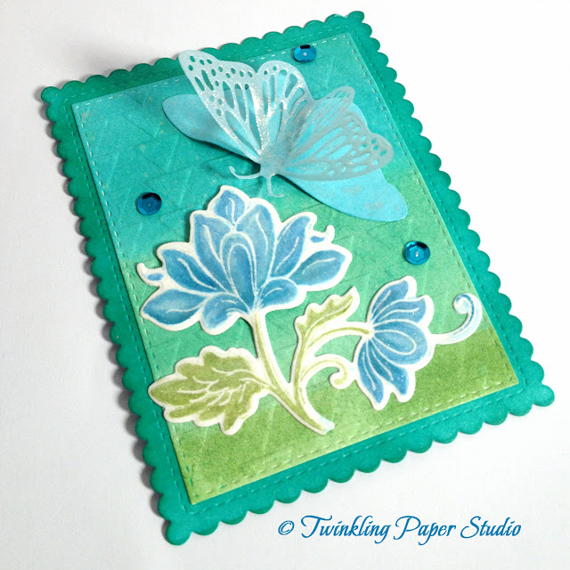
I worked on another Ombre card today in between my puppy girl, Holly, wanting to be on my lap for some snuggles and trying to get some of the mess off my desk.  I completely failed at the latter. Plus, I got some new white paper to photograph my cards on and it is much whiter than what I had before so that means fewer edits.  What I had before was from when I had a portrait studio and it was a much softer white to go with skin tones for high key photos. 

While this card front is ready, I haven't actually attached it to a card base yet. When I do, it'll likely be on Whisper White or Bazzill Card Shoppe Marshmallow.   Either of those work well with the not so stark white of my watercolor paper.  


I have a little trouble getting good pictures that accurately portray everything on the cards, but I did my best to get some closer shots and if I tell you what is there, you might just be able to see it. *Ü*


For this card, I started with a panel of Canson Water Color Paper.  When I was in class last week and the early part of this week, I played with some of my reinkers with some Perfect Pearls Solution mixed in.  I love the soft shimmer this gives to your paper, even with the water mixed in. My best guess is that the colors I used here are Bermuda Bay, Wild Wasabi and Tempting Turquoise.   You can make your Perfect Pearls Mist using a Mister Bottle with some Perfect Pearls Pigment Powder or you can just buy the ready made spray.  Another product you can use to achieve some sparkle and shimmer is Tsukineko Sheer Shimmer Spray.  These both use water in the spray, so you can't get too heavy handed with it.  It works best if you spray a light layer and then go back with another coat or two depending on your personal taste.   I love shimmer and sparkle so for me, it's usually three coats but it took me a while to go easier and in layers so my paper didn't warp too badly.  Next I embossed that using a We R Memory Keepers embossing folded in an arrow design.  I also used the Sheer Shimmer Spray after I cut this panel using the Simon Says Stamp Stitched Rectangles.  This size is the 2nd to largest frame.


The Scalloped Rectangle started as Soft Sky paper from Stampin' Up.  Using the Tim Holtz Mini Ink Blending Tool, I blended in SU! Bermuda Bay going in a circular motion and not paying too much attention to the center panel since I knew I was going to be covering it up.  I wanted the edges of this panel to be the dark part of the color.  The ink blending tool lets you do that without too heavy a concentration of whatever ink pad you are using.  It's a good idea to get a package of foam replacement pads and just have one for each color family of inks that you have.    There are so many blues that I have one for dark blues like navy, one for ocean blues and a 3rd one for light blues.  So far this is working for me.

Next I used Distress Marker in Peacock Feathers (with some Shabby Shutters for the leaves and stems) to watercolor my heat set Persian Motifs image.   Because my watercolor paper is not bright white, I use Simon Says Stamp Clear Embossing Powder.  You could also use any color you desire to be included in your final card front.  I haven't tried gold or silver yet, but it's on my to do list! Heat setting your image with embossing powder makes water coloring incredibly easy.  For the first layer of color on the flower, I used my water brush, but the 2nd and 3rd layers were blended using my Wink of Stella Clear Glitter Pen. That was another technique they used in my online card class.  Once I had the image colored in, I die cut it with the matching die.  This stamp set has three sizes and shapes of floral images and some separate leaves so you can build a scene if you like.

I like to attach the flowers with a small bit of foam adhesive in the center of the biggest part of the flower and then I used Ranger Multi-Medium Matte on all the other parts of the flower to stick them down. That makes it look a bit raised up/bigger in the center so it seems a little more realistic and dimensional.  If I don't have smaller squares on hand, I just cut a big one in half or in quarters.


This butterfly die is one made by Impression Obsession and is a two piece die set. None of the stores I am affiliated with carry this die.  It was purchased at this year's local CK Scrapbook Convention.  Mine has a 3-inch wing span if you want to compare the sizes. 

I cut the butterfly's body with some paper scraps and the wings from vellum. Bazzill makes a really nice 40# vellum.  I like to use an adhesive down just the center of the body to attach the vellum layer.  I used Ranger Multi Medium Matte and it dried clear with no traces of adhesive showing either through the vellum or oozing out from the sides of the body.  I tried a different liquid adhesive first and that one was not very successful.  Once I had that adhered, I used my Wink of Stella Clear Glitter Brush Pen on the vellum layer and the base layer where the cut outs are.  If you haven't tried that product, I highly recommend it.  It's made by Zig and has a real brush tip just like the Zig Clean Color Markers.  I also use a dimensional adhesive to attach the butterfly to the panel in just the front center of the body.  This gives it a bit of lift up front in a natural looking way.  Next I put a little bit of Multi Medium Matte on each end of the wing and at the "tail" of the body.  I never attach the wings all the way to the body because I want to make it seem as if it just landed on the flower.  Even though it goes down in the mail, it pops back up a bit when the recipient opens it so it keeps that effect.  


Now I confess, I had to put my ink pad carousel on the card for a few minutes to get the flower stuck down because watercolor paper is so thick and heavy that it kept wanting to pop off.  That did the trick for me.  It was the heaviest thing in my line of sight so I figured it would work.  I added just a few Peacock colored sequins from the Rhythm & Blues Collection for the final touch. 

I also want to say that the Ranger Multi Medium Matte is incredible stuff.  It really does dry to a matte finish and becomes virtually invisible.  I could not understand why everyone loved that stuff so much when I started making cards. I mean, its only glue after all (LOL).  Well I have used it on some difficult to adhere things with fantastic results but the clincher here for me was the way it disappeared under the vellum when it dried.  I'm totally sold.  Thankfully, I have a couple of bottles on hand since they are not very big.  I'm always surprised at how little it takes for great sticking power.  Its also great to use for sequins or other embellishments you might want to add to your projects.  You do need to give it a minute to dry.  After that, you are good to go.  Do yourself a favor though and get some Fineline Applicator Tips.  These caps will fit right on your Ranger Glossy Accents and Ranger Multi Medium Matte and have a built in Cap/Wire system to keep it from clogging.  I have the 18 gauge and the 20 gauge but I find the 20 gauge is too small for me.  

I hope you enjoyed this card.  I'll be back soon with another project.  

Saturday, September 26, 2015

Class Practice Continues

I'm doing a whole lot of watercolor practice right now before class wraps up next week.  Some projects I feel hugely successful with and others not so much. Ninety-Nine percent of my card recipients are female so flower images are always good for those.

This image was colored using traditional Kuretake Gansai Tambi Watercolor in #36 - Wine Red, and #58 - Evergreen with a Perfect Pearls Solution and some clean water.  I make my own solution with Perfect Pearls Pigment Powder and some water in a little sprayer bottle that came from Stampin' Up!.  You can buy Perfect Pearls Solution already made up and in a spray bottle.  I used the tiniest amount of #63 - Persian Blue, along with a VERY watered down bit of the Red Wine to achieve the super soft background.  One thing I have really learned this week is to walk away and let it dry.  The colors really come to life when they have a chance to dry.  Being a control freak, watercolor is very hard for me.  I have a hard time letting the water and the pigment do their thing.  This class has been so worth it to me for the the sheer amount of practice I'm getting.  I'm able to achieve the looks I desire for card making.  Even though I know people won't criticize a card they get in the mail, I still want my cards to be as nice as possible.


I love Altenew Stamps for the lined images they design.  They also have matching dies for many of their floral images.  This particular set is call Persian Motifs and I have the matching dies although I haven't used them yet.  The Henna Elements set is very nice as well as Peony Scrolls.  The images stamp super clean also with a thin line rather than a thicker one which is great for the "Emboss then Watercolor " technique.   Some people like bright white embossing powder for this technique but I like using Simon Says Stamp Clear Embossing Powder so that the embossing will be the same color as my watercolor paper.  In case I forgot to mention it before, the heat embossing helps the watercolor stay in the image and not go venturing outside of that line.

You all should be so proud of me because I got my Gansai Tambi Watercolors swatched!  I love this set so much now that I have had a chance to play with it following instruction.  Simon Says Stamp has this set available in 12, 18, 24 & 36 color sets.  Being Japanese Watercolors, they are extremely high quality.


I have about three different types of watercolor card stock at this time, but this one uses Canson Watercolor Paper.  It is 140# and cold pressed.  I haven't seen hot pressed paper at any of my local stores.  The difference is that hot pressed watercolor paper is very smooth.  I prefer to use the smooth side to my regular paper but you can also use the more textured side.  It just depends on the look you are going for.  Simon Says Stamp carries a wide variety of Professional Grade Arches Hot & Cold Pressed Watercolor Paper.  It's fancier than I need just for cards but I like to know where I can get it should I desire to experiment further, *wink*.

This card uses a white card base cut at 5.25 x 8.5 inches and top scored at 4.25 inches.   I used the WPLUS9 Sunshine Layers Die Set for the scalloped panel and the interior panel as well.  The burgundy is some Bazzill Mulberry which is a 100# weight.  I looked through my sentiment dies, but I didn't feel like any of them were a good fit on this card so I left it off this time.  I'm sending this card to my sweet Mother-In-Law who is at an assisted living facility.  She always loved cards when she was still able to be home so I think she enjoys the ones I make and send off to her.