Showing posts with label #Share Handmade Kindness. Show all posts

Friday, February 5, 2016

Krafty Valentines

Today I wanted to try something new to me.  I have three or four different styles of "Kraft" card stock.  You know the one - it's the color of a brown paper bag. Who knew those came in so many different colors?  I struggle to use mine at all and every time I've tried so far, I've been very unhappy with the results.  So I was asking around on a forum that I'm a member of and I was pointed toward Heather Nichols' Blog.  She has rightly been dubbed the "Queen of Kraft" and now I know why.

So after looking around her blog I decided to give it another go.  One thing I noticed is that I seem to really like Kraft with white accents or embossing.  I've even seen a few pastel embossing powders that I like, but I didn't try that today.

I pulled out my trusty Darkroom Door "French Script" Background Stamp. Laying it face up on my table I inked it up with Versamark.  Then I laid a piece of Kraft card stock on top of that and carefully holding it so as not to move or smudge it, I set a large acrylic block on top of that to press down.  There's less risk of me messing it up this way. The acrylic block glides over the surface of the paper without budging it, unlike my finger tips. I suppose it's all what you get used to doing and this is what works for me.  I heat set it using Simon Says Stamp White Embossing Powder and cut it with the largest Simon Says Stamp Stitched Rectangle.

Next I cut a My Favorite Things Leaf Filled Flourish out of Stamper's Select White Card stock. That reminds me...Have y'all ever noticed that Stampers and Scrapbooker's call it Cardstock (1 word) vs. the rest of the world that calls it Card Stock (2 words) and even spell check wants to correct it?  Ha!  Just thought I'd mention that.  For the hearts I have an old Accucut Die that I have always loved. It has one part that goes on the front of the card stock and another than that goes on the back to make the deep impression.  It's a "hinged" die if that makes sense.  I cut those using Papertrey Ink's Berry Sorbet Cardstock.  I love this color.  It has been a replacement for me of my no-longer-available Cameo Coral and it has just the right touch of pink. I absolutely love Papertrey Ink's Cardstocks. They are 110# solid core and soooo smooooth! I only have 3 colors of these so far, but I will replace my SU colors with Papertrey Ink's as my supply is depleted which will be a while.


Using Ranger Multi Medium Matte, I adhered the flourish to the background panel then attached that to my Stamper's Select White Card Base.  I used Foam Squares on the back of the hearts and adhered them with one slightly on top of the other,  I cut the "love" greeting using a die from Little Yellow Bicycle that I got at Hobby Lobby using a scrap of gold foil card stock.  I glued the "l" onto one of the hearts and the other end to the flourish which also adds a bit of dimension to the card as well.

This card will be on it's way tomorrow to my grand girls and I feel it's my first success on Kraft Cardstock.  I'll definitely be trying it again but in the meantime I'll be linking this up over on the Simon Says Stamp Wednesday Challenge Blog for the "Have A Heart" theme.

Friday, January 29, 2016

The Hands of Time

I have been in a Watercolor Class this week and I was so ready to make a card today when I finished with the lesson.  I didn't do much homework but class doesn't conclude until next Friday.

It should come as no surprise that when I sat down today to make a card, I chose pink (SU Rose Red) and coral (Simon Says Stamp Teeny Bikini) as my color choices.  I grabbed a piece of Canson Bristol Watercolor Card Stock and a couple of Mini Ink Blending Tools.  Lots of card makers just use white card stock to do this but I love the way the inks blend on the watercolor paper and I just can't get this good of an effect with card stock. This is about my favorite way to make a background panel.  I love the softness and the blend that I am able to achieve by using a bit of water to help the color along.  It doesn't take much effort and I don't have the patience to wait and see what happens by dabbing at it with multiple watercolors.

I inked up the background corner to corner with both in the middle and used a few mists of water to blend.  I use a solution of alcohol and water which speeds up this process.  Once it's dry from that, I stamped my Papertrey Ink Hands of Time clock image using Versamark and heat set it with Ranger Gold Tinsel Embossing Powder.  I forgot to use an embossing buddy or powder tool, but I took a dry brush to clean up the area where there was a bit extra. Thankfully, that only happened in one small place or I would have had to start over. *Ü*


I'd love to be able to tell you that the clock face has all those numbers on it, but it doesn't.  The stamp set does include each of the Roman Numerals so I carefully stamped them one by one.  I stamped 4 at a time, then put the Tinsel Embossing Powder on and heat set it, then moved on to the next 4.  I did mess one number up so I scraped it off with my palette knife, put more powder tool on it and re-stamped it. I can tell where it is, but I'm pretty sure no one getting a handmade card will notice.  They just enjoy the fact that you think enough of them to spend the time making a card.


The sentiment on this card is also two separate pieces so I laid the stamps face down on my card to see where they would fit, then picked them up with my acrylic block and stamped them in Versamark, again using Ranger Gold Tinsel Embossing Powder to heat set them. The hands of the clock are included with the stamps but I also got the Hands of Time Dies which are slightly larger, so I cut them with a scrap of Metallic Gold Foil Card Stock.


I cut my background panel with my favorite Simon Says Stamp Stitched Rectangle in the largest size and started assembling everything.  In photography, there is the rule of thirds that you should pretty much always use and I've found the same to be true in card making.  So my clock time is set using the rule of thirds.  For whatever reason, this is the most visually pleasing to most people. I poked a hole at the center of the hands for a tiny gold brad then mounted the background panel onto a PTI Stamper's Select White A2 card base.

This certainly isn't the most difficult card I've ever made, but I love how it came out.  I also love that it is flat for mailing.  I tend to mostly make things that are easily mailable so that I can send more cards rather than spending a fortune on postage and not being able to send as many.  Everyone loves to get a personal note in the mail.  This is an irrevocable truth.

I'll be entering this card over at the Simon Says Stamp Wednesday Challenge Blog this week for the "Anything Goes" Challenge.  I still have a few valentines to make so hopefully I'll be back here with one or two more before the weekend is over.
 
Thanks for stopping by today.  I hope everyone has a fantastic weekend!

Sunday, December 27, 2015

Peace and Joy in 2016

Even though I did make a card today, I can't seem to get it photographed decently.  I guess the colors I selected are more muted and just not that vibrant and the sparkle I added seems to be not that evident either so this is a poor representation for the Simon Says Stamp Wednesday Challenge which is "Make it Sparkle".  Trust me, I'll try to do a better one.

I wanted something similar to a card I made previously but thought I would go for a more "Chic" look so I started by embossing this Hero Arts Peace & Joy Stamp using WOW! Metallic Platinum Sparkle Embossing Powder and cutting it out with the WPLUS9 Love Showers Tag Die.  I used Wisteria Wonder Card Stock from SU! and embossing the word "in" from the Winnie & Walter "The Big, The Bold and The Comfort" Set using the same embossing powder. The embossing appears to be just a dull grayish color, but it isn't!  The A2 card base is Bazzill Marshmallow Card Stock with the front embossed using a Design Objectives Embossing Folder.  It isn't as 3D as the Next Level Embossing Folders, but it is more than just a 2 dimensional look.


I cut the stars from some old QuicKutz Dies that I had, the streamers from the Taylored Expressions Raise Your Glass Die Cut Set and the numbers from a number set by QuicKutz called No. 73.  I put 8 strands of DMC metallic thread through the hole in the tag and did a slip knot.  

To make sure the numbers matched as far as the color, I inked up a piece of scrap card stock using Versamark and put the same embossing powder over it and heat set it.  Then I cut my numbers. This particular color of embossing powder is a bit warmer than silver, so it was important to me to match it up and silver glitter paper just didn't do it.  Additionally, all of the paper was spritzed with Tsukineko Sheer Sparkle Shimmer Spritz.

To assemble the card I used a combination of Foam Squares and Ranger Multi Medium Matte. The tag and the bottoms of the numbers have foam on them while the top of the numbers have a bit of adhesive so they lay flat against the tag at the top.  The streamers are adhered with Ranger Multi Medium Matte as well. The stars are also a combination of foam squares and liquid adhesive.  

Assembled, this card barely fits in the envelope and if I made it again, I would make it 4 x 5.5 to give it that extra bit of room.  This card is side folding and I don't like it as much as the top folding version I had made before.  But it's for my best friend and she won't have nearly as critical of an eye as I do.  She just enjoys getting the card in the mail. 

Thanks for stopping by today.  I already have an idea for my next card so I'll see you all soon!  I'm going to have two of my granddaughters here for a few days this week before school starts again the next week, but I will be around.  Be sure to let me know if you have any questions and I'll answer them for you.  

Wednesday, November 25, 2015

So Kind

Today's card is a complete and total CASE from Jennifer McGuire all the way down to the stamp set and die cuts she used here.  I even used the same kind of water color that she used but I didn't have any little helpers to make backgrounds for me so I created a couple of my own.  I was able to cut 2 hearts out of each background that I colored using my Kuretake Gansai Tambi Water Color Set. One background I did completely at random and the other I intentionally made the ombre stripes.  Jennifer used her set of Finetec Mica Watercolors for the gold shimmer but mine have been back ordered and only shipped today, so I dipped my wet paint brush into my Perfect Gold Perfect Pearls and used that with a liberal amount of water for my top layer.  The backgrounds have a beautiful shimmer to them.


Since I knew that I would be painting these backgrounds in their entirety, I used my "not quite as white" Canson XL 140# Watercolor Paper for these.  I pulled some of the little pans of color out of my set and misted them with a short spritz of water to get the color moving a little bit.  The bottles I have came from Stampin' Up but this one by Judikins would work great as it has a very fine mist.

After I cut out my hearts using the Memory Box Stitched Heart Layers in the largest size, I lined up my coordinating die to go across the heart leaving the word, a top piece and a bottom piece.  Using a temporary adhesive, I put all three pieces down on my card front to line it up, then pulled out the word so that I could stamp the word in exactly the right spot.  Once I stamped that in Versamark, I pulled the top and bottom pieces off temporarily so that I could heat emboss it using Metallic Gold Sparkle Embossing Powder from WOW!  I didn't want any stray bits of embossing powder to stick to the heart parts until I was finished melting the powder on my sentiment. WOW! treats their embossing powders to be static free, but it's always a good idea to use a powder tool or embossing buddy first. WOW! is available in 136 different styles and colors from Simon Says Stamp, so there is something for everyone. Next, I adhered the top and bottom of the hearts back into place using a permanent adhesive.


This "Being Classy" stamp set is from a newer stamp company, Concord & 9th. The coordinating dies cut the outline only so this is why it works for this technique.  There are several words included in the set to make multiple greetings that are thankful or encouraging.  I think a thorough review of all my coordinating sets is in order to determine what other cards are possible using this same technique.  One of the best things about this card is that it is highly mailable.  There's no foam popping up the front panel that might get squished.  I seldom make a single layer card and this is easily the nicest one I have ever done.

The card bases are all made from Bazzill Marshmallow in a top folding A2 standard sized card. For the hearts, I swiped a piece of white card stock across my Versamark Ink Pad then sprinkled Metallic Gold Sparkle Embossing Powder on it to make an exact match. Using the Simon Says Stamp Mini Hearts Set die after I heat set that, I cut 3 rows of hearts for my 3 cards.  I'll keep the extras in a little container that I keep of spare parts.  I attached a few of the hearts randomly on each of my cards using Ranger Multi Medium Matte.  Just to keep everything in place, I laid a large acrylic block on top for a couple of minutes.


One of the words with a matching die for this set is "courageous" and I plan to make a card for each of my friends who are currently battling Breast Cancer. Thanks for stopping by today.  Please feel free to leave me any questions or comments.

Tuesday, November 24, 2015

A Note of Thanks With a Bit of Kindness Thrown In

Beautiful Day by Altenew
Today's card uses a few new things I've gotten recently.  The stamp set is from Altenew and is called "Beautiful Day".  I just love the outline image in this set that I can watercolor. It is actually a 4-part layering set, but I haven't tried it that way yet simply because I love to watercolor. This set was released just this month and I ordered it from Altenew the very first hour it was available for purchase on their website. I was sitting at my computer waiting for the appointed hour to arrive. Yes, you can make fun of me if you want, but hey, I know what I like.

One of the things that struck me when I first saw this set is that the flowers also look like Wild Roses and I will use it for that as well. This is a larger stamp set than most of mine set at 5 3/4 x 8 inches.  The large majority of my stamp sets are 4 x 6 inches.

There are several stamps included in this set including some floral branches and some sentiments that I will definitely use.  I've only recently figured out how to create a scene using masking for a realistic look, but this set has been pretty easy so far.

Acts of Kindness by Hero Arts
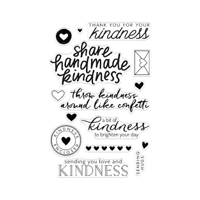
As a part of the Share Handmade Kindness campaign by Jennifer McGuire, Ink, Hero Arts designed the "Acts of Kindness" stamp set and is donating 25% of the profits to the Kind Campaign which is an international movement trying to end girl on girl bullying. Everyone could use a little more kindness in their life, don't you think?  I love all of these sentiments but especially the one that says, "throw kindness around like confetti".  I also love the little envelope and the hearts that you can add to your greeting.  What a great set for "Thank You" Cards as well.  I always sign my cards to friends with "sending hugs" so I really love that this sentiment is included in the set.

I also tried out a new embossing powder from WOW! in the color Platinum Sparkle.  The photo doesn't do a very good job of portraying how beautiful this embossing powder is so you will have to take my word for it.


For the floral image, I used Zig Kuretake Clean Color Real Brush Pens in Violet, Cobalt Blue and Deep Green for the leaves.  I cut the watercolor panel with the largest of the Simon Says Stamp Stitched Rectangles and adhered that to a piece of "Grape" card stock from Creative Memories using Ranger Multi Medium Matte. I attached that to a standard A2 top folding card base.   The Clean Color Real Brush Pens have some of the most vibrant and transparent colors you will ever see for watercolor. To finish up, I used Wink of Stella in clear on the flower and all of the leaves.  In this case, I am using this card to send a note of thanks to someone who loves both, flowers and watercolor. 

Thanks for stopping by today.  I will be back soon with another project to share with you.

Sunday, November 15, 2015

Artful Flowers

I sat down this morning to make a card for my sweet Mother-In-Law so that I can continue to "Share Handmade Kindness" in support of Jennifer McGuire Ink's November Challenge. Right now, I have a good supply of watercolor paper on hand and I've been wanting to play with some of my background stamps and my watercolor crayons.  I have the SU! Watercolor Wonder Crayons in Rich Regals, Soft Subtles, Brights and Neutrals.  These aren't available for purchase anymore, but if you want to try out something similar, try some Faber Castell Gelatos. They will be creamier than the water color crayons.

When I took the Watercolor for Cardmakers class, Shari Carroll did a class that used the Gelatos and I've been wanting to try my crayons since then.  I wish now that I had tried them sooner.  I love the watercolor backgrounds that can be achieved and created using background stamps.  I don't have too many of these -- only about five of them that I got at the Scrapbook Convention this year in August. Not all background stamps work for this type of background.  I have one that is stitched lines in leafy swirly patterns and that one did not give a very good effect. Any stamp that has a lot of surface area will work great.

I started out by laying my stamp with the stamping side face up on my work surface.  The particular stamps I have are all Cling Mount Red Rubber Stamps. Simon Says Stamp carries a wide variety of background stamps in their own brand and in many other brands -- 748 of them to be exact.  Next I took a Watercolor Crayon and colored directly on the stamp, trying to make sure that I had colored over every part of it. I have several small spritzer/misting bottles that came from Stampin' Up that I just love.  They are about twice as big as the Ranger Mini Mister and also a bit bigger around so easy for me to handle.  I keep various solutions such as Perfect Pearls mixed in water in mine and I have one that is just plain water.  I have a label maker and I always label whatever solution is in the bottle as I also have one that is Rubbing Alcohol so I wouldn't want to mix them. I misted all over the stamp with my water about a foot above the stamp and let that start activating.  I gave it a few seconds and then put a piece of watercolor card stock on top of that, then my largest acrylic block on top of everything.


My largest block is 5 x 7 as are my background stamps.  By laying my acrylic block on top, I am ensuring that the paper is in contact with the background stamp and the color over the entire surface of my paper.  The very light background in this card was achieved by a third generation stamp with paper to the stamp (vs. stamp to the paper).  The first and second generation stamps were also quite beautiful, but I had already water colored these flowers in anticipation of this card.  I felt that when I put the deeper concentration of color with the flowers it overwhelmed them.  However, I like all the variations of color I got using this technique so as I always do, I will save these experiments to use later. Also, when you lay the acrylic block on the top you don't have to worry about accidentally moving the paper and messing up your stamped image.

The hardest part of this technique for me, is letting everything dry so you can see what you really have.  As always, watercolor looks better once it is dry.  This third generation background didn't look so hot when it was still wet, but I love the end results.  It's there, but you might not notice it on first glance.

I've continued to explore the results of various watercolor mediums we studied in that class, so I had already "painted" my flowers from the Simon Says Stamp Watercolor Friendly Flowers for this card yesterday using Distress Markers, Zig Clean Color Real Brush Markers and Water Color Pencils. I knew that I wanted an arrangement of the flowers in something, so I sat down with my dies and tried to "see" something different than the original purpose, that I could alter to make a container for the flowers.  The pot or container is actually a mixing bowl from some old QuicKutz Revolution Cooking/Baking Dies that I got several years ago.  I cut off approximately the top third of the die to make a shorter container using my Score Pal to put a crease in just the right spot at the base of the bowl and a wider one at the top like many crockery style bowls and containers I've seen in the past.   I water colored it using Pumice Stone and Gathered Twigs Distress Markers.  I put a foam square in the very center of the bowl then gently curved the outside edges with my bone folder so it would appear rounded and put glue dots on the underside all the way around the rest of it.


For the greeting, I stamped the "Thinking of You" sentiment on a 3/4 inch tall piece of watercolor card stock and white heat embossed it using Simon Says Stamp White Embossing Powder.  I used a SU! Pretty In Pink Ink Pad and just swiped it across the banner for some color.  After assembling my card I added a few sequins for just a touch of bling and mounted it all on an Ivory A2 Card Base.

I'll be linking this post over at the Simon Says Stamp Wednesday Challenge Blog in the "Thinking of You category".  Thanks so much for stopping by, today!  I hope you have a great evening and I'll be back soon with another project designed to "Share Handmade Kindness".

Wednesday, November 11, 2015

Pretty Purple Poinsettias

Today's post is not really a new technique, but I don't think I've shared it on here before.  And even if I have, a refresher is always a good thing.  I'm actually combining a few techniques from my class this week.

I started by masking off the top two thirds of my card with the same strip of Post-It Tape that I used for my homework for Monday's class. Using a Tim Holtz Mini Ink Blending Tool, I started inking up the bottom portion of my front panel using Simon Says Stamp Thistle Ink.  I really love that color a lot. It's a cross between pink and violet and it makes me happy to just see it.  It did take several layers to get the intensity and depth I wanted and honestly, I could have started with a darker colored ink but it's okay.  I had plenty of time and I was not in a rush.  Once I had my ink blended on the bottom portion, I sprayed a solution of Tsukineko Sheer Shimmer Spray just on the ink blended portion then set it aside and moved on to my die cutting.

I used the Spellbinders Layered Poinsettia Die and cut all of the layers plus one leaf using my 100# Bazzill Marshmallow Card Stock.  I used my metal shim so that I would not need to emboss in a separate step.  I took the same ink blending tool and started by putting it down in the very center of each layer of the flower and turned back and forth right on the center very gently so I wouldn't bend up the layer.  For this I used SU! Blackberry Bliss Ink. It is a much deeper color and took seconds to do.  This left my flower layers still white on about the outer half so I came in with Simon Says Stamp Hollyhock Ink to finish up the ink blending. I did get out my already inked "pink" foam for this to keep the color pretty pure. I finished inking the outer half of the layers then took the purple blending tool and inked the edges of each petal. This gave me great shadow and depth.  Since the embossing makes hills and valleys on the paper and the hills are the highest points, it deposits more ink on those areas than on the valleys.  I set those aside to dry.  I've learned the hard way that even though the ink may feel dry to the touch, it really needs time to become completely dry.  With the dye based inks, the color smooths out while it is drying even though it may seem blotchy when you first stamp it. That's just the nature of the dye ink vs. a pigment ink that will stay pretty true to however it looks when you stamp it.  I started with Simon Says Stamp Beanstalk Green Ink for the leaf but eventually moved to SU! Garden Green to get the deeper shade.


I had recently (in the last 6 months or so) taken two Stampin' Around Wheels off their round little wheels and remounted them on some cling foam. The one I used here has always been a favorite.  It's 7 inches long all stretched out so it could also be used on larger cards  I have a  2 x 12 inch acrylic block that I got several years ago from Close To My Heart but Lawn Fawn has one here that is 2 x 8 inches.  Using Versamark Ink, I stamped that just beneath my line where the ink blending is and heat embossed it using Simon Says Stamp Silver Embossing Powder.

For the sentiment, I die cut that in Bazzill Marshmallow Card Stock then inked it up with Versamark.  I sprinkled the same Silver Embossing Powder all over it and heat set it then repeated that same process to get a double layer of the silver powder melted onto my die cut.  It gives the die cuts so much dimension.  I hadn't done that in so long I had forgotten how much I like it!  *Ü*

Using Ranger Multi Medium Matte I adhered the die cut sentiment along the diagonal line on the front panel.  Then I assembled the poinsettia layers just in the center with Multi Medium Matte and topped it with a Silver Sequin using a mix from Stampin' Up that I got a few years ago.  I attached that to the card front with one foam square in the center of the flower and one under the leaf.   I used the same SU! sequin mix for the small and large silver sequins and a Sparkling Clear Sequin in the 10mm size from Pretty Pink Posh for the embellishment on the right hand side of the front panel.


I tucked in the leaf, then trimmed the left side of the panel to fit on my 4.25 by 5.5 inch top folding Blackberry Bliss card base with a border of color on each side and none on the top or bottom. I cut a piece of fun foam slightly smaller than the card base, adhered that to the panel and used Multi Medium Matte to attach the finished panel to the card base.

The Share Handmade Kindness Campaign continues for the whole month of November in addition to my Online Card Class so I'll be back soon.  Please leave a comment for me if you stop by and thanks for visiting!

Monday, November 9, 2015

Online Card Class - Holiday Style


You all probably remember a couple of months ago when I took an online class called "Watercolor For Card Makers".  For the next few weeks I am taking another fantastic class through Online Card Classes called "Holiday Style" and it will feature many different styles of cards for the upcoming season. Today's card is "Clean and Simple" style.


I started by creating my card bases from 100# Bazzill Marshmallow.  These are 4.25 x 5.5 top folding cards.  Next I used a piece of 2 inch wide Post-It Tape to create a diagonal mask on the lower third of my card front.  I used the same piece for each of the cards and I will use it many more times and wear all the "sticky" out before I throw it away.  You could also use a couple of Post-It Notes if that is what you have.  Additionally I used a piece of painters tape on the top end to keep the panel in place on my craft mat while I did my ink blending with a Tim Holtz Mini Ink Blending Tool.  I don't use a clean pad for each color of ink that I have, only one for each color family; blues, reds, greens, etc.  My only exception might be for any pastel varieties of color but so far, I haven't needed one for pastels.  I used Simon Says Stamp Ink in Lipstick Red, with Stampin' Up's Rich Razzleberry and Pacific Point inks.  After I colored that portion of my card I misted each with my solution of Perfect Pearls and water that I keep in a little spritzer bottle, but before removing the mask.  You can buy little mister bottles at Simon Says Stamp or use one that is empty from another kind or type of product or you can buy Perfect Pearls Glimmer Spray ready to go.


I created the diagonal lines by scoring that section of my card front at 1/2 inch increments all the way up.  You make the first line by scoring on the top of the card.  Then flip it over, make the score line again in the same place and now the line will be raised on the front.  All of the additional lines will also appear raised on the front.  I couldn't have done this very well without my Score Pal.  Simon Says Stamp has the Martha Stewart Mini Score Board if you need one.  I've had my Score Pal for several years and it is actually a "Score Pal" brand.  If I didn't already have one, I would buy the mini because it takes a lot less space to store it.


Once you complete the score lines, you can stamp your sentiment on the front and finish it in whichever method you would like.  I used Simon Says Stamp Super Fine Detail Gold Embossing Powder and Fine Detail Silver Embossing Powder with the Simon Says Stamp Big Scripty Greetings - Holiday Stamp Set for both.  You could use a die cut if you wanted and I have a Christmas Blessings die cut that I plan to use in the future.

I loved the simplicity of this card design but I had to add my own little spin on it of course.  For the red card, I stayed true to the design of the class, but for the other two I put a strip of glitter paper that I pulled from my scraps along the diagonal.  You could use whatever width you want.  I actually would have like a skinny little strip on the red card, but I had already adhered everything by the time I thought of it.  I sort my paper scraps by color family so I usually know what I have in my scraps and I didn't need much for this card.  *Ü*


I cut the Poinsettia Leaves and Berries from the same Bazzill Marshmallow Card Stock.  The dies are from Spellbinders so they cut and emboss in one pass if you use the metal shim and/or the embossing pad.  I also did ink blending on the leaves in Simon Says Stamp Beanstalk Green and Stampin' Up Garden Green. For the berries, I used the Lipstick Red with several layers of color and Blackberry Bliss for the purple ones. Once I had everything adhered, I went over the berries with my Wink of Stella Clear Glitter Bush Pen and then put a coat of Glossy Accents on the top of each berry for the final touch. 

These were super fast cards to put together and I didn't need a lot of different papers or special supplies.  I already had everything I needed to make this "Clean and Simple" card.  I really love the look of the blended inks using the Tim Holtz Mini Ink Blending Tool.   The more layers you add deepens the intensity of the color. While I like the shimmer from the Perfect Pearls Solution, I also really like the card well enough not to use it on other cards I might make using this design. 

Thanks for stopping by!  Feel free to leave a comment if you like because I read every single one.