Showing posts with label Tsukineko Shimmer Spray. Show all posts

Sunday, July 10, 2016

Magnolias For Her... Again

I felt like it had been ages since I last sat down to watercolor so I wanted to do some yesterday. I saw a card yesterday morning on another blog and it reminded me how much I love this set.  The current challenge over at the CAS Mix-Up Challenge is for Stamping, Markers and my choice of a 3rd technique. For today's card I used Stamping & Zig Clean Color Real Brush Markers, with heat embossing, Die Cutting and Sprays.  I also plan to enter this card in the Altenew July 2016 Challenge of "Weddings".  It doesn't have the yellow color in the inspiration image, but it does feature Altenew Stamps, Dies and Cardstock with the white, pink and green, so I'm entering it.


To begin with, I stamped all of the flowers in the Altenew Magnolias for Her Stamp Set except for the sentiments using Versamark onto a 4.25 x 5.5 inch piece of Canson Bristol Watercolor Paper which is my favorite.  In fact, I ordered a pad of this paper yesterday in Bright White which is a new product for them. The Bristol I normally use is a soft white rather than a cream like most watercolor papers and if I am water coloring on it, then it's no big deal usually.  But occasionally if I am doing a white on white card the difference is noticeable.  Anyway, I heat embossed the blooms using Simon Says Stamp Antique Gold Embossing Powder.  This is still my favorite gold embossing powder.

I knew for the sentiment I wanted to use one from Altenew's Beautiful Day Stamp Set and I already had some of those stamped and heat embossed so I only needed to cut one of them out. I also stamped the branch from Vintage Flowers and heat embossed it in gold then went ahead and die cut it as it's a solid image and there is nothing to paint on it.

Next I cut a top folding card base with the Noted: Scalloped A2 Dies from Papertrey Ink out of Altenew's Spicy Yogurt Cardstock.  This card stock is so nice and I love it.  It's not quite as heavy as what I use most of the time but it's 92# cardstock so still quite a bit heavier than SU! Cardstock. I just got my first pack of 10 sheets and I know it's one I'll use over and over again for masculine and feminine cards.  It looks very much like a paper that Creative Memories used to have called Spargo.  It was my all time favorite and I used it like most people use White or Kraft Cardstock.  This paper is only available on the Altenew Website.  I haven't seen anything close to this anywhere else either.


I watercolored the blooms with my Zig Markers in Sugared Almond Pink and Olive Green.  It doesn't take much water to move the color around on the Bristol Paper and I also wanted soft color since this is a wedding card.  Once I had everything painted and the paper was completely dry, I die cut it using the Magnolia's For Her Coordinating Dies and started placing my elements onto my card front.  I have a magnolia tree in my yard so I know the branch isn't an accurate representation of how a real magnolia branch looks, but it's okay. It's just supposed to make the recipient smile.

I arranged the flowers and leaves along the branch and adhered them with a combination of Ranger Multi Medium Matte and Thin 3D Foam Squares.  I added some pale pink and iridescent sequins to the card then carefully misted the whole card front with Tsukineko Sheer Shimmer Spritz.  I let that dry and added a second coat. I love the delicate color in this card and I tried to capture the shimmer which is difficult on this speckled cardstock.  I hope you can see a little bit of it and imagine the rest.


I hope you are having a great weekend.  Thanks so much for stopping by my blog today.  I really appreciate it any time you leave a comment for me or if you have questions be sure to use the "Contact Me" form on the right hand side bar.

Sunday, December 27, 2015

Peace and Joy in 2016

Even though I did make a card today, I can't seem to get it photographed decently.  I guess the colors I selected are more muted and just not that vibrant and the sparkle I added seems to be not that evident either so this is a poor representation for the Simon Says Stamp Wednesday Challenge which is "Make it Sparkle".  Trust me, I'll try to do a better one.

I wanted something similar to a card I made previously but thought I would go for a more "Chic" look so I started by embossing this Hero Arts Peace & Joy Stamp using WOW! Metallic Platinum Sparkle Embossing Powder and cutting it out with the WPLUS9 Love Showers Tag Die.  I used Wisteria Wonder Card Stock from SU! and embossing the word "in" from the Winnie & Walter "The Big, The Bold and The Comfort" Set using the same embossing powder. The embossing appears to be just a dull grayish color, but it isn't!  The A2 card base is Bazzill Marshmallow Card Stock with the front embossed using a Design Objectives Embossing Folder.  It isn't as 3D as the Next Level Embossing Folders, but it is more than just a 2 dimensional look.


I cut the stars from some old QuicKutz Dies that I had, the streamers from the Taylored Expressions Raise Your Glass Die Cut Set and the numbers from a number set by QuicKutz called No. 73.  I put 8 strands of DMC metallic thread through the hole in the tag and did a slip knot.  

To make sure the numbers matched as far as the color, I inked up a piece of scrap card stock using Versamark and put the same embossing powder over it and heat set it.  Then I cut my numbers. This particular color of embossing powder is a bit warmer than silver, so it was important to me to match it up and silver glitter paper just didn't do it.  Additionally, all of the paper was spritzed with Tsukineko Sheer Sparkle Shimmer Spritz.

To assemble the card I used a combination of Foam Squares and Ranger Multi Medium Matte. The tag and the bottoms of the numbers have foam on them while the top of the numbers have a bit of adhesive so they lay flat against the tag at the top.  The streamers are adhered with Ranger Multi Medium Matte as well. The stars are also a combination of foam squares and liquid adhesive.  

Assembled, this card barely fits in the envelope and if I made it again, I would make it 4 x 5.5 to give it that extra bit of room.  This card is side folding and I don't like it as much as the top folding version I had made before.  But it's for my best friend and she won't have nearly as critical of an eye as I do.  She just enjoys getting the card in the mail. 

Thanks for stopping by today.  I already have an idea for my next card so I'll see you all soon!  I'm going to have two of my granddaughters here for a few days this week before school starts again the next week, but I will be around.  Be sure to let me know if you have any questions and I'll answer them for you.  

Wednesday, November 11, 2015

Pretty Purple Poinsettias

Today's post is not really a new technique, but I don't think I've shared it on here before.  And even if I have, a refresher is always a good thing.  I'm actually combining a few techniques from my class this week.

I started by masking off the top two thirds of my card with the same strip of Post-It Tape that I used for my homework for Monday's class. Using a Tim Holtz Mini Ink Blending Tool, I started inking up the bottom portion of my front panel using Simon Says Stamp Thistle Ink.  I really love that color a lot. It's a cross between pink and violet and it makes me happy to just see it.  It did take several layers to get the intensity and depth I wanted and honestly, I could have started with a darker colored ink but it's okay.  I had plenty of time and I was not in a rush.  Once I had my ink blended on the bottom portion, I sprayed a solution of Tsukineko Sheer Shimmer Spray just on the ink blended portion then set it aside and moved on to my die cutting.

I used the Spellbinders Layered Poinsettia Die and cut all of the layers plus one leaf using my 100# Bazzill Marshmallow Card Stock.  I used my metal shim so that I would not need to emboss in a separate step.  I took the same ink blending tool and started by putting it down in the very center of each layer of the flower and turned back and forth right on the center very gently so I wouldn't bend up the layer.  For this I used SU! Blackberry Bliss Ink. It is a much deeper color and took seconds to do.  This left my flower layers still white on about the outer half so I came in with Simon Says Stamp Hollyhock Ink to finish up the ink blending. I did get out my already inked "pink" foam for this to keep the color pretty pure. I finished inking the outer half of the layers then took the purple blending tool and inked the edges of each petal. This gave me great shadow and depth.  Since the embossing makes hills and valleys on the paper and the hills are the highest points, it deposits more ink on those areas than on the valleys.  I set those aside to dry.  I've learned the hard way that even though the ink may feel dry to the touch, it really needs time to become completely dry.  With the dye based inks, the color smooths out while it is drying even though it may seem blotchy when you first stamp it. That's just the nature of the dye ink vs. a pigment ink that will stay pretty true to however it looks when you stamp it.  I started with Simon Says Stamp Beanstalk Green Ink for the leaf but eventually moved to SU! Garden Green to get the deeper shade.


I had recently (in the last 6 months or so) taken two Stampin' Around Wheels off their round little wheels and remounted them on some cling foam. The one I used here has always been a favorite.  It's 7 inches long all stretched out so it could also be used on larger cards  I have a  2 x 12 inch acrylic block that I got several years ago from Close To My Heart but Lawn Fawn has one here that is 2 x 8 inches.  Using Versamark Ink, I stamped that just beneath my line where the ink blending is and heat embossed it using Simon Says Stamp Silver Embossing Powder.

For the sentiment, I die cut that in Bazzill Marshmallow Card Stock then inked it up with Versamark.  I sprinkled the same Silver Embossing Powder all over it and heat set it then repeated that same process to get a double layer of the silver powder melted onto my die cut.  It gives the die cuts so much dimension.  I hadn't done that in so long I had forgotten how much I like it!  *Ü*

Using Ranger Multi Medium Matte I adhered the die cut sentiment along the diagonal line on the front panel.  Then I assembled the poinsettia layers just in the center with Multi Medium Matte and topped it with a Silver Sequin using a mix from Stampin' Up that I got a few years ago.  I attached that to the card front with one foam square in the center of the flower and one under the leaf.   I used the same SU! sequin mix for the small and large silver sequins and a Sparkling Clear Sequin in the 10mm size from Pretty Pink Posh for the embellishment on the right hand side of the front panel.


I tucked in the leaf, then trimmed the left side of the panel to fit on my 4.25 by 5.5 inch top folding Blackberry Bliss card base with a border of color on each side and none on the top or bottom. I cut a piece of fun foam slightly smaller than the card base, adhered that to the panel and used Multi Medium Matte to attach the finished panel to the card base.

The Share Handmade Kindness Campaign continues for the whole month of November in addition to my Online Card Class so I'll be back soon.  Please leave a comment for me if you stop by and thanks for visiting!

Friday, October 30, 2015

Sometimes Less Really is More

The Simon Says Stamp Wednesday Challenge Blog theme this week is "Anything Goes".  Today's card is very quick!  Last night I set out to create another Christmas Card using some stamps and dies from Altenew along with another of my sentiments that came from the Papertrey Ink set that I used a few days ago.

I stamped several images on a larger piece of Canson XL 140# Watercolor Card Stock and heat set them using Simon Says Stamp Ultra Fine Clear Embossing Powder.  I opened my set of Gansai Tambi Watercolors because I knew I would want varying shades of red, green and even some brown.  After I had watercolored all of the images, I started trying to pull my card together.  I had Poinsettias, Pine Branches, Pine Cones, and some Mistletoe.

In the end, I saved all of the pieces, but I only used one lone little sprig of Mistletoe.  The greeting is simple and elegant in Gold Foil Card Stock.  I used a Glimmer Mist from Tattered Angels Kiwi to color the front panel.  I don't have any card stock that is that light and I wanted a soft green this time.  It somehow feels very gentle with the soft color, the clean and simple design and the sheer white bow.  You can make your own shimmer spray with Perfect Pearls Pigment Powder, a few drops of reinker and some water in a little spray or spritzer bottle or you can mix a little of the Tsukineko Sparkle Sheer Shimmer Spritz with a few drops of color as well.  It's all personal preference.


I used my Versamark Pen to make the three little white berries with some Pearl Embossing Powder from WOW!.  I did that twice for the added dimension but if I could have found my little white pearl embellishments, I would have used those.  Of course, I found them afterward-- LOL!

I used a Micro Glue Dot to attach the bow to the mistletoe sprig and then again to attach that to my card front.  The pale green panel was cut with the Simon Says Stamp Stitched Rectangles Die in the largest size.

Lately I've been liking only a very narrow frame around my front panels so that means I have to cut my card base down a little bit.  No big deal, I just use a T-Ruler to mark one end with a pencil and then I cut just inside the pencil line to remove it.

Have a great weekend everyone.  I always enjoy reading them if you would like to leave a comment.

Thursday, October 29, 2015

Watercolor Glads

I started today's card by stamping the Gladiolus image from the Clearly Besotted Friends Forever Stamp Set on Canson XL 140# Water Color Paper, heat embossed it with Judikins Fine Detail Silver Embossing Powder and set about to watercolor it for my card front.

I love to watercolor.  It is so soothing to me and I know my friends & family enjoy the mini works of art I send to them.

Whenever I see Gladiolus, I think of my Grandpa Shaver who named them as his very favorites.   He was killed by a drunk driver when I was 13, but I still remember seeing these flowers bloom in their special section of his vegetable garden.  "Glads" he called them and they were prolific at his funeral.   I have a really incredible number of memories with him for having lost him at such a young age.  For much of my childhood, they lived in Ft. Lauderdale, Florida, while we lived in a Kansas City suburb.  I started 4th grade when we moved to a different suburb because my dad became a police officer in that city.  My grandparents moved from Florida to be closer to us grandkids.  The six of us were the only grandchildren for them.  After they moved to the same town, I would go to stay at their house on the weekend and they would always take me to this truck stop/diner they liked for Fried Chicken (still one of my favorites) with Mashed Potatoes and Gravy.  When quizzed about what dessert I wanted, I would always ask for more mashed potatoes and gravy rather than a dessert.  So many of my memories are connected to that place in my mind and heart.  At that age I also didn't realize that my mom made the best fried chicken on the planet!

As you can imagine, while I was coloring this image I was visiting that place and time in my memory.  And as always happens when I think of flowers, I got a little curious about the specifics of that flower.  I was surprised to learn that Gladiolus are a member of the Iris family while Amaryllis is not.  You know, because Glads look like Amaryllis and vice versa.  I figured they would be of the same family but they aren't.  And Iris are perennials while Glads are annuals. Once I get a question in my head, it will not leave until I look it up, so that is your science lesson for the day.

I used Tim Holtz Distress Markers in Mermaid Lagoon to color the flowers while the leaves were done with Peeled Paint.  I used a Yellow Stardust Gel Pen for the Stamen because they are so small.  I love sparkly pens!  I bought this set a number of years ago and they still work.  I handed a card to a friend the other day and she opened it and said, "You even have sparkly pens!"  It wasn't a question as she is my nail tech and I usually get a sparkly finish on my nails called (quite appropriately) "Fairy Dust".  *Wink*

Next I took one of my many water color "experiments" where I was doing the splattering technique in blues and purples to make a night sky.  My base color wasn't really dark enough for a night sky, but I still liked the effect and it was a perfect match to the flowers I water colored here.  I cut each side of a 2 inch wide piece with a scallop border die, then cut it down the center as if it was printed paper for a decorative strip on each side of the watercolor panel.  Then I mounted that to a top folding A2 card base in Simon Says Stamp Island Blue Card Stock misted with some Tsukineko Sparkle Shimmer Spray.


I cut the Mama Elephant "hello" greeting in DCWV Silver Foil Card Stock to match the silver embossing and attached it near the bottom of my card.  I cut another "hello" for the inside of the card.  I used a white panel to go inside the card since I used a colored card base this time.


I enjoyed perusing Pinterest to see all the many colors and varieties of Gladiolus out there and pinned a few favorites to my Flora & Fauna Board.  I actually didn't see any in blue, but they certainly exist in my imagination.  Thanks for stopping by today!  Feel free to leave a comment for me when you do.  I enjoy them very much.

Wednesday, October 14, 2015

Dream a Little Dream

For today's card, I took one of the many images that I have recently colored using Tim Holtz Distress Markers and finished with my Wink of Stella Clear Shimmer Brush Pen.  This image is from Clearly Besotted's Beautiful Friend Stamp Set and has a coordinating die.  After stamping my image on Canson XL 140# Watercolor Card Stock, I heat set it using Simon Says Stamp Ultra Fine Gold Detail Embossing Powder.  I colored the image with Abandoned Coral, Mowed Lawn and Gathered Twigs.  These are super simple to take a few to color when you are on the go. You can literally throw three markers, a few embossed images and a water brush in to a stamp pocket and toss it in your purse.  The stamp pocket helps to keep everything nice and clean.  I buy the Simon Says Stamp brand of Stamp Pockets because the thickness feels identical to the Avery Elle Pockets but I get twice as many for only one dollar more.


I had previously cut a few of these Impression Obsession Butterflies in a peachy-coral color with some vellum top layers so I grabbed one out of my container that I keep spare parts in. I always cut the antennae off of the solid butterfly image and just keep them on the vellum layer so it doesn't look like my butterfly has 4 antennae.  I use a marker to make them black.  I attached the layers as I usually do by putting Ranger Multi Medium Matte down just the center of the butterfly's body to attach the vellum layer.  Using my fingernail or my bone folder, I gently curve the tips of the wings on both layers so that they are pointing slightly downward.  I use a foam square cut in half lengthwise under the butterfly's bottom layer to attach it to my background panel and then a smaller piece of foam adhesive under the tip of each wing.  The rear of the butterfly I attach directly to the card base using Ranger Multi Medium Matte or you could also use a glue dot.  This card panel is cut with my largest Simon Says Stamp Stitched Rectangle Die in Cameo Coral, which is another discontinued SU! color. 


I took 3 foam squares and cut each of them in quarters to use in attaching the floral image to the background panel.  You always need to put a little of the foam adhesive in the center of whatever image you are attaching so it doesn't "cave in" at the center.


Next I cut three of the "Dream" die cuts and stacked them up so I would have a nice, dimensional word.  This die cut came in a set of three words from Little Yellow Bicycle at Hobby Lobby but the only place I've seen it since I got mine is Amazon.  The bottom two layers are just scraps of watercolor card stock and the top one is from some scrap pieces of watercolor paper that I had painted.  I try to always look at and utilize my scraps.  If something is a nice color or special in some way, I try to find die cuts that I can use with it.  I sort my scraps by color families from time to time when the pile near my Cuttlebug starts getting too big.


I cut a thin strip of Gold Glitter Cardstock and started assembling my card.  For the word "Dream", I put a tissue underneath it and added a layer of Wink of Stella and then Ranger Glossy Accents on top, setting it aside to dry for about an hour.  When I came back, it was ready to attach to my card.  Using Ranger Multi Medium Matte, I adhered it and held it down for a few minutes so it would not come loose.  I could have set some acrylic blocks on it, but my hands were free for a few minutes Ü.  I love the simple but elegant touch that just a narrow strip of glitter card stock makes on a card.  This is a tip that I picked up from Jennifer McGuire and I find it works often when you need just a touch of something more on your card.  I considered sequins, but I like this option better for this card at least.  

Tuesday, October 13, 2015

Wonderful Watercolor

This week's Simon Says Stamp Monday Challenge is Wonderful Watercolor. This is such a huge trend right now in the paper crafting industry and it's also one that I personally love.   

My favorite medium for watercolor by far is using Distress Inks either in the form of Distress Markers or Distress Re-Inkers mixed with a bit of water.  Pearlized water can be made made by adding some Perfect Pearls Pigment Powder or you can use Tsukineko Clear Shimmer Spray.  I have a few colors of the Perfect Pearls but I really only ever use the Pearl Colored Pigment for this technique.

All 57 (the current #) Distress Inks were formulated by Tim Holtz and Ranger to activate or reactivate with water, even after they are dry. They are non-toxic, fade resistant, and water based. They work great for hand coloring line images, or giving an authentic vintage feel to your other projects. They come in Ink Pads, Markers and Re-Inkers.  All of these are available at Simon Says Stamp

For this card I had a background panel on hand from when I took my Online Card Class - Watercolor -- Exploring Mediums.  This particular panel was done using Kuretake Gansai Tambi Watercolors on a Canson Watercolor Paper in 140# weight.  I have the set of 36 which includes two different colors of gold pearlescent shimmering paint and a white pearly one as well.  There are smaller sets available in 12, 18 and 24.  I treated the paper afterward with a Tsukineko Shimmer Solution misting a light layer a couple of times so it didn't warp my paper.  This particular water color paper is a soft ivory color vs. some papers that are whiter and brighter.  I like both options.   


I wanted a teal color with a bit of a bluish green all tangled together for this background.  I was trying to see if I could maintain 2 separate areas of color but with no hard lines.  It's hard for me to be patient and let the water do it's work, but I did succeed here and on a few other panels as well. Since I didn't want hard lines,  I just used a bit of paper towel to pull up the extra color and moisture as the colors were drying.   It's a good idea to have a bit of paper towel or tissue along with a bit of water when you sit down to watercolor.  You can fix virtually any mistake made in your watercolor by adding clean water to the "messed up" area and sopping that up with a bit of tissue or paper towel until it's clear again. I get outside the lines from time to time and this is an easy fix so far.  I'm sure it helps that my canvas is small.  

The Scalloped Stitched Rectangle panel I had also done previously using Tim Holtz Mini Ink Blending Tools and Island Indigo Ink.  Like always, I hang on to spare parts & pieces to see if I can use them on something else at another time. 

The Simon Says Stamp Stitched Rectangles I use on almost every card I make in one size or another.   I like to buy dies that I know I will use over and over and this fits the bill for me.
The floral image is from the Clearly Besotted Beautiful Friends Stamp Set and was stamped using Versamark with Simon Says Stamp Gold Ultra Fine Detail Embossing Powder and heat set.  I normally use clear embossing powder, but I wanted something a bit different and the gold adds a touch of elegance. This set also has the Beautiful Friends Coordinating Dies I used the Tim Holtz Distress Markers in Broken China for the flowers and Mowed Lawn and Pine Needles for the Leaves. Gathered Twigs colored the branch.  I applied my color directly to the image in very small areas one at a time and blended that color out using a Water Brush.  I always pull or push the color in the direction that the leaves or petals are going.  After it's dry I go back in with another layer or two (or three) to add depth to my color for a true watercolor look and feel.  My last layer is usually some Wink of Stella or a solution of Perfect Pearls.

My husband and I traveled this past weekend so I took some images with me to color. Since the water was contained in the handle of my brush and the color was contained in my markers, I had no problems doing this in the car as long as we were on the interstate. Curvy, hilly, rural Missouri roads would not be conducive to success, so I didn't attempt it.  While I do have other mediums available to use, this is hands down, my absolute favorite! The transparency achieved with Distress Inks is just beautiful and second to none.   

Wink of Stella comes in approximately two dozen colors but you could go broke trying to buy and keep one in each color.  Since I'm adding color with markers first, I only have the Clear Wink of Stella brush pen.  From time to time I also use a Water Brush with some Gold Shimmer Spray in the barrel for coloring, but I normally only use Clear Shimmer Spray.  You can also use any of the shimmer sprays you may already have on hand. You just need to play a little bit to find out what your spray does with your type of color and get predictable, repeatable results.  When I searched for shimmer mist at Simon Says Stamp, it popped up 62 of them.  Use whichever one you like and gives the results you want.  

I used a Simon Says Stamp Exclusive Sending & Wishing Die Set for the "Sending" greeting.  The "love" die came from a different set by Little Yellow Bicycle.  For a final touch to my card, I cut some of the Simon Says Stamp Holiday Shapes - Hearts & Stars Die with some Gold Glittered Card Stock scraps.  I assembled the card panels to the ivory card base using my ATG Gun.  I've mentioned before that you cannot move anything with this adhesive on it once you press down, so make sure you have your image lined up on the panel.  I do get one a bit crooked from time to time, but as has already been said, "It's Handmade, not Hallmark".  I think people care more about actually getting a card than they do about whether or not it's a fraction of an inch crooked.   The ATG Gun is a very cost effective adhesive but not suitable for everything I do. The hearts were adhered using Ranger Multi Medium Matte.  If a bit oozes out from the side of the embellishment, it dries to a matte finish and is invisible.  It is a great, very strong adhesive for any type of embellishment.  

I have several projects on my To-Do-List right now, so I'll be back soon with another card.   Thanks for looking and feel free to leave a comment. It always means a lot to me when people take time to comment.  

Wednesday, October 7, 2015

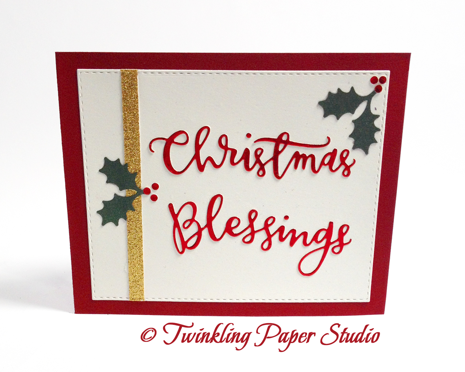
Clean & Simple II

I don't normally enter more than one card in the Simon Says Stamp Weekly Challenges but I've been anxious to play with some of my Christmas Dies.  Since that is what the Wednesday Challenge is this week, it was a good afternoon to do a little work in my studio.

I'm still trying to figure out what design I am going to use for my Christmas cards this year.  It has to be pretty simple as I will need to mass produce them. Cards just don't get much simpler than this design.

For this card I started with a landscape, side folded Lipstick Red card base.  This is one of Simon Says Stamp's 100# card stocks.  They are thick and smooth and make beautiful cards.  I treated my card front with some Shimmer Spray made by Tsukineko and set it aside to dry while I designed the rest of it.  This spray gives your paper a sparkle but you can't get too heavy handed with it or it will warp your paper.  Two light coats is far better than one saturated coat.

Next I wanted just a bit of sparkle on my card so I attached a 1/4th inch strip of gold glittered card stock from a mat stack by Die Cuts With a View onto a piece of Bazzill Marshmallow 100# Card Stock.  After that I cut the panel with my ever faithful Simon Says Stamp Stitched Rectangle Die.  That extra little touch of stitching just adds that finishing touch to whatever project you are working on and I always prefer the finish of a die cut over a trimmer cut.


A new trimmer is on my wish list as the one I have no longer has replacement blades available.  I've also learned that if you buy titanium blades, they will last much longer than a regular trimmer blade.  I cut a lot of paper, so I'm totally going for that.  The one on my wish list is a Fiskars Wire Guide Premium Cut Line Trimmer and Simon's also has Titanium Blades available for purchase.

I cut the Christmas Blessings die cut in a Die Cuts With a View Red Foil Card Stock. The little dots on the I's are very tiny, so its important to keep track of them.  For the final element on my card panel, I cut some Holly & Berries with a Martha Stewart Punch that I've had for several years out of green shimmer card stock and red foil for the berries.  My goal was to accent the greeting without overwhelming it.  To me, nothing says "Christmas" quite like Holly & Berries does.

I assembled everything with Ranger Multi Medium Matte and attached the panel with Tombow Mono Permanent Adhesive.   I have two of these dispensers and several refills on hand.  This particular card would have been a good one for the ATG because I was not using watercolor card stock.  There are 36 yards of adhesive on one roll of that and the refills come in a 2-pack for $5.99 at Simon Says Stamp.  That is the most economical adhesive that I use but the size is pretty intimidating.

I have a few more works in progress on my desk so I'll have more cards for you soon. Thanks for stopping by and please feel free to leave me a comment.

A Couple of Clean and Simple Christmas Cards

This week's Simon Says Stamp Wednesday Challenge is Clean and Simple Christmas featuring Memory Box Products if you have any.  It so happens that I do.

In an effort to understand how each of my watercolor mediums move and work, I have lots of "experiments" laying on the table in my studio.  The one featured here used Eggplant and Night of Navy Stampin' Up Inks with some Tsukineko Shimmer Solution in it.  I was going for a night sky kind of look as far as color is concerned.  I actually wasn't too pleased with the colors initially. But in the interest of trying new techniques, I got out my Copic White Medium and spattered away with a few different sizes of Watercolor round brushes.  The largest one was a Size 6 Round and the smallest one was a Size 2 Script Brush. I'm pretty sure there are some Size 4 Round spatters as well.  I still didn't like what I had done, so I moved the pieces aside and went on with some other "experiments".  Eventually I moved on to other things in my home and came back the next day.  I immediately noticed that it had a snowy night sky look, so I've been saving these panels since this past spring to use on just such a card. Watercolor always looks different when it dries.

Using some American Crafts WOW Silver Glitter Paper, I cut this Memory Box Snowflake Love Pendant die.  I thought this would make such a nice holiday or winter-y card when I originally saw it.  For this card, I chose to let the snowflakes and the night sky conjure whatever images the recipient would associate with it and not use a greeting.  It could also be used in some reds for a Valentine's Day Card.  I have a water colored red and coral panel sitting on my work surface right now, waiting for me to get to it so I might have to give that suggestion a try sooner rather than later. *Grin*


I kept the rest of the card simple using my Simon Says Stamp Stitched Rectangles Dies for the background mat and the front panel.  I used three different Martha Stewart Snowflake Punches including the Arctic Snowflake.  I don't know what the names of the other two are.  I adhered everything (including the watercolor panel) using Ranger Multi Medium Matte.  Sometimes my tape runner will pop up after a bit and a liquid adhesive doesn't do that.  I chose not to use any dimensional adhesive so my card would stay nice and flat for mailing.  I added a few sequins in the purple and magenta colors for a fun little accent as well as a purple glitter paper heart for the die cut inlay.


My second card repeats all of the first card except that I used a Penny Black Tree of Joy Thin Metal Die cut in the same silver glitter paper.  I've left off any further embellishments for now but I'm thinking I will add a few sequins on there as well.

Both of my card bases are made from Bazzill Marshmallow Card Stock with a top fold.  The mats are cut from Stampin' Up Rich Razzleberry Card Stock.

The glitter paper is some that I've had for quite some time but one thing I would note is that this glitter paper has a kind of plastic or vinyl backing on it and it was not very well suited to die cuts that are this intricate.  I have others with a regular paper backing that have cut much better.  I had already cut it and didn't want to waste it, so I did not start over.  I did have to run the dies through several times back and forth to be able to pull the pieces without tearing it.  I really love the American Crafts Glitter Paper because it doesn't lose any of it's glitter all over my table top.  I just need to remember to use it on less fussy die cuts.

Comments are always appreciated so let me know what you think!