Showing posts with label Vellum. Show all posts

Saturday, January 20, 2018

Papertrey Ink's January 2018 Create Along With Us

Hello everyone!  I want to take a few minutes today to share that I am still blogging but because we are moving to another state and I'm having to travel a lot, I don't have time for as many blog posts.  We've been working on this move for nearly a year now and things are starting to come together but I have been gone quite a bit over the holidays and now with the details and decisions of getting our home built. There are just so many details to work out but we're getting there.  I hope you'll stay with me even though I can't share as often until we get settled in our new home which should be sometime between March 1st  and May 1st of this year.

Today's card is for the Papertrey Ink January 2018 Create Along With Us Challenge and I chose one of Laurie Schmidlin's Day 1 Release projects to be inspired by.  There are always so many fantastic projects from all of the design team which makes it very hard to choose sometimes, but I wanted to make a card to send to my best friend who came to visit last weekend.  She is one of the reasons that I am so excited to be moving back to Texas as I had to leave her behind when we moved here eight years ago. We've made the best of it but we definitely plan to spend more time together once we get moved back. She works a full time+ job and doesn't have a lot of free time since she is also a mom to one daughter in high school and a son in his first year of college.


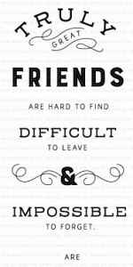
Because I feel so behind in my work right now (I'm really not behind) I wanted to try to make maximum impact at first glance by using this Quoted: True Friends saying for the focal point of my card.  I was also inspired by this card from Laurie that was posted last week for a post she did on using vellum.  Like Laurie, I like to use vellum to soften the look of background papers on my cards.  The color is there for the feel but the pattern becomes so much softer.

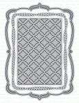
For my card, I started with a 4.25 x 5.5 inch panel of Stamper's Select Vellum and my sentiment from the Quoted: True Friends stamp set. This is a $5.00 stamp set which is fantastic. You can arrange some or all of the words however you want it to read and this time I left one group out.  Since we are moving back, I didn't want to use the "difficult to leave" part of the sentiment.  I stamped the sentiment using Versamark Ink and Heat Embossed it with Antique Gold Embossing Powder.  I repeated this twice but you have to be super careful doing this on vellum because it is very easy to burn the embossing powder. And because Vellum has a tendency to warp, you'll want to make sure you are stamping in the exact same place.  Three light coats is better than one or two heavier coats.  Once I had it embossed, I die cut it using Mix & Mat: Pretty Brackets without the center insert piece of the die.  The Mix & Mat series is so great because every single part of the die is interchangeable with other pieces from the series although I didn't use it that way today. So far there have been 11 of these die sets.


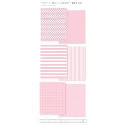
I cut the vellum so that my saying was a little closer to the right side of the mat because I wanted to use some of the Fancy Foliage Details leaves around the left side to kind of frame it up. I die cut a stitched rectangle from Bitty Big Sweet Blush Patterned Paper to go behind the vellum and used some Metallic Gold Cardstock from Gina K Designs for my background mat and the leaves. Once I attached that to a top folding card base made from Stamper's Select White Cardstock, I added a few sequins from Lucy's Rose Gold Collection to finish it off. Since 95% of the cards I make actually get mailed, I didn't want to use any 3D Foam Tape. 

The supplies I've used are linked below for your convenience (affiliate links may be used).
Cuttlebug Die Cutting Machine
Shop at:
SSS
GKD Gold Metallic Cardstock
Shop at:
GKD
Kokuyo Long Dot Runner Adhesive
Shop at:
SSS
PTI Mix & Mat: Pretty Brackets
Shop at:
PTI
PTI Quoted: True Friends
Shop at:
PTI
PTI Stamper's Select Vellum (#44)
Shop at:
PTI
PTI Stamper's Select White Cardstock
Shop at:
PTI
PTI Sweet Blush Bitty Big Patterned Paper
Shop at:
PTI
Ranger Multi Medium Matte
Shop at:
SSS
SSS Antique Gold Embossing Powder
Shop at:
SSS
SSS Stitched Rectangles Dies
Shop at:
SSS
Teflon Bone Folder
Teflon Bone Folder
Shop at:
SSS
Versamark Ink
Versamark Ink
Shop at:
PTI | SSS
Wagner Heat Tool
Wagner Heat Tool
Shop at:
SSS
WPLUS9 Gift Card Layers Designer Dies
Shop at:
SSS
Little Things from Lucy's Rose Gold Sequin Shaker Mix
Shop at:
SSS

Thursday, April 28, 2016

Clear & Sheer - Enhancing Vellum

This week I am in a class over at Online Card Classes with Jennifer McGuire and Kristina Werner called Clear & Sheer.  Lots of new-to-me ideas are being taught by some of my favorite designers, but it was Jennifer's technique from yesterday morning that caught my attention right away and I had to try it. The classes are all about how to use vellum or acetate in your projects and also how to hide the adhesive. This technique uses Dye Based Inks to stain or color vellum.  I love vellum but it is nearly impossible to find colored sheer vellum.  Now I know how to make my own in whatever color or shade I want.

To start this card I took a sheet of Papertrey Ink Stamper's Select Vellum (48#) and cut it in half lengthwise resulting in a sheet that is 4.25 x 11 inches scored at 5.5 inches and two pieces of 4.25 x 5.5 inch Stamper's Select White Cardstock.  This technique will not work with lightweight vellum since the vellum has to be heavy enough to be your front panel and stand on end.

I placed a strip of Post-It Tape across the top aligned with the score line to keep the ink only where I wanted it.  You could use any kind of low tack tape. Honestly, I am not sure it mattered since I hid the part that was above the colored part.  But I did it just to be sure. As you can see, I've used this piece of Post-It tape several times and will continue to do so until it completely loses its tackiness.

Using any kind of dye based ink go Direct To Paper (DTP) and swipe the ink pad across the vellum in the color(s) and pattern(s) you want.  Then take a dry cloth or paper towel and rub it into the paper. This will remove the excess color and moisture from the paper.  I chose to do an Ombre Pattern on two of the cards I made. For the one on the right, I used 5 different Distress Inks.  For the one pictured just below, I used Seedless Preserves and Picked Raspberry Distress Inks.  Once you get the inks blended how you want, set the vellum aside to finish drying while you create the rest of the pieces.  I also used Papertrey Ink Perfect Match Ink Cubes for another card I made as well as some Simon Says Stamp Inks.  Any die based ink will work but pigment inks do not work.


For the next card, I used a single color (Salty Ocean) on the vellum.  To hide your adhesive, just sandwich the vellum layer between two cardstock layers using any strong double sided dry adhesive. How simple is that?  

For all of these cards, I used Papertrey Ink's Bitty Bouquets Stamps & Dies to stamp the Tulip and Rose bouquets in my MISTI.  I really love how I can double stamp with the MISTI in the exact same spot to get the more vibrant color.  The roses are two steps and the tulips are three steps. The butterflies all came from the new Color Pop Butterflies Kit by Betsy Veldman for Papertrey Ink.  The kit came with several pre-printed images that you can just cut out with the dies included in the kit. There is also a stamp set in the kit but I just used the pre-printed images.  


I die cut all of the hearts from the Little B Hearts Designer Dies in the next to the largest size and cut a fun foam heart to go behind from the next size smaller so it would fit behind without showing which allows for some dimensional adhesive. I attached all of the die cut flowers using Ranger Multi Medium Matte.  The hearts came from the Simon Says Stamp Mini Hearts Die which has three different styles in three different sizes each. And y'all know that I gave everything  some Wink of Stella for that extra shimmer. 
The sentiments came from some older stamp sets by Clearly Besotted and Altenew.  I don't have much that is good for Mother's Day but I wanted to get these done, so I made do.  Since I always write a sentiment of my own inside, these worked just fine. 

The Simon Says Stamp Wednesday Challenge this
week is for "Anything Goes" and The Card Concept is a Spring or Floral Theme which I am entering in a Clean & Layered Style.  I hope to be back later in the week with another project or two for some of the other challenges that are going on.  Have a great evening everyone and thanks so much for stopping by.  

Saturday, April 16, 2016

Everything's Coming Up Roses

I am so happy to be back on my blog again this evening. I have had a tough week this week, especially the last 48 hours while one of my little puppy girls has been so sick. In the last hour, she has really rallied and is back with her happy feet and playful manner. She will always be like a puppy no matter how old she is.  I mean, really, who could resist this face?  But she has been pitiful!

I started so many projects this week and I was not happy with any of them until now.  This one is not what I originally had in mind, but I do love it.  In some ways, this started as an experiment with some of my Peerless Watercolors.  It is so hard to get a deep red in any kind of watercolor.  I didn't go as far as getting out my tube watercolors, but I have been intrigued by this color called Carnation Pink which is one of the Pretty In Pink Collection by Nicholson's Peerless Watercolors.  I have all of those colors swatched but this one is decidedly more red than pink. I could have made it Pink by increasing the amount of water, but I love how intense I was able to get this red.  It takes lots of layers of Festive Berries to get anything even remotely close to this.


For this card, I stamped the flower and two clusters of leaves from the Beautiful Day Stamp Set by Altenew onto watercolor paper, twice and heat embossed it using Simon Says Stamp Antique Gold Embossing Powder.  I only recently got the coordinating dies for this stamp set because I use this set so often. Somewhere when this stamp set first came out, I heard that it is supposed to be a peony, but it always makes me think of wild roses when I see it and that's always how I use it.  If I want a peony, I have another set I can use. *Ü*

I water colored the flower and the leaves on the extra images and the flower layer on the card base panel.  I wanted to pop up the top layers on Thin 3D Foam Squares (Scrapbook Adhesives makes it in white and black) and I didn't want the unpainted image to be noticed underneath, so I painted it.  I die cut the extra for my top layer.  As I mentioned, the rose is water colored with Carnation Pink and the leaves with Hunter's Green, both Nicholson's Peerless Watercolors.  Once that was done, I die cut the panel with a Simon Says Stamp Stitched Rectangle in the largest size.  


This week over at the Simon Says Stamp Wednesday Challenge Blog the theme is "Let's Do The Polka", which I immediately interpreted as Polka-Dots.  I am not really a polka-dot kind of girl, so I took liberties with the theme.  I used one of my stencils that has the three dots in the curve and using a Versamark Marker, inked it up then heat embossed it with Ranger Gold Tinsel Embossing Powder. I went over all of the dots a second time and added more embossing powder.  I love the whimsical feel this added to my card.  I used the Hero Arts Love Stamp & Cuts set for the sentiment and die cut the word from Gold Poster Board then adhered it to my panel with Ranger Multi Medium Matte.   

The butterfly is from SU's Papillion Potpourri as is the matching punch. I was going to use a bigger butterfly die cut, but that seemed to overwhelm the rose so I went with this smaller one.  It's heat embossed on Papertrey Ink Stamper's Select Vellum.  I made a top folding A2 card base using Papertrey Ink's Pure Poppy Cardstock.  I plan to surprise my husband by sneaking this into his lunchbox to find.  I wonder how long it will take him?  

I'll be entering this card at the Simon Says Stamp Wednesday Challenge "Let's Do the Polka", the Simon Says Stamp Monday Challenge of "April Showers Bring May Flowers" and the CAS Mix Up Challenge with my 3 being Stamping, Stenciling, and Watercolor with Die Cutting and Heat Embossing thrown in for good measure.  

I hope you all have a great rest of the weekend.  Thank you so much for stopping by and leaving me a comment if you'd like!

Saturday, October 24, 2015

A Flurry of Flakes

I sat down in my studio yesterday for only a few hours.  The night before I had made snow speckles on some light purple paper, so I knew that I would be able to assemble 4 cards in pretty short order. I made the "snow" using Copic White with some water and Perfect Pearls Pigment Powder in it.  Using a #2 Script Brush, I tapped it firmly above my paper until it resembled snowfall. Then I walked away for the evening so it would have a chance to dry.

When I returned last night I set about making my actual cards.  I had several different parts of the cards ready to go.  The background panels were already cut, the greetings heat embossed, the bows tied, snowflakes cut, etc.  Technically, I should have been able to make 4 identical cards, but I just don't seem to be able to do that even though I had all the same ingredients sitting on my table ready to go.  It's okay though! My cards are handmade, not Hallmark so each one is going to be just a bit different than the previous one.  That makes them more special.

Three of these cards use the "messy thread" technique although mine is not too messy.  I made a special trip in to town yesterday to buy a spool of gold thread and one of silver.  Now when I say "in to town", I just happen to live outside of the city limits and in a different county than the zip code my address belongs to.   This definitely has some advantages.  But, Walmart in town is only 5 miles away - literally!   I found a couple of other things to buy as well.  Who knew you could get a 4 inch tall container of glass seed beads at Walmart for $1.47.  I picked up two of those also; one in silver and one in gold.  I plan to try making a shaker card later this weekend and these will be great for that.  Not to mention that I can make at least 25 cards using each color with the amount of beads I got and I don't have to feel bad about the few cents it cost me to do it.  Plus, there was the confetti in iridescent and silver.  Those two colors will work with about any color of shaker card I might want to make.  I would feel bad if I paid much money for a technique that might not work, so this way there are no worries.


Anyway, I got off track for a bit there, but I found a few things more than just the thread I was going for.

So now I have better quality thread than I did previously for the Tie-It-Up Challenge over at Simon Says Stamp's Wednesday Challenge.  I did actually like this thread much better than the other one I already had that was iridescent. This new thread is silkier and just seemed nicer over all.  It is shiny as well, which just makes it seem more festive.  And the big plus is that it is much easier to handle.


These cards are pretty straight forward.  I have yards and yards of ribbon here, so I just had to hunt for the ones I wanted to use.  The background panels were die cut using the WPLUS9 Sunshine Layers Die.  I used the same snowflake dies that I did previously which are Simon Says Stamp Exclusive Snowflake Dies called Rylynn, Eliza, Kate and Alexis along with the Martha Stewart Punches I have in Alpine, Himalayan, and Glacial.  Simon's Nadine and Kinley snowflake dies are on my wish list.  They have a good variety of snowflake dies and several bundles as well that contain a variety of sizes.   

All of the greetings were heat embossed with Judikins Fine Detail Silver Embossing Powder which melts faster than any other embossing powder I have.   I have learned to let my heat tool warm up for about 20 seconds before I take it to my paper which decreases the amount of warping on vellum.  I also have a bit of Simon Says Stamp Silver Embossing Powder which embosses nicely too.  

After assembling the cards, I gave each one some sequins in clear and purple or I also had some snowflake sequins.   The purple paper I used is called Wisteria Wonder and it came from Stampin' Up!  When I run out, I am going to get the Simon Says Stamp Lavender Card Stock.

I have no idea what I am going to work on for the rest of the day, but I'll tell you all about it when I figure it out.  Have a great Saturday, everyone and thanks for stopping by.   Please feel free to leave a comment as I always love that!  

Wednesday, October 14, 2015

Dream a Little Dream

For today's card, I took one of the many images that I have recently colored using Tim Holtz Distress Markers and finished with my Wink of Stella Clear Shimmer Brush Pen.  This image is from Clearly Besotted's Beautiful Friend Stamp Set and has a coordinating die.  After stamping my image on Canson XL 140# Watercolor Card Stock, I heat set it using Simon Says Stamp Ultra Fine Gold Detail Embossing Powder.  I colored the image with Abandoned Coral, Mowed Lawn and Gathered Twigs.  These are super simple to take a few to color when you are on the go. You can literally throw three markers, a few embossed images and a water brush in to a stamp pocket and toss it in your purse.  The stamp pocket helps to keep everything nice and clean.  I buy the Simon Says Stamp brand of Stamp Pockets because the thickness feels identical to the Avery Elle Pockets but I get twice as many for only one dollar more.


I had previously cut a few of these Impression Obsession Butterflies in a peachy-coral color with some vellum top layers so I grabbed one out of my container that I keep spare parts in. I always cut the antennae off of the solid butterfly image and just keep them on the vellum layer so it doesn't look like my butterfly has 4 antennae.  I use a marker to make them black.  I attached the layers as I usually do by putting Ranger Multi Medium Matte down just the center of the butterfly's body to attach the vellum layer.  Using my fingernail or my bone folder, I gently curve the tips of the wings on both layers so that they are pointing slightly downward.  I use a foam square cut in half lengthwise under the butterfly's bottom layer to attach it to my background panel and then a smaller piece of foam adhesive under the tip of each wing.  The rear of the butterfly I attach directly to the card base using Ranger Multi Medium Matte or you could also use a glue dot.  This card panel is cut with my largest Simon Says Stamp Stitched Rectangle Die in Cameo Coral, which is another discontinued SU! color. 


I took 3 foam squares and cut each of them in quarters to use in attaching the floral image to the background panel.  You always need to put a little of the foam adhesive in the center of whatever image you are attaching so it doesn't "cave in" at the center.


Next I cut three of the "Dream" die cuts and stacked them up so I would have a nice, dimensional word.  This die cut came in a set of three words from Little Yellow Bicycle at Hobby Lobby but the only place I've seen it since I got mine is Amazon.  The bottom two layers are just scraps of watercolor card stock and the top one is from some scrap pieces of watercolor paper that I had painted.  I try to always look at and utilize my scraps.  If something is a nice color or special in some way, I try to find die cuts that I can use with it.  I sort my scraps by color families from time to time when the pile near my Cuttlebug starts getting too big.


I cut a thin strip of Gold Glitter Cardstock and started assembling my card.  For the word "Dream", I put a tissue underneath it and added a layer of Wink of Stella and then Ranger Glossy Accents on top, setting it aside to dry for about an hour.  When I came back, it was ready to attach to my card.  Using Ranger Multi Medium Matte, I adhered it and held it down for a few minutes so it would not come loose.  I could have set some acrylic blocks on it, but my hands were free for a few minutes Ü.  I love the simple but elegant touch that just a narrow strip of glitter card stock makes on a card.  This is a tip that I picked up from Jennifer McGuire and I find it works often when you need just a touch of something more on your card.  I considered sequins, but I like this option better for this card at least.  

Monday, October 5, 2015

The Colors of Autumn

I'm so excited to get to do a fall card today for the Simon Says Stamp Monday Challenge.  Fall is by far my favorite season.   I love the vibrant colors against the crisp, cool temperatures that call for hot tea or hot chocolate.

For this card I started with a side folding ivory card base.  Next I took a piece of Canson 140# Watercolor Paper and did the background using the ink "smooshing" technique.  I inked up each color, one at a time on an acrylic block starting with yellow.  I don't think there is much yellow left visible, but I'm okay with that because I think the background is so beautiful.  After inking up my acrylic block, I gave it a spritz of Perfect Pearls Solution then turned the block over and "smooshed" it on to my watercolor paper.  Then I repeated the same process for coral and then my deepest red ink.  I walked away for a bit to let that dry so I could see what I had to work with or if I was going to use this background at all.  I always love the shimmer that a solution of Perfect Pearls gives to anything I am working on and this was no exception.


Next I used a stamp set called "Autumn Splendor" that I already had from Close To My Heart.  I selected four different leaf stamps and stamped them randomly one shape at a time over the color in Brilliance Archival Galaxy Gold Ink trying not to overlap too much.  This set of images has lots of detail in them, so they weren't suitable to watercolor but I love the veins that show all of the details in the gold ink against the vivid colors of the background.   I was surprised at how visible the leaves are!  

I set that aside for a little bit while I stamped the greeting and heat embossed it with Simon Says Stamp Embossing Powder in Ultra Fine Gold on Vellum.  This is another Close to My Heart Stamp Set called "Happy Autumn".  For the solid color background I used Calypso Coral cut with the Sunshine Layers Designer Die.  Next I cut the watercolor with a different die from the same set that has the rounded corners.  Since they are from the same set, the size is perfectly proportioned.


I wrapped the vellum around the smaller panel and adhered it to itself on the back side of that piece.  I punched a couple of maple leaves from the watercolor leftovers using a punch that I have had for a number of years and attached them with a foam square cut in half, corner to corner.


All in all, this was a pretty simple card and the background was very easy.  The hardest part for me was actually walking away to let the ink dry on the watercolor paper.  *Ü*

I was unable to get a good picture that really shows the shimmer in the paper.  I even treat my solid color paper so it has it too.  I always love to hear feedback on the cards I post so if you've got a minute, drop me a note here in the comment section. Thanks for looking!