This week for the Papertrey Ink Make It Monday #276, Melissa Phillips showed us a technique using Colored Pencils on Kraft Cardstock. Melissa used White Heat Embossing for her projects and I did try that but ultimately decided I liked the Gold Heat Embossing much more (big surprise, I know). I was actually surprised at how well the colored pencils show up on the Kraft and the Black. For both of the projects shown here, I used Faber Castell Polychromo Pencils and Derwent Studio Colored Pencil in Olive Green for the foliage. Melissa also mentioned wondering how this technique worked on black cardstock so I gave that a try.
For the first card, I used gold heat embossing with Library Ledger Patterned Paper, Stamper's Select Vellum and Rustic White Cardstock. The ribbon is a bit of Grosgrain Stampin' Up Ribbon I already had on hand in Tempting Turquoise.
The second card uses the same Rustic White Cardstock for the card base, Smokey Shadow Cardstock that was stamped tone-on-tone with Smokey Shadow Ink using a background stamp that I've had for several years, and another panel of vellum to help soften that up. I stamped the same Poppy from Botanical Blocks III onto True Black Cardstock, coloring it with Polychromo Pencils. The "Praying For You" sentiment that is stamped onto the vellum is part of the same stamp set.
Faber Castell Polychromo Pencils are different than other colored pencils in that they have a very hard lead which can be sharpened to a very sharp point that doesn't break too easily. Lot of folks like Prismacolor Pencils for their blendability while others like Polychromos for their ability to put in the fine details. I also have a different set of Derwent Inktense Watercolor Pencils that worked nicely on the Kraft Cardstock.
I really like the way these cards turned out and that the challenge stretched me outside of my "normal" box - whatever that is. Gold heat embossing is my "normal". Some people like yellow gold jewelry, others like white gold and still others prefer to have lots of costume jewelry in a variety of colors and finishes. In real life and in cards, I'm a yellow gold kind of girl. I'd rather have less of the good stuff than more of the costume jewelry. Neither way is wrong, it just depends on the person.
You can stop by Nichole's blog to see Melissa's Video Tutorial and all of the projects that everyone adds to the link up all week. Have a great week, everyone!
Monday, February 27, 2017
Saturday, February 25, 2017
Altenew February 2017 Inspiration Challenge
I was pretty excited yesterday when my Altenew Adore You Stamp and Die Bundle came in yesterday's mail. I've entered one project at the blog already, but I've been hoping this new set would arrive in time for me to use it since we can have more than 1 entry.
If you've been to my blog before, you know that although I have Copic Markers, I'm not all that comfortable with them. I've had them for more than 10 years but lately I've been trying to practice and I think it's helping a lot! I'm actually starting to understand why people like them.
I started this card by selecting several of the images from this set and heat embossing them with Simon Says Stamp Antique Gold Embossing Powder on Stamper's Select White Cardstock. I used a variety of Red, Violet and Red-Violet Markers to color in the blooms while choosing G and YG markers for the leaves. I'm sorry I didn't write any of them down. I just played until I came up with a combination I liked and then repeated it or used similar colors for flowers that were to be adjacent to whichever one I was coloring.
Aga is hosting this month and her image of the Bougainvillea was taken in Majorca, Spain. I was in Phoenix in January and my sister-in-law has these gorgeous bright pink bloomed plants growing in her back yard. They are also very commonly seen on the wrought iron balconies of the French Quarter in New Orleans although the ones I seem to remember were purple rather than pink. I'm sure lots of other warmer winter places have them as well. While my body is tired of the cold weather this year, my mind knows it has been a pretty mild winter here in Northeastern Oklahoma. We didn't even get a single snowfall this year except when we traveled back home to Kansas for Christmas and then we got ice with it.
The nice thing about art is that you can make it be for whatever season you are longing for at the moment and I am longing for Spring. My issue of Better Homes & Gardens arrived this week with a cover full of tulips which probably explains why I stamped so many of them in the past week.
There's lot of inspiration for this challenge at the Altenew Blog and I better get posting mine if it's to be included! I interpreted the off white color in the inspiration image as gold which is my go-to neutral! I used gold watercolor for some spatter on my white card base and the sentiment is one included with the Adore You Stamp Set.
Thanks for stopping by to look at my project and be sure to stop over at Altenew as well to see the projects there!
Papertrey Ink February 2017 Blog Hop
As always, Nichole has provided us with a beautiful inspiration image for today's blog hop! There are so many bright and vibrant colors in the image along with lots of texture and sparkle as well. When I saw the image, the first thing I did was to sit down and start pulling cardstock so I could see the color palette I was using. Even though I wasn't using most of the cardstock, it helps to give me a visual representation of the colors I'm working with since Papertrey has Perfect Match Papers and Inks. My colors are slightly different than the photo, but I love how they all work together. I chose cardstock in True Black, Smokey Shadow, Olive Twist, Plum Pudding, Autumn Rose, and Lavender Moon along with some Antique Gold Embossing Powder and some Sparkle Shimmer Mist. For my stamping, I used all but the True Black and Smokey Shadow inks. For one of the colors, I achieved it by stamping one layer in the the Plum Pudding and then a 2nd layer on top of that in the Autumn Rose to get the mix of color that I wanted for the bouquet. I should probably also mention here that Lavender Moon is much more pink than it is purple in real life but it is always so lovely with Autumn Rose. It's the cardstock at the very front of this group.
Fresh Bouquet is a recent release designed by Nichole Heady (December 2016) and is second only to Tulip Time in terms of being a favorite. The genius of the stamp set and coordinating die is a style that I would love to see Nichole repeat in future sets. To begin my card, I cut a few of the die cuts from Stamper's Select White Cardstock which cuts the entire bouquet in one pass. This set is a layering set which I love, but I'm using it in a different way than probably what most people would do. I stamp the complete outline stamp in Versamark and then heat emboss that with Antique Gold Embossing Powder. This provides a framework or outline to stamp into once I start using my colored inks. I place the negative of the die cut into my MISTI Tool and line the stamp up in it. I place each stamp layer in it's place and then pick it up with the MISTI door. I like the way the images look when double stamped (more vibrant, saturated color) and there is no way I could do it without the MISTI or a similar stamping tool.
This is what the stamp set looks like. You stamp the outline and then each of the flowers or leaves is a different stamp. I absolutely love that I can heat emboss the outline because I love having that touch of gold on my projects. It's rare that I don't use gold embossing powder on a card and I don't see that changing any time soon. It's part of my signature style. Because I am heat embossing the outline, I don't need to stamp the flower centers as it's part of the outline image.
The largest bloom was stamped in Autumn Rose. The 2nd largest blooms (3 flowers) were stamped in Lavender Moon, the buds or berries were stamped with 1 layer in Plum Pudding and a 2nd layer in Autumn Rose to give it a different color more in line with the Pomegranate color of the inspiration image. There just isn't a Papertrey Ink in that color yet.
I also created a background panel for my card using a favorite method lately; scoring. First I did a bit of ink blending on a panel of Canson Bristol Watercolor Paper in Lavender Moon with a bit of ink pouncing in Plum Pudding for added texture using a Mini Round Ink Blending Tool. With the super soft pink, I felt like the card really needed that extra bit of color and texture. I could have made the second softer but I wanted a few of the hard edges in there for the texture. Once the ink blending/pouncing was finished, I misted the panel with a tiny bit of Iridescent Gold Shimmer Mist and a liberal spritzing of Sparkle Shimmer Mist as well. When it was mostly dry, I scored it on the diagonal every 1 inch to create the Harlequin Diamond Background Pattern. The slight bit of moisture helps to make the score lines a bit deeper and I gently folded them (but did NOT crease them) in the proper direction. That also helps to enhance the score lines. Before assembling the card, I put a drop of White Opal Liquid Pearl at each intersecting point on the background and let it dry. This is much easier and less frustrating for me than using little pearls. After that it was simple assembly onto a card base made from Smokey Shadow Cardstock. I wanted to use one of the pre-printed signs from the Make It Market Garden Gate Kit which I die cut with the coordinating die and also the sign holder die from that kit. That allowed me to bring in another small touch of gold to help make the whole design cohesive.
Thank you so much for stopping by today and be sure to stop over at the Papertrey Blog to check out all the beautiful projects there. I'll be back soon with a new project to share.
Monday, February 20, 2017
Papertrey Ink - Celebrating 2016
Today we are marking the 10th year of Papertrey Ink and there was no question in my mind which set I would choose as my favorite from 2016; Tulip Time, which was designed by Betsy Veldman! I knew lots of folks would use this set as a favorite so I had to think of a way to make my project stand a bit apart from the others you'll see.
Earlier in this 10 day celebration Laurie Schmidlin created a bold card with some score lines on it for a bit of texture. It was such a lovely idea and one that I tend to forget about. My first experience with score lines was in a class I took at Online Card Classes and was taught by my now friend, Laurie Willison who was on the Papertrey Design team I have a small scoring board that I use most of the time, but I still have the big 12 x 12 inch Scor-Pal and that is a lot easier to do this type of technique on. I wanted my diamonds to be closer together than I did on a previous card posted during this week's festivities. That particular card was done with a score line every 2 inches but today's background was done with score lines every 1 inch. To start, I score the first line on the diagonal from the upper left corner to the lower right and then made the score lines every inch in either direction. Then rotate it 90 degrees and do it again every 1 inch and that will give you your pattern. You can vary the width of space in between the score lines to get bigger or smaller diamonds or squares. Doing straight lines would give you a checker-board pattern. I happen to really like diamonds (all kinds) so that was what I figured out how to do.
In real life and on paper, Pink Tulips are my favorite. These were stamped with Lovely Lady, Hibiscus Burst and Raspberry Fizz inks. For my background panel, I did a bit of ink blending with Berry Sorbet Ink and then misted the panel all over with Iridescent Gold Shimmer Mist and let it dry. I used my Mini MISTI to stamp the sentiment in Versamark and heat emboss it with Antique Gold Embossing Powder. I wanted to add a little "jewel" at each point where the lines intersected except where my sentiment is so using some Ballerina Pink Liquid Pearls, I placed just a dot at each of those points. Then I sprinkled it again with embossing powder and heat set it. I couldn't think of any other way to get gold since I didn't have Gold Liquid Pearls and I'm happy with how this worked.
On the yellow tulip card, I blended Lemon Tart Ink, misted with Iridescent Gold and used White Opal Liquid Pearls for the intersecting points. Once my background panels were completely dry, I cut them with a large stitched rectangle die and then mounted them to Top Folding A2 White Card Bases made from Stamper's Select White. Then I could add my tulips to the card fronts. The Yellow Tulips were stamped in Lemon Tart, Bright Buttercup and Summer Sunrise. I used Thin 3D Foam Squares to attach them to my background panel. You'll have to trust me that this card is just gorgeous in real life with all the golden shimmer and shine.
Today's post is the most significant for me as I became fully immersed in Papertrey Ink, it's products, it's forum and all the challenges that go on each month of the year during 2016. February is always special as it is the anniversary month for Papertrey with lots of activities, revisiting older sets, seeing new products, getting the annual "anniversary discount" which typically corresponds with how many years they are celebrating. Papertrey had a huge pre-anniversary sale in January and the warehouse staff is just now starting to catch their breath so there is a delay in all the big announcements for this year, but it won't be too many more days before we get to see and hear all the news. Be sure to stop over at the Papertrey Ink Blog and see the gorgeous projects! There are a ton of them from customers and Design Team Members alike. Have a great week everyone!
I'll be linking this up over at the Simon Says Stamp Wednesday Challenge with the theme of "Fantastic Florals".
Saturday, February 18, 2017
Papertrey Ink - Celebrating 2014
The Papertrey Ink 10th Anniversary Celebrations continue today with a look back at 2014. I still didn't even have Papertrey Ink on my radar. How did I miss this great company for so many years? Although to be fair all around, I wasn't making cards back then.
We're looking back today at one of the first type of items I purchased from them although that wouldn't happen for another year. Papertrey featured Text Block: Birthday on the blog this morning. I have that one but I wanted to use my favorite one of these, called Text Block: Horizontal Birthday. I have several of these and they make pulling a quick last minute card together incredibly easy! Just select a background paper or solid color card base, add your die cut and any little details you want to include and viola, you have a finished card.
For my card I used some Grey & Gold Foil Striped paper for the background panel with Smokey Shadow Cardstock for the candle. The card base is Papertrey Ink's Stamper's Select White. The candle die is a very old one from Quickutz many years ago and I keep it with this Text Block Die. I cut the solid candle to go behind from gold glitter paper and the same for the candle flame. I put glossy accents on the stars and candle flame. Quick and easy is my favorite thing when I am in a hurry and need something quickly.
I've got a couple of days of the Anniversary Celebration to go back and do some projects for get projects done for so I'm make this post Quick & Easy as well. Have a great Saturday, everyone!
Friday, February 17, 2017
The Hands of Time - Celebrating 2013
I'm so happy to be celebrating the year 2013 as it was a banner year for one of my favorite non-floral stamp sets, Hands of Time. There's also a Clock Face Die and Hands of Time Die, each available separately. This set is so classic and elegant and I love using it.
I love clocks, especially ones that have Roman Numerals! The particular clock image that I used today normally requires multiple stampings to get all of the numbers and other details stamped onto it. The set includes a smaller clock than only requires two stamps to get the clock face and numbers done, but I wanted to use the bigger one today. I usually like bigger and bolder graphics.
I wanted to make a card in different colors from the one I posted on my blog back on January 29, 2016 which was done in pink and coral and definitely had a feminine feel to it. To start today's card, I did ink blending using Distress Inks in Cracked Pistachio, Peacock Feathers and Blueprint Sketch on Canson Bristol Watercolor Paper. Once I had the ink blending done I gave it a little spritz with some Tsukineko Sheer Sparkle Shimmer Spritz. and then heat set it for a minute to let that dry since I was planning to heat emboss the clock. Distress inks tend to stay a bit wetter than some other inks and I wanted clean, crisp embossing. Once I was sure it was dry, I stamped the clock face in Versamark and heat Embossed it with Ranger Gold Tinsel Embossing Powder. Each of the Roman numerals for the large clock face are stamped individually if you are using an acrylic block. But since I last stamped them last year, I have acquired a MISTI Stamping Tool which let me lay all of the numbers down in their place, pick them up with the door of the MISTI and then ink them up all at once with Versamark. Once I stamped them, I heat embossed in the Gold Tinsel Embossing Powder. This took much less time than lining up each Roman Numeral one at a time and stamping it. In fact, it was so easy, I'm thinking I might do another one of these yet today.
Next I cut the Hands of Time Die which gives you the clock hands and stamped the sentiment then heat embossed it. The sentiment reads, "Time allows the heart to grow fonder". I die cut the panel with a stitched rectangle and mounted it to a Dark Indigo Card Base. Like Black or White, Navy is another classic. Anytime I use a dark colored card base, I put a light colored panel on the inside to write on. It makes for a nice finishing touch.
This card was so simple it seemed like I was cheating to make this beautiful card. That is one of the things I like most about Papertrey Ink - their stamps are very much my style and have a classic and timeless appeal. The kits are the same way but are even easier with their coordinating papers. Effortless is a good way to describe their stamp sets.
I hope you've enjoyed this card. It's not a new design but rather a timeless one. Be sure to stop over at the Papertrey Ink (Nichole Heady's) Blog to see all of the gorgeous projects from the Design Team and customers as well. Thank you so much for stopping by today and I hope you'll come back soon.
Simon Says Fantastic Florals
Hello everyone! Today's card features Copic Coloring and I'm going to enter a few challenges with it. The Fusion has a "Pretty in Pink" Theme this week, Simon's Wednesday Challenge is "FantasticFlorals" theme featuring Altenew, and the Altenew February Inspiration Challenge for this month features Ivory with Pink, Green and White. For my Ivory, I used Altenew's Spicy Yogurt Card Stock for my card base. I love this cardstock and the last time I got some, I purchased 50 sheets of it. I'm glad, because it's still out of stock and it is a favorite for me.
I have been practicing with my Copic Markers, trying to get more comfortable and like anything else in life, practice is helping me to get better. I want so much to portray how I see the petals in my mind and while I am not there yet, I'm improving each time I try so don't give up if you struggle with the same thing. We're always our own worst critics.
I really wanted to color my images using Copic Markers today, but I also really love the way Gold Heat Embossing looks so I was just careful not to run my marker over the embossed edge with my markers when I was coloring. I'm also using my Copic hex chart that I got from Sandy Allnock and I find that to big a big help in selecting colors that work together. The marker numbers just never work how I think they should and the Hex Chart is a visual reference that makes it easy. You can find Sandy's chart here. There's a colored in version than you can print, but you have to know the color will only be as good as your printer. There's also a blank version that you fill in as you get colors. There is no need to have all the colors. I love pinks and purples so those are the colors I have the most of but yours might be green or blue. It's a downloadable file so you get it right away.
My colored in hex chart is printed, put in a sheet protector and stored with my ink swatches using the same system Jennifer McGuire uses with the coin pages. I made my own files for the swatches on my computer but Jennifer has downloadable ones on her website. Since I don't buy or want to buy every kind of ink out there, I found it easier to make my own. I have 36 Altenew Inks, 36 Distress Inks and about 46 Papertrey Inks that I have swatched. I also have some of the full size ink pads from other companies, but I enjoy the smaller size as long as I can keep the lids on them. Those are the inks I use 90% of the time. In fact, I recently got a new organizer for my ink cubes. It was more expensive than what I wanted, but I really love this. With my old system I was constantly knocking over my ink pads and dumping them into a trash can so this has been awesome. I'm using a similar system with my Copic Markers since I have both Ciao and Sketch Markers and I've grouped them in color families. For the inks, each drawer holds 24 inks so right now I have 2 drawers for each brand and the extra drawer holds my most used tools. At some point I may have to give up that drawer to more inks but for now, I'm good.
As a little side note, I got to meet Jennifer McGuire at CHA. I couldn't believe it when I saw her standing there, not at a booth where she was doing a make and take or otherwise with a group. She was standing alone, waiting to see her friends (Kathy Racoosin and Kristina Werner who I also got to meet) as she had just arrived at the convention center and they had a designated meet up spot. When I walked up to Jennifer and introduced myself I put out my hand and she insisted I give her a hug instead of a handshake. It was a long hug too! I've had a little bit of communication back and forth with her before this, but she totally remembered who I was. I had even brought a gift for her in case I happened to run into her and I must say, it made my trip! She is every bit as warm and lovely as she seems in her videos. Even my husband knew that meeting Jennifer and Yana in person was really the only thing I hoped to achieve at my first CHA. The only person I wanted to meet but didn't was Heidi Crowl. Another time I hope!
Altenew's Beautiful Day is one of my favorite sets and is much loved and often used. The size of the blooms makes them a good choice for coloring. Since I'm trying to familiarize myself more with my markers I used a couple of different color combinations today but I put them away before I remembered to write down the colors. For the leaves, I colored them using G21, YG63 and G46. So far, this is my favorite for green leaves and such so far.
The Fusion Challenge has a theme this week of Pretty in Pink and since I couldn't decide which pink I wanted to use, I did a few of these blooms. For these, I used RV91, V93 and V95. Red Violets seems to be my preferred color palette which is not a surprise to me. These colors remind me a lot of Lavender Moon from Papertrey Ink, which is actually a pink tone more than a purple one.
I have several other projects to work on today so I better finish this post and get moving on to something else but I think it's highly like that you'll see additional entries for the Altenew Challenge before the month is over. Have a great day everyone, and thanks for stopping by! I apologize in advance if this post seems rambling - it does to me too!
Tuesday, February 14, 2017
Papertrey Ink Anniversary Celebration - 2010
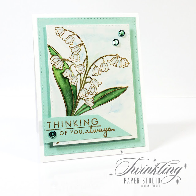
Today we are continuing our journey back through the first 10 years of Papertrey Ink with a look back at 2010. That year brought several new stamp sets including one called "Year of Flowers" and featured the different flowers for each of the months of the year. I have only one of the larger version, Lily of the Valley. Lily of the Valley are special in my family. However, after seeing all the gorgeous projects that Nichole posted and seeing Keeway's watercolor, I know the Sweet Pea will be my next set. I also really want the Daffodil, and the Rose and ....well - you know. Probably all of them eventually.
I started by stamping the image in Versamark onto a piece of Canson Bristol Watercolor Paper and heat set it using Antique Gold Embossing Powder. I grabbed a few distress markers and my water brush and took it on a clip board to color in front of the TV. I feel like I don't get to watch much TV but the clipboard gives me a strong flat surface to work on if I want to do something while I'm "watching" which should probably be more accurately described as listening. Anyway, this is my absolute favorite way to watercolor. While I have other mediums, I find this one to be easiest for what I do. And I even prefer it over my Zigs.
I used a combination of Mowed Lawn and Pine Needles to color the leaves but for the white blooms I put down just the tiniest amount of Weathered Wood and pulled it out with my Wink of Stella Clear Glitter Brush Pen. Once that was dry, I went all around the image with a small amount of Tumbled Glass and slightly more water and let it pool a bit here and there to give it a few hard edges in an otherwise soft blue "sky".
To create the card, I die cut the watercolor panel then die cut another larger panel from Aqua Mist Cardstock. I put a piece of fun foam under the watercolor panel to give it some dimension. That was attached to a Card Base made from Stamper's Select White Cardstock. Then I stamped the sentiment on a scrap piece of Aqua Mist, heat embossing it then cut it into a banner to attach to my card front. The fun foam behind the main panel helps it to go through the mail without getting torn up. I added a few metallic aqua sequins as the final touch.
While I love Keeway's beautifully colored image, that wouldn't have suited my image well at all. Thanks again for stopping by to see my card and I hope you'll come back again. Be sure to pop over to Papertrey Ink's Blog to see all of the projects for today!
Monday, February 13, 2017
Papertrey Ink 10th Anniversary - Celebrating 2009
The 10th Anniversary celebrations are continuing today on the Papertrey Ink Blog and today features some of the sets that came out in 2009. I was totally inspired by Laurie Schmidlin's card using the Giga Guidelines Stamp Set. This set is no longer available, but I bought it from someone on the For Sale or Trade Board over at the Papertrey Ink Forum sometime last summer. I love the big bold graphics of this set. I didn't really know that about myself until I started making cards. I would have thought my style would be frilly and ultra feminine but I find that for the most part, I love really bold graphics rather than dainty in my work.
I love the grey, black, white and gold of Laurie's card because, let's face it, it is bold! Laurie also scored her front panel to emboss the diamond pattern on there. I'm not sure how she did it, but I have a fairly close version of it myself although it took several tries to get it. When I finally figured it out in pencil, I scored my panel following the pencil lines on the back side which left the impression on the card front. Then I used that as my guide for lining up my stamps. I also used the Guide Lines Stamp Set to have a smaller but coordinating image in the same style. For those images I stamped them in Versamark and heat embossed them.
Like Laurie, I used two colors of ink (Smokey Shadow and Lovely Lady) and two different stamps from the Giga Guidelines Set. I really like this design and it would be very easy to make into a masculine card using some blues or browns. I mounted this panel on a top folding card base made from Smokey Shadow Cardstock. Just like Laurie, I added some gold watercolor spatter to the card front using my Finetech Mica Gold Palette.
I used one of the Limitless Layers Circles to cut a circle and stamped one of the medallions I used in Versamark and heat set it with Gold Embossing Powder. I also used one of the sentiments from the set and heat embossed it as well.
Thanks for stopping by my blog today and be sure to go over to Papertrey Ink and see all the design team inspiration.
Sunday, February 12, 2017
Celebrating 2008 with Garden of Life
Today we are continuing the 10th Anniversary Celebration at Papertrey Ink with a look back at 2008. I actually wanted to change one thing on yesterday's card but that went sideways in a hurry and I need to start over on that one. I have a few days to get it done, thankfully!
One of the stamp sets that was revisited today is Garden of Life. There are links to all of the original posts with that set but one of the new Design Team Members, Keeway Tsao, used it for today's post with a bit of a modern twist. I love her fun, cheerful card and immediately I thought of some paper that happened to still be on my desk.
Papertrey had a big Pre-Anniversary sale last month and put almost all of the paper packs they had on sale for $1.00. Yes, you read that right, $1.00. I didn't buy much paper, but I did get a couple; Luxe Foil Designer Papers in Gold and Star Scribbles which is printed on White Linen with some in Gold Foil and some in Silver Foil. These are pre-cut for you at $.25 x 5.5 inches. Foiled Designer Paper is almost the only patterned paper I ever use. There are exceptions from time to time of course, but I remembered seeing one of the papers in the stack that made me hone in right away on Keeway's card. I love the way she offset the scribbled or doodled flowers over the top of the solid images to get the fun whimsical look on her card. Plus, she has just a touch of Gold cardstock on there and you know I am a fan of that!
One of yesterday's featured sets from 2007 is Spiral Bouquet, which I just happen to have gotten from the For Sale or Trade Forum about a year ago. There a few sentiments in that set that I really love. So using a piece of designer paper from the Luxe Foil pack and yesterday's set I came up with my card for today.
To create my scribbled flowers, I used a circular piece of red rubber that was a leftover from an old cling mount style rubber stamp. I have a few of these and I've kept them for another project that I do from time to time, but this one was perfect to stamp inside of the gold scribbles being 2 3/8th inches in diameter. For the top flower I used Lovely Lady Ink and for the bottom right I used Hibiscus Burst Ink. I stamped these by hand but for the sentiment I used my small MISTI since on yesterday's card I got it crooked.
Once I had the greeting stamped and heat embossed with Ranger Ultra Fine Detail Gold Embossing Powder, I laid my scalloped edge die across the front of the panel and die cut it a bit shorter so that I could have the piece of Pink and Gold Striped Paper peeking out from the bottom. The easiest way to do this is to cut a strip the width of your card and attach it to the card base at the bottom front. Once that was done, I could attach the scalloped piece at the top to create the front of my card. After that I added quite a bit of gold watercolor splatter to the front panel protecting the pink and gold foiled paper with a couple of post-it notes to give it added texture.
This made for a fast and easy card in a very clean and simple design. The pre-printed Gold Luxe Foil Papers made it that much faster and gave me the ability to mimic the style Keeway used on her card.
Be sure to stop over at the Papertrey Ink Blog to see all the projects that get linked up each day during the festivities. Thanks so much for stopping by my blog today and I hope you'll come back soon!
Wednesday, February 8, 2017
Puppy Valentines
Initially I was not going to do a blog post for these cards, but Lols over at Simon Says Stamp asked me to do one and enter it into the Simon Says Stamp Wednesday Challenge for this week which is featuring Wild Rose Studio Stamps and the theme "Cute". I used the Wild Rose Studio "Dog with Heart" Stamp for my cards.
I'll be the first person to admit that I am not a Copic Certified Colorist or even that I do it the right way. But one of the things I am trying to do is use all the tools I have and about 10 years ago I purchased a good supply of Copic Markers so I keep on practicing with them. For me, that's what its all about; not whether or not I'm doing it the "right" way. Therefore, I am certainly not going to tell you how to do this because I don't really have a clue except to say I used a lot of flicking motions to get the "furry" look. I used 3 shades of Warm Grey for one Dog and 3 shades of Cool Grey for the other. I don't have very many browns to choose from in my markers so I could find three colors to work together so that is why I went with the grey tones. These are stamped in Simon Says Stamp's Intense Black Ink.
I have two little Yorkies that are my babies. They are full grown and are 3 years old but only weigh 6 or 7 pounds. Some people would call them teacup but that is not a legitimate breed for Yorkies and is more of a reference to size. They are considered a Toy Breed and my girls are "Blue & Tan" in color. Holly is more of a golden blonde and Reese is a platinum blonde. The Blue is a reference to their other color. If they have even a tiny little whisper of white in their coat, they are considered blue rather than black.
Anyhow, when I saw this stamp I thought it would make a cute card. The little face on this dog is so adorable and made me think of our girls. One of these cards was readied for the mail today to go to the lady who was our breeder when we got first one and then another of her puppies. Our rascally little girls have pretty fluffy names too; Reese Mackenna and Holly Noelle. Holly was my Christmas present that year although we didn't actually get to bring her home until January. Reese is very much a Daddy's Girl and Holly is a Momma's girl but we adore them. Holly is the one in the photo and she was bringing me her bear so I could play with her. Who could resist that face? Not I!
So even though normally I don't do a lot of critters, there are exceptions and this stamp was one of them. It's also a good price at $7.99. It's currently out of stock but if you want one just get on the e-mail notification list for when it's back in stock and Simon will send you an e-mail. Wild Rose Studio is a UK Company and has some of the most adorable critter stamps. There are several different bunnies, bears, elephants and even a little dragon or two. I stamp those sometimes and send to my grandson to color. He thinks it's pretty cool to get little coloring pages in the mail from his Mimi. Wild Rose Studio also has some gorgeous printed papers as well and I used several of them during this past Christmas.
These are definitely more along the cute category than my typical style but they will make for cute valentines. I'm going to dash off here so I can color another to send to my littlest grandson who just turned 5. When we were on FaceTime the other night, he had me turn the phone around so I could show him "Reese-y" as he calls her.
Thanks for coming by my blog today and I hope you'll come back soon!
Tuesday, February 7, 2017
Will You Be My Valentine?
Over at The Paper Players Challenge #330 this week they have a theme challenge for Valentine's Day. I was thinking I was finished making Valentine's Day cards but I got something I had ordered yesterday and had to make just a couple more. I've already been thinking of all the pretty cards I can make using this die in the future. One of my nieces is getting married in August and I already have in mind the card I'll make for her. Have you seen this new Caprice Heart Die from Birch Press Designs? They have several layered dies where you just stack the layers to make these beautiful designs but most of them are card sized and just too expensive for me to buy many of. Even this one was kind of a splurge but I know I will use it many times.
I made the shaped card using the Little B Hearts Dies in the same way as I did for this post. The Caprice Heart Die is not quite the same proportions as the Little B Dies, but you can't really tell once you get everything assembled. For my card I used all Papertrey Cardstock in Pure Poppy, Hibiscus Burst and Lovely Lady. The die layers are done in the same bottom to top and the top layer is cut from gold foiled cardstock.
The sentiment banner is from the Enclosed: Heart Mini Stamp Set from Papertrey Ink and is cut with the Tag Sale: Quilted Die. So far, this is the only smaller sized layered die from Birch Press Designs but I will be anxious to see what the future holds with them. The Prismatic Heart is kind of lacey and pretty like this one, but it isn't a layered die.
I still have a few cards to write out to get all my Valentines mailed and today is about the latest I want to do that so I'm going to skate off of here for now to finish those up. Have a great day and I hope you'll come back very soon.
Monday, February 6, 2017
Love You, Yes I Do!
Today I have one card for three different Challenges. The Color Throwdown Challenge #428, Inspired By All The Little Things #42 and one for the Simon Says Stamp Flickr Challenge #64, "Love Is In The Air". I keep thinking I am done making all of my Valentine's Day Cards, but there are still a lot of challenges for those color schemes and occasions. I'll be honest with you - I really wasn't too sure about this color combo until I started trying to pull this card together. The inspiration images are fantastic but it isn't a typical palette in my arsenal. I do the challenges to stretch myself artistically and that was certainly true for these colors. I saw a picture in the last day or two where someone had made soft pink marshmallows that were peppermint flavored. Doesn't that just sound delicious? You could cut them in any shape you want including little hearts. It makes me want to run to Starbucks for the biggest hot chocolate on the menu!
I have made so many Valentine's Day cards for my girlfriends but I thought of one more today that I wanted to make and this will be perfect for her.
I started my card by creating a top folding card base from Stamper's Select White Cardstock. Next, I embossed a 4.25 x 5.5 piece of Dark Chocolate Cardstock with a wood grained embossing folder and then cut it with the largest Simon Says Stamp Stitched Rectangle Dies. I love the clean finished edge that using a die gives to paper. There's never a raggedy edge from a dull paper trimmer. I use my Stitched Rectangles Dies more than any other dies I have. In fact, I use them so much that I'm beginning to wonder if I can wear one out!!
Using the Simon Says Stamp All About Love Stamp Set (No longer Available), I stamped the letters in Versamark and heat embossed with Antique Gold Embossing Powder. I used my Cherub Hearts Dies from Memory Box to cut the heart from Pure Poppy Cardstock.
The tulips are a stamp set from Papertrey Ink called Tulip Time and I have the coordinating dies. The easiest way to stamp these is with the MISTI Tool because there are lots of layers. I place the die cut negative in the MISTI and then lay the positive piece back into the negative. For these, I stamped the lightest layer in Sweet Blush, the medium layer in Pure Poppy and the darkest color in Scarlet Jewel. The leaves are stamped with Vintage Jadeite and New Leaf Inks, all from Papertrey Ink.
I attached the wood grain background to my card base with ATG Adhesive and then I attached the Love Panel and the Tulips with Foam Tape. That finishes up this card.
I hope you like my interpretation of the inspiration images. I'm glad you spent a few minutes here on my blog today and if you'd like to leave a comment, I really appreciate each one of them. Have a happy Monday everyone!
I have made so many Valentine's Day cards for my girlfriends but I thought of one more today that I wanted to make and this will be perfect for her.
I started my card by creating a top folding card base from Stamper's Select White Cardstock. Next, I embossed a 4.25 x 5.5 piece of Dark Chocolate Cardstock with a wood grained embossing folder and then cut it with the largest Simon Says Stamp Stitched Rectangle Dies. I love the clean finished edge that using a die gives to paper. There's never a raggedy edge from a dull paper trimmer. I use my Stitched Rectangles Dies more than any other dies I have. In fact, I use them so much that I'm beginning to wonder if I can wear one out!!
Using the Simon Says Stamp All About Love Stamp Set (No longer Available), I stamped the letters in Versamark and heat embossed with Antique Gold Embossing Powder. I used my Cherub Hearts Dies from Memory Box to cut the heart from Pure Poppy Cardstock.
I attached the wood grain background to my card base with ATG Adhesive and then I attached the Love Panel and the Tulips with Foam Tape. That finishes up this card.
I hope you like my interpretation of the inspiration images. I'm glad you spent a few minutes here on my blog today and if you'd like to leave a comment, I really appreciate each one of them. Have a happy Monday everyone!
Sunday, February 5, 2017
Muse Challenge #201
Hello there! I'm glad you are here. Today's card is one made for the Muse Challenge #201. Valentyna is the Muse for this week and she created the card on the left.
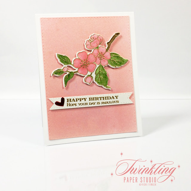
For several weeks, I have been making Valentines for my friends and family and before that it was Christmas Cards. This week we are supposed to have temps in the high 70's and I am ready to work with some beautiful flowers. So for my card, I pulled out a favorite from Clearly Besotted called Beautiful Friend. I love this image of a branch from an Apple Tree and I used Valentyna's colors as my inspiration.
I started with a panel of 4.25 x 5.5 Canson Bristol Watercolor Paper and did some ink blending on it with a combination of Pale Peony and Lovely Lady Inks. Then I misted it with Iridescent Gold Glimmer Mist and set that part aside to dry.
Next I stamped the blooming branch in Versamark on another piece of Canson Bristol Watercolor Paper and heat set it with Simon Says Stamp Antique Gold Embossing Powder. I cut a banner from Tag Sale: Quilted and stamped the birthday greeting from Boutique Borders: Birthday Stamp Set, again in Versamark and heat set it then laid it aside.
Using Distress Markers, I watercolored the blooms in Worn Lipstick, the leaves in Mowed Lawn and the branch in Gathered Twigs. Once everything was dry, I die cut the background panel with the largest Simon Says Stamp Stitched Rectangle, and used the coordinating die for the flowering branch. Using a card base made from Stamper's Select White, I adhered the background panel using my ATG dispenser. For the banner and the branch, I used Thin 3D Foam Squares. I had a few small hearts leftover from my Valentine's Day projects, so I put one of them on the left side of the banner which completed my Clean and Simple card.
I watercolored additional images of this branch as I made a card for a niece and I'm making several cards for one of my sisters-in-law this week so they'll be ready to go if I want to use them again. I always try to make multiples so that I have extras for pulling together a quick card. I leave them uncut until I decide on my design, keeping them in the Stamp Pocket with the stamp set. It makes for a fast card if I need one in a hurry.
Thanks for stopping by today. Be sure to check out the Muse Challenge Blog to get all the details on this challenge and to see the beautiful entries.
For several weeks, I have been making Valentines for my friends and family and before that it was Christmas Cards. This week we are supposed to have temps in the high 70's and I am ready to work with some beautiful flowers. So for my card, I pulled out a favorite from Clearly Besotted called Beautiful Friend. I love this image of a branch from an Apple Tree and I used Valentyna's colors as my inspiration.
I started with a panel of 4.25 x 5.5 Canson Bristol Watercolor Paper and did some ink blending on it with a combination of Pale Peony and Lovely Lady Inks. Then I misted it with Iridescent Gold Glimmer Mist and set that part aside to dry.
Next I stamped the blooming branch in Versamark on another piece of Canson Bristol Watercolor Paper and heat set it with Simon Says Stamp Antique Gold Embossing Powder. I cut a banner from Tag Sale: Quilted and stamped the birthday greeting from Boutique Borders: Birthday Stamp Set, again in Versamark and heat set it then laid it aside.
Using Distress Markers, I watercolored the blooms in Worn Lipstick, the leaves in Mowed Lawn and the branch in Gathered Twigs. Once everything was dry, I die cut the background panel with the largest Simon Says Stamp Stitched Rectangle, and used the coordinating die for the flowering branch. Using a card base made from Stamper's Select White, I adhered the background panel using my ATG dispenser. For the banner and the branch, I used Thin 3D Foam Squares. I had a few small hearts leftover from my Valentine's Day projects, so I put one of them on the left side of the banner which completed my Clean and Simple card.
I watercolored additional images of this branch as I made a card for a niece and I'm making several cards for one of my sisters-in-law this week so they'll be ready to go if I want to use them again. I always try to make multiples so that I have extras for pulling together a quick card. I leave them uncut until I decide on my design, keeping them in the Stamp Pocket with the stamp set. It makes for a fast card if I need one in a hurry.
Thanks for stopping by today. Be sure to check out the Muse Challenge Blog to get all the details on this challenge and to see the beautiful entries.
Saturday, February 4, 2017
The Fusion Challenge
I have a card on my blog today that is for the Fusion Challenge which is a bi-weekly challenge and I'll also be linking it up over at the Simon Says Stamp Wednesday Challenge for a second entry there. At the Fusion Challenge, we can use the sketch or we can use the photo as inspiration or we can combine them for a Fusion of the two. The Simon Says Stamp Challenge has "The Color of Love" theme for this week.
I love the interlocking hearts on the quilt and used them as my inspiration for my card. I've made several cards for Valentine's Day this week and they have all been in a similar style but I must say, this is a favorite. I love how elegant it is in Gold and White with the tiny touch of red in the itty bitty hearts. Those little hearts are cut using a Simon Says Stamp Mini Hearts Die. This particular card is for Valentine's Day but wouldn't this be oh so elegant for a 50th Anniversary Card? You could put the "50" where the "love" die cut is now. I still have a bit more of this paper so I will definitely be trying to remember this for future reference.
This card is easy stuff! I cut two of the hearts from gold foiled cardstock. This die cuts and embossing in one step. I have had this die for a number of years (15 maybe). It's an Accucut die. The banner is from Papertrey Ink's Tag Sale Quilted Die. The Happy Valentine's Day sentiment is from the Hero Arts Love Stamp & Cut Set. The glittered gold and white paper is from Michaels Open Stock. The love die cut is Simon Says Stamp Kristina's Love Die also cut from gold foiled card stock. The little red hearts are cut from Red Mirror Board. I made several Valentines this week using Gold Mirror Board, but I didn't honestly care for the look of it too much. It was okay this one time, but I prefer the more muted color of the gold foiled cardstock and it's much easier to photograph. I used a Simon Says Stamp Stitched Rectangle Die in the largest size to cut the background panel and gave it a light mist with Iridescent Gold Glimmer Mist. While that dried, I did all my other die cutting and stamped my banner using Versamark and heat set it with Simon Says Stamp Gold Embossing Powder. I normally use Antique Gold but it was too warm of a color for the glitter paper.
I attached the background panel to a top folding Stamper's Select White Card Base. Then I cut 2 more of the Kristina's Love Die cuts from the same white so that I could make my sentiment a bit thicker. I glued those, one on top of the other, with Ranger Multi Medium Matte, putting the gold layer on the top. The hearts and banner were attached using Thin 3D Foam Squares. I use a ton of these in my card making. I have lots of little ones but I just ordered some of the larger ones to have on hand as well. I like that I get a bit of dimension but that they are not as thick as foam tape or regular foam squares. They hold up very well going through the mail. That is it for this card. There is very little stamping here, only the banner.
Thank you for stopping by today to check out my project. Be sure to stop at the Simon Say Stamp Wednesday Challenge Blog and the Fusion Challenge to see all the great projects.
Wednesday, February 1, 2017
Love & Romance
There's a new challenge up at The Card Concept and Simon Says Stamp Wednesday Challenge. The image on the left is our inspiration for the theme of "Love & Romance" at The Card Concept and Simon's theme is "The Color of Love". I never need an excuse to use pink, but I do love to incorporate it into Valentine's Day projects. Since I enjoy making cards so much, I love having all types of cards ready to go for each occasion and Valentine's Day is no exception.
I love the colors in this particular inspiration image and I wish I had a scrapbook store nearby so I could peruse the paper section for some paper that looks similar to this. It's got the French Country look to it and that's a style I love.
For today's card, I started with a top folding card base made from Stamper's Select White. The Silver and Pink Paper is a sheet that found at Michaels in Dallas when I was there at Christmas. I only got one sheet because I tend to use a lot more gold than silver, but I think this is so pretty and elegant and I knew it would make a pretty card for just the right person. The hearts are cut from an Accucut die that I have had for a number of years that cuts and embosses at the same time. I cut these from Silver Cardstock and Lovely Lady Cardstock.
The sentiments both came from the Hero Arts Love Stamp & Cut Set. I used Stick-It on both sides of a piece of White Fun Foam, then added the silver cardstock to the top of one side and die cut the whole thing to get the thick word die cut. I'm still not very good at working with Stick-It so I consider this more practice. The small little sentiment on the pink strip is the only stamping I did on this entire project. I used Versamark with Detail Silver Embossing Powder. Once I had the card put together I added some Sparkling Clear Sequins from Pretty Pink Posh. The ones I have are a mix of sizes in 4, 6, 8 & 10 mm all in one package.
This card was easy to put together once I decided on how I wanted my design to look. It was simply a matter of die cutting and assembling.
Thank you so much for coming by today and checking out my project. I love this theme so I hope to have time to make a couple more cards for this challenge. I'm thinking I need to make another of these for a young lady who is getting married in May of this year. If you'd like to leave a kind of encouraging comment, I do read each and every one of them.
Subscribe to:
Posts (Atom)