Friday, July 22, 2016

A Nautical Wedding Card

The Simon Says Stamp Monday Challenge Blog's theme for this week is Nautical/By the Sea. I don't really have any beach themed stamps or dies but whenever I think of Nautical, I automatically think of a Naval Officer's Uniform, Sailor Dresses, Sailor's Suits, Sailor's Knots and even a few Sailor's style outfits I've had through the years.  There's some interesting information on Wikipedia about this style that came to be popular for women and children in the 20th century.  For this card I naturally got out my stash of Navy Blue and Gold Striped Paper. Sadly, this is the last piece of it.  I have a little left from the Diagonal Stripe but only enough to use on maybe two cards.

As I sat and looked through my stamps and dies, I didn't have the one thing I really wanted for this challenge — a compass. So I went to look for one on the Internet and found one in some free clip art.  I had to pull it into my photo editing software to fix the rotation, but I remembered how to do that without too much difficulty. This image was just what I wanted. I tried to print it from Microsoft Word, but that didn't work. When I opened it in Windows Picture Viewer I could tell it to print from there, what kind of paper I was using (Stamper's Select White Cardstock) and it also allowed me to print at 600 dpi for a presentation quality image.  I've tried to print on Cardstock before without success so I was excited to notice these setting as available in that program.  I'm using an HP Inkjet Photo Printer that I've had since we moved to Oklahoma more than 6 years ago. The printer before this one was also an HP Inkjet Photo Printer.

Once I had the compass image printed, I cut it with the 2nd largest My Favorite Things Stitched Square Stax Die.  I cut the striped paper in the largest square die from the same set. I cut a white strip wide enough for the greeting from the Simon Says Stamp Congratulations Stamp Set.  I stamped that using Versamark and heat set it using Simon Says Stamp Gold Embossing Powder. I wanted the little bit brighter gold to match the stripes on the patterned paper. Once I had that stamped and heat set, I went around the edge of that piece with my Versamark Cube and then put the same gold embossing powder on it and heat set it to have the gold all the way around.

I made a mat for the sentiment by using my die creatively with a small scrap of the navy & gold paper.


I used some Navy grosgrain ribbon to tie a Sailor's Knot around the panel with the compass on it. To get it to lay flat I had to cut it in half at the back and tape the ends down.  The knot on the front was positioned and then adhered with Ranger Multi-Medium Matte for a good strong hold. I set a few acrylic blocks on top of that for about 5 minutes so it wouldn't budge. I assembled the card onto a top folding A2 Night of Navy Cardstock Base. I adhered a white die cut panel on the inside of the card for a place to write a sentiment.

So now y'all see how my mind wanders when I am creating a card, but it definitely works for me most of them time.

Thursday, July 21, 2016

Make it Monday #258 Spritzed Stamps

This will be a super quick post today. I took a couple of days off this week and now I have several other projects on my agenda for this week still, so I'll try to keep it short and sweet.

This week on the Make It Monday over at Papertrey Ink, Melissa Phillips did a technique featuring spritzing stamps.  This technique really requires at least a two step stamp set and I used one that has been on my desk a lot lately, Friendly Flowers.  I've done this technique before so I knew a lot of what to expect as far as the behavior of my inks when spritzed.  My spray bottle happens to have a very fine mist sprayer which I think makes for smoother and more predictable results. I also used watercolor paper which helps the water move although in my case, it didn't move too much because my mist was superfine.  Mostly it only softens the hard lines of the stamps.  If you used more water, it would feel a lot looser and more like watercolor.  

I combined two of the stamps from Friendly Flowers for the blooms and only one layer of the leaves. The Blooms are stamped in Lovely Lady and Hibiscus Burst.  I tried a 2nd layer of the leaves (stamped in New Leaf) on another card but I didn't like the look. For this card, I stamped the base bloom then the dotted petals on top of that.  For my third layer, I stamped the dotty petals again with Versamark and heat embossed them with WOW! Neutral Ultra Shimmer Embossing Glitter.

For the greeting, I cut three of the "Hugs" and glued them one on top of the other for a thicker embellishment.  Using Hibiscus Burst Ink Cube direct to paper, I colored the sentiment.  When that was dry, I inked it up with Boss Gloss Liquid Embossing Ink from Stampendous and sprinkled it with the same WOW! Neutral Ultra Shimmer Embossing Glitter.

I cut the stamped panel down with a Simon Says Stamp Stitched Rectangle Die and adhered it to a Noted A2 Card Base cut from Hibiscus Burst Card Stock. If I hadn't done this technique before, the card would have taken me a lot longer just to learn and understand how the inks work when combined with water. It was a quick card to make although I must admit, it really isn't my usual style.

I'll be back soon with another project or two.  Thanks so much for stopping by!

Sunday, July 17, 2016

Stamping Patterned Backgrounds

I have to say, one of the hardest things for me to do is to use patterned papers. Very often, they simply are not the colors I want or I feel that they are "watered down" versions of the colors I'm using. So when I saw the video that my friend Yana posted on her blog yesterday morning, I wanted to give it a try.  What could be better than stamping your own patterned paper in bold and vibrant colors?  I enjoy participating in Challenges and I saw that the CAS on Sunday Challenge Blog the theme is Sequins with a Clean & Simple card.  There is nothing simpler than a single layer card but that doesn't mean it can't also be pretty.  

Having had a portrait studio before, I have used the rule of thirds or what many in this industry call a "visual triangle" since I started making cards last year.  It's just a guideline for what is naturally pleasing to the eye. We're human and while precision and symmetry is admirable, it's often not as pleasing to us as something that has a more asymmetric or random look to it.  Yana mentioned this as one of the guidelines to use when stamping your own backgrounds in addition to using a stamp that has a lot of surface area.  With these two things in mind, I looked through my stamp sets to see what I had that could be used in this way.  It was pretty easy to decide on the Friendly Flowers Stamp Set from Papertrey Ink.

As I continue on this card making journey, I find that the one thing to pay the most attention to is those in this industry whose work you admire.  I love everything Yana creates and I enjoy watching her creative process. I also feel that her style is a pretty good match for what I like and what I want produce in my own studio.  So, imitation being the most sincere form of flattery, that is what I do.

I was so happy with the first two of these backgrounds that I made, that I went ahead and did 4 more.  I make sets of note cards as Christmas gifts and this year I am planning to make a bigger variety rather than just "thank you" or "thinking of you" cards.  I'm planning to include this style in that selection.  Additionally, they are a single layer which makes them easily mailable.  

Since I was experimenting with color combinations I really decided to go for broke this time and get really out of my wheelhouse for these.  For the blue toned colors, I used SU! Pistachio Pudding, Cracked Pistachio, Ocean Tides, Hawaiian Shores and Peacock Feathers.  I wish I would have used Vintage Jadeite instead of Pistachio Pudding, but there's always next time.  


Next I used a combination of pinks & rose with Spun Sugar, Lovely Lady, Hibiscus Burst, Autumn Rose, and Picked Raspberry.
  

And last but not least I used Pale Peony, Melon Berry, Berry Sorbet, Worn Lipstick, and Ripe Persimmon.  This turned out to be my favorite.  As Yana mentioned, the most important thing is stamping in a visual triangle.  It's less important how many colors you use although I think having four to five is awesome.  You don't have to worry about colors overlapping, or masking which I mostly don't like doing.  I love how the colors overlapped and became a new color in those areas. For the sentiment I used a smaller size of flower in the set with the sentiment, stamped them in Versamark and heat set them using Simon Says Stamp Antique Gold Embossing Powder.  


I really like the variety of colors I was able to use to achieve these backgrounds. Someone on Instagram commented that Yana's looked like watercolor while mine don't.  I used much more vibrant and varied colors than Yana did because that is what I wanted.  You can change up the look by using more muted colors, more vibrant colors, soft pastels or any combination of colors you like.  The sky is the limit so give it a try.  I'm planning to try this technique using only Distress Inks on a piece of watercolor paper this week.

To finish off the cards I mounted them to a top folding 5.5 x 4 inch top folding note card and placed one 6 mm. gold sequin to the right just below the sentiment. The background stamping only took a few minutes to do.  It actually took me longer to figure out which colors to use.

This concludes the first card of "The 12 Cards of Christmas". These won't be Christmas Cards, but the set will be a Christmas Gift.  I'm planning to showcase each card as I complete it for the set of 12 that I give to each of my sister's in law. July is half over already and I like to get an early start on the cards I make for them. I am not a procrastinator.

I hope you enjoyed today's cards and I'd love to see any cards that you try using this technique. Just be sure to leave me a link in your comment so I can follow you back and see what you've done.  You can also follow me on Facebook and Instagram.  I read every comment and it means the world to me when you take time to do it.  I'll be back soon with another project.

I decided to edit this post to show one more card I created with a colored casrd base. I used the Noted: Scalloped A2 Dies to cut a card from Hawaiian Shores Cardstock.  I love this look and will be creating more of these.

Friday, July 15, 2016

Simon Says "Flora & Fauna"

This week over on the Simon Says Stamp Monday Challenge Blog the theme is one of my favorites, "Flora & Fauna".  I wanted to create a card with a lot of textural interest as well as visual interest for my sweet Mother-In-Law.  With all the shimmer and bling that is on this card, I know she will enjoy looking at it. She doesn't read the writing anymore so what's on the outside is far more important than what is on the inside.  I try to make it as fun as possible.

Recently, I watched a video that my scrappy friend, Yana Smakula (pronounced Sma-coo-la not Smack-u-la), had done where she showed a product that was new to me called Stampendous Boss Gloss Embossing Ink. Just the name is fun! If you ask my husband, he would tell you that I am always bossy, so this ink and I were made for each other. *Ü* If you haven't ever checked out Yana's Blog, you should.  Even though English is her 3rd language and not her 1st or even her 2nd, her videos are remarkably well done and her English is exceptionally good as well. You can click the link I provided here but I always have her linked as one of the blogs I follow in the sidebar on the right hand side of my blog.  Also, be sure to check out her YouTube Channel as she has a significant number of video tutorials there also.

So anyway, the Boss Gloss comes in a 2 oz. bottle that has a little sponge dauber top and can work on die cuts that have already been cut, stenciled, or colored somehow. You can also use it to apply embossing ink directly to your stamps for embossing or even to apply embossing ink to a die cut word.  This is going to be a handy tool in my studio and I like having a choice.  The bottle will fit in places that the ink pad will not.  I'm sure there will be other ways to use it that I haven't even thought of yet.

To begin, I stamped one of the Stampendous Pen Pattern Butterflies on a piece of Canson Bristol Watercolor Paper using Versamark and heat embossed it with Simon Says Stamp Antique Gold Embossing Powder.  I've been using this paper since I took a Watercolor for Cardmakers Class last August.  For the type of watercolor I do, it is my absolute "go to" paper.  I just got a pad of this paper in what Canson calls "Bright White", but it is truly no whiter than the Regular Canson Bristol Watercolor Paper.  It has the same smooth surface and is nearly identical in weight, but I haven't actually used any of it yet. I'll have to report back when I actually try some of it.

I colored the butterfly using Distress Markers in Worn Lipstick, Abandoned Coral, Wilted Violet and Seedless Preserves with Dark Grey Zig Clean Color Real Brush Marker for the the body.  I used the Coordinating Dies to cut out the butterfly.  I cut 2 of the Poppy Stamps Massa Leaf Background Dies from Vellum as well as a Memory Box Blushing Flower Die in Vellum. For the Blushing Flower Die cut, I colored the flowers using Worn Lipstick and the leaves in Mowed Lawn on the front side since I was planning to heat emboss. Next I used Versamark and Stampendous Embossing Ink all over all the pieces and then put a layer of WOW! Neutral Ultra Shimmer Embossing Powder on everything and heat set it. This powder looks the same as the Judikins Iridescent Sparkle Embossing Powder.  I have a box lid that is very shallow to set these things into while I heat emboss them so they aren't blowing all over my room.   There is so much sparkling goodness on these elements now.  I did my best to capture it in a photograph, but there is no way for the camera to capture all that the human eye and mind can see in a single glance.


I cut the Smile Circle Die in gold foil cardstock and a white background circle to go behind it which I also covered with embossing ink, embossing powder and then heat set. I can hardly wait until I begin making Christmas Cards to use this Embossing Ink and Powder for shimmer and sparkle on the snow or on any ornaments I might make.


I cut a Noted: Scalloped A2 card base from Papertrey Ink Berry Sorbet Cardstock, and I used a Simon Says Stamp Stitched Rectangle in the largest size to cut a white insert for the inside of the card.  I misted the card front with Tsukineko Sheer Sparkle Shimmer Spritz and let it dry for a few minutes.  Then I began assembling everything using Ranger Multi Medium Matte except for the butterfly which I adhered using Scor-Tape down the center of the body.  By attaching it this way, I can make it seem as if the butterfly might take flight at any moment.

Thanks so much for stopping by today. I hope you enjoyed this card and that you will stop by Yana's blog and check it out as well.  She makes the loveliest things. I'll be back soon with another project.

Wednesday, July 13, 2016

July 2016 Create Along With Us

I am popping in today with a really quick post and a quick card.  Each month, we have the opportunity to be inspired by something the Design Team has created using the products from the upcoming release which in this case is July 15th. Betsy's cards always inspire me and this month is no exception.  She used a die from her newest Paper Clippings series called "Done in Love".  I can hardly wait to get my hands on this set.  In the meantime, I used a Paper Clippings: Thinking of You die cut that I have a few of. We scrappy friends like to share our goodies with each other so we often send cuts to each other. That is how I happened to have the one I used today.

Betsy Veldman for Papertrey Ink
For this card, I started with a Noted: Scalloped A2 Card Base cut from Stamper's Select White Cardstock.  I went around the outside edge of the card front using a stencil brush using Hawaiian Shores Ink to give it a softly blended bit of color.  I wanted the background to work well with the Paper Clippings: Thinking of You die cut and I think this blending achieves it more than plain white cardstock would. Being careful and mindful of the entire die cut, I gently blended Tropical Teal Ink on the "wreath" portion of the die cut and Amethyst Allure on the Words.  I used Distress Markers in Spun Sugar, Cracked Pistachio and Wilted Violet for the blooms and leaves on the die cut.  There is a coordinating Paper Clippings: Thinking of You Stamp Set available to go with the die but I don't have it so I just colored it by hand.


I normally make a couple of cards the same or in a similar design at one time when it is a technique driven card so I almost always have a card ready to go.  I wanted something simple this time and not technique driven.  The Paper Clippings Series of stamps and dies make this an incredibly easy way to accomplish this.

Thanks for stopping by today!  I'll be linking this up over at the Papertrey Blog for the Create Along With Us Challenge.  This is not a very clever card, but Betsy is expert at creating things that make us look like we are very clever indeed.  See you soon!

Sunday, July 10, 2016

Magnolias For Her... Again

I felt like it had been ages since I last sat down to watercolor so I wanted to do some yesterday. I saw a card yesterday morning on another blog and it reminded me how much I love this set.  The current challenge over at the CAS Mix-Up Challenge is for Stamping, Markers and my choice of a 3rd technique. For today's card I used Stamping & Zig Clean Color Real Brush Markers, with heat embossing, Die Cutting and Sprays.  I also plan to enter this card in the Altenew July 2016 Challenge of "Weddings".  It doesn't have the yellow color in the inspiration image, but it does feature Altenew Stamps, Dies and Cardstock with the white, pink and green, so I'm entering it.


To begin with, I stamped all of the flowers in the Altenew Magnolias for Her Stamp Set except for the sentiments using Versamark onto a 4.25 x 5.5 inch piece of Canson Bristol Watercolor Paper which is my favorite.  In fact, I ordered a pad of this paper yesterday in Bright White which is a new product for them. The Bristol I normally use is a soft white rather than a cream like most watercolor papers and if I am water coloring on it, then it's no big deal usually.  But occasionally if I am doing a white on white card the difference is noticeable.  Anyway, I heat embossed the blooms using Simon Says Stamp Antique Gold Embossing Powder.  This is still my favorite gold embossing powder.

I knew for the sentiment I wanted to use one from Altenew's Beautiful Day Stamp Set and I already had some of those stamped and heat embossed so I only needed to cut one of them out. I also stamped the branch from Vintage Flowers and heat embossed it in gold then went ahead and die cut it as it's a solid image and there is nothing to paint on it.

Next I cut a top folding card base with the Noted: Scalloped A2 Dies from Papertrey Ink out of Altenew's Spicy Yogurt Cardstock.  This card stock is so nice and I love it.  It's not quite as heavy as what I use most of the time but it's 92# cardstock so still quite a bit heavier than SU! Cardstock. I just got my first pack of 10 sheets and I know it's one I'll use over and over again for masculine and feminine cards.  It looks very much like a paper that Creative Memories used to have called Spargo.  It was my all time favorite and I used it like most people use White or Kraft Cardstock.  This paper is only available on the Altenew Website.  I haven't seen anything close to this anywhere else either.


I watercolored the blooms with my Zig Markers in Sugared Almond Pink and Olive Green.  It doesn't take much water to move the color around on the Bristol Paper and I also wanted soft color since this is a wedding card.  Once I had everything painted and the paper was completely dry, I die cut it using the Magnolia's For Her Coordinating Dies and started placing my elements onto my card front.  I have a magnolia tree in my yard so I know the branch isn't an accurate representation of how a real magnolia branch looks, but it's okay. It's just supposed to make the recipient smile.

I arranged the flowers and leaves along the branch and adhered them with a combination of Ranger Multi Medium Matte and Thin 3D Foam Squares.  I added some pale pink and iridescent sequins to the card then carefully misted the whole card front with Tsukineko Sheer Shimmer Spritz.  I let that dry and added a second coat. I love the delicate color in this card and I tried to capture the shimmer which is difficult on this speckled cardstock.  I hope you can see a little bit of it and imagine the rest.


I hope you are having a great weekend.  Thanks so much for stopping by my blog today.  I really appreciate it any time you leave a comment for me or if you have questions be sure to use the "Contact Me" form on the right hand side bar.

Thursday, July 7, 2016

Make It Monday #255

Amy Sheffer's String Art Card
When I watched Papertrey Ink's 's Make it Monday #255 video this week, I fell in love with this card by Amy Sheffer who taught the technique. Somehow I had to find a way to make the technique my own. While looking for a certain color of sequins earlier, I passed up two spools of Silver and two spools of Gold DMC Metallic Thread... BINGO! I always love pink and gold and I knew this was what I was going to do for my challenge entry this week.

To start this card, I cut a Noted: A2 card base from Stamper's Select White Cardstock.  I masked off the scalloped edge then laid it in a shallow box and spattered Finetec Mica Gold Watercolor in Inca Gold on the front.  This card uses a #8 Silver Black Velvet Brush.  I set that aside to let it dry and went on to the String Art portion of the card.

I have 8 small medallion dies that I could swear came from Papertrey Ink, but I cannot find them on their website. I didn't realize at the time I received them that I would start a blog some months later and it would be important to know who made them.  I didn't used to keep track of that kind of thing.  If anyone recognizes these dies, please let me know what they are!  You have to use something that has holes in it or else make the holes for this technique that is also called Spirelli. It's really easy to do as Amy demonstrated for us and you can watch the video at Nichole Heady's Blog or at the Papertrey Ink YouTube Channel.  I had worked on something Spirelli years ago for a scrapbooking border set and used Iridescent Metallic Thread for that so I'm going to have to find that spool and put it with my others!


Once I had the medallions die cut, I used a Kabuki Brush to apply ink in Lovely Lady and Hibiscus Burst before doing the string art. I wanted some variation in the color of the blooms just as they would be in real life.  For the Spirelli art, my holes were big enough that a knot in the thread wouldn't have stopped it so I used a tiny piece of micro pore tape on the back side to hold the thread in place firmly so I could do the string art portion.  At the end of each flower, I tied it in a knot and taped it down with another tiny piece of micro pore tape. This held really well for me.

Using another Kabuki Brush (I have 5 - 1 each for the color families of Red, Orange, Yellow, Blue and Violet), I ink blended in Hawaiian Shores Ink ever so softly in the center of the front panel to give just a hint of a sky behind the flowers and then stamped the sentiment which is from Papertrey Ink's Friendly Flowers Stamp Set.  These Kabuki brushes give you a softness that is hard to achieve with an ink blending tool.

After that I cut 2 of the leafy stems from the Painted Petals Dies and another from a different set that I have.  Since I had gold spatter and gold metallic thread on my card, I wanted to cut the stems from gold cardstock as well to tie all of the elements together.  I adhered the flowers to the stems with a bit of Ranger Multi Medium Matte in one spot and then adhered the flower to the card front using Ranger Multi Medium Matte and Thin 3D Foam Squares.  A few sequins in Moonshine and Aquamarine finished this card.

This was such an easy card to create that I decided to make another one. This is a great one to send to my girlfriends to let them know I'm thinking of them and missing them since I don't live near any of them anymore.


For the flowers on the second card, I used Papertrey Ink's Tropical Teal and Amethyst Allure Inks with Simon Says Stamp Island Blue Ink for the flowers and a Hawaiian Shores Card Base.  The background panel was cut from Stamper's Select White with the Sunshine Layers Die Set for WPLUS9 Design Studios. I used Finetec Mica Gold Watercolor in Tibet Gold for the spatter and Hawaiian Shores for the soft area of "sky" behind the flowers.  Some Moonshine and Peacock Sequins finish it up.  The sentiment is one I often use from Altenew's Beautiful Day Stamp Set.

I've mentioned this before, but it probably bears repeating that I use Gold Metallic Poster Board from Hobby Lobby.  It's much less expensive and I can use all I want without worrying about the cost. I buy it when it's on sale 2/$1.00 and cut it into manageable pieces when I get it home.

Thanks for stopping by to share a quick card today.  I hope you'll stop over at the Papertrey Ink Blog and watch the video.

Wednesday, July 6, 2016

Another Card for the Altenew Challenge

As I was sitting and working on a completely different style of card on Monday afternoon, I had an idea for another card for the Altenew July 2016 Inspiration Challenge using the image on the left and using the theme of "Wedding".  Altenew lets you enter their challenge as many times as you wish in one month so I decided to go for it again and make this second card. I could easily make a few more too. I used the color palette given in a different way this time having the largest blooms be yellow with only a very small amount of the pink this time.
For this card, I cut a 4.25 x 5.5 inch piece of the gold foil and white striped paper to be my background and mounted it on a Top Folding Vertical Card Base made from Stamper's Select White Cardstock. This is the same foiled paper that I used on my card here, just a much larger piece of it. It's called "Be Bold, Be Bright" and is available at Hobby Lobby and happens to be half off this week.   Let me just say that while I love the gold, it is very hard to photograph although I did manage to get a couple of acceptable images to use for this post.  Anyway, the foil makes for an instantly elegant card.  I have several patterns in the gold and white paper but again, I like stripes although I may try another pattern later.

Using Altenew's Peony Bouquet and Beautiful Day Stamp Sets, I stamped and heat embossed them using Versamark and Simon Says Stamp Antique Gold Embossing Powder.  To color the flowers I stamped inside the outlines using Lemon Tart and Harvest Gold.  The 2nd and 3rd detail layer were both stamped with the Harvest Gold but the color deepens a bit when you stamp the next layer over it.  I feel like I am not explaining myself very well so please ask if you have a question.  I tried using a third ink color, but I didn't like the way it looked.  This way is much more subtle and realistic.  The larger leaves are from the Beautiful Day Stamp Set while the single leaves are part of the Peony Bouquet Stamp Set. I used New Leaf for all of the leaves and Raspberry Fizz for the berries.  It's a little difficult to get those berry filled little sprays lined up and inked up so today I die cut them from watercolor paper first, then stamped and heat embossed them after cutting. To keep the paper lined up for stamping, I left the positive pieces in the negative and put a piece of masking tape over the back side to hold them in place until I was done with all the stamping.  This worked very well.  The stem and leaves are one part and the berry details are another.  Then each of those has another layer for coloring them in.  It's a little bit tedious, but I honestly didn't mind and felt it was worth it for the final results.  I used the Beautiful Day and Peony Bouquet coordinating dies.


I also cut a Spellbinders Labels 42 Decorative Elements as an anchor for my bouquet although you can't see much of it in the end.  It's just a skosh wider than the standard A2 card, but it will still fit in the envelope if you do it carefully.  I wanted to have my arrangement go from the upper left corner to lower right this time which helps draw your eye from the two corners and meet up at the greeting of "Congratulations" which was stamped using Altenew's Magnolias for Her Stamp Set.  The banner is from Papertrey Ink's Tag Sale: Quilted Die.  I've used this banner way more than the other part of the die.  Not every sentiment will fit onto it, but it is the perfect size for many of them. *Ü*


It's a bit hard to tell from the photos, but this is a super elegant card that you could give for a wedding or engagement card or even to a couple who is celebrating a milestone anniversary.  The peonies were spritzed with some Iridescent Gold Shimmer Mist (this one would be close) after the ink dried but before they were adhered to the card base using Ranger Multi Medium Matte. The only element I used dimensional adhesive for is the banner.  

I hope you enjoyed another card for the Altenew Challenge.  Be sure to stop by their blog and see the other entries. Thanks for stopping by today. See you soon! 

Tuesday, July 5, 2016

CAS(E) this Sketch #179

I saw this sketch this morning over at the CAS(E) this Sketch Challenge and loved it so I decided to play along. I really love how it looks like a wreath or branches framing in the sentiment and grounding it.  I'm limited to 5 entries on the Simon Says Stamp Wednesday Challenge each week and this will be my 4th entry there, but today is the last day before a new challenge is issued.

I used some already heat embossed and stamped pieces left from another card and added a couple of new ones in.  I started my card by creating a 4.25 x 5.5 inch top folding notecard from Papertrey Ink's Lovely Lady Cardstock.  Next, I cut a background panel from Stamper's Select White using the WPLUS9 Design Studio's Sunshine Layers Die Set. Using a kabuki style makeup brush as my stencil brush, I brushed Lovely Lady Ink all around the outer edges of the panel lightly.  In the future I'm just going to call this my stencil brush without explaining what I am using until someone asks.  I have to say, I am loving this technique and I find it to be great for not getting marks or streaks in the ink.  Ink blending is great too, but I'm glad to have another option in my tool box.

I cut a gold foil oval from Spellbinders Oval Floral and cut the oval center out as well for a true "frame" feel.  I adhered that to my background panel using Ranger Multi Medium Matte.  When that was dry, I arranged the peony and leaves (from Altenew's Peony Bouquet Stamp Set) how I wanted them on the card and attached them with a combination of Thin Foam Squares and Ranger Multi Medium Matte.  I also used the same stencil type brush to lightly ink up the sentiment banner which used Altenew's Beautiful Day Stamp Set and attached it with Thin Foam Squares as well.


Since most of the pieces were already stamped and cut, it made for a quick card. I think this is a sentiment that can be used for a wedding, birthday or even encouragement cards.

For your reference, the leaves were stamped in Vintage Jadeite and the peony was stamped in Spun Sugar Distress Ink for the lightest layer, Lovely Lady for the 2nd and 3rd layers and then the 3rd layer was stamped again in Hibiscus Burst to give it a little more depth.

Typically, I don't do very many dimensional elements because I mail nearly every card I make so I want them to go through the machines.  It's nice that with the Thin 3D Foam Squares it can have a little of that while still being mailable. I'm pretty sure this one is going to my Mother-In-Law, Agnes.  She still enjoys her cards and my sister-in-law, Brenda, made her a binder of all the cards she has received so she can look at them in book format.  She doesn't remember who they're from, but she does like being able to see them.

Thank you so much for stopping by today.  I appreciate that you've spent some time on my blog today.  You can also find me on Facebook and Instagram.  Have a great day, everyone!

Monday, July 4, 2016

Stampin' Royalty #336 & Simon Says Wednesday Challenge

I have a card today for the Stampin' Royalty #336 Challenge and the Simon Says Stamp Wednesday Challenge.  The Simon Challenge is "Anything Goes" and Stampin' Royalty is using the inspiration image on the left which you can see has lots of blues and corals in it.

As I often do when trying a new technique, I stamped multiples of the pieces for the card I created yesterday (in case of mistakes) for the Altenew July 2016 Inspiration Challenge.  That is how I happened to have 4 of these coral colored blooms from the Altenew Peony Bouquet Stamp Set.  I ended up not using any of the coral ones on that card but when I sat down this morning to figure out a few challenges to participate in, I thought of these immediately when I saw the inspiration image.

I started by making a top folding 4.25 x 5.5 inch card base from SU! Night of Navy Cardstock. I had planned to use Enchanted Evening from Papertrey Ink but that is more of a Midnight Blue than a Navy Blue and didn't work with my accent paper.  The background panel is cut from Berry Sorbet Cardstock with the largest Simon Says Stamp Stitched Rectangle Die. The blooms are stamped with Pale Peony and Berry Sorbet for both of the layers.  I used a strip of navy & gold striped paper for a vertical stripe to adhere my row of flowers to.  While the designs I've seen so far all feature a horizontal stripe, I liked the visual interest of the vertical stripe and I had just enough of the coral blooms to do it this way.

For the greeting, I used one of the sentiments from Altenew's Beautiful Day and heat embossed it with Simon Says Stamp Antique Gold Embossing Powder which is the same as the one I used on the blooms.  The outlines images of the blooms were stamped with Versamark and heat set, then stamped with colors inside the heat embossed outline.  Afterward, I used a less expensive version of the ever so popular Clarity Stencil Brushes to lightly apply ink with Berry Sorbet. It just helps to tie it all together although I'm not you can tell in the photo. The Clarity Brushes are expensive at $30.00 for a set of 4 brushes in varying sizes and then you'd need two sets at that price to have one brush for each color family. A friend suggested that she was going to try this technique with a kubuki style makeup brush which makes perfect sense.  I wasn't sure it would work, but I've been very happy with the results and I got 5 large brushes, all about the same size in the set of make-up brushes I ordered from Amazon.  That pretty much covers the color groups I would need - Pink/Rose, Coral/Orange, Yellow, Blue/Indigo and Violet.  So far, these brushes don't shed as you are using them. You can find this set I got by following the link.


This card went together much faster than I was expecting but the hard part was already done so it just meant coming up with a design.  I have a very hard time using patterned paper but this gold foil striped paper is a winner for me every time.  I have it in white, mint, dark blue, grey, teal and green.  The pink and orange are long gone.  The paper is Hobby Lobby's "Be Bold, Be Bright" patterned paper that comes in an 8.5 x 11 inch pad of 80 sheets with all different patterns.  There are two of each color in each pattern.  If you buy it with a coupon like I did, it will be well worth the price.  Foiled paper is easily $2.00 a sheet so I feel like this was a bargain. I've got enough for quite a while. I took this last photograph at a slightly different angle so you could see the gold foiled paper.  The finishing touch is a few gold sequins.


I'm also going to pop over to the Simon Says Stamp Wednesday Challenge Blog and enter this card since they have an Anything Goes theme this week.  Thank you so much for stopping by today.  I always appreciate it when you take time to leave me a comment.  See you again soon!


Sunday, July 3, 2016

July 2016 Altenew Inspiration Challenge

Hello there!  I don't know about you all, but I have had a very busy week.  I work in my studio every day but I don't always have an idea that comes to fruition right away.  Sometimes I start a project with all the elements but in the end, I just didn't have something I was happy with, so I started over.   

That was the case yesterday when I began my card for the July 2016 Altenew Inspiration Challenge.  Sometimes, you just need a do-over. It's not that the first card was a total disaster, but in the end I felt it was just "too much" and decided to start from the card base I had created a few of at the onset of this project.

I started with a note card cut from Stamper's Select White Cardstock using the Papertrey Ink Noted: A2 Dies.  Once I had the note card folded, I masked off the scalloped border using the stitching lines as my guide.  Using my Fintec Mica Gold Watercolors in the color Inca Gold, I created some spatter. You can use any kind of shallow box to lay the card base in so you don't get spatter everywhere. I still always end up with more spatter on the hand that I bounce the brush off of than I do on my actual project.  I was so excited yesterday when I discovered that Finetec makes individual replacement pans of this watercolor. The set I have has 6 different colors of gold and I use the Inca Gold and Arabic Gold the most.  It will be great that I can replace just the one that is empty.  Simon Says Stamp carries the individual pans of the Kuretake and I'm hoping they will start carrying these as well.  I tried several several different brush sizes on the first card base but quickly decided that my #8 Silver Black Velvet Paintbrush was the size of spatter I liked; big enough to see, but not big enough to overwhelm.  The size of the brush determines the size of the spatter.  I tried everything from a #2 all the way to a #12.  I chose to do the ink spatters because Altenew carries a card stock called "Spicy Yogurt" which has speckles in it and I love the look.  I figured for a wedding card, gold spatter would be good.  Simon Says Stamp carries Altennew Stamps and Dies, but no cardstock so you have to order it from them directly. I've not found it elsewhere. I do have some Rustic White Cardstock from Papertrey Ink, but it is far less speckled than the Spicy Yogurt from what I can tell.  I'll let your know later as I ordered some.  It just hasn't arrived yet.  I'm planning to do at least one other card for this challenge after it arrives.

I wanted to use one of my Spellbinders Labels 42 Decorative Elements as my substitute for the Antique Trims that Altenew also carries. Yana Smakula is leading this challenge for Altenew and I love her stuff.  Her card was nothing less than stunning.  She creates the most beautiful cards all of the time. My own style is similar to hers and I use lots of gold embossing and shimmer in almost every card I make.  Some people don't like the mess of heat embossing but for me, it's still magic — every.single.time.  


Once I had my gold label cut, I stamped each outline image in the Altenew Peony Bouquet Stamp Set multiple times (anticipating errors) and heat embossed them using Simon Says Stamp Antique Gold Embossing Powder, which is my favorite gold embossing powder even over WOW! or Ranger. It is a warm gold and very well suited for almost everything I make. Occasionally I need silver or platinum, but most of the time I use gold embossing powder and this one is a great fit for me.  It melts nicely and the price is great as well. I cut each shape out with the Altenew Peony Bouquet Coordinating Dies so I could stamp them.

To color the blooms, I stamped each different layer of color on the leaves and blooms.  I have a couple of very light pink inks but the only one I really like for multi-layer stamping is Distress Ink in Spun Sugar.  It is a cool pink tone rather than a warmer tone such as Sweet Blush or Pale Peony.  For the first (and lightest layer) I stamped twice using the Spun Sugar Distress Ink on the large blooms and then the 2nd and 3rd layers using Lovely Lady and Hibiscus Burst Ink.  I stamped the 3rd layer again using Raspberry Fizz this time for the brightest pink accents. I stamped the smaller blooms of the peony in Lovely Lady with Hibiscus Burst and then Raspberry Fizz for the pink blooms and Lemon Tart with Harvest Gold for the 2nd and 3rd layers of the yellow blooms. All the leaves are stamped with Vintage Jadeite and the berries were stamped with Raspberry Fizz.  I assembled my bouquet on top of the gold label and then picked the whole arrangement up using Press 'N Seal.  I have a couple of pieces of this in my studio and I use them over and over again until they are no longer sticky.  There are a lot of small pieces to that bouquet and I didn't want to try to get it right from a picture on my phone so this method saves some of my sanity.   I don't normally use this many pieces on a card, but afterall, a wedding is special. The Press 'N Seal was a good way to keep the design together while I glued the pieces down.  You just start by adding glue to the backs of the pieces that you just picked up with the Press 'N Seal.  After that, you can add a drop or two of glue anywhere that you missed before.

I almost forgot the embellishments but remembered at the last minute and added some clear sequins and clear droplets from Pretty Pink Posh. I cut the sentiment piece by re-aligning my paper back into the same small rectangle from the My Favorite Things Stitched Rectangle Stax Dies and cutting again to make it narrower.  I attached it using a thin foam square on the far right end and some Ranger Multi Medium Matte on the left end.  I wish I could buck the system a little but at least in English, we read from left to right, so it's always more natural for me to lead in from the left hand side of the card and work toward the right.  I tried the sentiment with gold spatter on there, but I didn't like and felt it was distracting so I made a new one without the spatter.  

I'll be entering this card in the July 2016 Altenew Inspiration "Wedding" Challenge as well as the Simon Says Stamp Wednesday Challenge with their "Anything Goes" theme this week.  Have a great holiday weekend and stop by again soon!  

Friday, July 1, 2016

Simon Says "Anything Goes" July 1 - 2016

I love the weeks on the Simon Says Stamp Wednesday Challenge where the theme is "Anything Goes" because it means I can create anything my heart desires and it qualifies for the challenge.  I have several things sitting on my desk right now that I've been trying to get to, so this weekend will be a great time to play and upload to their Challenge Blog.

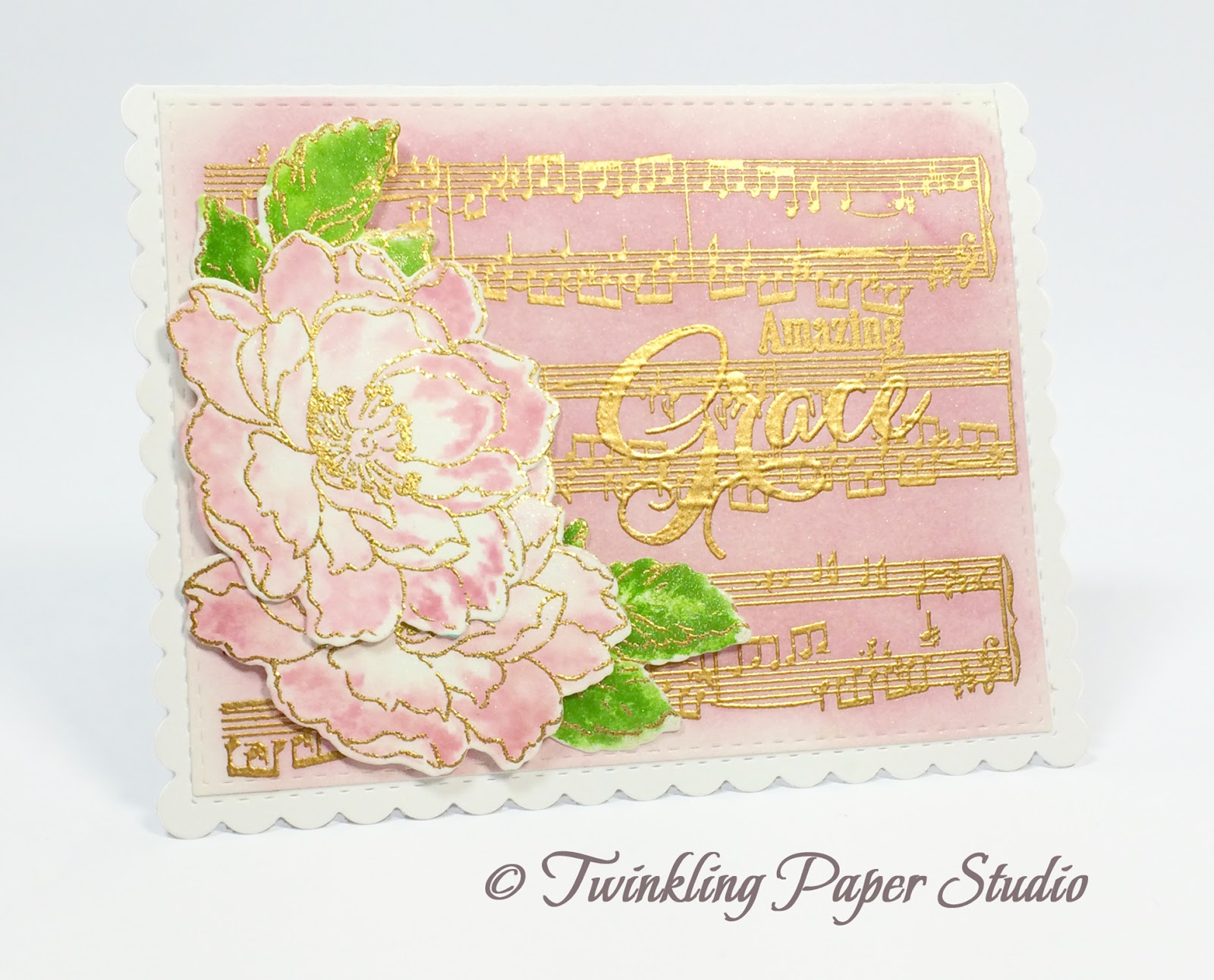
I've been wanting to play with this stamp set, Background Basics - Sheet Music for a while. Dawn McVey created a card during the last Papertrey Release in June and I've been wanting to play with it since then. So yesterday I sat down and created a couple of backgrounds to use for some cards I was putting together.

I stamped the Sheet Music onto a piece of watercolor paper with Versamark and heat embossed it using Simon Says Stamp Antique Gold Embossing Powder. Next I did some ink blending using Lavender Moon Ink with a Mini Ink Blending Tool on that panel and set it aside to dry so that I would be able to stamp and heat emboss my greeting after it was dry.  While I waited for that, I created the blooms and leaves using the technique that I developed called Watercolor Detail Stamping where I emboss the outline layer then add a detail layer to "watercolor" those images. I'm actually stamping that 2nd layer into the outline image of Altenew's Beautiful Day Stamp Set by lightly misting my paper with water and then stamping that layer in.  I used Lavender Moon Ink for these and New Leaf for the leaves.  This simply moves the water a bit for that hand watercolored look.  I confess, I need to be a lot better about leaving more white space when I am watercolring.  This technique makes it easy to do.

Once the flowers had dried I die cut them with the Altenew Beautiful Day Coordinating Dies then returned to my background panel so that I coulds stamp the Sentiment from the Papertrey Inspired: Grace Stamp Set.  I stamped with Versamark and heat embossed with Simon Says Stamp Antique Gold Embossing Powder.  Beautiful Day is my 2nd most favorite stamp set and my very favorite of the sets I have from Altenew.  You can find this at Simon Says Stamp or Altenew.


My card base is made from Stamper's Select White and the Noted: A2 Dies. The largest Simon Says Stamp Stitched Regtangle Die is nearly the perfect size to fit on top of the stitched outline on the note card.  I just realign the paper back into the die (lining up the stitches too) and cut about 1/8th of an inch off from one end to make it fit perfectly.  I love it when I can mix several products across different manufacturers.  That makes it a win-win for everyon, but especially for me.

I love being able to make these horizontal note cards with this die but I am very much hoping for the release of a top folding vertical card die as a companion piece to this one.  I think my cardmaking world would be complete with that.

I have several other things on my desk this morning that I am planning to use this weekend so I hope you'll come back soon to check them out.  Meanwhile, I will be posting this over at the Simon Wednesday Challenge Blog.Thanks very much for stopping by today!