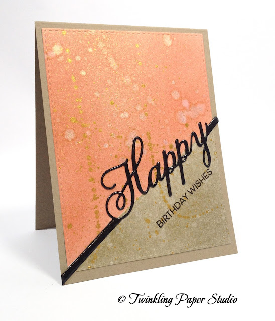
 Today's card is for a couple of challenges; the Papertrey Ink Make it Monday for this week and the newest Color Q Challenge #343.
For the Make it Monday #250 technique this week, Laurie Willison masked off a half inch border all the way around her card front and then used ink blending to color the background. If you click the link it will take you to the website to watch the video. By now I have done quite a bit of successful ink blending so I wanted to do the technique with a slightly different twist for my project.
Using a 4.25 x 5.5 inch piece of watercolor card stock, I masked off a portion along the diagonal and then started ink blending the top of the panel using Melon Berry Ink from Papertrey Ink. Once I had that part inked up, I removed the tape and then masked off the opposite part. Using a clean pad for my Mini Ink Blending Tool, I blended Encore Metallic Gold Pigment Ink over that section. When I removed the masking tape I spritzed the entire panel with Iridescent Gold Glimmer Mist and then mimicked Laurie's technique of adding some droplets on my background. This gave the ink blending a nice shimmer and also gave it the distressed look from the water droplets. To take it one step further, I splattered Finetec Mica Watercolor in Tibet Gold with a #4 Round Silver Black Velvet Brush which created the brighter gold spots. The size of the brush determines the size of your spatter. Smaller brushes make smaller splatter.
Next I die cut the "Happy" from a scrap of black cardstock. Laying it on top of my Ranger Craft Mat, I smooshed Versamark Ink over the entire die cut, poured clear embossing powder on it and heat set it. I used something from my barely used items - Ranger Large Particle Embossing Powder. My mom had sent me a message this morning asking me if I had used this product and I told her only once and that I had not liked it. Since it was on my mind and I had been meaning to try it for this technique, I got it down off my shelf and used it today. Normally, I would have to ink up my die cut with Versamark and pour clear embossing powder on it a minimum of three times to get the same look that I got in one shot here. So I am pretty stoked about it! It was a lot easier than squeezing glossy accents over the whole word but gave it the same look. Thanks, Mom! Be sure not to touch it until it's completely cooled down which only takes a few extra seconds. Otherwise, it will have your fingerprints on it (the voice of experience here *Ü*).
Using the "Birthday Wishes" sentiment from the Papertrey Ink 2016 Painted Petals Anniversary Set, I stamped it with Onyx Black Versafine, poured Simon Says Stamp Fine Detail Clear Embossing Powder over that and heat set it again. I die cut the ink blended panel with the largest Simon Says Stamp Stitched Rectangle and adhered it to a Kraft Card Base then assembled the rest of the card.
This is another clean and simple card that will be great to mail and is also a great for a masculine look. If you used a color other than orange, you could also go with a black card base but in this case it seemed a little too much like a Halloween look.
I have to say, after so carefully blending my inks it seemed sort of a waste to mess it all up by adding the water drops to distress it but I guess it's okay for a once in a while kind of grungy look and feel. I couldn't stand it though so I had to make a second card... I know, I know!
My second card uses Pure Poppy with the Gold Metallic Ink and an A2 Black Card base. I did use some Tsukineko Shimmer Spritz but I did not use any splatters. I really love the Red and Gold with the pop of the black and I'm thinking this will make a great choice for my father-in-law's birthday coming up in a few weeks. He always buys a red pick-up so I'm thinking this is good color choice to send him.
Thank you so much for stopping by to see my card and I hope you'll be back soon to check out my next project.


Vicki, both of these cards are very striking. The red one sounds perfect for your FIL, but my favorite is the first one. Guess I tend to favor Fallish colors more.
ReplyDeleteBoth of these look wonderful! The embossed sentiments really pop on the card!
ReplyDeleteOnce again-- very simple in appearance, but elegant in execution!! Both look perfect for a guy!
ReplyDeleteSuper artistic cards, Vicki, and both with an added touch of glamour. I especially love the background you achieved on the first one (reminds me a little bit of the beautiful card you sent me)!
ReplyDeleteWow, these are gorgeous. I loved reading about your process too. Thanks for playing along with us at colourQ!
ReplyDeleteFun designs, Vicki, It is nice to know that someone else thinks about the impact one color has on the process. Thanks for creating with us this week at the colourQ.
ReplyDeleteLove the split colors and sentiments! Great cards!!
ReplyDeleteLove both versions of this fantastic and pretty card. Thanks so much for playing along with us at ColourQ this week.
ReplyDelete