Saturday, August 29, 2015

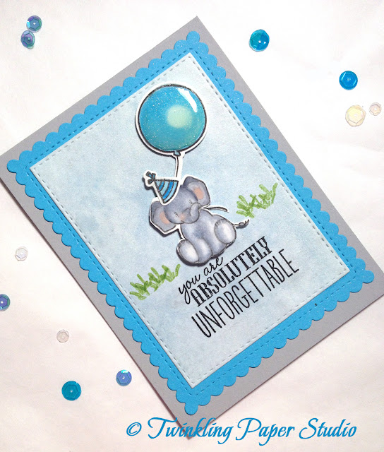
You are "Unforgettable"

I'm a messy creator, so this morning I worked on my table and trying to get some things put away before I started another project.  I do this 1 or 2 times a week, but when I am creating, there's no stopping to put something back. If I reach for it and it isn't right, onto the pile it goes!  It's not for everyone, but it works for me.  

After that, I sat down to try out this "Unforgettable" stamp set that has been back ordered for quite a while.  I finally got mine this past week.  I think that was the first time I have ever gotten the dies before I got the stamp set. *Ü*  

Dawn Woleslagle, the owner of WPLUS9 designed this stamp set and it has matching dies (here).  There's a YouTube video (here) where Dawn did a beautiful vintage looking, water colored card with this stamp several months ago and I have been in love with it ever since.     

I actually did two similar cards using this stamp set because I was experimenting with two different kinds of paper.  The second one is a birthday card for my youngest grandchild, Xander.  He loves his animals and will love this card so much.   

All of the images in this set, stamp very well so for the lightest possible outline, I used 3rd generation stamps of Versafine Black Pigment Ink.  It's really important to use a Water Resistant ink with Copic Markers because they are alcohol based. I used my Copic Ciao Markers in C1, C3 and C5 with a touch of R11 for the cheeks and ears.  One elephant was done on watercolor paper and the other was done on Stampin' Up's Whisper White which is a super smooth card stock.  I really don't have a preference at this time for one over the other.  I think both types of paper offer advantages. The one pictured here is the one done on card stock.  The party hat and balloon were colored using B00, B02 and B05.  Even the little blades of grass are included in this stamp along with three different elephant images, the balloon and several greetings.  For my greeting, I put a strip of masking tape over the bottom line of this 3-line sentiment to use it for a non-birthday card.  Then I inked up the stamp and pulled the strip of masking tape off before stamping.  With no ink on that line, nothing transferred.   


The front panel is one that I created when I was experimenting with Ranger Distress Inks and watercolor several weekends ago.  I didn't like how it turned out for that project, but I saved it just in case.  I love it when I can go back and use something that I saved!  So after I die cut it, I just created my scene.


There are dies for the different elephants, the balloon, the party hat and even a little bow for the tail or the balloon string if you want to use it.  I loosely scattered some matching sequins on the card front just for the pictures.  I haven't attached any to the card just yet.


I used the stitched and scalloped Sunshine Layers from WPLUS9 for the turquoise background panel and the Stitched Rectangles from Simon Says Stamp for the pale blue panel where I created my scene.  Those two dies are probably my most frequently used.  The card base is a 4.25 x 11 inch piece of Stampin' Up Smoky Slate that was scored and top folded at 5.5 inches.  The blades of grass are stamped directly onto the front panel in Wild Wasabi which is my favorite green from Stampin' Up.

The elephant with his party hat and the balloon are mounted to the card front with dimensional adhesive.  The hat and balloon have a layer of Wink of Stella in clear, then Glossy Accents on top which really makes them pop!  

I like to let my Glossy Accents dry for at least 24 hours before I do anything else, so this card might get a few sequins before I mail it out on Monday morning.

Here's the other card I made which was stamped and colored directly onto a piece of watercolor paper.  Again, the stamped images are 3rd generation but still so crisp!

Wednesday, August 26, 2015

I Hope You Smile - Part 2

This post is a continuation of my earlier post with a different card featured.  I tried this same card using the Stitched Rectangles from Simon Says Stamp. These dies are a bit different in that if you are cutting a "window" in your card stock, it leaves a stitched line around it.  So you have the piece left from cutting out the window also.  I saved that piece for a later project.


For this card I started with a pale pink card base cut at 4.25 x 11 inches then scored and top folded at 5.5 inches.  Next I cut a panel of the darker pink at 4 x 5.25 inches.  I lined the stitched rectangle up on this panel to be in the center horizontally but toward the top of the card to leave room for my sentiment.

Next I cut 4 pieces of the Bazzill Marshmallow Card Shoppe (110#) card stock with the Simon Says Stamp Caliope Die.  I used my Tim Holtz Distress Markers in Victorian Velvet, Tempered Glass, Shabby Shutters and Milled Lavender to color the different bits of flowers and stems to make it look like a variety of plants.  I applied thin adhesive all around the window opening then arranged the die cuts in the window.  Once I had them how I wanted them, I used a We R Memory Keepers Next Level Woven Embossing Folder to emboss a pale pink 3.75 x 5 inch piece of card stock to go behind the "window" and "flowers". If you haven't seen what these can do, you are missing out!  They are used just like any other embossing folder but have more than two levels of impression so it is a super 3D effect on your card stock.  They are fabulous!  Once I did that, I assembled my card front panel onto the basket weave panel using 3D Foam Tape so that there was a bit of room for the "flower garden" effect.  Then I attached that to my card base.

I cut my sentiment and finished off with a few sequins in Iridescent and a Rose color from my stash.  

The foam tape allows the card and envelope to lay really flat for mailing and the sequins stay really well with Micro Glue Dots.  I need to run out and get some more.  Have a great day everyone!


These pinks are really hard to photograph with accurate color, but you get the idea!

I Hope You Smile

Today's card begins with one of my favorite summer colors, Sea Glass.  The paper that I have came from Creative Memories several years ago.  Simon Says Stamp carries a paper this color now, but I don't have any of their new color to compare with my old color just yet.

I used a teal card base cut 4.25 x 11 inches, then scored and top folded at 5.5 inches. Next, I cut a Bazzill Card Shoppe in Marshmallow panel using the scalloped & stitched rectangle from the Sunshine Layers Die by WPLUS9.  This panel is 4 x 5.25 inches.  The Bazzill Card Shoppe Papers are 110# papers and hold up very well if you are using any kind of mist or spray, Copic Markers or Distress Inks.

Next I cut a panel from the Sea Glass card stock then cut a heart shaped window into it using a heart die from Memory Box Cherub Hearts.  I used a T-Ruler to line up the die since I am bad about not getting it centered.  I didn't make a mark on my card stock, I just placed it using the ruler as my guide.  I use micro pore tape, washi tape or masking tape to gently hold the die in place while cutting. Once I did that, I turned the panel over and put adhesive all around the heart shaped opening.  I use a variety of different adhesives but the one that I use most often is the Tombow Mono Adhesive Permanent Runner.


Next I did a few cuts of my Simon Says Stamp Caliope Die in white shimmer paper.  I then placed the cuts randomly across and into the heart shaped opening to give a "lacy" look.  For the size heart I used, three cuts was more than enough to fill the opening.  Once I had those placed and secured along the edge of the heart opening, I cut a slightly smaller piece of  semi-transparent soft blue vellum behind that panel for the color instead of the Marshmallow background.  After that, I die-cut that panel with a Stitched Rectangle in a size that coordinated with the Scalloped & Stitched panel.


Once that was complete, I adhered the Sea Glass and vellum panel to the Marshmallow Panel, and attached that to my card base.


The "smile" die cut was part of a set from Little Yellow Bicycle.  I have several one word greetings that would be equally suitable.  You could also use other shapes to achieve this look.  

I'm planning to try out a few others today and will post pictures for you to see. This card will be entered into the Simon Says Stamp Work It Wednesday Challenge.

For the inside I put a strip of Teal Glittered Washi Tape down the left hand side of a piece of Bazzill Marshmallow and cut it with the Stitched & Scalloped Rectangle Panel so it would be easy to see when you write on it.  *Ü*

Sunday, August 23, 2015

Simon Says Wednesday Challenge - Back to School

This week's challenge over on the Simon Says Stamp Wednesday Challenge Blog is "Back to School".   I initially had a little trouble coming up with a back to school idea at all until I remembered this printed paper.  I've been wanting to send my three sweet grandsons who live in Texas a card marking their return to school this week.  Simon's Challenge was just the incentive I needed to get my creative juices going.

I used a white A2 card base with a side fold for this card.  The decorative printed paper is from Close To My Heart's "Chalk It Up" collection.  Most of this collection was sent to a friend for her high school boys scrapbook pages, but I did keep this sheet for myself.  The stamp came from another Close To My Heart set called "Special Care" which was a past Stamp Of The Month.  Boys pick up all kinds of stuff on their way home from school even though it's only a few blocks. You know-- rocks, sticks, critters etc.  I stamped the sentiment using Versamark Ink and heat embossed in Calypso Coral embossing Powder from SU!


The background coral panel was cut using a scalloped, stitched rectangle from the WPLUS9 Sunshine Layers set.  I trimmed the scallops off since I was sending it to boys.  Next I cut a panel of the printed paper, rounded the corners and inked the edges up using the DTP method in some teal ink for a slightly distressed look.


I wanted a secondary focal point behind the stamped image since the printed paper is busy, so I cut the star in SU! Brown Sugar using some Quickutz dies that I've had for a number of years.  I attached the embossed piece with some tape runner and then topped it with the geometric self adhesive embellishment from my supplies.  The Chalk It Up Collection came with the puffy stickers in the coordinating shapes.    I'm not much for stickers usually, but these are cute and match perfectly.  A super quick and easy card!

Scrapbook Convention

My mom traveled to where I live this week to attend the Creating Keepsakes Scrapbook Convention with me.  She had never been to one before.  Compared to the GASC in Arlington, Texas, this one was barely a blip on the radar screen, but it was great for us.  Mom is getting older and my body doesn't work so well either due to the MS.  But we did okay.  We went a little early so we could get a decent parking space and not have to walk too far.  We managed to walk around for about 5 hours and make it to all of the vendor booths we wanted to see.  It's always nice to spend time with my mom who is also a paper-crafter.

I had a couple of things on my list of items that I was hoping to find at the convention for a reasonable price.  I was particularly looking for background stamps as I only have a couple and they don't work for very many of the things I want to do.  I'm a huge fan of Jennifer McGuire and she does some amazing things with her background stamps.  I was fortunate to find a few I really liked that were clearance priced. 

Today's card started with a piece of Sea Glass card stock cut 4.25 x 11 inches, scored and top folded at the 5.5 inch mark.  Next I inked up a Justrite Cling Background Stamp with Versamark and heat set it using Pearl Embossing Powder.  I love the tone on tone, textured color this gives to my card base.  I pulled this Wild Wasabi from my SU! stash and cut a panel using Memory Box Stitched Rectangles from Simon Says Stamp.  I like this particular set of dies because there are 7 sizes in the set. 


I cut a second stitched rectangle out of this beautiful Prima Marketing Firefly Collection paper.  Next I added a strip of Glittered Washi Tape in green and made a vertical band around those two stitched panels.  The tape is not rough at all and the "glitter" doesn't come off.  It's also super thin and easy to use.  I got the Washi Tape at the Eyelet Outlet booth at the CK Scrapbook Convention.  It's really beautiful and easy to add to any card.  I got 6 different colors.  I really love this "friend" die from Mama Elephant.  I cut 4 of these and glued them one on top of the other using Ranger Multi Medium Matte to get the thicker, more dimensional sentiment.  Next, I cut a single branch with leaves in the Wild Wasabi using a My Favorite Things die.  I snipped off a few of the leaves to make it fit better on my card.  After that I cut the top layer of the butterfly from White Shimmer card stock and the bottom layer from some semi-translucent blue vellum.  The butterfly die is from Impression Obsession and was also purchased at convention.  I put narrow strips of foam adhesive down the center of the body to pop it up.  I used an embossing tool handle to help shape the wings slightly. You can also do this with flowers using any kind of tool that has a small diameter handle.   


For the white insert I also used a strip of the green washi tape down the left hand side of that panel.  As the final touch, I added a few sequins from the Rhythm & Blues Collection from Simon Says Stamp.  

For any of the products I mention, you can click on the item and it will link you to a site where these items can be purchased.  

I hope you enjoyed this card.  Have a great rest of the weekend.  

Tuesday, August 18, 2015

A couple of simple cards

It used to be that there was pretty much 3 die cut companies out there so the process for using a die cut machine was one way or the other.  Nowadays, I have to figure out the "sandwich" recipe for each type of die.  I have a Cricut machine, but I love the absolute crispness of dies on card stock and how clean the edges are.  That is something that you cannot get with a paper trimmer or the Cricut.  

Mostly my style is pretty clean design.  I love clean lines versus a "Shabby Chic" type of card.  I have seen many of that style that are absolutely gorgeous, but that just isn't my particular style.    

I have a few projects going this week, but the style of the designs is again very clean.  However, clean doesn't necessarily mean straight as you will soon see.  I have this plaid paper that I absolutely love.  It has been a favorite for many years--at least 10 years.  Of course, this means you can't buy it anymore.  With the exception of card stock, paper changes all the time.  I only have a couple of sheets and some scraps left so I'm trying to make it stretch as far as I can! 


I follow Jennifer McGuire Ink and I love her clean style as well.  One of the things I have picked up from her is the use of just a touch of Glitter Paper on cards. The cards I've worked on this week are super simple but that touch of glitter has really added a super nice touch to these.  You can see that narrow strip of my favorite paper added to this one as well.  


You can see the gold decorative element is also embossed and the greeting has been added with dimensional adhesive.  I will be so sad when the plaid paper with the gold foil design is all gone. I think I need to make something for myself with it!   


The next card uses another favorite color combination that I can no longer get either-- Eggplant and Thistle, both from Creative Memories.  This card is for my Aunt and you know she must be pretty special to me if I'm using my stash of irreplaceable paper for her.  *Ü*


Both of these dies are from the Anna Griffin Cuttlebug Collection.  I love them, but they do take up the entire front of an A2 sized card so I don't use them too often.   The small sentiments is a set of 3 dies from with one outline that are interchangeable from Momenta Craft Dies.  I've never seen another set and you can't find them online either.  But again, they cut and emboss.  

This blog is new to me and I'm still working out a few kinks with the photography and setting the scene for a good clear image.   I hope you're having a great week!  

Thursday, August 13, 2015

Simon Says Wednesday Blog Challenge

When you start writing a blog it is helpful to have some direction of where you are headed with this.  Since I am new to this, I am using some of the blogs that I follow to inspire me or help generate ideas.  This is how I arrived at today's post.

Simon Says Stamp has a few blog challenges going on and I try to participate in them every week.  So, the Wednesday Challenge for this week is "Food &/or Drinks".  I'm here to tell you that I don't have many stamps sets that are related to either one of these, but it did make me sit down to look through what I do have.  Sometime this summer I ordered some things from Close To My Heart and I had the chance to purchase this Stamp of the Month set called "Ice Cream Dream" for $5.00.  You just can't beat that action for a full sized "D" stamp set.

I had a lot of trouble deciding how I wanted to stamp the greeting and tried several techniques before I remembered something I heard on a Kristina Werner YouTube video a while back.  It just didn't look right in black ink.  And even though I tried Onyx Black VersaFine and Momento Tuxedo Black, both bled into the paper when I tried to color in that skinny little detail in the lettering.  So I gathered the other papers I planned to use and I tried a few different shades of brown that didn't look right either.  I don't have Stazon Black but if that doesn't bleed, you can let me know!

I often experiment with techniques I've seen in YouTube videos and I had been playing with different brushes I already have on hand.  I wanted the softer watercolor look that I've seen on other paper crafting sites.  There just happened to be one of those experiments sitting on my work table in just the right color to work here.  Bingo!


I stamped the greeting on that watercolored paper panel in gold ink, put Ranger Super Fine Clear Embossing Powder on it and heat set it.  There was the look that I was going for!  The ice cream cone was stamped on the same Strathmore 140# Cold Pressed Watercolor Paper with Versamark and heat set with Ranger Superfine Clear Embossing Powder.  It was colored in with Copic Ciao Markers in the "R" family (20, 22 & 32).  The waffle cone was colored in with E33 & 35. This was actually my first successful attempt at using Copic Markers.  It really helps when you can watch a technique video instead of just listening to a teacher speaking to you from the front of a classroom 7 or so years ago!  I used Ranger Glossy Accents on the ice cream cone and let it dry overnight.  Then I attached it to my card using dimensional adhesive.  I love the effect of the glossy accents and how it made the ice cream cone just pop!


I used a 4.25 x 5.5 inch white card base but trimmed 1/4 inch off each side to make it fit the stitched panels better.  The papers are a pinky coral and taupe and I attached them to the card using Tombow Mono Multi and attached a few sequins on it in iridescent clear, coral and gold to help tie in the gold ink. About half of my sequins are from Cartwright's and you can order the size and color that you desire from their website.  When I ordered, I tried to anticipate my needs based on the many colors of paper that I have in my stash for the most economical shipping.  They have a minimum $10.00 order requirement and they will ship First Class or Priority Mail, your choice.    

I haven't yet decided how I prefer to attach my sequins.  On this card I used a few micro glue dots.  Other times I use Ranger Multi Medium Matte.  I have a couple of other options as well, so when I pick just one, I will let you know.

I hope you enjoyed this card.  

Tuesday, August 11, 2015

Simon Says Monday Challenge - "Homegrown Summer"

I have a friend who is a "Homegrown" friend.  Like a flower garden, friendships need tending, too. She has had a few really tough years with an aging (aren't we all) parent who has a devastating illness and another parent whose health isn't too great either.  We're about the same age and share many similarities such as being a Mom and a Mimi.  I met her in real life several years ago through a scrapbooking retreat. We had long admired each other's scrapbooking style via a message board before then so it wasn't unnatural for us to meet in that way.

My husband and I relocated 5 years ago but even before then my friend and I hadn't lived too near each other as she was in West Texas and I was in North Dallas, Texas.  But we communicated often via e-mail mostly.  Because we have moved several times with my husband's job, I know how really important it is to stay in touch, keep contact and keep those friendship fires burning.  I don't even know anymore how many cards I've sent to her.  But I do know that sometimes, the five minutes at the mailbox is the only tiny little break of enjoyment she gets in the course of a day.  When I started, my cards were okay, but they really weren't anything special.  Now I delight in surprising her with new techniques and fresh designs.  She hasn't had time, space or her belongings to do any papercrafting in a few years although I think she would consider it therapeutic.

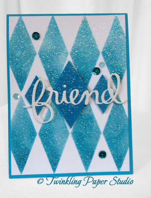
Yesterday, I posted a new technique that I had tried the previous evening.  I played with the same technique this morning because I had a couple of cards to make and I wanted to try this out in a bit more of a practical application.

To make this card, I used Stampin' Up's new Heavy Whisper White Cardstock. The ink and the background panel are both Stampin' Up in Tempting Turquoise. I frequently treat my cardstock in order to give it a shimmer or twinkle.


Once I had completed the stenciling on the base white panel, I took my Versa Mark and inked up a 2  x 4 inch scrap piece of the turquoise, applied the Iridescent Sparkle Embossing Powder from Judikins and heat set it.  Once that was done I cut the larger center diamond and the two smaller diamonds from a set of Quickutz Diamond Dies that I have had for several years.  The diamonds were popped up on the panel with foam squares for the added dimension.  I love this Mama Elephant "Friend" die cut!  I cut just a single layer of the die in Shimmer White Cardstock that came from Creative Memories several years ago. I kind of arranged the sentiment how I wanted it to go on the card and then I was careful to put Tombow Mono Multi only where it would be attached to the raised diamond panels.  I finished it off with a few sequins from the Rhythm and Blues 8 mm Collection and Wild Peacock 5 mm Sequins.  I like using 2 or 3 sizes on a single card just for the asymmetrical feel.  This is a side view of the card showing the various layers of dimension.


Friends so enjoy getting a handmade card in the mail.  And they don't even seem to mind that sometimes they get my experiments too!  I usually like to surprise my friend but I couldn't resist sending her a text with a picture of this card in it this morning.  She will be stalking her postman in a few days waiting for its arrival.  *Ü*  This post is dedicated to my friend in honor of her unwavering devotion to her parents.  As she said recently, "Growing older is not for wimps!"


Monday, August 10, 2015

A New Technique

** So as I was taking pictures of my card to post here, I realized that I put my panel on upside down...Grrr.  I guess that is what I get for staying up too late to finish.  But I still like the card enough to keep it!**

I will admit that I spend some time on the weekends watching a few YouTube Videos.  There are a lot of papercrafters out there who do technique videos. Two ladies (Laura Sterckx at makingcardsisfun.com & Jennifer McGuire from Jennifer McGuire Ink) come to mind immediately.  I subscribe to their YouTube Channel so I know right away if they have posted a new video.  While I may know the technique already, each person has their own little tips and tricks to share with you.  It is very hard not to take away something from each and every one that I watch and often they will give me ideas for something new I want to try.  I couldn't even tell you whose video that I was watching that made me think of this particular project.   Laura has done several videos for a technique that I'm trying hard to perfect--Shaker Cards--but I am not there yet!  

Anyway, something I watched yesterday kick started an idea that I have been formulating in my head.  I feel this was very successful so I'm sharing it here today.

I don't know what it is, but I like diamonds in ANY form.  The real thing is always the best, but I like them in paper form nearly as much.  I've been seeing some really neat stenciling techniques with a flower stencil so I wanted to try my version.  I got my Harlequin Stencil from Simon Says Stamp ages ago.  I actually only have the diamond stencil, but I couldn't find a link to the single version on their website.  

For a variety of purposes, I use Drafting Dots, Washi Tape or Painters Tape, whichever is handier at the moment.  I kind of move around in my studio from my desk where my computer is, to my table and I even have a corner desk that I use to heat emboss or cut dies in my little Sizzix Sidekick. One thing I have found to be true with any of these is that you should put the sticky side on your skin (I use the back of my hand) before attaching it to paper of any kind. Otherwise, you might tear off a layer of your nice smooth cardstock as you remove the mask.  I'm using a 4.5 x 11 inch card base with a top fold at 5.5 inches.  I lined up my stencil on the card with the design centered.  I used a sponge dauber to apply my Tim Holtz Victorian Velvet Distress Ink.  I have only 5 colors/pads in this ink, but so far I have managed well with just these few.   I "stamped" some ink on one of my clear acrylic blocks and applied that ink directly to the cardstock.  I did a heavier concentration of ink in the lower left of each diamond to create a shadow which you will hopefully be able to see in the photo.  Once I had my color laid in, I used a clean sponge dauber to go over the top with Versamark Embossing Ink.


Then I removed the stencil and applied Iridescent Sparkle Embossing Powder from Judikins to the card and heat set it.  I am so happy with the outcome.  Once that part of the panel was complete, I used my Thanks Die by Mama Elephant.  I cut three and adhered them to each other for the added dimension.  I also made two cuts from the Simon Says Stamp Super Hearts Border Die.  I chose just a few of these in different sizes to use on my card.  After attaching them, I went over all of the die cuts with Ranger Glossy Accents to give them a high shine, enameled look. This was my first time using glossy accents for that purpose and I have to say, I am definitely a fan. 


I hope you enjoy this technique. I always love it when something in my head actually comes out on paper.  Please let me know if you try it and what your results were.  Have a great week!    

Sunday, August 9, 2015

Tie it Up #2

I sat down today to work on a thank you card for someone and I attempted a new technique which I saw in a U-Tube Video by Dawn Woleslagle of WPLUS9.  I hope I spelled her name right!!  I've watched this particular video a few times so that when I sat down to try it myself I could feel a bit more confident. Water-coloring is a huge trend right now and I have done a bit of it in much looser forms with my cards and card backgrounds in particular.  But to watercolor a flower in a way that actually seems realistic was definitely outside of my normal "box".  Dawn made it look so easy that I felt I had to try it.


I should probably mention here that I am not an artist.  I am definitely a crafter, and I am definitely creative.  But I have never considered myself artistic.  I can't draw or paint or do any of the things that would be considered "Artistic".  

Dawn Woleslagle is a wildly talented artist outside of the papercrafting world. So when she showed how to get a water colored look without having to draw the image first, I was all in.  For this technique I used a stamp set called "Pretty Peonies" designed by Dawn for WPLUS9.  It's a multi-layer stamp set designed to give you a realistic image by stamping three different color inks--light, medium and dark.  I stamped the detail image from the largest peony of this set onto Canson 140# Cold Pressed Watercolor Paper using my Tim Holtz Distress Markers in Spun Sugar with a pretty small watercolor brush.  I just used the marker to ink up the stamp and then stamped it onto my watercolor paper.  Dawn showed that by pulling that ink with water and a very small brush, you can achieve this soft, realistic flower.   

I originally attempted this method with my regular stamping inks that I have from Stampin' Up.  However, the color of those inks is too vibrant and intense to get a good result for watercoloring using this particular method.  A more water soluable ink in a very soft color gives much better results.  Dawn used Worn Lipstick in the video that she made.  For the watercolored image above, I used 5 distress markers in Spun Sugar for the flower, Squeezed Lemonade for the center of the flowers, Shabby Shutters, Bundled Sage and Frayed Burlap for the leaves.  Most of the water I used was on the flower image with only a little bit on the leaves.  

    
So I've been thinking about making this card for several days and finally sat down to do it this morning.  Since I had only watercolored the one flower on a small scrap of watercolor paper, I had just enough to cut that scrap with the Stitched Rectangle dies by Memory Box, available at Simon Says Stamp. I continued with that same set of dies (it's a set of 7) to get the multi-layered look I wanted.  I used a 4 x 5.25 inch white card base.  The pink and white stripe paper is from American Crafts, the solid pink and the sage green cardstock are both from Stampin' Up.  The Green to Pink Ombre ribbon is from my stash and was perfect for this card.  The "Thanks" diecut is from Mama Elephant.  I have a few different "thanks" dies but this one is my favorite.  I didn't have any pink sequins the right shade so I used irridescent instead.  

I'm also going to enter this card in the "Tie it Up Challenge" over at the Simon Says Stamp Wednesday Blog Challenge but there's already 244 entries including one other one from me! 

I'm wishing everyone a great day and a great week.  

Friday, August 7, 2015

Tie it Up!

Today I worked on an entry for one of the blogs I subscribe to. They have a Monday Challenge each week and also a Wednesday Challenge.  This weeks theme for the Simon Says Stamp Wednesday Challenge is "Tie it Up".  I have lots of ribbon to choose from in my "collection" even though I rarely use it so it was indeed a challenge for me.

I like the crispness of die cut panels on a card but I didn't have the sizes I needed to do this particular card.  I was over the moon this evening when I went to check for a set of dies I have been waiting for at Simon Says Stamp and they were back in stock.  I did not hesitate-- I ordered!  I didn't want to miss out and be waiting yet again.


On with the details.  I used a top fold 4.25 x 5.5 inch card base made from White Neenah 110# cardstock.  The base panel is Pink with a little shimmer in it.  The next layer is Slate which is a much better match than black to the print.  I love this fun paper from Carta Bella's Paris Girl Collection. I used the Direct To Paper (DTP) method to ink the edges in Dusty Plum Cat's Eye Ink.  I then applied the "Belly Band" by tying pink grosgrain ribbon around the printed cardstock panel. I always seem to tie a knot vs. a bow as its not as frilly or fussy as an actual bow. I always cut my ends at an angle to prevent fraying.  I cut three layers of the word "LOVE" and glued the layers one on top of the other with Tombow Mono Aqua Glue for dimension. Two additional layers of the pink cardstock went into the die for the heart part of that die cut.   I added just a few Black Iridescent Sequins using micro glue dots and adhered the layers to the base card.  Voila!

I was very much wishing that I had the Spellbinders Eiffel Tower Die for this card, but I haven't purchased it so far.   I can see that I need to add it to my wish list as I have more of this paper and I really like the clean & simple design of this card.

Happy Friday Everyone!


Tuesday, August 4, 2015

You add a little Sparkle

Today's card features a die that I absolutely love from Paper Trey Ink.  There's also a matching stamp set here.  I've used this die for note cards, birthday cards, and there will be many times that I will use it for other occasions.  The are many word phrases in the stamp set to help you personalize a card for your occasion.  I love the versatility of this set.  It makes a nice little greeting for a just because card, a birthday card, an anniversary card, and well, you get the idea.


Another thing I really love is the stitched rectangles available from Simon Says Stamp here.  There's another set I want from Simon Says Stamp here that has stitching on both sides of the cutline, but they've been back ordered for a bit.  

When making cards, I really love to add dimension by using foam tape to attach the various layers of card stock to my card base which I am hoping you can see with this side view of the card.  Only the soft cocoa colored panel is adhered directly to the card base. I used foam tape on the other two layers to give the added dimension.  It ships well with the foam tape and does not require extra postage.  For this card I stamped the sentiment (except for the die-cut word) and heat embossed with Ranger Super Fine Gold Embossing Powder for an always elegant look.  I cut the large "Sparkle" out of antique gold foil cardstock and added just a few sequins from Pretty Pink Posh with micro glue dots for a touch of fun and whimsy.  With all of the gold in the card, I didn't feel like I needed to add the extra layers to the die cut word.  


I'm very happy with my finished card! 


Sunday, August 2, 2015

Sharing My First Card

I love the creative process for making a card.  No two cards are ever exactly alike.  That's one of the things that makes hand-made cards so special.


For this card, I used an ivory colored card base scored at 5 1/2 inches with a top fold.  When selecting papers for a card, I often look to nature for color inspiration.  The first photo I posted here (the Kansas Sunrise) was the inspiration for this beautiful card.  I love how this card came together and I know someone will love it nearly as much as me.  

Saturday, August 1, 2015

Christmas is coming!

I am not a procrastinator so I am already working on a project for the holidays this year.  That project inspired this card at least in part.  The other part of the inspiration came from last week's Simon Says Stamp Wednesday Blog Challenge found here.  The theme was Sparkle and Shine (Shiny & Sparkly are my 2 favorite colors!!!).  I did not get a chance to enter last week's contest, but I did want to make the card.  This is one of my favorite dies and I don't get the chance to use it very often.  I love the big script-y font and it comes in a set with that says "Sparkle & Shine" from Paper Trey Ink.   I LOVE dies and one of my favorite things to do is to cut a few of the same sentiment and glue them on top of each other for dimension as I did in this case.  The gold foil patterned paper came from the Simon Says Stamp May Card Kit and is one of the papers from My Minds Eye Fancy That Collection.


This card is on an ivory base scored at 5 1/2 with a top fold.  I love the way a top fold or tent card stands up so well for display by the person who receives it. Who doesn't like a beautiful, handmade card?  I really love the soft coral, nude and gold metallicand shimmer color tones in this card.  A few Chocolate Brown Sequins from this collection added just the right touch of whimsy.

I'll be opening an Etsy Store soon which will also be called Twinkling Paper Studio.  For now, I'm off to the Simon Says Stamp Wednesday Challenge to enter this card.  This week's theme is "Anything Goes" so I can still get in my entry! Have a lovely Sunday everyone!